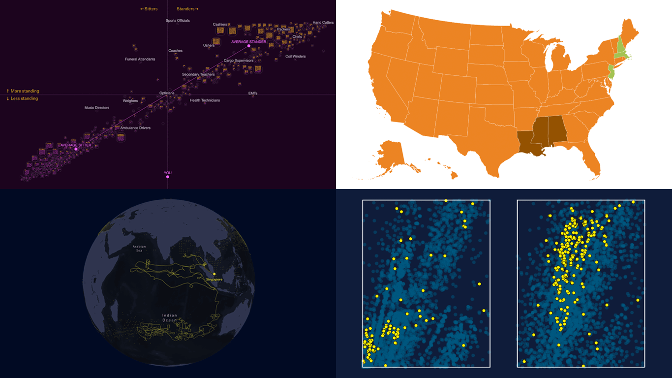
- Favorite Thanksgiving pies across the United States — Sherwood News
- Standing and sitting jobs — The Pudding
- Dark fleet tankers near Malaysia — Bloomberg
- Tracing microplastics — The Straits Times
Data Visualization Weekly: November 22, 2024 — November 29, 2024
Most Popular Thanksgiving Pies Across U.S.
As we reflect on yesterday’s Thanksgiving celebrations, many of us are still savoring the pies that sweetened our gatherings. While pies are a universal holiday delight, favorite flavors vary significantly across different regions of the United States.
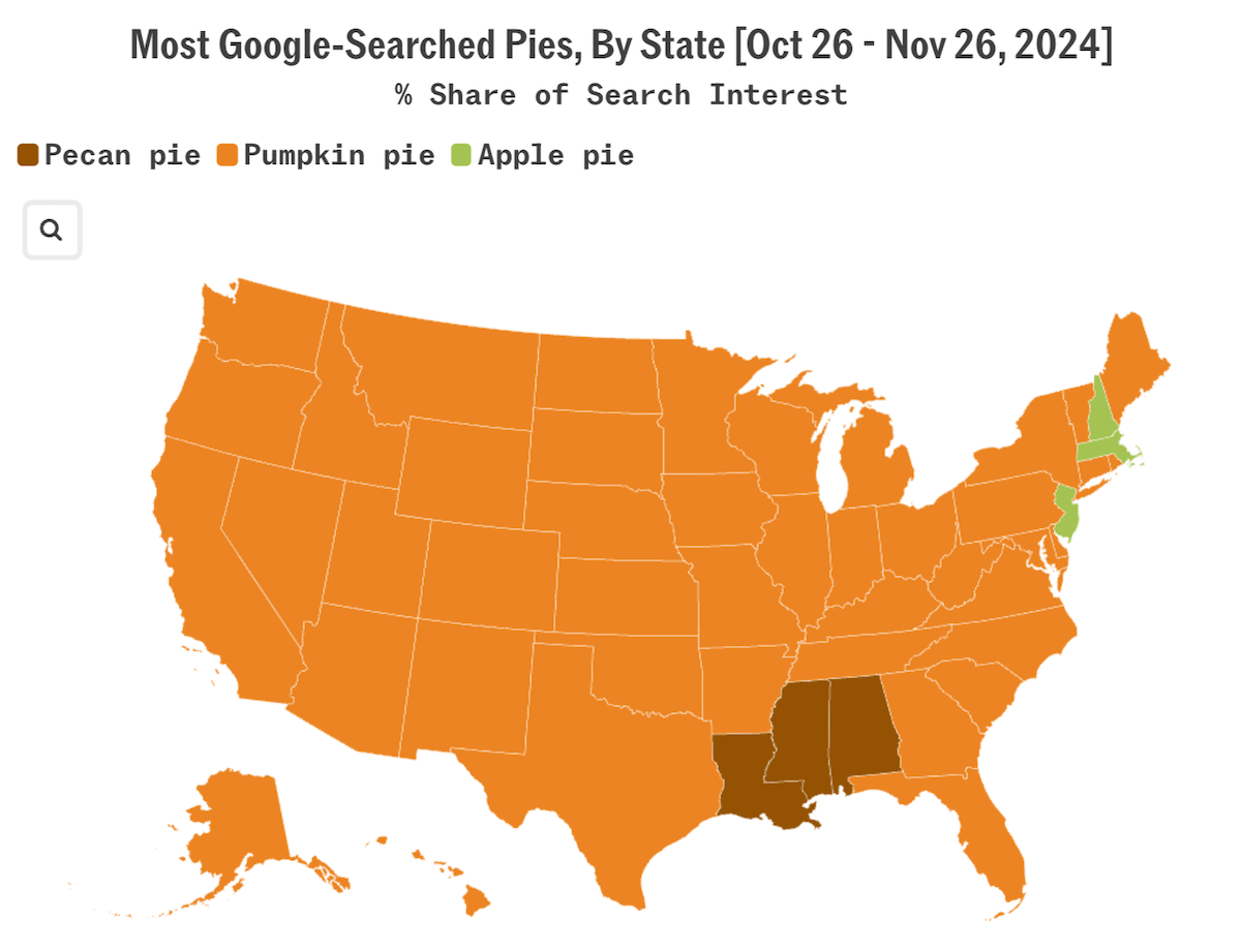
Sherwood News used Google Trends data from October 26 to November 26 to create an interactive choropleth map revealing the most googled pie types by state. Over the past 30 days, “pumpkin pie” dominated search queries in all but six states. Only Massachusetts, New Hampshire, and New Jersey leaned more toward “apple pie,” while Alabama, Louisiana, and Mississippi favored “pecan pie.” Separate choropleth maps for these three types of Thanksgiving pie are included, using a gradient color scale to highlight regional differences in interest for each.
Check out the piece by Millie Giles on Sherwood News.
Divide Between Standing and Sitting Jobs
Over recent decades, work in America has shifted dramatically from physical labor to more sedentary roles. We’re pretty sure you guys, who are reading this, also spend your workdays mostly sitting, for example.
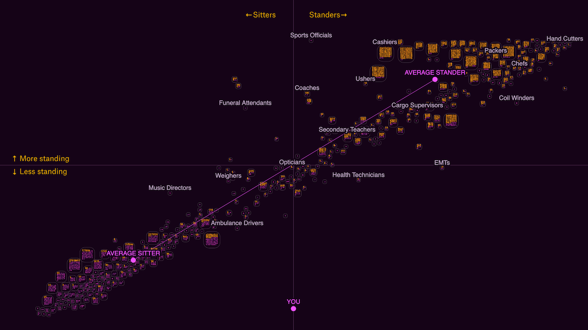
The Pudding published a story by Alvin Chang that delves into the divide between occupations where workers primarily stand and those where they sit. Using data from the Occupational Requirements Survey, the story centers around an interactive scatter plot. Each square represents a specific occupation, with each person icon within symbolizing about 50,000 Americans in that role. Occupations are arranged horizontally, with “sitter” jobs on the left and “stander” jobs on the right. As you move through the visual narrative, the vertical axis shifts to highlight different job attributes, such as income, education levels, ability to choose between sitting and standing, opportunities to pause work, physical demands, and demographic factors like race and citizenship status.
At the end, all these elements come together in a comprehensive interactive visualization, allowing you to explore the full dataset. You can search for specific jobs, select variables to focus on, and engage with the chart by zooming, dragging, and hovering.
Explore the story by Alvin Chang on The Pudding.
Dark Fleet Tankers Near Malaysia
A network of covert tankers is transporting many millions of barrels of sanctioned oil along key maritime routes. East of the Malaysian peninsula lies the largest hub for these operations, where ship-to-ship transfers reportedly enable Iranian oil to reach China.
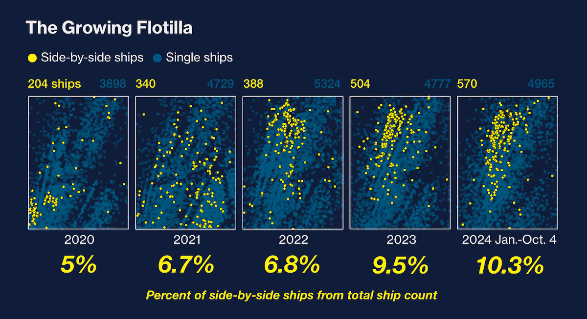
Bloomberg analyzed nearly five years of satellite imagery of this region, uncovering the rapid growth of a shadowy oil trade that has thrived under tighter U.S. sanctions on Iran. The investigation features side-by-side dot maps illustrating yearly activity in the area from 2020 to 2024, revealing a dramatic surge in ship-to-ship transfers, which have doubled in frequency over the past few years. Another map (a route map) traces the approximate paths of the Titan and Win Win ships before their encounter near Malaysia witnessed by Bloomberg reporters, showcasing an example of such covert operations.
See the article on Bloomberg — by Serene Cheong, Clara Ferreira Marques, Weilun Soon, Krishna Karra, and Yasufumi Saito.
Tracing Microplastics
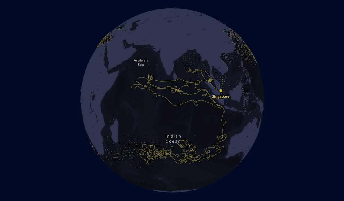
An estimated 170 trillion microplastic particles now float in our oceans, posing grave threats to marine life and ecosystems. These tiny pollutants infiltrate our food and water, turning ocean pollution into a global crisis.
The Straits Times explores the Indian Ocean Garbage Patch — the third largest after those in the Pacific and South Pacific — through an engaging scrollytelling experience. The piece illustrates how textile microfibers from washing machines enter the environment and uses a globe visualization to trace the decades-long journey of a single fiber released near Singapore. It also maps the locations of other major plastic concentration hotspots and examines the consequences of the issue.
Discover the story on The Straits Times — by Laura Aragó, Claire Xu, and Roman Sverdan.
Wrapping Up
We hope you found these examples of real-world data visualizations both insightful and inspiring. From exploring regional pie preferences to a deep dive into the divide between standing and sitting jobs, and from uncovering hidden maritime activities to highlighting environmental challenges, these charts and maps demonstrate the power of data to illuminate the obscure and tell compelling stories.
Stay tuned for more fascinating examples in the next edition of Data Visualization Weekly. If you have any suggestions or came across a data viz you’d like us to feature, feel free to share it with us.
- Categories: Data Visualization Weekly
- No Comments »