 In 2024, data visualization remained a vital tool for exploring complex topics and presenting insights in engaging ways. From global conflicts and environmental challenges to cultural phenomena and historical trends, charts and maps provided valuable perspectives and captivated audiences.
This special edition of DataViz Weekly highlights the best data visualizations of 2024. Featuring projects selected by FlowingData, The Pudding, and the Global Investigative Journalism Network (GIJN), as well as year-in-review collections from leading media sources, it offers a curated look at some of the most compelling visual storytelling created during the year. All aboard!
Best Data Visualization Projects of 2024 — FlowingData

Nathan Yau, the statistician and data visualization expert behind FlowingData, shares his favorite projects of 2024, showcasing engaging designs and perspectives, and worthy of being called the year’s best.
- This is Not My Name by Complexity Science Hub — A research project exploring the convergence of Chinese names, enhanced with audio pronunciations.
- Your Name In Landsat by NASA Landsat Science — An interactive tool that personalizes satellite imagery by allowing users to see their names represented.
- Climate—Conflict—Vulnerability Index by the German Federal Foreign Office, UniBw München, PIK, and Truth & Beauty — An interactive map presenting a dataset to understand changing global risks.
- When A.I.’s Output Is a Threat to A.I. Itself by The Upshot — A visualization demonstrating the convergence in AI outputs.
- I Shrink 10x Every 21s Until I’m an Atom — The Micro Universe by Epic Spaceman — A visual journey scaling down by tenfold every 21 seconds, illustrating relative sizes from macroscopic to atomic levels.
- Full Of Themselves by Dominikus Baur and Alice Thudt — An exploration of self-referential movie quotes, beginning with a reference to “Back to the Future.”
- The Mullet Is Alive and Well in AFL by ABC News — An analysis of the prevalence of mullet hairstyles in the Australian Football League.
- A Torrent of Trash by Reuters — An illustrative piece depicting the overwhelming flow of garbage, highlighting waste management challenges.
- The United States of Abortion Mazes by The Pudding — An interactive experience where users navigate mazes representing each state’s abortion laws.
- How Uber and Lyft Used a Loophole to Deny NYC Drivers Millions in Pay by Bloomberg — A data-driven investigation revealing patterns in driver compensation.
- Parallel Lives by Jan Willem Tulp — A visualization presenting the ages of notable historical figures, offering perspective on their achievements relative to their time periods.
For a comprehensive exploration of these best projects and to understand why they stood out in 2024, visit the full FlowingData article.
Best Visual and Data-Driven Stories of 2024 — The Pudding

Renowned for its innovative visual essays, The Pudding annually awards the Pudding Cup to exceptional data-driven storytelling projects. Here are the 2024 winners:
- Here’s to the Next 100 Sudokus by Vivek Rao — An introspective analysis of the author’s journey with Sudoku puzzles, offering insights into personal growth and problem-solving approaches.
- Votes in a Name by Aman Bhargava and Reechik Banerjee — An exploration of name similarity and its impact on voting in Indian elections, balancing detailed analysis with accessibility for those unfamiliar with Indian politics.
- Battle of the Chocolate Bars by Surbhi Bhatia — A comparative study of European and American chocolate standards, highlighting differences through annotated ingredient lists and chocolate-themed visuals.
Honorable mentions include:
- The Most Iconic Duo in Brooklyn Nine-Nine by Soumya Karwa — An analysis of character pairings in the TV show “Brooklyn Nine-Nine,” identifying the most iconic duos.
- The Sign of the City by Hongqian Li — A visual exploration of urban signage and its cultural significance within city landscapes.
- Detroit Neighborhoods Mapping Tool — An interactive tool designed to map and explore the diverse neighborhoods of Detroit.
- Artificial Worldviews by Kim Albrecht — A project examining the perspectives and biases inherent in artificial intelligence systems.
- Counting Peak Blossom by Hannah Recht — A data-driven visualization tracking the peak bloom periods of cherry blossoms over time.
- New Blood Joins this Earth by Caroline Dinh — An exploration of birth rates and demographic changes across different regions.
- The Wealth Disparity Gap by Jason Zhang — A visualization highlighting the growing wealth disparity and its societal implications.
For a deeper dive into these standout projects and to explore past winners, visit The Pudding Cup Winners page.
Top Data Journalism Projects of 2024 – GIJN
In 2024, data journalism offered compelling insights into global events through visual storytelling. Global Investigative Journalism Network (GIJN) highlighted standout projects in its Data Journalism Top 10 columns, covering elections, conflicts, climate change, and more.
Elections
United States
- How Counties Are Shifting in the 2024 Presidential Election by The Washington Post — An interactive dashboard revealing county-level voting patterns in the 2024 US presidential election.
Germany
- This Is How the AfD Brought Hatred into Parliaments by Tagesspiegel — An analysis of 340,000 paragraphs of speeches by the far-right AfD party.
War and Conflict
Middle East
- “We’ve Become Addicted to Explosions” The IDF Unit Responsible for Demolishing Homes Across Gaza by Bellingcat and Scripps News — A satellite imagery-based investigation tracking destruction in Gaza, focusing on military operations and civilian damage.
- Israel Has Bombed Much of Gaza to Tubble. What Would It Take to Rebuild? by The Washington Post — A visual explainer detailing the potential phases and challenges of Gaza’s reconstruction process
- Domino Effect by Axios — An analysis of the broader impact of the conflict across the Middle East.
Russia and Ukraine
- The Price of Territories by Texty — A detailed timeline correlating military advances, casualties, and territorial shifts in the conflict.
- How Ukrainians Are Fighting Against Russia with Cheap Drones by Der Spiegel — An investigation into the increasing use of improvised drones as weapons in Ukraine.
Sudan
- Fierce Fighting Has Gripped Sudan. Hospitals Are in the Line of Fire by The Financial Times — A visual analysis of the devastation of Sudan’s healthcare infrastructure during the ongoing civil war.
Climate Change
Wildfires
- Climate Change Is So Bad, Even the Arctic Is On Fire by Bloomberg — An interactive report on the prevalence and impact of wildfires in the Arctic, the Brazilian Pantanal, and Indonesia’s peatlands.
Rising Water Temperatures
- Danube Warming Up by Atlo — A visual story showing five decades of warming along the Danube River and its ecological consequences
Olympic Coverage
Paris Olympics
- Games of Two Eras by The South China Morning Post — A visual exploration of changes in the Olympics over the past century.
Paris Paralympics
- Paralympic Games 2024: Discrimination Linked to Disability, in Figures and Graphs by Le Monde — A comparison of accessibility in Paris, Tokyo, and London, highlighting challenges in Paris’s transport infrastructure.
Other Topics
- Elon Musk’s Hard Turn to Politics, in 300,000 of His Own Words by The Wall Street Journal — A comprehensive analysis of Elon Musk’s tweets.
- The Fentanyl Funnel by Reuters — An illustrated explainer showing how fentanyl ingredients from China are smuggled into Mexico via the United States.
- Tokyo Runway Collision by Nikkei — A reconstruction of the January 2 collision at Haneda Airport using flight data and 3D modeling.
- How Data Brokers Sell Our Location Data and Jeopardize National Security by Netzpolitik.org and Bayerischer Rundfunk (BR) — A report exposing the privacy and security risks tied to location data sold by data brokers.
- China’s Great Wall of Villages by The New York Times — An interactive feature mapping villages built by China along disputed borders.
- Buenos Aires Crime Map by La Nación — A visualization of geolocated crime data in Buenos Aires, offering insights into urban safety.
Bonus
- Is the Love Song Dying? by The Pudding — An analysis of 5,100 Billboard Top 10 hits, demonstrating the evolution of love songs over decades.
Discover more about these top projects in GIJN’s full article.
2024 Year in Data Visualizations

These year-in-review features highlight some more of the best data visualizations of 2024, showcasing the year’s pivotal stories through charts, graphics, and compelling visual narratives produced by the respective creators:
- 26 Charts That Helped Explain 2024 in Politics by FiveThirtyEight / ABC News — A curated collection of visualizations illustrating the most significant trends and events in politics throughout the year.
- Axios Visuals 2024 in Review by Axios — A showcase of Axios’s most engaging and impactful visuals of the year.
- 2024: The Year in Graphics by Bloomberg — A selection of visualizations capturing 2024’s economic and financial highlights.
- A Year of Our Visual Journalism by The Economist — The Economist’s most notable data stories from 2024, combining clarity with analytical depth.
- The Charts that Help Make Sense of 2024 by Harvard Business Review — A roundup of impactful charts, shedding light on 2024’s key economic and societal shifts.
- 2024: The Year in Graphics by Marco Hernández — A personal look at the year’s most compelling visual stories by the independent infographic creator.
- Charts of the Year: 2024’s Most Popular Visualizations by Macrobond — A compilation of Macrobond’s best-performing charts of 2024.
- 2024: The Eear in Charts by McKinsey & Company — McKinsey’s most influential charts summarizing the year’s business and economic trends.
- Looking Back at the First Year of Maps.com by maps.com — Highlights of the most popular maps produced by Maps.com in 2024.
- The Year 2024 in Nexo Charts by Nexo Jornal — A Brazilian perspective on the year’s key stories, presented through Nexo’s signature style of concise and elegant visualizations.
- These 10 Charts Will Help You Understand 2024 by The New York Times Opinion Section — Ten carefully selected charts offering insight into the most defining data stories of the year.
- 2024: The Year in Visual Stories and Graphics by The New York Times — A visual retrospective of the year’s major events, told through compelling graphics and interactive pieces.
- Sportico’s Charts of the Year: Best Data Visualization of 2024 by Sportico — A collection of the best sports-related data visualizations of 2024.
- 2024 in Visual Stories and Digital Graphics by The Straits Times — A collection of digital graphics covering key topics from Asia and beyond.
- Here Are the Biggest Stories from Our Data Visuals Team in 2024 by The Texas Tribune — A roundup of the Texas Tribune’s top data visuals, focusing on regional and state-level issues.
- 2024 in Visual Storytelling by The Washington Post — Highlights of the newspaper’s most impactful visual journalism, from data graphics to immersive storytelling.
- 2024 — The Year in Graphics by The Wall Street Journal — A comprehensive wrap-up of the year’s best visual storytelling by the WSJ graphics team.
Best AnyChart Visualizations in 2024
We could not resist joining this festive celebration of the best data visualizations of 2024 with our own works! 🙂 Here are two of our favorites, highlighting some of the advancements we at AnyChart introduced to our solutions for charting and visual analytics over the past year.
Best New JavaScript Chart in 2024
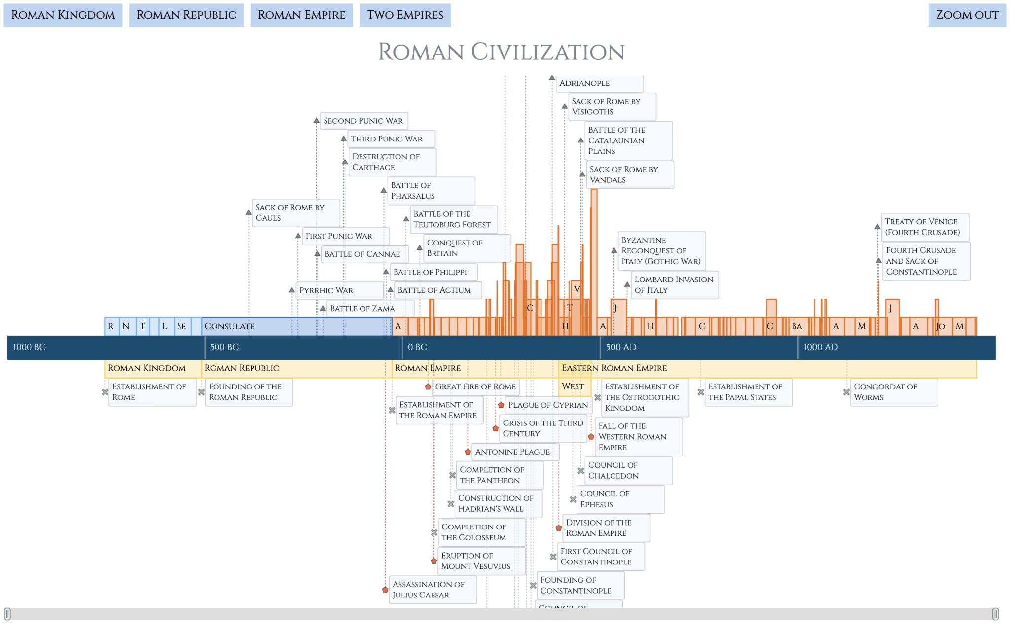
- Roman History Timeline — An interactive timeline chart bringing the history of ancient Rome to life, offering a compelling way to explore key events and periods. It is available with full code and is accompanied by a detailed tutorial that provides comprehensive, step-by-step guidance through the creation process.
(Powered by AnyChart JS Charts 8.13.0.)
Best New Qlik Visual in 2024
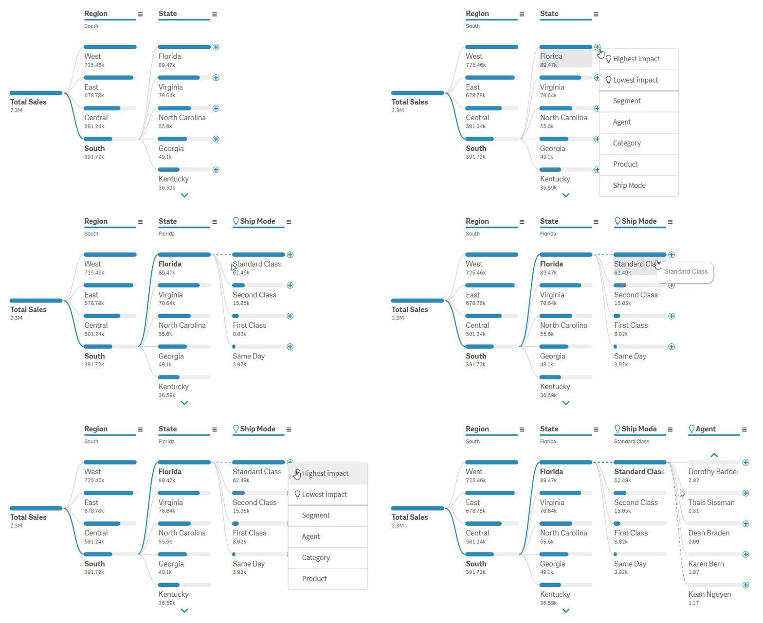
- Decomposition Tree with AI Splits — A cutting-edge visualization option for Qlik Sense, redefining root cause analysis with its unique approach to uncovering dimensional relationships. Now featuring AI Splits, it enables users to uncover key impact factors instantly.
(Powered by our Decomposition Tree Extension for Qlik Sense.)
Wrap-Up
2024 brought us a wealth of compelling charts, maps, and storytelling, and we are thrilled to have showcased the best data visualizations for you here. As you explore these works, we hope they spark ideas and inspire your own projects. Stay tuned to Data Visualization Weekly for the latest in visual data graphics as we continue to highlight the best in data viz throughout 2025.
Have a fantastic year ahead! 🙌
- Categories: Data Visualization Weekly
- No Comments »
