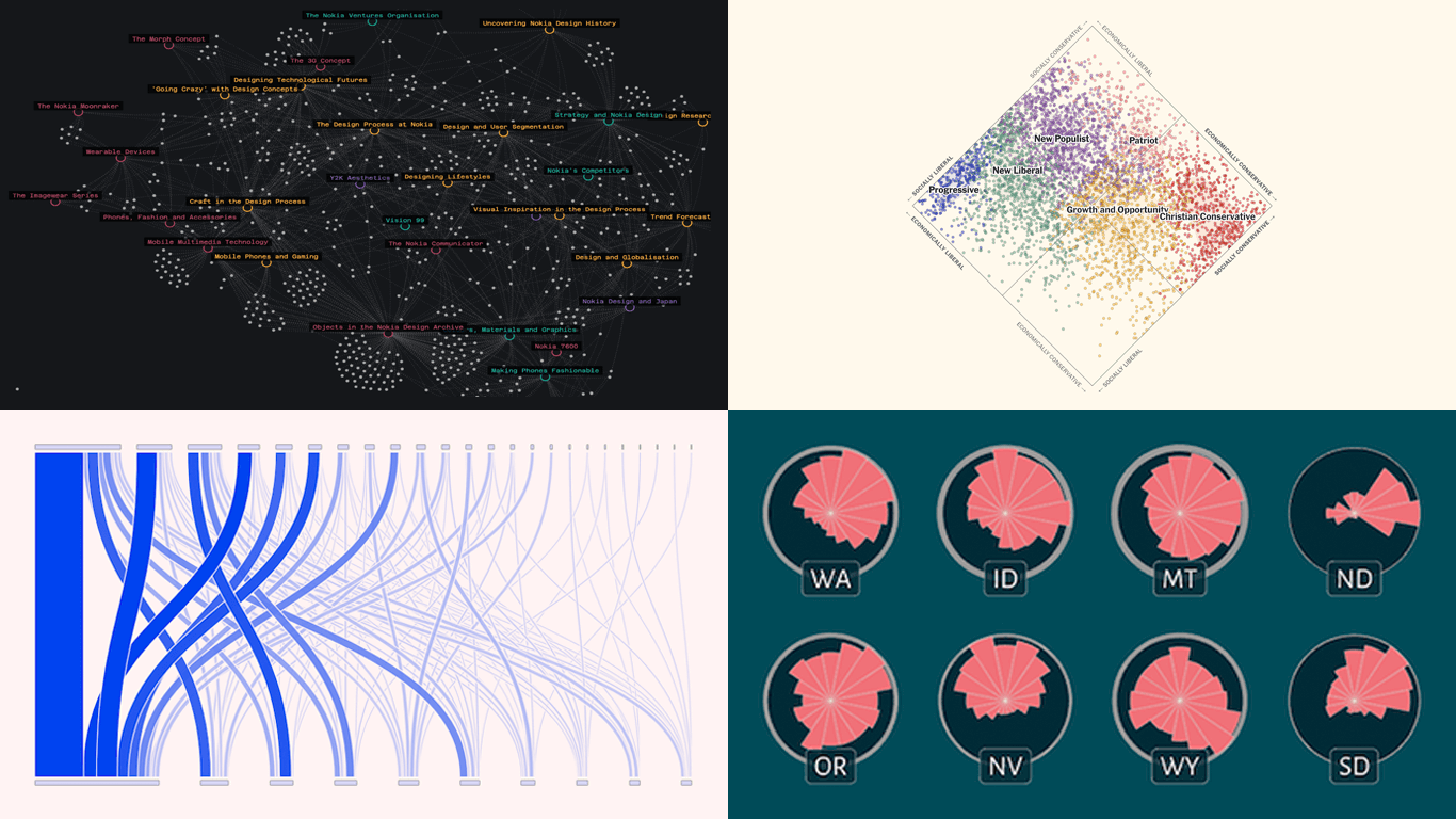
 Welcome to the first regular edition of DataViz Weekly in 2025! Last Friday, we wrapped up the year with a special Best Data Visualizations of 2024 post. Now we’re back to our usual format, highlighting some of the most compelling new visuals that caught our attention recently. Here are the first featured projects of the year — dive in and get inspired:
- Nokia Design Archive — Aalto University
- AI research collaborations — Rest of World
- Orientation of ski slopes — OpenSkiStats
- Policy preferences in a hypothetical U.S. multiparty system — NYT Opinion
Data Visualization Weekly: January 17, 2025 — January 24, 2025
Nokia Design Archive
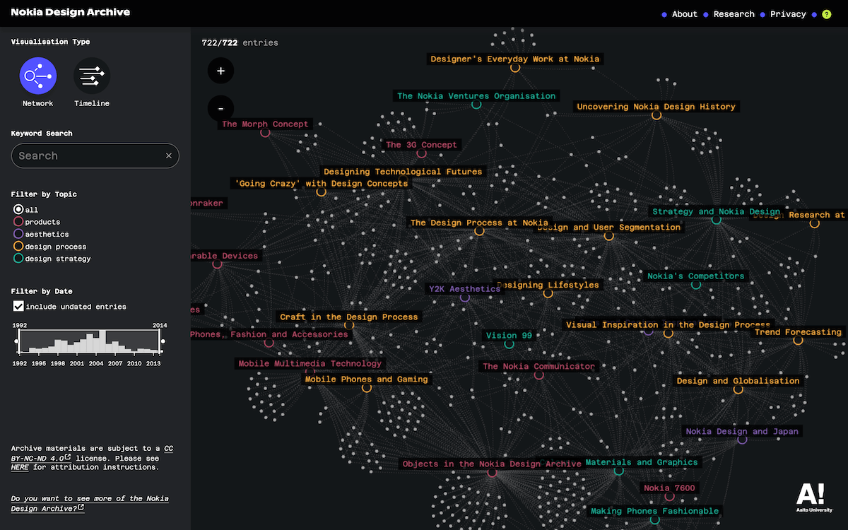
Mobile phones transformed global communication in the 1990s and early 2000s, with Nokia leading the charge. But what shaped the design of these iconic devices?
The Nokia Design Archive, launched by Aalto University in Finland under the guidance of Anna Valtonen, provides a fascinating look at over 20 years of Nokia’s design history. Interactive visualizations allow you to explore thematic collections, designer contributions, and behind-the-scenes materials, including sketches, photos, and interviews. A network chart organizes entries by thematic relationships, while a timeline chart represents information on 300+ designers chronologically.
Learn more about the Nokia Design Archive and discover it at nokiadesignarchive.aalto.fi.
AI Research Collaborations
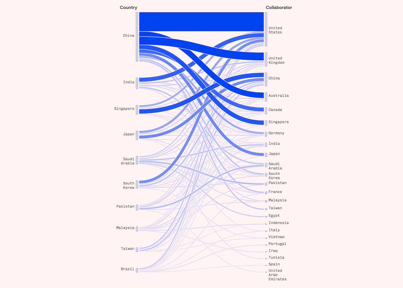
Artificial intelligence research is becoming increasingly global, with non-Western countries playing a growing role in transnational collaborations. Despite geopolitical tensions, China-U.S. partnerships are at the forefront.
Rest of World analyzed a decade of AI research collaboration using data from Georgetown University’s Emerging Technology Observatory. A parallel sets chart showcases the top 10 non-Western countries producing collaborative AI research papers (2014-2024) and their most frequent international partners. A line chart further explores the temporal trends in these partnerships over time.
Check out the piece on Rest of World, by Khadijah Alam.
Orientation of Ski Slopes
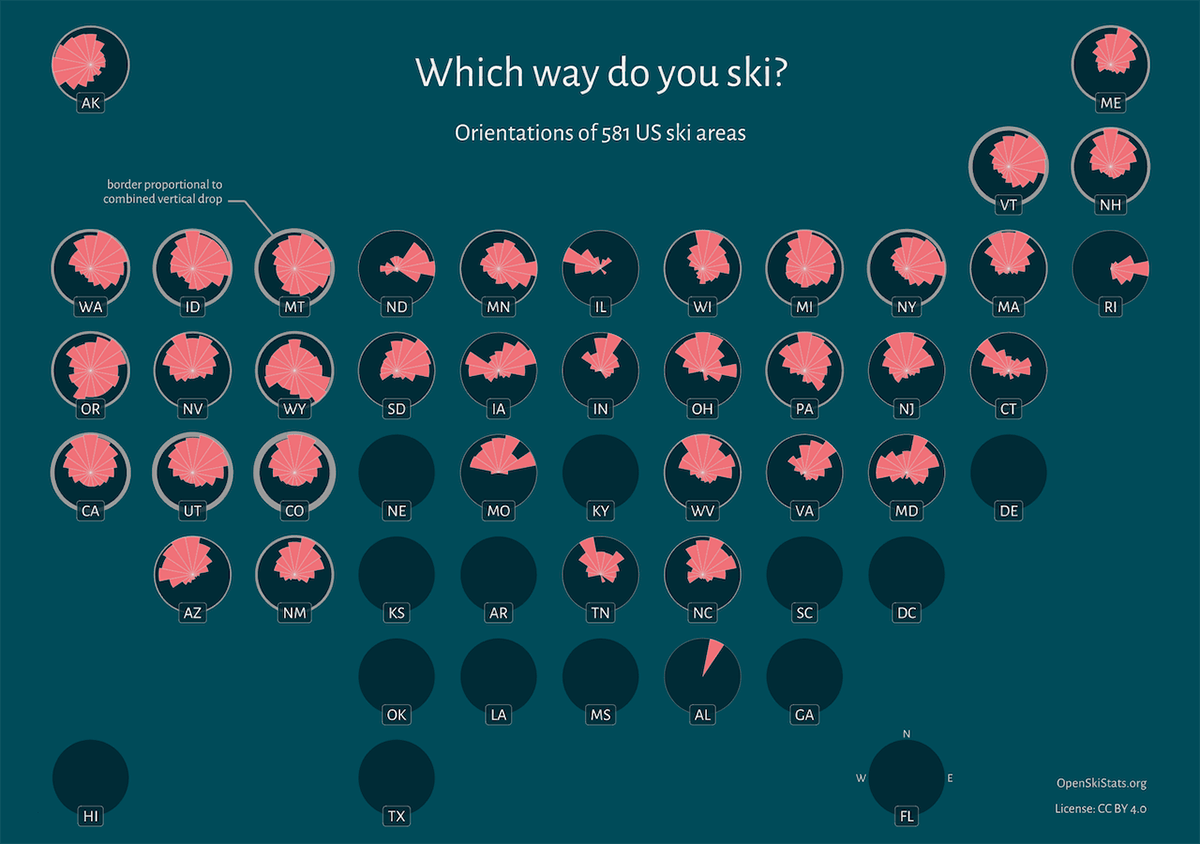
Ski slopes worldwide tend to face the nearest pole — northward in the Northern Hemisphere and southward in the Southern Hemisphere, with an additional moderate eastward preference in both. This can be explained by minimizing sun exposure to optimize snow retention.
This insight comes from a visual story recently published by OpenSkiStats, a side project by Daniel Himmelstein and his family. Using ski trail data from OpenSkiMap/OpenStreetMap, they created “ski roses,” circular charts that visualize the directional tendencies of ski trails in resorts across the United States and globally. Beyond trail orientation, the project provides data on metrics like total vertical drop, lift counts, and peak elevation for ski areas worldwide.
Explore OpenSkiStats and the story at openskistats.org.
Policy Preferences in Hypothetical U.S. Multiparty System
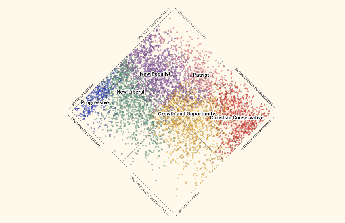
The two-party system in the United States often forces voters into binary choices. Could proportional representation with multiple parties better reflect voter preferences?
The New York Times Opinion helps imagine this scenario, visualizing how six hypothetical parties could align with voters’ values. A scatter plot takes center stage, plotting 5,000 surveyed individuals’ economic and social policy opinions. It shows how voters align under both the two-party system and a proposed multiparty framework. Through scrollytelling, the piece also imagines how such a system could function across U.S. states.
See the full piece on NYT Opinion, by Jesse Wegman and Lee Drutman with graphics by Aileen Clarke.
Wrapping Up
From exploring historical archives to visualizing ski slopes, AI collaborations, and hypothetical political systems, these projects showcase the power of data visualization to inform and inspire. Whether you’re working on your own visualizations or simply enjoy great data graphics, stay tuned for more in future editions of Data Visualization Weekly!
- Categories: Data Visualization Weekly
- No Comments »