New Selection of Significant Data Visualization Examples — DataViz Weekly
February 28th, 2025 by AnyChart Team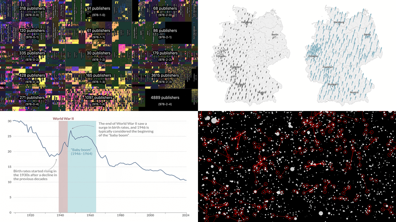 Our JavaScript charting library, Qlik Sense extensions, and other products give you the flexibility to visualize data how, where, and when you need. But making a chart or map truly effective — whether for exploration or explanation — is an art of its own. That is why we run DataViz Weekly: to share a selection of significant examples we have recently encountered, showcasing how others tackle visualization challenges across different contexts and datasets.
Here are some new examples — take a closer look and see what insights they might inspire:
- All books in the ISBN space — phyresky
- Germany’s 2025 federal election — The New York Times (and more)
- Baby boom in 7 charts — Our World in Data
- School shootings in America — Mohamad Waked
- Categories: Data Visualization Weekly
- No Comments »
Heading to Qlik Connect 2025 — Join Us There!
February 25th, 2025 by AnyChart Team We are going to Qlik Connect 2025! 🚀
Not packing just yet — May is still a bit away. But we are getting ready and looking forward to meeting the amazing Qlik community in Orlando, with lots of great presentations and conversations ahead.
We will be there with our Qlik Sense extensions, bringing something special to push the boundaries of visual analytics in Qlik even further. Make sure to stop by if you are around — we would love to connect!
And while we are counting down the days, feel free to check out how great it was last year — take a moment to revisit our Qlik Connect 2024 recap.
See you in Orlando! 📍
- Categories: Big Data, Business Intelligence, Dashboards, News, Qlik
- No Comments »
Recent Data Graphics in Focus — DataViz Weekly
February 21st, 2025 by AnyChart Team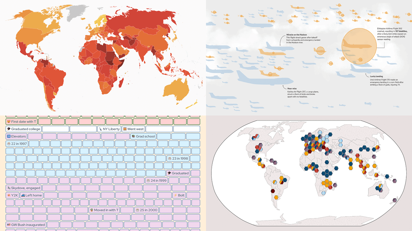 Data holds valuable insights, and well-crafted visualizations help bring them to light. DataViz Weekly is all about demonstrating how that happens in practice, curating compelling recent data graphics from around the web. Check out what we have for you today:
- Corruption perceptions worldwide — Transparency International
- Bird strikes and aviation safety — Reuters
- Crops and extreme weather — Carbon Brief
- Life in weeks — Gina Trapani
- Categories: Data Visualization Weekly
- No Comments »
Data Visualization in Action: Fresh Examples — DataViz Weekly
February 14th, 2025 by AnyChart Team We’re back with DataViz Weekly, where we showcase some of the best new data visualization examples — from individual charts and maps to full-scale visual stories and projects. Take a look at our latest picks:
- Swiss research funding — Colas Droin
- Education and voting patterns in U.S. presidential elections — Jon Boeckenstedt
- City walkability and improvement potential — The Economist & Matteo Bruno et al.
- Self-censorship in Super Bowl halftime shows — Artur Galocha for The Washington Post
- Categories: Data Visualization Weekly
- No Comments »
Quadrant Chart with Custom Image Markers — JS Chart Tips
February 11th, 2025 by AnyChart Team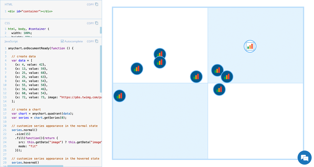 Displaying unique images as markers can add a distinctive touch to your charts, making data visualization more engaging and informative. In this edition of JS Chart Tips, we will guide you through the process of using custom image markers for each data point in a quadrant chart with our JavaScript charting library.
- Categories: AnyChart Charting Component, HTML5, JavaScript, JS Chart Tips, Tips and Tricks
- No Comments »
Noteworthy New Visualizations to Explore — DataViz Weekly
February 7th, 2025 by AnyChart Team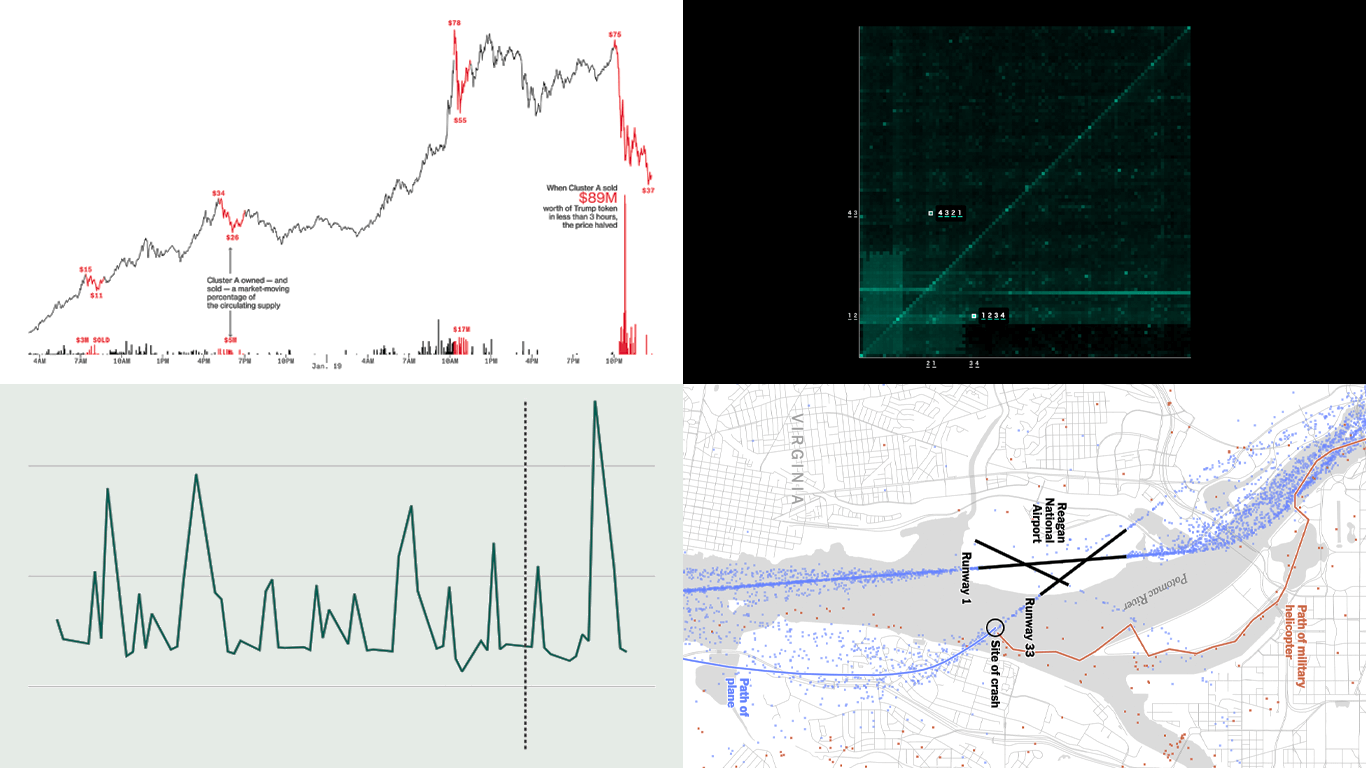 Continuing our regular DataViz Weekly, we’re glad to share the most interesting of all the new data visualizations we’ve recently come across, well worth a look. Here’s what we have lined up this time:
- PIN code popularity — ABC News
- Complexity of D.C. airspace amid the Potomac River midair collision — The New York Times
- Trading patterns in the Trump memecoin — Bloomberg Crypto
- U.S. federal expenditures in real time — The Hamilton Project
- Categories: Data Visualization Weekly
- No Comments »
20+ Years of Advancing Data Visualization: Interview with Our CEO
February 5th, 2025 by AnyChart Team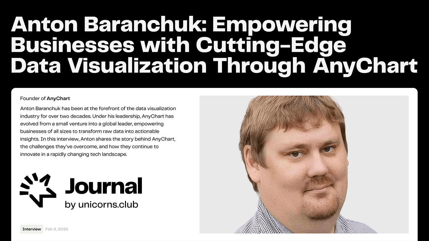 Unicorns Journal just published an interview with our CEO and co-founder, Anton Baranchuk, where he reflects on AnyChart’s journey from a small startup to a global leader in data visualization, trusted by enterprises worldwide.
Anton talks about how we got started, the transition from Flash to JavaScript charting, our work with Qlik, and the vision and values that continue to drive us forward.
- Categories: AnyChart Charting Component, AnyGantt, AnyMap, AnyStock, Big Data, Blogroll, Books, Business Intelligence, Dashboards, Financial Charts, Flash Platform, Gantt Chart, GraphicsJS, HTML5, JavaScript, News, Oracle Apex, Qlik, Stock Charts, Success Stories
- No Comments »