 Continuing our regular DataViz Weekly, we’re glad to share the most interesting of all the new data visualizations we’ve recently come across, well worth a look. Here’s what we have lined up this time:
- PIN code popularity — ABC News
- Complexity of D.C. airspace amid the Potomac River midair collision — The New York Times
- Trading patterns in the Trump memecoin — Bloomberg Crypto
- U.S. federal expenditures in real time — The Hamilton Project
Data Visualization Weekly: January 31, 2025 — February 7, 2025
PIN Code Popularity

Four-digit PINs serve as a critical layer of security for unlocking phones, accessing bank accounts, and verifying digital identity. Yet, many people unknowingly choose highly predictable codes, making them easier to guess. An analysis of millions of PINs exposed in data breaches reveals just how common — and vulnerable — certain combinations are.
ABC News visualizes this through a heatmap chart that highlights the popularity of different PINs based on real-world breach data from Have I Been Pwned. As you scroll through the piece, key insights emerge dynamically on the heatmap, revealing clusters of frequently chosen PINs, patterns like sequential numbers and birth years, and the risks associated with these choices.
Check out the visual story on ABC News, by Julian Fell and Teresa Tan.
Complexity of D.C. Airspace Amid Potomac River Midair Collision
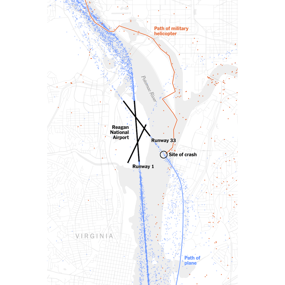
The airspace around Ronald Reagan Washington National Airport is highly complex, with civilian and military aircraft operating in close proximity. A recent midair collision near the airport has drawn renewed attention to the challenges of navigating and managing flight paths in this dense and busy region.
The New York Times depicts these challenges through a series of annotated maps using data from the Federal Aviation Administration, Flightradar24, and ADS-B Exchange. The project illustrates designated helicopter routes along the Potomac River, standard approach paths for planes landing on intersecting runways, and the positions of aircraft in the days leading up to the collision, providing an understanding of how air traffic moves through this shared space in relation to the recent accident.
See the article on The New York Times, by Elena Shao, Leanne Abraham, Eli Murray, and Lazaro Gamio.
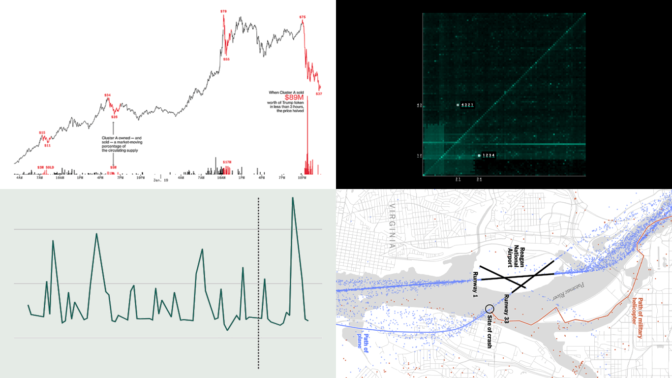
Trading Patterns in Trump Memecoin
The launch of Donald Trump’s memecoin generated intense speculation, with early buyers making enormous profits while most latecomers faced uncertain outcomes. A detailed analysis of blockchain transactions sheds light on how trading unfolded in the first hours and days.
Bloomberg represents these dynamics through a series of charts based on data from Helius and Chaos Labs, illustrating the role of “whale” traders in dominating early transactions. The charts highlight how a small number of wallets accumulated and sold vast amounts of Trump tokens, their impact on price movements, and the distribution of profits and losses among different types of investors.
Take a look at the piece on Bloomberg Crypto, by Leonardo Nicoletti and Muyao Shen.
U.S. Federal Expenditures in Real Time
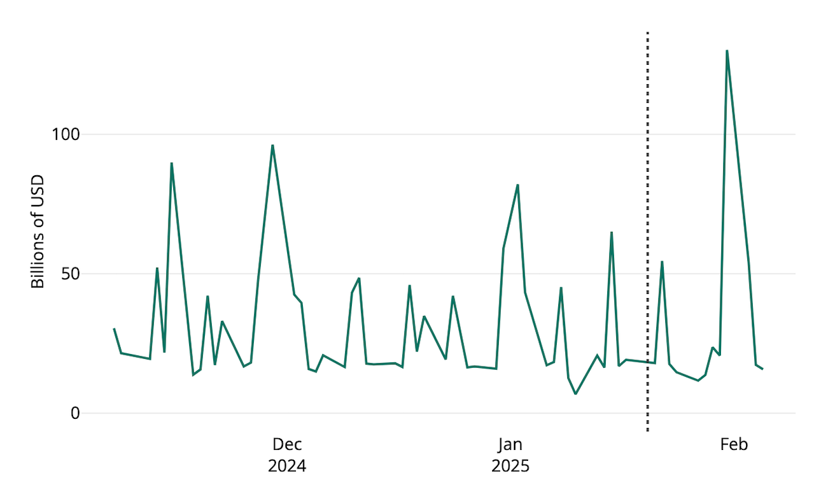
A recent spending freeze ordered by the Trump administration, along with subsequent legal and policy developments, has brought renewed attention to federal expenditures. As a result, many are now closely watching how government funds are being distributed.
The Hamilton Project provides a real-time tracker that monitors federal spending using data from the U.S. Department of the Treasury. This interactive tool features a line chart that updates daily, displaying actual outlays to major programs, departments, states, Congress, and the Judiciary. The view can be adjusted by selecting a time range, spending categories, and outlay frequency. All data is available for download and further analysis.
Explore the tracker on The Hamilton Project‘s website.
Wrapping Up
These noteworthy projects once again highlight how charts and maps help make complex data insightful.
Stay tuned for more great data visualizations and inspiration in Data Visualization Weekly!
- Categories: Data Visualization Weekly
- No Comments »