 Data holds valuable insights, and well-crafted visualizations help bring them to light. DataViz Weekly is all about demonstrating how that happens in practice, curating compelling recent data graphics from around the web. Check out what we have for you today:
- Corruption perceptions worldwide — Transparency International
- Bird strikes and aviation safety — Reuters
- Crops and extreme weather — Carbon Brief
- Life in weeks — Gina Trapani
Data Visualization Week: February 14, 2025 — February 21, 2025
Corruption Perceptions Worldwide
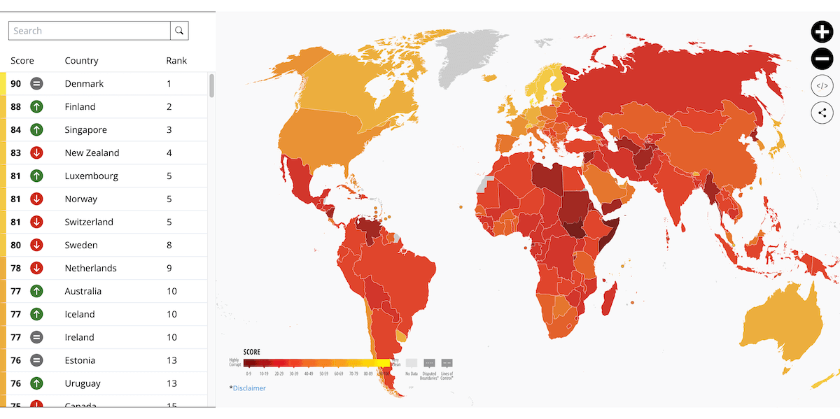
Corruption remains a global challenge, affecting governance, economies, and public trust. Transparency International annually assesses perceptions of public sector corruption worldwide, providing a comparative view across countries and over time.
The 2024 Corruption Perceptions Index is now released, traditionally featuring an interactive choropleth map that ranks countries by their corruption scores. Hovering over a country reveals a tooltip displaying its score, rank, and change from 2023, along with a linear gauge using a color gradient to visually contextualize the score and mark the global average.
Explore the 2024 CPI on Transparency International’s website.
Bird Strikes and Aviation Safety
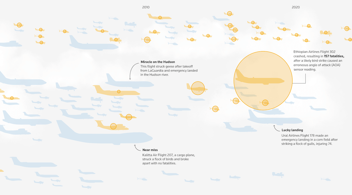
Bird strikes — collisions between birds and aircraft — pose an ongoing challenge for aviation safety, with thousands of incidents reported globally each year. Most cause no damage, but severe cases, though rare, can have serious consequences.
Reuters presents an interactive visual report on bird strikes, drawing on data from aviation risk consultancy Avisure, the International Civil Aviation Organization (ICAO), and other sources. In a scrollytelling format, it examines global bird strike statistics and highlights key incidents. The report also takes a closer look at Muan International Airport, where a Jeju Air flight crashed in December 2024, and bird remains were found in both engines. Additional visualizations explore the bird species most commonly involved in such incidents, along with some of the more unusual cases — including collisions with turtles and even a giraffe.
See the story on Reuters — by Vijdan Mohammad Kawoosa, Sudev Kiyada, Mayank Munjal, Adolfo Arranz, and Jackie Gu.
Crops and Extreme Weather
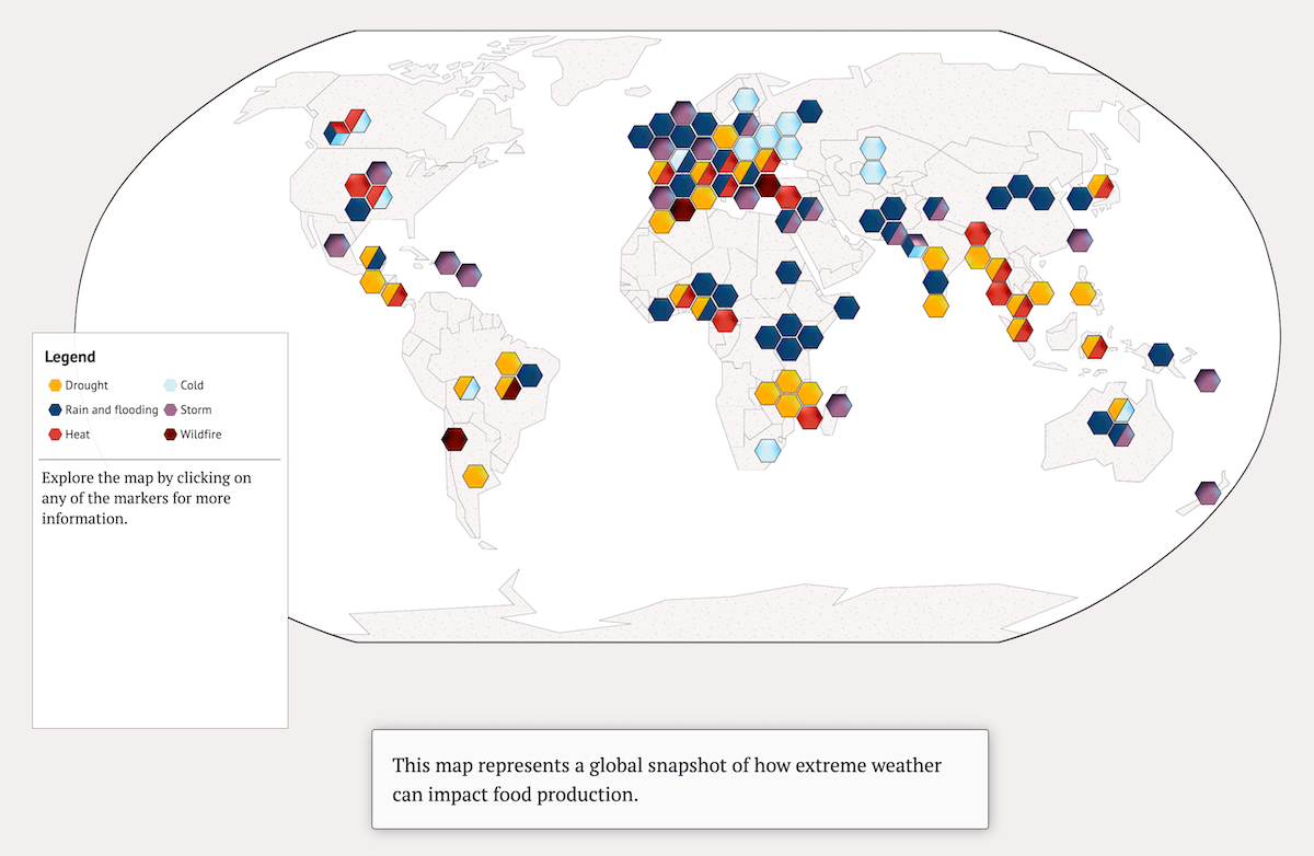
Extreme weather events are increasingly disrupting global food production, affecting yields and food security. Rising temperatures, droughts, heavy rainfall, and other climate-driven impacts pose significant challenges to agriculture worldwide.
Carbon Brief analyzes 100 instances of crop losses caused by extreme weather in 2023–2024, based on global media reports. It begins with a map offering a geographic overview, categorizing cases by type of weather event with hexagon-shaped markers — some multi-colored to indicate multiple contributing factors. The report then expands on the data with a chart summarizing the most commonly reported extreme weather events that led to crop destruction, followed by additional visuals detailing affected crops and crop types.
Check out the analysis on Carbon Brief’s website — by Orla Dwyer and Tom Prater.
Life Week by Week
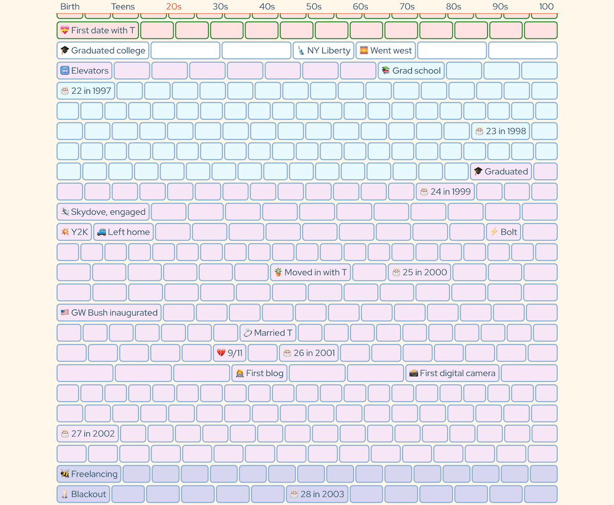
Lifetime is often considered in years, but breaking it down into weeks provides a different perspective. This approach can nicely highlight how personal milestones align with a broader timeline.
Gina Trapani visualized her own life as a series of weekly segments. Each small box represents a week, with border colors indicating location and fill colors showing her main activity at the time. Key moments are annotated with text, while hovering over or tapping on any box reveals the details about that particular week.
Take a look at My Life in Weeks on Gina Trapani’s website.
Wrapping Up
That wraps up this edition of Data Visualization Weekly! We hope you enjoyed these striking data graphics. Stay tuned for more insightful data viz next time!
- Categories: Data Visualization Weekly
- No Comments »