 Data has its own language, but humans? We’re wired for visuals. Charts and maps serve as translators, turning raw numbers into something we can instantly grasp. Welcome to DataViz Weekly, where we bring forward compelling visual graphics that bring data to life! Here are the latest we’re glad to feature:
- Looking back at the COVID-19 pandemic — Scientific American
- COVID’s impact in 30 charts — The Upshot
- Prisoner release risk assessment in Spain — Civio
- Settlement sizes in the Donbas region — NZZ
Data Visualization Weekly: March 7, 2025 — March 14, 2025
Looking Back at COVID-19 Pandemic
This week marked exactly five years since the World Health Organization (WHO) officially declared COVID-19 a global pandemic. While it may feel distant to some, its toll remains clear for those who experienced loss or worked on the front line. Plus, it still claims more lives than influenza.
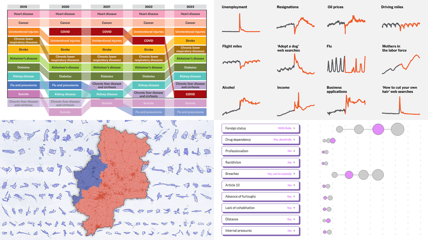
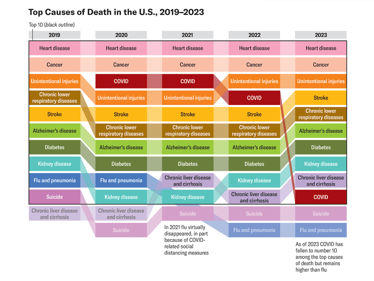
Scientific American gathered insights from public health experts discussing key lessons from how the United States handled the COVID crisis. The piece is supported by several informative visualizations, highlighting the broader context and human impact. Annotated area charts with text and line markers illustrate trends in hospitalizations and deaths — the two metrics closely tracked during the pandemic. Additionally, a bump chart ranks COVID-19 among America’s leading causes of death, clearly showing how its position changed over time.
Check out the article by Tanya Lewis on Scientific American with graphics by Amanda Montañez.
COVID’s Impact in 30 Charts
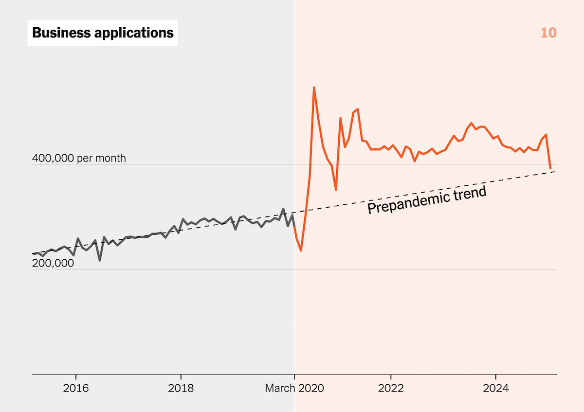
Years from now, the effects of COVID-19 will still be evident in historical data—sharp spikes, sudden dips, and lasting shifts across various aspects of life. Want to see how these patterns stand out today?
The New York Times’s The Upshot presents thirty charts that illustrate the pandemic’s imprint, showing how key metrics changed before and after COVID-19 emerged. The collection covers a wide range of areas, from economic indicators like employment rates to personal aspects such as family life and work patterns, making the pandemic’s influence visible in many measurable dimensions. Most charts are line graphs, with some column charts complementing the analysis. Each visualization distinctly marks the onset of the pandemic, shading data before its arrival in gray and highlighting trends afterward for contrast.
See the piece on The Upshot, by Aatish Bhatia and Irineo Cabreros.
Prisoner Release Risk Assessment in Spain
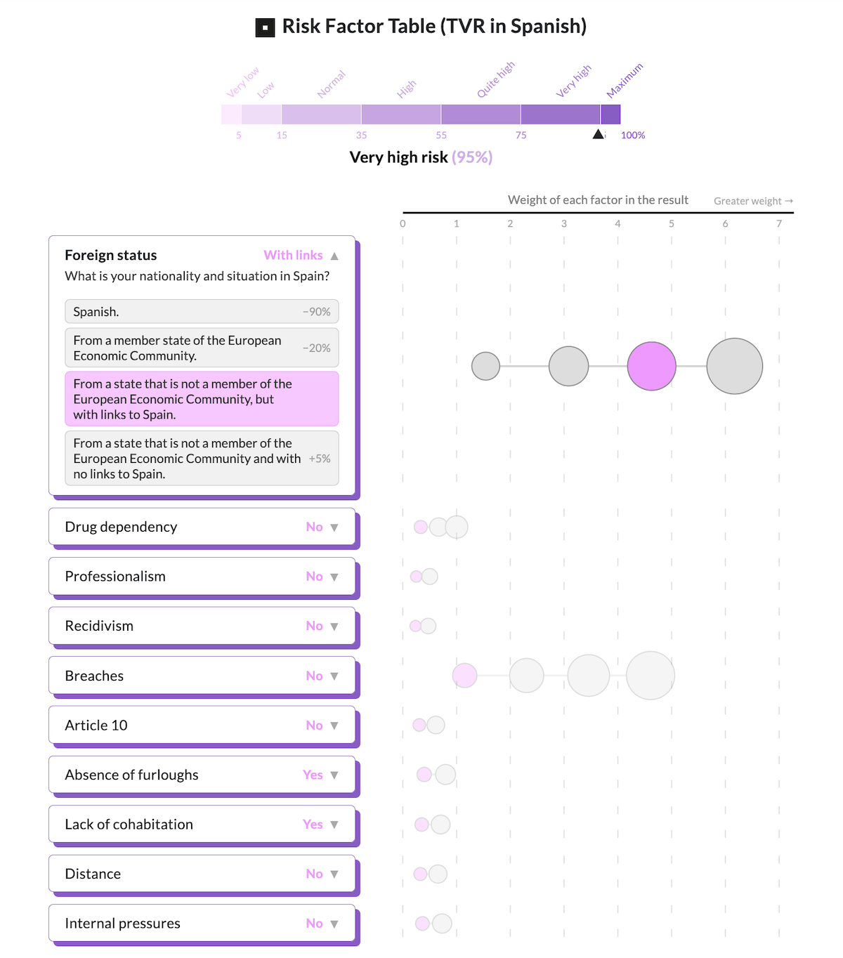
For over 30 years, Spain has used a predictive tool to assess risks of granting a prisoner temporary release. Despite its continued use in court rulings, experts — including its original developer — argue it is outdated and needs revision.
Civio examines the implications of this decades-old model and why professionals are calling for an update. An interactive simulator of the Table of Risk Variables (TVR, its Spanish abbreviation for Tabla de Variables de Riesgo) visualizes the system and how scores fluctuate as different variables are adjusted in the dropdown menus. You can clearly see, for example, that non-EU foreign prisoners with no ties to Spain receive the highest risk scores, even when they rank the lowest on the other criteria.
Discover the project on Civio, by Ter García, Carmen Torrecillas, Adrián Maqueda, and David Cabo.
Settlement Sizes in Donbas
2'224 Siedlungflächen gibt es im Donbass. Sie alle will Putin erobern, bevor es zu einem allfälligen Diktatfrieden kommt. Wie weit ist er? Unsere lange Visualisierung zeigt es. Mit @simon_huwiler und @adinarenner. @NZZ https://t.co/OkNtFOLgCx pic.twitter.com/6P30KzDTRp
— NZZ Visuals (@nzzvisuals) March 6, 2025
Russian forces reportedly control about two-thirds of all settlements in the Donbas. As of March 5, LiveUAMap data indicated over 1,800 under Russian control, while Ukraine held 422, most of them small, with only 22 covering more than five square kilometers.
Swiss newspaper Die Neue Zürcher Zeitung (NZZ) presents a detailed visual breakdown of settlement sizes and territorial control in the region. Using scrollytelling and small multiples, the piece juxtaposes the areas of towns and villages, making it easier to grasp their scale. As you scroll, you move through where Ukrainian control was reported to stand as of March 5, 2025, before reaching those under Russian control, highlighting key phases from 2014 through early March 2025.
Explore the story on NZZ, by Simon Huwiler and Adina Renner.
Wrapping Up
These visualizations show how well-crafted charts and maps can turn raw data into something meaningful and engaging. From trends to decisions, data comes to life when presented effectively.
Stay tuned for more compelling examples in the next edition of Data Visualization Weekly!
- Categories: Data Visualization Weekly
- No Comments »