 Data can speak — when we let it. Visualization is how we give it a voice. That is what DataViz Weekly is here for: to present real projects showing how data can be expressed through thoughtful visual work. In this edition, we’ve picked four new ones worth your attention:
- Animal sounds across languages — The Pudding
- March Madness 2025 bracket projections — The Athletic
- AI search citation failures — Columbia Journalism Review
- Travel times from any U.S. location — OpenTimes
Data Visualization Weekly: March 14, 2025 — March 21, 2025
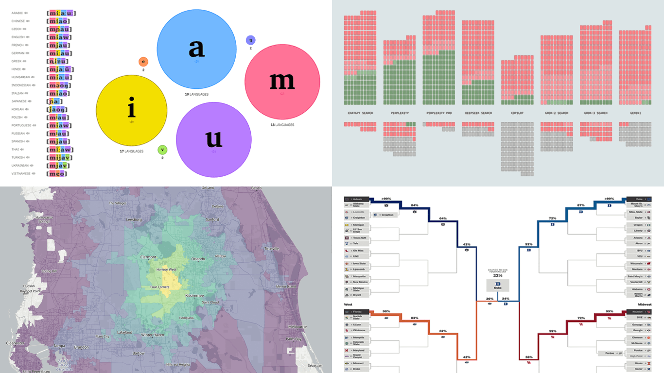
Animal Sounds Across Languages
Onomatopoeia gives sound a voice through language — though not always in the same way. From meows to quacks and oinks, even familiar animal noises are heard and expressed differently across cultures, shaped by unique linguistic patterns.
The Pudding returns with another compelling visual essay, this time exploring how 21 languages translate the sounds of three animals: cats, ducks, and pigs. Each onomatopoeic word is transcribed using the International Phonetic Alphabet (IPA) and broken down into color-coded phonemes, making it easy to compare their structure visually.
While cat sounds reveal consistent patterns, duck and pig sounds vary much more across languages. Bubble charts summarize the most frequent phones, and you can click any transcription to hear its pronunciation. Altogether, this project offers a fascinating lens on how humans interpret sound and express it through language.
Check out the story on The Pudding, by Vivian Li.
March Madness 2025 Bracket Projections
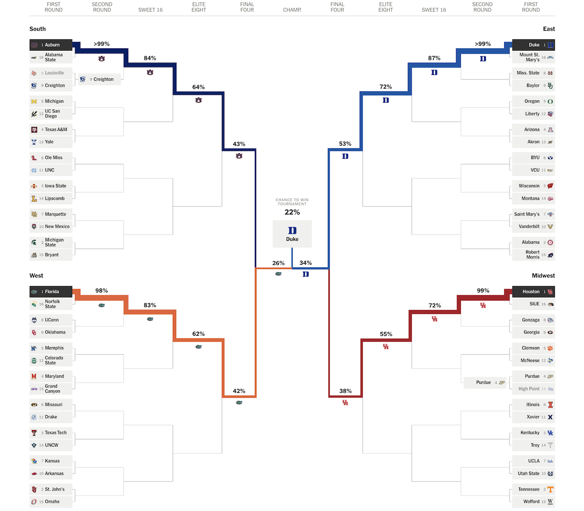
Every spring, the U.S. college basketball world turns its attention to a high-stakes single-elimination NCAA tournament known as March Madness, where 60+ men’s teams compete for the national title. With so many matchups and potential upsets, predicting the outcome is no easy task — and that is where statistical modeling and data visualization come in.
The New York Times’s The Athletic presents an interactive bracket built on 200,000 tournament simulations, showing each team’s chances of progressing through every round and ultimately winning the title. Probabilities are displayed directly within the bracket structure, with thicker connecting lines indicating stronger chances at every stage.
You can tap or hover to examine individual team paths, and the projections should be expected to update in real time as results come in. As it currently stands, a Duke vs. Florida final appears most likely, with Duke carrying the highest overall chance of claiming the championship (22%).
Take a look at the bracket model on The Athletic, by Austin Mock, designed and developed by Ryan Best and Oliver Viehweger.
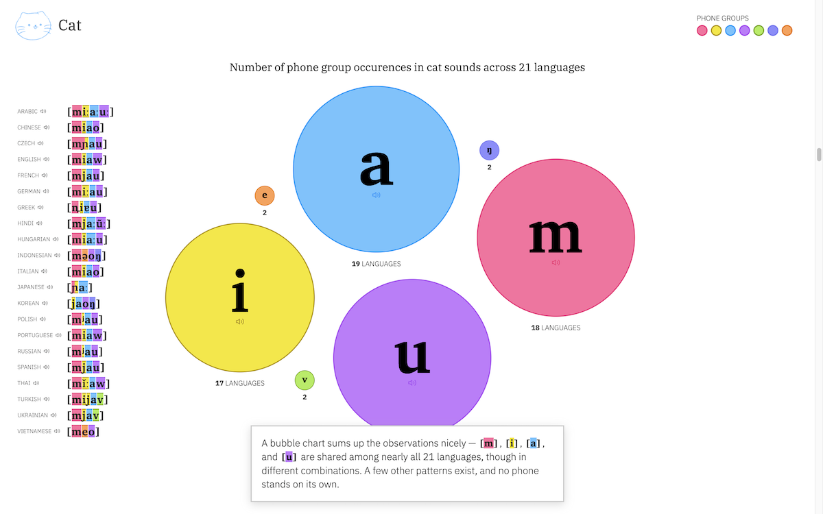
AI Search Citation Failures
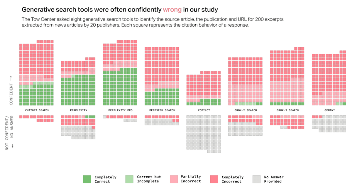
As more people turn to AI chatbots instead of traditional search engines, concerns are growing about how well these tools handle news content. Generative AI often summarizes and rewrites, sometimes distorting it — making it harder to assess where the material comes from or how accurate it really is.
The Tow Center for Digital Journalism at Columbia’s Graduate School of Journalism evaluated eight AI search platforms — ChatGPT Search, Perplexity, Perplexity Pro, DeepSeek Search, Copilot, Grok-2, Grok-3, and Gemini — testing how accurately they could identify and cite the original sources of 200 news excerpts from 20 publishers.
The results are visualized using tiled bar charts (unit charts), with each square representing a response and its citation outcome. Color indicates accuracy, while vertical position reflects the model’s confidence. Additional graphics spotlight issues like fabricated URLs, crawler violations, and a surprising trend where paid versions often gave confidently incorrect answers more frequently than free ones.
See the report on Columbia Journalism Review, by Klaudia Jaźwińska and Aisvarya Chandrasekar.
Travel Times from Any U.S. Location
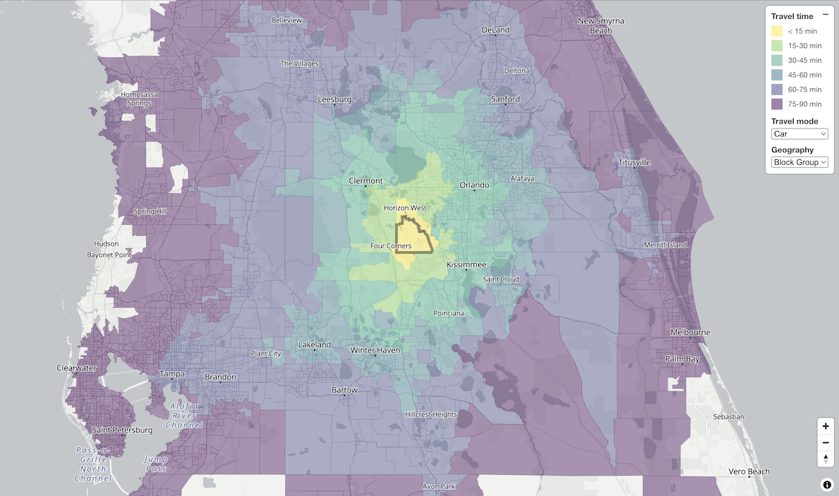
How far can you get from any point in the United States within 15, 30, or 45 minutes — or even an hour or more? A new project launched just days ago makes questions like this instantly answerable, visualizing reachable areas by travel time and mode of transportation.
Dan Snow created OpenTimes, a large-scale dataset of estimated travel times between locations across the U.S., paired with an intuitive isochrone map interface. Click anywhere to see how far you can go from that spot by car, bike, or foot, and choose your preferred geographic granularity — county, tract, or block group. Color-coded intervals reflect the time ranges, giving a clear and immediate view of local accessibility.
In the snapshot above, the map centers on Disney’s Coronado Springs Resort — the venue for Qlik Connect 2025, taking place May 13–15. We’ll be there, showcasing the latest in our library of Qlik Sense extensions as a proud event sponsor. If you’re attending, you’ll notice that destinations like Kennedy Space Center and Tampa appear within just over an hour’s drive — perfect for a fun side trip.
Explore the map at opentimes.org and access the database if you’d like at data.opentimes.org.
Wrapping Up
Each of these fresh projects shows how data can be given a voice through thoughtful visuals. Stay connected for more in future editions of Data Visualization Weekly — your regular source of real charts and maps that let data speak.
- Categories: Data Visualization Weekly
- No Comments »