 Scatter plots are widely used to visualize relationships between variables by displaying values on a coordinate plane. In some cases, users may need to control which data points remain visible — whether to focus on a specific category, filter out outliers, or simplify the view for better readability.
In this edition of JS Chart Tips — our blog series featuring practical solutions inspired by real customer questions — we’ll show you how to implement interactive point visibility control in a JavaScript scatter plot. By using specialized API methods, you can let users dynamically hide and show individual markers, making data exploration more flexible and insightful.
Let’s dive in!
Question: How to Toggle Visibility of Scatter Plot Data Points?
A customer recently asked our Support Team how to allow users to manually hide and show specific points in a scatter plot by interacting with elements elsewhere on the same web page. Providing control over data visibility without modifying the dataset itself can be useful in various scenarios — whether the interaction happens via a table, list, or even another chart.
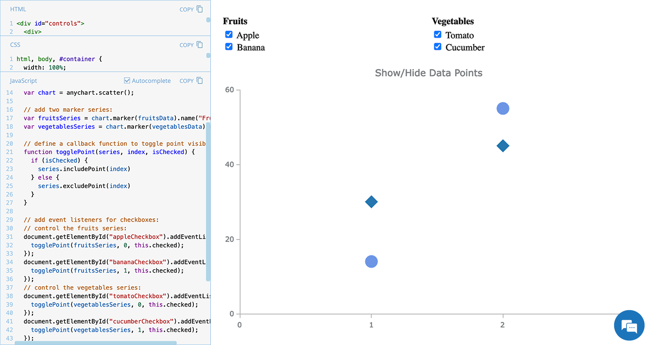
To demonstrate the core approach, our engineers created a basic example where users can toggle individual points using checkboxes. Here’s how that works in action:
So, how exactly can you implement this functionality? Below, we’ll walk you through the process, making it easy to integrate into your own scatter plots — or even other chart types.
Solution: Using Exclude/Include Points to Control Visibility
Overview
In our JavaScript charts, you can control data point visibility dynamically using the Exclude/Include Points feature. Two key API methods make this possible:
- excludePoint() — Removes (hides) a specific data point from the display.
- includePoint() — Redisplays a hidden data point.
By combining these methods with event listeners, you can allow users to toggle data points on and off, adjusting not the dataset but its visual representation on the fly.
Now, let’s go step by step through the implementation. We’ll build a simple example where checkboxes control which points are displayed — a flexible approach that can be extended to various use cases.
In Detail
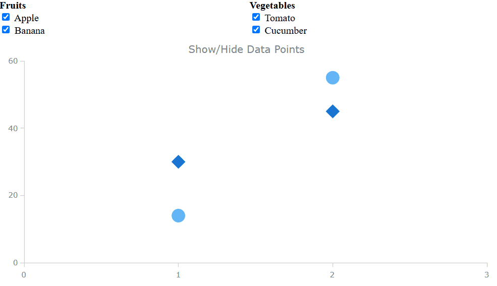
First, you need to create a scatter chart. In this example, we’ll define two categories of data points — fruits and vegetables — and display them as two scatter marker series.
<html>
<head>
  <title>JavaScript Scatter Plot with Point Visibility Control</title>
  <script src="https://cdn.anychart.com/releases/8.13.0/js/anychart-base.min.js"></script>
  <style>
    html, body, #container {
      width: 100%; height: 100%; margin: 0; padding: 0;
    }
  </style>
</head>
<body>
  <div id="container"></div>
  <script>
    anychart.onDocumentReady(function() {
      // define data points:
      var fruitsData = [
        {x: 1, value: 14, name: "Apple"},
        {x: 2, value: 55, name: "Banana"}
      ];
      var vegetablesData = [
        {x: 1, value: 30, name: "Tomato"},
        {x: 2, value: 45, name: "Cucumber"}
      ];
      // create a scatter plot:
      var chart = anychart.scatter();
      // add two marker series:
      var fruitsSeries = chart.marker(fruitsData);
      var vegetablesSeries = chart.marker(vegetablesData);
      // set the container and render the chart:
      chart.container("container");
      chart.draw();
    });
  </script>
</body>
</html>
Second, add checkboxes to let users control the visibility of specific points. Each checkbox corresponds to a data point, allowing users to show or hide them dynamically. In our example, we’ll add them to the <body> section of the HTML as follows:
<div id="controls">
  <div>
    <strong>Fruits</strong><br>
    <label>
      <input type="checkbox" id="appleCheckbox" checked> Apple
    </label><br>
    <label>
      <input type="checkbox" id="bananaCheckbox" checked> Banana
    </label><br>
  </div>
  <div>
    <strong>Vegetables</strong><br>
    <label>
      <input type="checkbox" id="tomatoCheckbox" checked> Tomato
    </label><br>
    <label>
      <input type="checkbox" id="cucumberCheckbox" checked> Cucumber
    </label><br>
  </div>
</div>
Third, define a function that determines whether a data point should be included (shown) or excluded (hidden) based on the checkbox state.
function togglePoint(series, index, isChecked) {
  if (isChecked) {
    series.includePoint(index); // Show the point
  } else {
    series.excludePoint(index); // Hide the point
  }
}
Fourth, attach event listeners to the checkboxes so that whenever a user checks or unchecks a box, the togglePoint() function updates the chart accordingly.
// control the fruits series:
document.getElementById("appleCheckbox").addEventListener("change", function () {
  togglePoint(fruitsSeries, 0, this.checked);
});
document.getElementById("bananaCheckbox").addEventListener("change", function () {
  togglePoint(fruitsSeries, 1, this.checked);
});
// control the vegetables series:
document.getElementById("tomatoCheckbox").addEventListener("change", function () {
  togglePoint(vegetablesSeries, 0, this.checked);
});
document.getElementById("cucumberCheckbox").addEventListener("change", function () {
  togglePoint(vegetablesSeries, 1, this.checked);
});
Finally, fine-tune the appearance of the checkbox controls and chart layout as needed, and you’ve got an interactive scatter plot where users can hide or show individual data points at will.
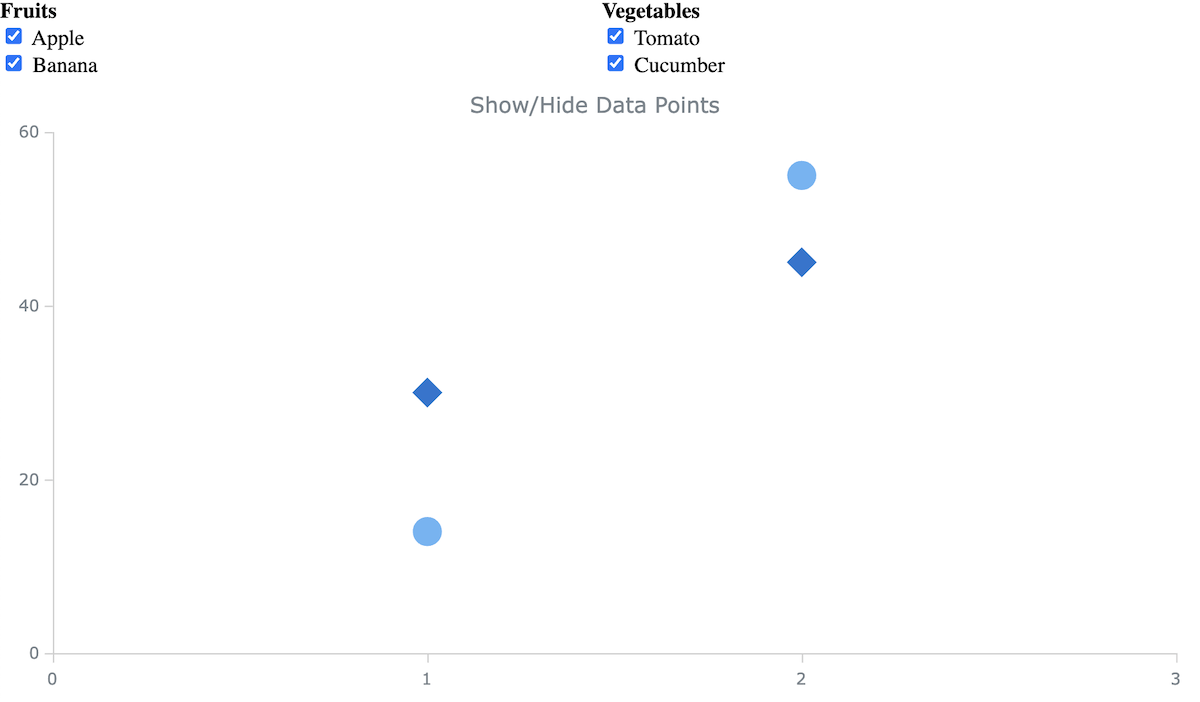
Example
Check out this interactive scatter plot example with dynamic point selection, built using the approach we’ve just explored. It includes additional visual tweaks for better usability — feel free to experiment with its code and customize it to fit your needs.
Further Learning
For more details on scatter plots, event handling, and point visibility control, explore the following sections of our JavaScript charting documentation:
- Scatter Plot | AnyChart JS Documentation
- Event Listeners | AnyChart JS Documentation
- Exclude and Include Points — Interactivity | AnyChart JS Documentation
Check out more tutorials on creating scatter plots with JavaScript on our blog:
- Building a Scatter Chart in JavaScript by Shachee Swadia — Visualizing the top 1,000 highest-grossing movies.
- Building a JavaScript Scatter Plot Module by Wayde Herman — Comparing cat vs. dog popularity in the United States.
Wrapping Up
Letting users show or hide specific data points enhances scatter plot interactivity and usability. By using methods like excludePoint() and includePoint() with event listeners, you can efficiently control point visibility, making visualizations more flexible and insightful.
Want to take it further? Try adding buttons, dropdowns, or logic-based filters for even more customization.
Have additional questions? Feel free to reach out to our Support Team. And stay tuned for more practical tutorials in our JS Chart Tips series!
Happy scattering with JavaScript!
- Categories: AnyChart Charting Component, HTML5, JavaScript, JS Chart Tips, Tips and Tricks
- No Comments »