Interactive JS Map by AnyChart and More

February 28th, 2016 by Margaret Skomorokh

Here is a quick recap of the visualizations that we have shared with you this week on AnyChart Facebook Page and Twitter (including an interactive JS map by AnyChart):

  • Who Receives the Most Acknowledgements at The Oscars?Visually has analyzed over 450 speeches in the 6 major award categories – Best Actor, Best Actress, Best Supporting Actor, Best Supporting Actress, Best Motion Picture and Best Director – to see if mothersget more credit than fathers or if agents steal the limelight from writers.
  • Map of Contemporaries — Did you realize that Alessandro Volta was younger than Napoleon? See which famous people shared their time on Earth. The Map of Contemporaries project is the history of the world in famous people’s lifespans. This data visualization is inspired by Wait But Why’s blog post about Horizontal History — the idea of taking a “horizontal” slice of time and tracing the lifetimes of all the famous people living at that time.
  • New York City Marathon in Six Charts — six data visualizations by The New York Times. The first chart is a great way to visualize the speed of participants. When the winner of the New York City Marathon crosses the finish line on Sunday, some of the slowest finishers are likely to be running their third miles, just inside Brooklyn. See it for yourself!
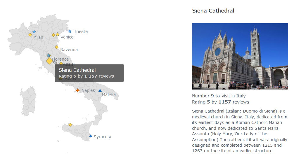
  • Top 30 Places to Visit in Italy — Check out this interactive JS map by AnyChart, showing top 30 places to visit in Italy (based on data from Tripadvisor.com and Wikipedia). As you can see, AnyChart allows to combine different types of information: our map is linked to images and short text descriptions, which is a great way to provide users with quick reference information. Please note that AnyChart is both flexible and fast rendering solution.

  • No Comments Yet

    *