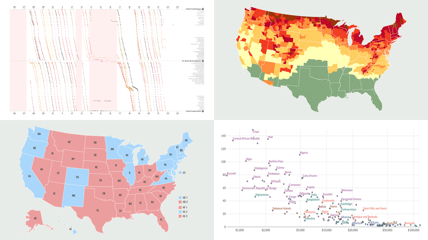
 Another week, another collection of new data visualizations! Check out some of the most interesting examples we’ve discovered recently, curated for DataViz Weekly.
- Predicting the outcome of the 2024 U.S. presidential election — NBC News
- Impact of air alerts on Kyiv’s public transport — Text.org.ua
- U.S. fall foliage in 2024 — SmokyMountains.com
- Child mortality due to malnutrition — Our World in Data
Data Visualization Weekly: September 6, 2024 — September 13, 2024
Predicting Outcome of 2024 U.S. Presidential Election
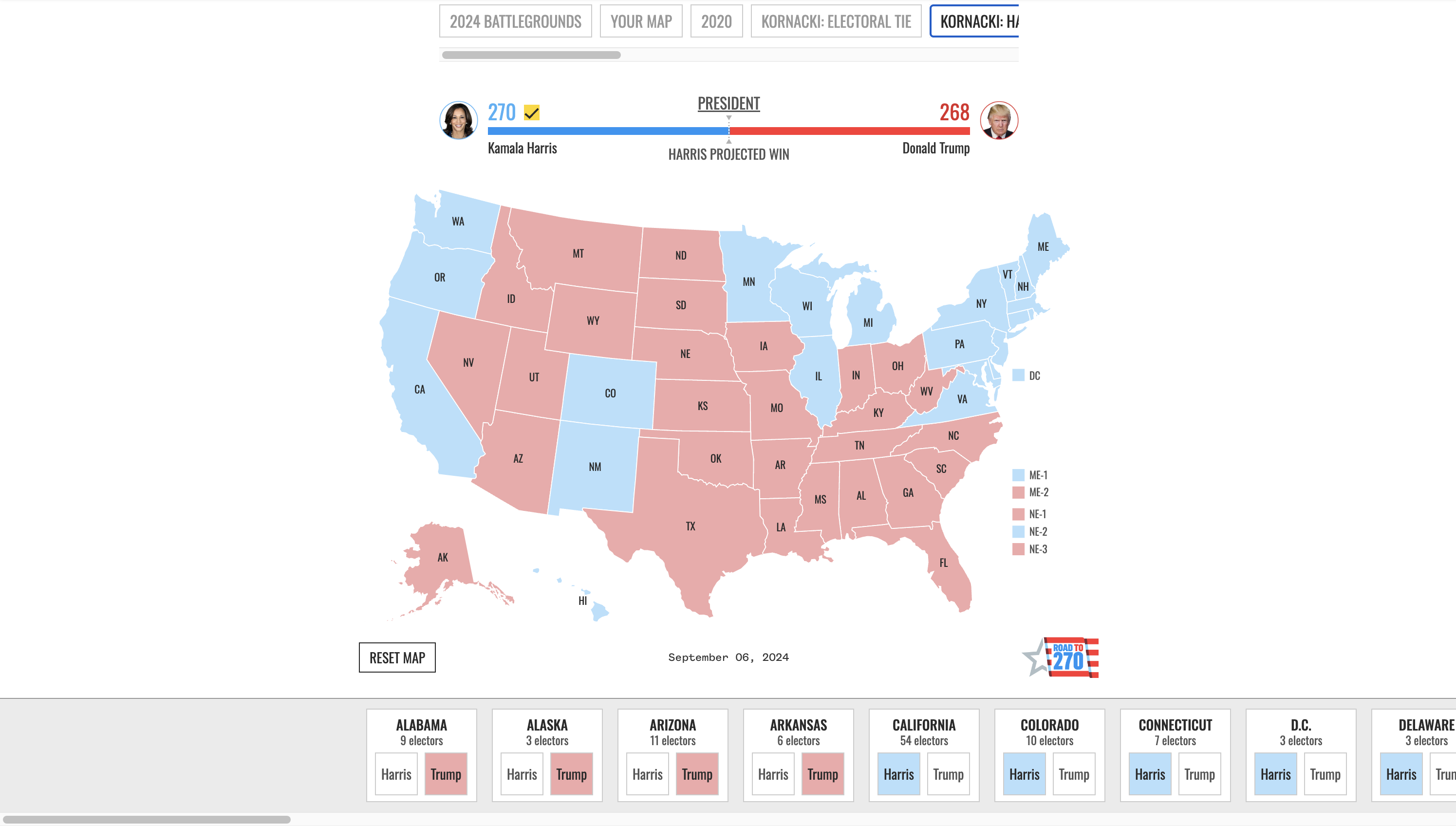
To secure the U.S. presidency, a candidate must win at least 270 electoral votes. In 2020, Biden claimed victory with 306 electoral votes compared to Trump’s 232. What could happen this year?
NBC News introduced the 2024 edition of its interactive Road to 270 electoral map. This tool allows you to project the outcome by clicking on individual states to allocate electoral votes either to Harris or Trump. The map updates in real time as states are toggled, keeping a running total of electoral votes for each candidate. The tool also features scenarios developed by political analysts Steve Kornacki and Kristen Welker, offering insights into possible outcomes based on current data.
Explore the tool on NBC News, designed and developed by Chet Hill, Joe Murphy, JoElla Carman, and Nigel Chiwaya.
Impact of Air Alerts on Kyiv’s Public Transport
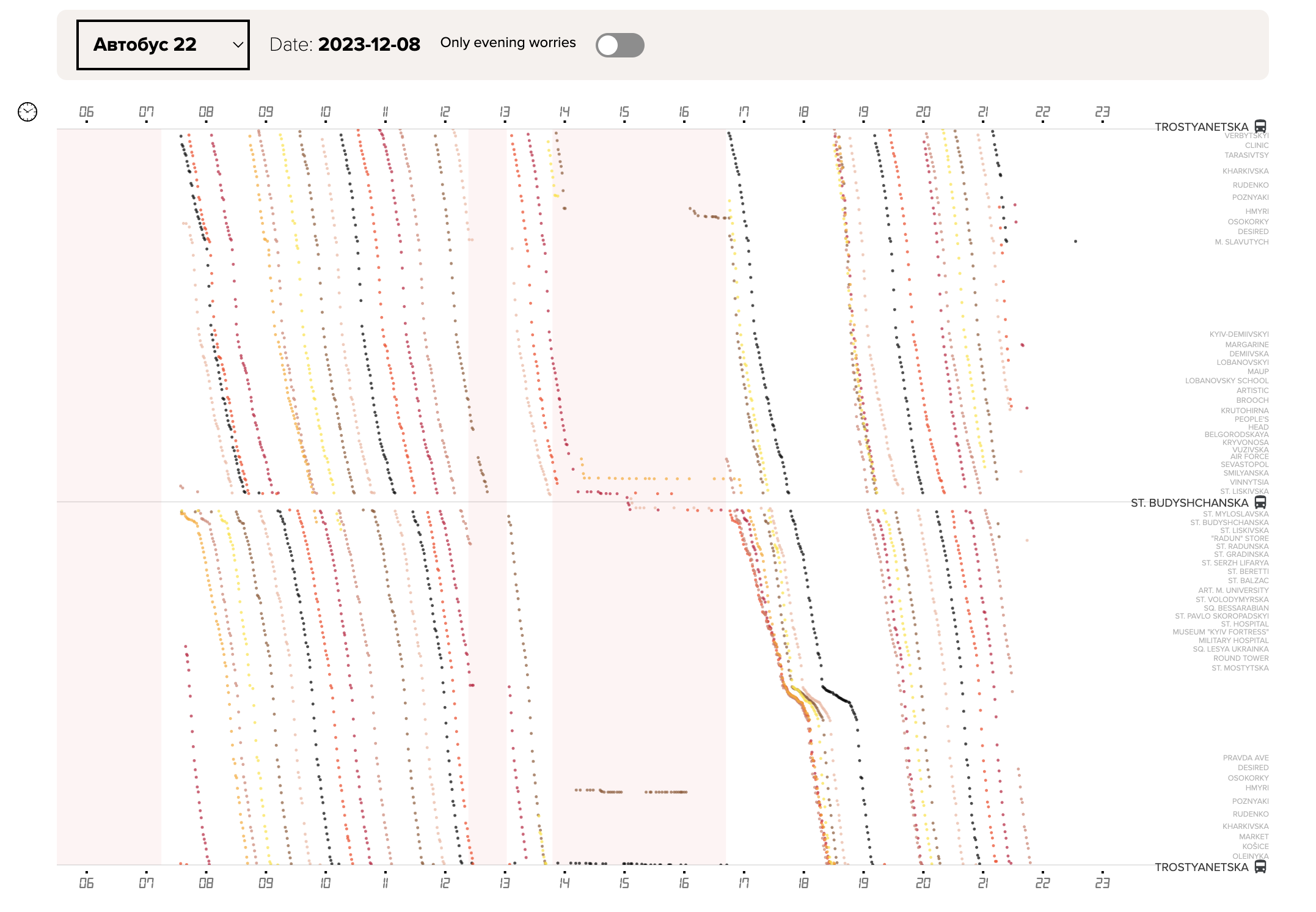
Kyiv is one of the few Ukrainian cities where public transportation halts during air alerts. Although the subway resumes operation quickly after, ground transport faces significant delays.
Texty.org.ua conducted an analysis of public transport during and following air alerts, revealing that buses, trams, and trolleybuses experience prolonged delays in returning to normal schedules. These disruptions often result in services being unavailable for up to several hours after the alerts have ended. Texty.org.ua also published an interactive visualization tool that lets you track how air alerts impact traffic on different routes, shedding light on the broader impact on public mobility.
Check out this analysis and tool on Texty.org.ua, developed by Valery Pavlenko, Vlad Gerasimenko, and Nadia Kelm.
U.S. Fall Foliage in 2024
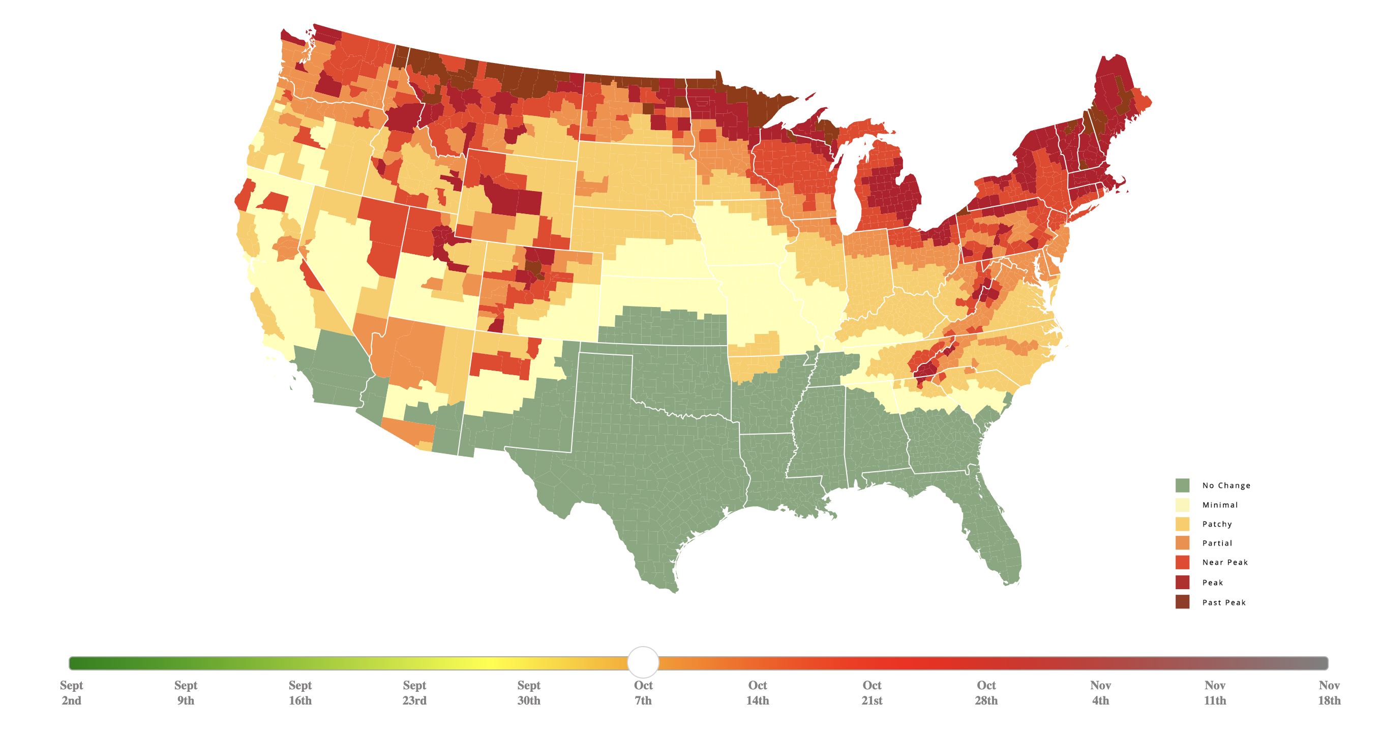
As it is already September and the leaves have started changing colors, travelers should plan their fall adventures. If you’re hoping to catch the peak foliage in your area, there’s a tool that can help you pinpoint the perfect time.
SmokyMountains.com released its annual Fall Foliage Map, which offers a detailed week-by-week and county-by-county view of the changing fall colors across the United States. The map uses color codes to show the progression of leaf changes, from no change (green) to peak foliage (vibrant red). It’s based on historical and forecast data on temperature and precipitation, local tree types, and user data. The map reveals that northern states have already begun their seasonal transition, with changes now spreading to other regions.
Take a look at the map on SmokyMountains.com.
Child Mortality Due to Malnutrition
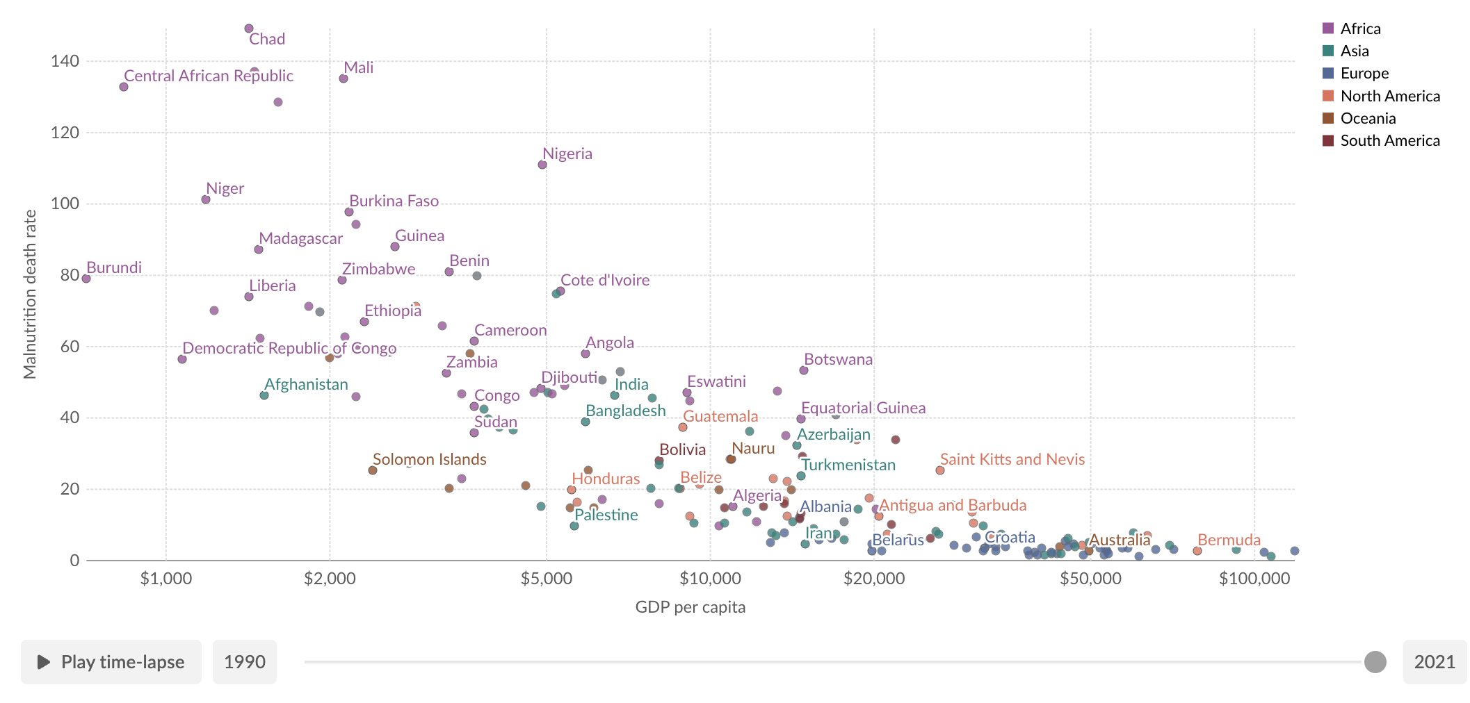
In 2021, approximately 4.7 million children under the age of five died globally. Child and maternal malnutrition accounted for roughly 2.4 million of these deaths — nearly half of all child mortality.
Our World in Data published a new article by Hannah Ritchie, examining the impact of malnutrition on child mortality. It features three key visualizations: a bar chart highlighting the main nutritional risk factors, with low birth weight as the leading cause; a scatter plot showing the relationship between malnutrition-related deaths and a country’s GDP, demonstrating that poorer nations suffer higher death rates; and a line chart illustrating the progress in reducing child mortality due to malnutrition since 1990.
See the full article on Our World in Data.
Wrapping Up
That wraps up this week’s Data Visualization Weekly. We hope these charts and maps gave you some fresh insights and inspiration. Be sure to check back next week for another roundup of interesting data visualizations from around the web!
- Categories: Data Visualization Weekly
- No Comments »