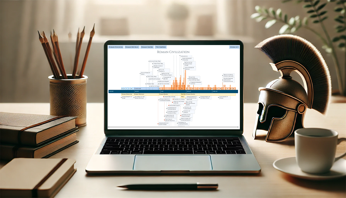
 Ever caught yourself thinking about the Roman Empire more often than you’d like to admit? You’re not alone, and we’ve got just the thing for you! With the recent AnyChart JS Charts 8.13.0 release, we’ve enhanced our timeline chart for better support of historical data visualization. We’d love to showcase this improvement in action.
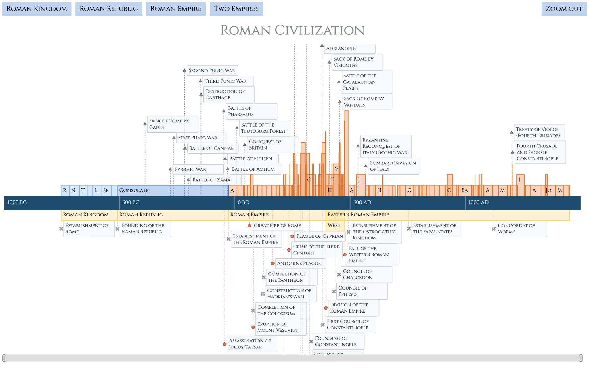
We’ve added a Roman History Timeline to our gallery of timeline chart examples, and we now invite you to discover how it was developed from scratch. In this in-depth JavaScript charting tutorial, we’ll cover everything from A to Z, meticulously guiding you through each step — from setting up the HTML environment to adding detailed data and customizing the visualization to make the chart both informative and engaging. The final result is an interactive timeline that you can proudly call your own Roman Empire.
So, whether you’re a history enthusiast caught up in the recent meme trend or a developer eager to expand your data visualization skills, follow along and learn how to create compelling historical timeline charts using JavaScript!
Table of Contents
- Introduction
- Step 1: Setting Up Environment
- Step 2: Adding Data
- Step 3: Creating Timeline Chart
- Step 4: CSS Styling
- Result: Timeline Chart of Roman History
- Wrapping Up
Introduction
Visualizing historical data can be challenging, especially when dealing with extensive timelines and precise dates. With the latest improvements in the AnyChart JavaScript charting library, creating detailed and accurate timeline charts is more accessible than ever.
In this tutorial, we’ll build an interactive JS timeline for a web page, which illustrates significant periods and events in Roman history, complete with custom tooltips and convenient navigation. Take a glance below to see how the final result will look, and let’s begin!
Step 1: Setting Up Environment
To get started with building our timeline, we need to set up a basic HTML structure for our webpage. This includes setting up the document, creating a container to display the chart, and linking the necessary resources.
1.1. Create Basic HTML Document
First, we need to create a basic HTML document that defines the structure of the page. This is the foundation of any webpage.
<!DOCTYPE html>
<html>
  <head>
    <title>Roman Civilization Timeline with All Data</title>
  </head>
  <body>
  </body>
</html>
1.2. Create Container for Chart
Next, we need a container where the timeline chart will be displayed. This can be a simple <div> element with a specific ID, placed in the <body> section:
<div id="container"></div>This element will act as the placeholder for our chart. We will reference it in the JavaScript code to generate the visualization.
1.3. Include All Necessary Resources
Now, it’s time to include the necessary resources for our web project.
Let’s use a custom web font. For example, Cinzel from Google Fonts. Simply include the relevant links in the <head> section:
<link rel="preconnect" href="https://fonts.googleapis.com">
<link rel="preconnect" href="https://fonts.gstatic.com" crossorigin>
<link href="https://fonts.googleapis.com/css2?family=Cinzel:wght@400..900&family=Nunito:ital,wght@0,200..1000;1,200..1000&display=swap" rel="stylesheet">
We also need to connect the AnyChart JavaScript library to bring in the charting functionality. Link the required modules similarly in the <head> section:
<script src="https://cdn.anychart.com/releases/8.13.0/js/anychart-core.min.js"></script>
<script src="https://cdn.anychart.com/releases/8.13.0/js/anychart-timeline.min.js"></script>
<script src="https://cdn.anychart.com/releases/8.13.0/js/anychart-ui.min.js"></script>
These <script> tags include the core charting library, the dedicated timeline chart module, and the UI module to customize the user interface.
Now, we are ready to place the JavaScript timeline charting code within the <script> tag in the <body> section:
<script>
  // The place for the JavaScript charting code
</script>
1.4. Complete HTML Setup
At this point, here’s what the complete HTML structure looks like:
<!DOCTYPE html>
<html>
  <head>
    <title>Roman Empire Timeline</title>
    <link rel="preconnect" href="https://fonts.googleapis.com">
    <link rel="preconnect" href="https://fonts.gstatic.com" crossorigin>
    <link href="https://fonts.googleapis.com/css2?family=Cinzel:wght@400..900&family=Nunito:ital,wght@0,200..1000;1,200..1000&display=swap" rel="stylesheet">
    <script src="https://cdn.anychart.com/releases/8.13.0/js/anychart-core.min.js"></script>
    <script src="https://cdn.anychart.com/releases/8.13.0/js/anychart-timeline.min.js"></script>
    <script src="https://cdn.anychart.com/releases/8.13.0/js/anychart-ui.min.js"></script>
  </head>
  <body>
    <div id="container"></div>
    <script>
      // The place for the JavaScript charting code
    </script>
  </body>
</html>
Step 2. Adding Data
Now that we’ve set up the structure, it’s time to add data that will populate our timeline. There are multiple ways to do this. Here, within the JavaScript code of the chart, we’ll create a function called loadData() to add all the data as objects:
function loadData(){
  // The data comes here…
};
The data to be visualized consists of two main types:
- Periods: Time ranges representing significant durations, like reigns of emperors or historical eras.
- Events: Specific historical moments, such as battles or important occurrences.
Let’s proceed by adding the data for each type.
2.1. Define Periods (Ranges)
Periods are represented as time ranges. Each one has:
name: The label or title, such as “Legendary” or “Emperors.”direction: Defines the orientation on the timeline as either pointing “up” (up) or “down” (down).ranges: An array of specific data ranges, each with a name or title (name) to identify the period, start (start) and end (end) dates that mark the time span, and additional attributes like images (img) and descriptions (description).
For example, here’s the code defining the period of “Legendary” kings:
var periods = [{}];
periods[0] = {};
periods[0].name = "Legendary";
periods[0].direction = "up";
periods[0].ranges = [
  {
    name: "Romulus",
    start: new Date(Date.UTC(-753, 0, 0)),
    end: new Date(Date.UTC(-717, 0, 0)),
    img: "https://upload.wikimedia.org/wikipedia/commons/thumb/9/95/Brogi%2C_Carlo_%281850-1925%29_-_n._8226_-_Certosa_di_Pavia_-_Medaglione_sullo_zoccolo_della_facciata.jpg/250px-Brogi%2C_Carlo_%281850-1925%29_-_n._8226_-_Certosa_di_Pavia_-_Medaglione_sullo_zoccolo_della_facciata.jpg",
    description: "The legendary founder and first king of Rome, who established the city's foundations."
  },
  // Other kings follow
];
Add more periods in a similar manner:
// 1) Add periods (ranges):
var periods = [{}];

// legendaries' years of life
periods[0] = {};
periods[0].name = "Legendary";
periods[0].direction = "up";
periods[0].ranges = [
  {
    name: "Romulus",
    start: new Date(Date.UTC(-753, 0, 0)),
    end: new Date(Date.UTC(-717, 0, 0)),
    img: "https://upload.wikimedia.org/wikipedia/commons/thumb/9/95/Brogi%2C_Carlo_%281850-1925%29_-_n._8226_-_Certosa_di_Pavia_-_Medaglione_sullo_zoccolo_della_facciata.jpg/250px-Brogi%2C_Carlo_%281850-1925%29_-_n._8226_-_Certosa_di_Pavia_-_Medaglione_sullo_zoccolo_della_facciata.jpg",
    description: "The legendary founder and first king of Rome, who established the city's foundations."
  },

  // Other legendary kings follow

];

// consuls' years of rule
periods[1] = {};
periods[1].name = "Consuls";
periods[1].direction = "up";
periods[1].ranges = [
  {
    name: "Consulate",
    start: new Date(Date.UTC(-509, 0, 0)),
    end: new Date(Date.UTC(-27, 0, 16)),
    img: "https://upload.wikimedia.org/wikipedia/commons/thumb/9/98/Roman_SPQR_banner.svg/150px-Roman_SPQR_banner.svg.png",
    description: "Consuls were elected annually, and the position was often shared by two individuals, making it difficult to track the exact reign periods for all consuls over the centuries."
  }
];

// emperors' years of life
periods[2] = {};
periods[2].name = "Emperors";
periods[2].direction = "up";
periods[2].ranges = [
  {
    name: "Augustus",
    start: new Date(Date.UTC(-27, 0, 16)),
    end: new Date("0014-08-19"),
    img: "https://upload.wikimedia.org/wikipedia/commons/thumb/5/5e/Augustus_of_Prima_Porta_%28inv._2290%29.jpg/250px-Augustus_of_Prima_Porta_%28inv._2290%29.jpg",
    description: "First Roman emperor, marking the transition from the Roman Republic to the Empire."
  },

  // Other emperors follow

];

// historical states' years of existence
periods[3] = {};
periods[3].name = "Historical states";
periods[3].direction = "down";
periods[3].ranges = [
  {
    x: "Roman Kingdom",
    start: new Date(Date.UTC(-753)),
    end: new Date(Date.UTC(-509)),
    img: "https://upload.wikimedia.org/wikipedia/commons/thumb/0/0a/Platner_-_Ancient_Rome_city_growth.jpg/375px-Platner_-_Ancient_Rome_city_growth.jpg",
    description: "The Roman Kingdom is the earliest period of Roman history, traditionally dated from the founding of Rome in 753 BC to the overthrow of the last king in 509 BC, marking the transition from a monarchy to a republic."
  },

  // Other states follow

];
2.2. Define Events (Moments)
Events are individual moments that don’t span long periods but occur on specific dates. Each one has:
name: The event’s title (e.g., “Sack of Rome by Gauls”).direction: Orientation on the timeline (upordown).moments: An array of events that include names (y), dates (x), and additional attributes like images (img) and descriptions (description).
For example, here’s how to define wars and battles:
var events = [];
events[0] = {};
events[0].name = "Wars and Battles";
events[0].direction = "up";
events[0].moments = [
  {
    y: "Sack of Rome by Gauls",
    x: new Date(Date.UTC(-390, 0, 0)),
    img: "https://upload.wikimedia.org/wikipedia/commons/8/88/La_Bataille_de_l%27allia_-_G.Surand.jpg",
    description: "Gauls under Brennus sacked Rome after the Battle of the Allia, causing major devastation."
  },
  // Other wars and battles follow
];
Add more events similarly:
// 2) Add moments (events):
var events = [];

// wars and battles
events[0] = {};
events[0].name = "Wars and Battles";
events[0].direction = "up";
events[0].moments = [
  {
    y: "Sack of Rome by Gauls",
    x: new Date(Date.UTC(-390, 0, 0)),
    img: "https://upload.wikimedia.org/wikipedia/commons/8/88/La_Bataille_de_l%27allia_-_G.Surand.jpg",
    description: "Gauls under Brennus sacked Rome after the Battle of the Allia, causing major devastation."
  },
  // Other wars and battles follow
];

// establishments
events[1] = {};
events[1].name = "Establishments";
events[1].direction = "down";
events[1].moments = [
  {
    y: "Establishment of Rome",
    x: new Date(Date.UTC(-753, 0, 0)),
    img: "https://upload.wikimedia.org/wikipedia/commons/thumb/e/ea/Kapitolinische_Wölfin_Museum_Capitolini.jpg/330px-Kapitolinische_Wölfin_Museum_Capitolini.jpg",
    description: "Rome was founded, according to legend, by Romulus and Remus."
  },

  // Other establishments follow

];

// disasters
events[2] = {};
events[2].name = "Disasters";
events[2].direction = "down";
events[2].moments = [
  {
    y: "Assassination of Julius Caesar",
    x: new Date(Date.UTC(-44, 0, 0)),
    img: "https://upload.wikimedia.org/wikipedia/commons/thumb/e/eb/Vincenzo_Camuccini_-_La_morte_di_Cesare.jpg/375px-Vincenzo_Camuccini_-_La_morte_di_Cesare.jpg",
    description: "Caesar was killed by Roman senators to stop his increasing power."
  },

// Other disasters follow

];
2.3. Complete Data Loading Function
Once all periods and events are defined, the loadData() function can be finalized, ensuring it returns both periods and events to populate the timeline chart:
// Function to add data for the timeline chart:
function loadData(){

  // 1) Add periods (ranges)
  // …

  // 2) Add events (moments)
  // …

  return {"periods": periods, "events": events}

};
This loadData() function is crucial, as it prepares the dataset that will feed into the chart graphically representing the periods and events of Roman history.
With this step complete, we’re now ready to configure the timeline visualization of this data.
Step 3. Creating Timeline Chart
Now, let’s initialize and generate the timeline chart with the data we’ve added.
3.1. Prepare Ground
As previously mentioned, all the JavaScript code responsible for chart creation should be inside the <script> tag within the <body> section of the HTML document.
Additionally, to ensure all the main charting code runs only after the entire page has fully loaded with all external resources, wrap it within the anychart.onDocumentReady() function. This prevents errors related to accessing elements before they exist.
Here’s the basic structure:
<body>
  <script>
    anychart.onDocumentReady(function () {
      // The place for the main JavaScript Timeline Chart code
    });
  </script>
</body>
Then, declare a chart variable. In a typical case, it could be done within the anychart.onDocumentReady() function. However, since we will need to access it from other functions as well, we will declare it outside the function. The rest of the JavaScript code will be placed inside anychart.onDocumentReady(), unless specified otherwise.
<body>
  <script>
    // Create a chart variable here to be accessible from various places in the script
    var chart;
    // Ensure the main charting code runs after the page has loaded with all external resources
    anychart.onDocumentReady(function () {
      // Main JavaScript Timeline Chart code goes here
    });
    // Other functions go here
  </script>
</body>
3.2. Set Up Chart
Now, we need to set up the timeline chart. To create this type of data visualization, use the anychart.timeline() method. This initializes the chart object, which will be later configured with data and styling options.
chart = anychart.timeline();To make sure the chart displays data within the right time frame, set the minimum and maximum dates for the timeline’s scale. This helps display all periods and events properly, from early Roman history to later stages.
chart.scale().minimum(Date.UTC(-1000));
chart.scale().maximum(Date.UTC(1500));
These two lines define the visible range of the timeline from 1000 BC to 1500 AD.
3.3. Set Data to Chart
It’s time to populate the timeline with the data we’ve structured in the loadData() function in Step 2. Recall that this data includes periods (ranges) and events (moments).
3.3.1. Load Data
First, retrieve the structured data by calling loadData():
var data = loadData();Now, we’ll set up the data series.
3.3.2. Set Series for Periods (Ranges)
To display the periods, i.e. a range series, use the range() method. The data for periods is in the periods array, and we will loop through it to set each period in the chart.
Here’s how to loop through the periods and bind them to the chart:
// 1) Set the range series for periods (e.g., rulers, empires)
for (let i = 0; i < data.periods.length; i++) {
  var period = data.periods[i];
  var range = chart.range(period.ranges);
  range.name(period.name);
  range.direction(period.direction);
  range.labels().fontFamily("Cinzel");
};
3.3.3. Set Series for Events (Moments)
For events, use the moment() method. Similarly, we’ll loop through the events array and create a moment series for each set of events.
// 2) Set the moment series for events (e.g., battles, establishment of states)
for (let i = 0; i < data.events.length; i++) {
  var event = data.events[i];
  var moment = chart.moment(event.moments);
  moment.name(event.name);
  moment.direction(event.direction);
  moment.labels().fontFamily("Cinzel");
};
3.4. Customize Tooltips
Tooltips enhance user experience by providing additional details when users hover over periods and events in the timeline. Both the period (range) and event (moment) series support rich HTML content, allowing you to display descriptions, images, and other information in a user-friendly format.
Let’s customize the tooltips.
3.4.1. Configure Period Tooltips
For example, here’s how you can customize the tooltip for the range series (periods).
First, create a tooltip variable:
var tooltip = range.tooltip();Second, enable HTML content in the tooltip:
tooltip.useHtml(true);Third, format the tooltip to include all the information that needs to be displayed, in the desired way:
tooltip.format(function(){
  var img = this.getData("img");
  var description = this.getData("description");
  return "<center><img src='" + img + "'/></center><p style='max-width: 250px;'>" + description + "</p>";
});
Fourth, if you don’t want to have the line separating the tooltip header from the tooltip content, simply remove it:
tooltip.separator(false);Finally, it’s possible to customize the tooltip header separately:
// enable HTML in the tooltip header
tooltip.title().useHtml(true);
// format the tooltip header
tooltip.titleFormat(function(){
  // use the anychart.format.dateTime() method to format the dates
  var start = anychart.format.dateTime(this.start, "y G");
  var end = anychart.format.dateTime( this.end, "y G");
  return "<p>" + this.x + " (" + start + " – " + end + ")</p>";
});
Here’s how the entire tooltip customization code looks in this case:
// create a variable
var tooltip = range.tooltip();
// enable HTML in the tooltip
tooltip.useHtml(true);
// format the tooltip content
tooltip.format(function(){
  var img = this.getData("img");
  var description = this.getData("description");
  return "<center><img src='" + img + "'/></center><p style='max-width: 250px;'>" + description + "</p>";
});
// disable the tooltip separator
tooltip.separator(false);
// enable HTML in the tooltip header
tooltip.title().useHtml(true);
// format the tooltip header
tooltip.titleFormat(function(){
  // use the anychart.format.dateTime() method to format the dates
  var start = anychart.format.dateTime(this.start, "y G");
  var end = anychart.format.dateTime( this.end, "y G");
  return "<p>" + this.x + " (" + start + " – " + end + ")</p>";
});
3.4.2. Configure Event Tooltips
Similarly, customization can be applied to the tooltip of the moment series (events):
// create a variable
var tooltip = moment.tooltip();
// enable HTML in the tooltip
tooltip.useHtml(true);
// format the tooltip content
tooltip.format(function(){
  var img = this.getData("img");
  var description = this.getData("description");
  return "<center><img src='" + img + "'/></center><p style= 'max-width: 250px;'>" + description + "</p>";
});
// disable the tooltip separator
tooltip.separator(false);
// enable HTML in the tooltip header
tooltip.title().useHtml(true);
// format the tooltip header
tooltip.titleFormat(function(){
  var x = new Date(this.x);
  // use the anychart.format.dateTime() method for date formatting
  var formatted = anychart.format.dateTime(x, "y G");
  return "<p>" + this.value + ", " + formatted + "</p>";
});
3.4.3. Complete Tooltip Customization
Finally, let’s combine everything within the series configuration functions to ensure proper functionality in the current setting.
// 1) Set the range series for periods (e.g., rulers, empires)
for (let i = 0; i < data.periods.length; i++) {
  var period = data.periods[i];
  var range = chart.range(period.ranges);
  range.name(period.name);
  range.direction(period.direction);
  range.labels().fontFamily("Cinzel");
  // Customize the range series tooltip:
  var tooltip = range.tooltip();
  // enable HTML in the tooltip
  tooltip.useHtml(true);
  // format the tooltip content
  tooltip.format(function(){
    var img = this.getData("img");
    var description = this.getData("description");
    return "<center><img src='" + img + "'/></center><p style='max-width: 250px;'>" + description + "</p>";
  });
  // disable the tooltip separator
  tooltip.separator(false);
  // enable HTML in the tooltip header
  tooltip.title().useHtml(true);
  // format the tooltip header
  tooltip.titleFormat(function(){
    // use the anychart.format.dateTime() method to format the dates
    var start = anychart.format.dateTime(this.start, "y G");
    var end = anychart.format.dateTime( this.end, "y G");
    return "<p>" + this.x + " (" + start + " – " + end + ")</p>";
  });
};

// 2) Set the moment series for events (e.g., battles, establishment of states)
for (let i = 0; i < data.events.length; i++) {
  var event = data.events[i];
  var moment = chart.moment(event.moments);
  moment.name(event.name);
  moment.direction(event.direction);
  moment.labels().fontFamily("Cinzel");
  // Configure the moment series tooltip:
  var tooltip = moment.tooltip();
  // enable HTML in the tooltip
  tooltip.useHtml(true);
  // format the tooltip content
  tooltip.format(function(){
    var img = this.getData("img");
    var description = this.getData("description");
    return "<center><img src='" + img + "'/></center><p style= 'max-width: 250px;'>" + description + "</p>";
  });
  // disable the tooltip separator
  tooltip.separator(false);
  // enable HTML in the tooltip header
  tooltip.title().useHtml(true);
  // format the tooltip header
  tooltip.titleFormat(function(){
    var x = new Date(this.x);
    // use the anychart.format.dateTime() method for date formatting
    var formatted = anychart.format.dateTime(x, "y G");
    return "<p>" + this.value + ", " + formatted + "</p>";
  });
};
3.5. Enhance Navigation
Navigation plays a critical role in timeline charts, especially when working with extensive historical datasets.
By default, you can use the mouse to navigate timeline charts: move along the timeline by dragging, and zoom in and out using the mouse wheel. To enrich this behavior and make the visualization even more navigable, let’s add a scrollbar element (scroller), zoom-on-click functionality (to zoom in on a moment or range), and zoom control buttons (to easily focus on specific eras in the timeline of Roman history).
3.5.1. Add Scrollbar
Adding a scrollbar allows users to navigate through the timeline easily. It can be enabled with a single line of code:
chart.scroller(true);The scroller will appear below the timeline.
3.5.2. Set Up Zoom Interactivity
To make the timeline more interactive, let’s add an event listener that zooms into a specific period or event when clicked. Here’s how.
First, add an event listener that triggers when a point (either a period or event) is clicked:
chart.listen("pointClick", function(e){
  // Configure the chart listener here
};
Second, declare variables that will define the area for zooming:
var start, end, gap;Third, determine if the clicked element is a moment or a period:
var type = e.series.getType();Fourth, configure the behavior for moments. We’ll zoom in on them with a 50-year margin before and after:
if (type == "moment") {
  var momentDate =  e.point.get("x");
  start = momentDate;
  end = momentDate;
  // 50 years in milliseconds
  gap = 1577880000000;
}
Fifth, specify the desired behavior for non-moment elements, i.e. periods. We’ll zoom into them with a 10% margin before and after.
else {
  start = e.point.get("start");
  end = e.point.get("end");
  gap = (end - start)/10;
}
Now that all prerequisites have been set up, use the zoomTo() method to finalize the configuration of the zooming functionality within the event listener.
chart.zoomTo(start - gap, end + gap);Check out the entire code that configures this zoom interactivity within the event listener:
// Add an event listener to zoom into an element when it's clicked:
chart.listen("pointClick", function(e){
  var start, end, gap;
  // check if the clicked element is a moment or a period
  var type = e.series.getType();
  // configure the behavior for moments
  if (type == "moment") {
    var momentDate =  e.point.get("x");
    // zoom into the moment, showing 50 years before and after it
    start = momentDate;
    end = momentDate;
    // 50 years in milliseconds
    gap = 1577880000000;
  } else { // for periods (non-moment elements)
    // zoom into the period, showing 10% of its length before its start and after its end
    start = e.point.get("start");
    end = e.point.get("end");
    gap = (end - start)/10;
  };
  // zoom into the element when it's clicked
  chart.zoomTo(start - gap, end + gap);
});
Importantly, since we’re working with years and centuries (without the need for quarters, months, and so on), we should patch the zoom levels on the timeline scale. Configure this using a new function placed outside of anychart.onDocumentReady().
// Function to patch the zoom levels on the timeline scale
function patchedZoomLevels(){
  var customZoomLevels = [
    [
      {"unit": "month", "count": 1},
      {"unit": "quarter", "count": 1},
      {"unit": "year", "count": 1}
    ],
    [
      {"unit": "quarter", "count": 1},
      {"unit": "year", "count": 1},
      {"unit": "year", "count": 10}
    ],
    [
      {"unit": "year", "count": 1},
      {"unit": "year", "count": 10},
      {"unit": "year", "count": 50}
    ],
    [
      {"unit": "year", "count": 10},
      {"unit": "year", "count": 50},
      {"unit": "year", "count": 100}
    ],
    [
      {"unit": "year", "count": 50},
      {"unit": "year", "count": 100},
      {"unit": "year", "count": 500}
    ]
  ];
  return customZoomLevels;
};
Once the custom zoom levels are defined, call this function inside the anychart.onDocumentReady() block. This ensures the zoom levels are patched before the chart is drawn.
chart.scale().zoomLevels(patchedZoomLevels());One more important thing: don’t forget to disable the selection functionality to ensure click tracking works correctly for zooming.
chart.interactivity().selectionMode("none");3.5.3. Add Zoom Control Buttons
Next, let’s add buttons to facilitate zooming into key periods of Roman history: the Kingdom, Republic, Empire, and Two Empires.
First, set up the period buttons in the <body> section of the HTML page.
<button id="period-button" onclick="zoomTo('kingdom')">Roman Kingdom</button>
<button id="period-button" onclick="zoomTo('republic')">Roman Republic</button>
<button id="period-button" onclick="zoomTo('empire')">Roman Empire</button>
<button id="period-button" onclick="zoomTo('empires')">Two Empires</button>
Then, write JavaScript to make the period buttons functional, using zoomTo(period) to implement zooming into the target periods when buttons are clicked.
function zoomTo(period) {
  switch (period) {
    case "kingdom":
      chart.zoomTo(Date.UTC(-755), Date.UTC(-505));
      break
    case "republic":
      chart.zoomTo(Date.UTC(-515), Date.UTC(-20));
      break
    case "empire":
      chart.zoomTo(Date.UTC(-40), Date.UTC(410));
      break
    case "empires":
      chart.zoomTo(Date.UTC(380), Date.UTC(1460));
      break
  }
};
Let’s also add a button to reset the zoom level to fit the entire timeline within the chart, using zoomOut() with the chart.fit() method.
<button id="zoom-out" onclick="zoomOut()">Zoom out</button>function zoomOut() {
chart.fit();
};3.6. Add Era Designators
In this step, we’ll introduce era designators into our timeline chart. They will be appended to the years to indicate the era.
AnyChart uses locales to manage date and time formats, including era designations such as “BC” (Before Christ) and “AD” (Anno Domini) or “BCE” (Before Common Era) and “CE” (Common Era), depending on the locale. You can modify the locale’s format properties to include era designators through a custom function placed outside the anychart.onDocumentReady() function.
function patchDateTimeLocale(){
  // read the current output locale and create a structured clone of it
  var currentOutputLocale =  structuredClone(anychart.format.locales[anychart.format.outputLocale()]);
  // read the formats object to prepare for creating a custom version of the locale
  var dateTimeLocaleFormats = currentOutputLocale.dateTimeLocale.formats;
  // loop through all available format keys to find those related to the current scale
  for (var format in dateTimeLocaleFormats){
    // "timeline_" is the scale we are looking for
    if (format.startsWith("timeline_")){
      // read and loop through an array of format values to insert an era designator
      var formatValues = dateTimeLocaleFormats[format];
      for (var i = 0; i < formatValues.length; i++) {
        // formats are usually represented by strings like "yyyy" or "dd MMMM yy HH:mm.SSS"
        var formatValue = formatValues[i];
        // there are two possible configurations of year representation inside a locale string "yyyy" and "yy"
        // we need to find both versions or neither to correctly modify the locale string
        var index4Y = formatValue.search(/y{4}/g)
        var index2Y = formatValue.search(/y{2}/g)
        // if there is a string representing a "yyyy" year, modify the format to include an era designator
        if (index4Y >= 0) {
          /*
          Create a new string that includes everything before and after the index identified earlier.
          The new string will include an era designator, but ensure the indexes are adjusted correctly,
          as we want to insert the era designator after the part of the string that represents the year.
          */
          var formatValuePatched1 = formatValue.slice(0, index4Y) + "y G" + formatValue.slice(index4Y + 4);
          formatValues[i] = formatValuePatched1;
        // if there is a string representing a "yy" year, modify the format to include an era designator
        } else if (index2Y > -1) {
          var formatValuePatched2 = formatValue.slice(0, index2Y + 1) + "y G" + formatValue.slice(index2Y + 3)
          formatValues[i] = formatValuePatched2
        }
      }
    }
  }
  // add the custom current output locale to AnyChart
  anychart.format.locales["custom"] = currentOutputLocale;
  // set the custom locale as the active locale
  anychart.format.outputLocale("custom");
};
Once the locale patching function is set, call it in the anychart.onDocumentReady() block. Make sure to put it before rendering the chart, so the timeline properly displays the era designators.
patchDateTimeLocale();3.7. Set Font for Axis Labels
We’ve already applied the Cinzel font to series labels and tooltips. To maintain consistent typography throughout the timeline, we’ll also set the axis label font to match the overall design. Here’s how to set it:
chart.axis().labels().fontFamily("Cinzel");3.8. Set Chart Title
A title helps users immediately understand what the chart represents. We can easily add a title using the chart.title() method:
chart.title({
  text: "Roman Civilization",
  fontFamily: "Cinzel",
  fontSize: 32
});
3.9. Set Container and Draw Chart
To display the chart, we need to link it to a container and then render it.
The container is the <div> element with id="container" that we created in the HTML.
chart.container("container");Finally, draw the chart.
chart.draw();This command renders the entire timeline chart in the specified container on the page.
3.10. Complete JavaScript Timeline Code
Feel free to view the complete JavaScript code for the timeline chart on AnyChart Playground. There, you can also download the entire project as an HTML file or ZIP archive.
Step 4. CSS Styling
Before viewing the final result, remember that CSS is essential for ensuring our page appears exactly how we want it. Let’s apply CSS to style the entire web timeline visualization, making the project look clean, organized, and visually appealing.
4.1. Style HTML, Body, Container
The following CSS ensures that the webpage and the chart container take up the full screen while maintaining a consistent layout. The container is positioned absolutely to cover the available space, ensuring the chart adjusts to fit the window properly.
html, body {
  width: 100%;
  height: 100%;
  margin: 0;
  padding: 0;
}

#container {
  position: absolute;
  min-width: 1000px;
  width: 100%;
  top: 40px;
  bottom: 0;
}
4.2. Style Zoom Control Buttons
The following CSS styles the zoom control buttons, which are used to zoom in (and out) on specific periods of Roman history. The buttons are styled to look consistent with the Roman theme, using the “Cinzel” font and a modern blue shade for hover effects.
#period-button, #zoom-out {
  background-color: #bad5f1;
  border: none;
  padding: 5px 10px;
  text-align: center;
  text-decoration: none;
  display: inline-block;
  font-size: 16px;
  font-family: "Cinzel", serif;
  margin-top: 5px;
  margin-left: 5px;
}

#period-button:hover, #zoom-out:hover {
  color: #fff;
  background-color: #1976d2;
}

#zoom-out {
  position: absolute;
  right: 5px;
}
4.3. Style Tooltips
To make the tooltip content, including images and text, more visually appealing and legible, we apply styles to the images and paragraphs that appear inside the tooltips.
img {
  max-width: 300px;
  max-height: 300px;
}

p {
  font-family: "Cinzel", serif;
  margin-top: 1px;
  margin-bottom: 1px;
}
4.4. Complete CSS Code
Here’s the complete CSS code that styles the container, buttons, and tooltip content.
html, body {
  width: 100%;
  height: 100%;
  margin: 0;
  padding: 0;
}

#container {
  position: absolute;
  min-width: 1000px;
  width: 100%;
  top: 40px;
  bottom: 0;
}

#period-button, #zoom-out {
  background-color: #bad5f1;
  border: none;
  padding: 5px 10px;
  text-align: center;
  text-decoration: none;
  display: inline-block;
  font-size: 16px;
  font-family: "Cinzel", serif;
  margin-top: 5px;
  margin-left: 5px;
}

#period-button:hover, #zoom-out:hover {
  color: #fff;
  background-color: #1976d2;
}

#zoom-out {
  position: absolute;
  right: 5px;
}

img {
  max-width: 300px;
  max-height: 300px;
}

p {
  font-family: "Cinzel", serif;
  margin-top: 1px;
  margin-bottom: 1px;
}
Result: Timeline Chart of Roman History
After following all the steps, including setting up the environment, adding data, configuring the chart, and applying styling, we now have a fully functional, interactive Timeline Chart of Roman Civilization with zoom control, custom tooltips, and a visually consistent design. The timeline displays historical periods and events with detailed information, providing an immersive experience.
Check it out on AnyChart Playground with the full source code, where you can also tweak the settings, modify the data, and experiment with new features.
Wrapping Up
Congratulations! We’ve successfully created a detailed, interactive timeline chart of Roman history using JavaScript. We’ve walked through everything from setting up the HTML structure, data, tooltips, zoom controls, and more. Hopefully, the steps were clear, and you’re now ready to build your own timeline visualizations.
Explore more examples in our timeline chart gallery and dive into the timeline chart documentation to discover other customization options and possibilities.
Happy JavaScript timeline charting!
- Categories: AnyChart Charting Component, Big Data, HTML5, JavaScript, JavaScript Chart Tutorials, Tips and Tricks
- No Comments »