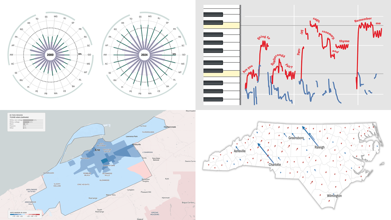
 Every day brings a wave of new data visualizations on a range of topics across the internet. Our regular series DataViz Weekly introduces you to those that have lately caught our eye as especially interesting. Here’s what’s in the spotlight this time:
- Female representation in Brazilian municipal chambers — Gênero e Número
- Key battleground microcommunities in the 2024 U.S. presidential elections — NYT Opinion
- Local voting trends within the seven swing states — The Washington Post
- Hidden patterns in folk songs and music evolution — Scientific American
Data Visualization Weekly: October 18, 2024 — October 25, 2024
Female Representation in Brazilian Municipal Chambers
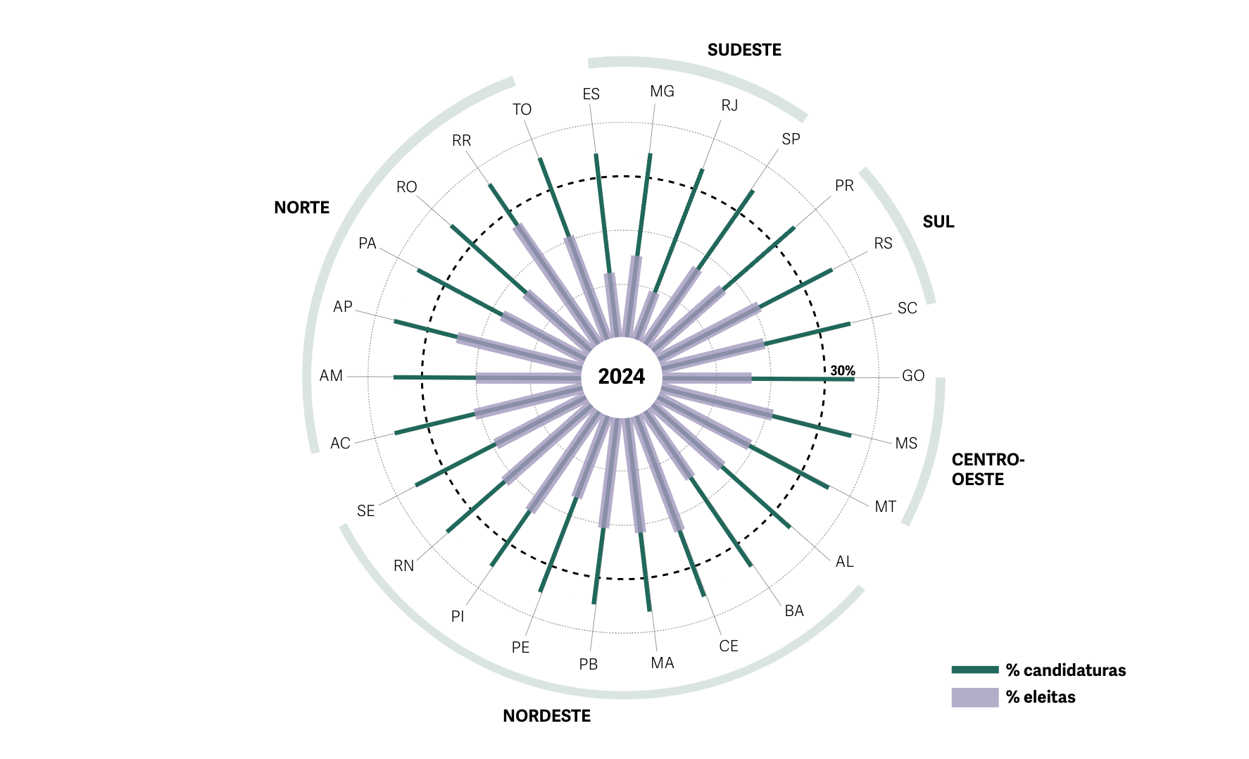
In the 1990s, Brazil introduced a gender quota aimed at increasing women’s representation in politics, but its initial impact was limited. A 2009 reform closed certain loopholes and ensured the minimum threshold for female candidates would be upheld, but even so, the current law’s effectiveness in meaningfully boosting the number of women elected to municipal chambers seems to remain under question.
Exploring the factors and potential solutions, Gênero e Número offers a series of polar diagrams that show female representation trends across the last seven municipal chamber elections, from 2000 to 2024. Each diagram corresponds to an election year, with bars displaying the proportion of women among registered candidates and elected officials, by state. A dotted line marks the 30% legal quota. Data is sourced from the Open Data site of the Superior Electoral Court (TSE).
See the article on Gênero e Número, by Vitória Régia da Silva, Marilia Ferrari, Victoria Sacagami, Diego Nunes da Rocha, and Aline Gatto Boueri.
Key Battleground Microcommunities
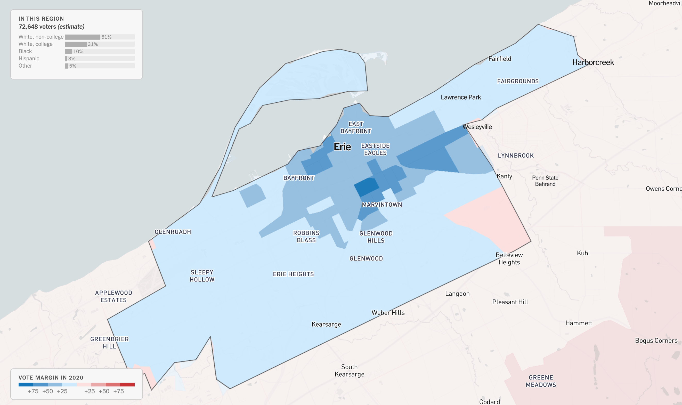
The pivotal factor in the U.S. presidential election often lies within swing states, also known as battleground states. Seven states — Arizona, Georgia, Michigan, Nevada, North Carolina, Pennsylvania, and Wisconsin — hold this status for the current race. The outcome in each of them will largely hinge on voting patterns within specific communities.
In an article for The New York Times Opinion section, Patrick Ruffini, a pollster with Echelon Insights, examines these microcommunities in detail. According to him, the most reliable way to predict a state’s outcome is to start at the precinct level, analyzing neighborhood data and exploring the diversity in demographics and voting behaviors across these areas. Applying this method, Ruffini has identified over 100 political microcommunities in battleground states whose voting outcomes could ultimately decide the national election.
The article highlights four representative states, illustrating the regional and demographic complexity of these precincts, each presenting opportunities for both presidential candidates. Visual explanations employ choropleth maps that leverage demographic and turnout estimates from Echelon Insights, alongside precinct-level 2020 presidential results from the Voting and Elections Science Team.
Check out the piece in The NYT Opinion, with graphics by Quoctrung Bui and Aileen Clarke.
Local Voting Trends Within Swing States
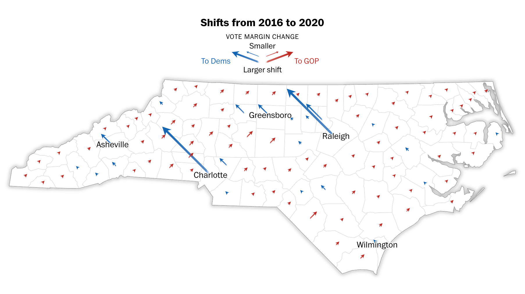
The Washington Post also takes a closer look at the battleground states in the upcoming U.S. presidential election, arguing that these states are not politically uniform. Analyzing trends from the past three presidential elections, they highlight specific voting blocs within each state that could play a crucial role in the final outcome.
The article dives into each of the seven battleground states individually, laying out the data as follows: first, a scatter line chart presents the margin of victory across the last three elections. Following this, a map shows vote margin shifts at the county level from 2012 to 2016, then from 2016 to 2020, using color-coded arrows to depict the direction and size of changes. Then, as you scroll, a detailed precinct-level bubble map displays the 2020 results by the winning margin. Finally, attention shifts to the specific regions in each state deemed most likely to influence the upcoming election.
Explore the analysis on The Washington Post, by Kati Perry, Dan Keating, and Aaron Blake.
Hidden Patterns in Folk Songs and Music Evolution
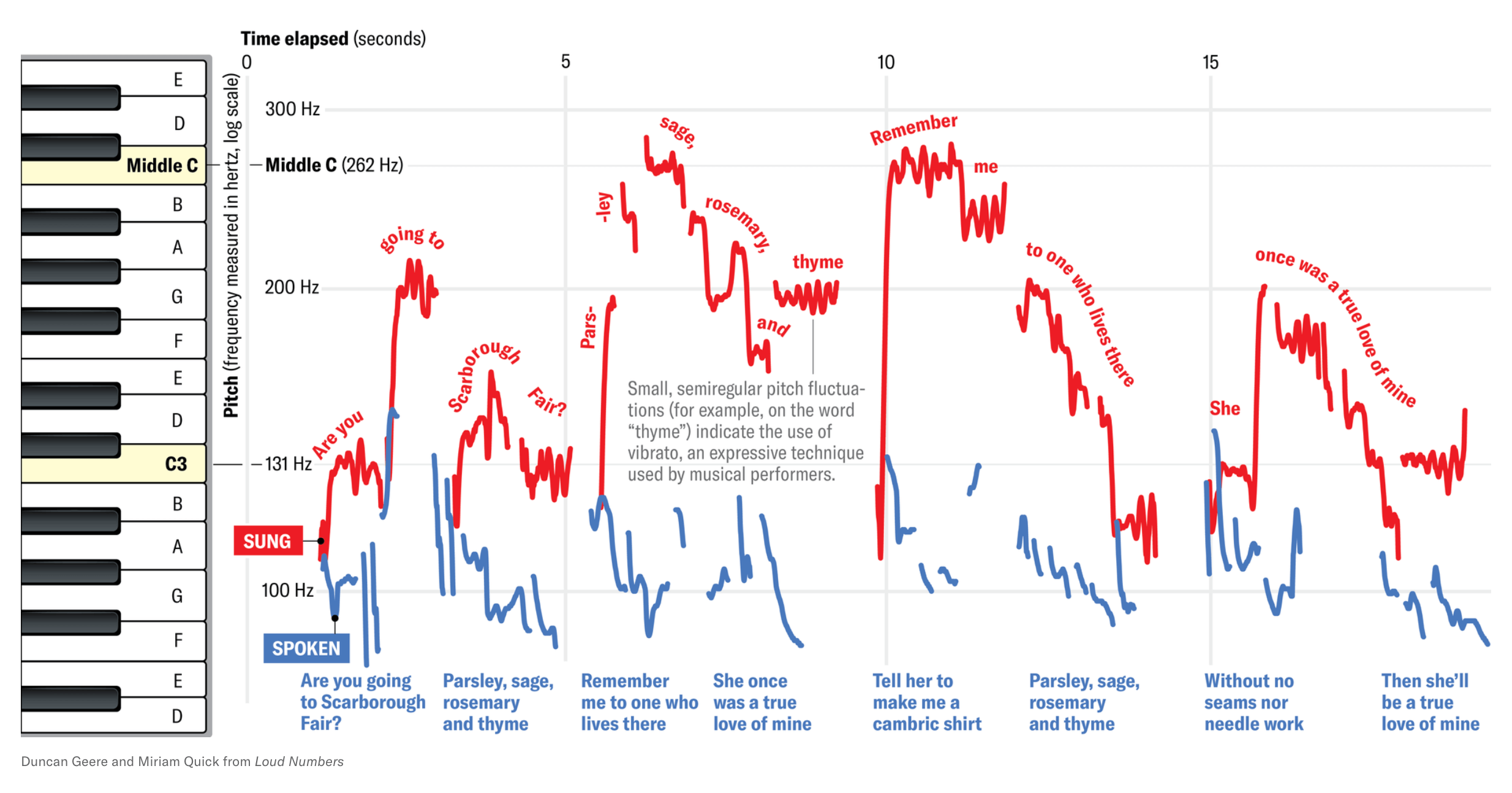
Last but not least, a recent chart illustrating the difference between song and speech patterns caught our attention this week, bringing us to a fascinating study on the evolution of music through folk songs.
Musicologist Yuto Ozaki of Keio University in Tokyo, together with a large international team of collaborators, analyzed traditional songs worldwide. Each of them, totaling 75 people speaking 55 languages, sang a song, spoke its lyrics, played an instrumental version of the melody, and provided an explanation of its meaning. This resulted in 300 audio recordings that were then examined to find out how parameters like pitch height, pitch stability, and tempo vary across these forms, allowing for cross-cultural comparisons.
Scientific American summarizes this research in a recent article by Allison Parshall, featuring visualizations by Duncan Geere and Miriam Quick from Loud Numbers. For example, the line chart shown above displays sung and spoken renditions of the English folk song “Scarborough Fair,” performed by study co-author Patrick Savage.
Check out the article on Scientific American, and find the original study in Science Advances.
Wrapping Up
That’s it for this week! Stay tuned for more examples of data-driven projects and stories that showcase how charts and maps can uncover meaningful insights from the data around us.
- Categories: Data Visualization Weekly
- No Comments »