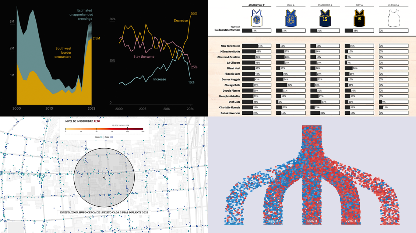
 We’re a bit behind schedule after last week’s big release of updates for our Qlik Sense extensions, including the transformative AI Splits feature in the Decomposition Tree. But finally, here we are with a fresh edition of DataViz Weekly! Check out the projects with charts and maps that stood out to us most lately:
- U.S. immigration trends in historical context — ProPublica
- Crime trends in Buenos Aires — LA NACION
- Evolution of NBA uniform colors — The Pudding
- Internal migration and political polarization in the United States — The Upshot
Data Visualization Weekly: October 25, 2024 — November 1, 2024
U.S. Immigration Trends in Historical Context
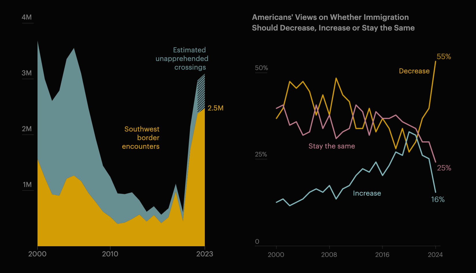
In recent years, the number of migrants crossing the U.S. border has surged. However, spikes have happened before. Today’s situation looks distinct due to changes in the origins and visibility of arrivals, as well as heightened public attention supported by political rhetoric.
ProPublica recently launched an investigative series delving into U.S. immigration trends. The opening story places current events in a historical context, featuring a series of insightful visualizations. Area and stacked area charts illustrate border encounters and unapprehended crossings, along with shifts in migrant origins. A column chart displays removals and releases by U.S. Customs and Border Protection. These graphics are based on data from the U.S. Department of Homeland Security. For additional context, line charts track job openings per unemployed person and public opinion on immigration, drawing from Gallup and U.S. Bureau of Labor Statistics data, respectively.
See the piece on ProPublica — by Mica Rosenberg and Jeff Ernsthausen, with graphics, design, and development by Lucas Waldron, Zisiga Mukulu, and Lena Groeger.
Crime Trends in Buenos Aires
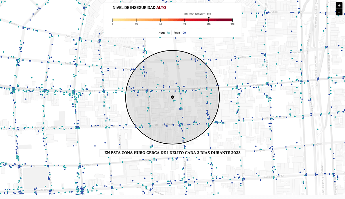
Is Buenos Aires truly an unsafe city? It depends on the metric. In 2023, the city reported Argentina’s highest rate of robberies and thefts. However, it remains one of Latin America’s safer cities in terms of homicides, with rates below the national average and a downward trend in intentional killings.
Argentinian newspaper LA NACION visualized reported crimes across the city in 2023 using the Buenos Aires government’s database, which records each incident with geolocation. An interactive dot map represents thefts and robberies citywide, allowing you to filter specific types (car thefts, armed robberies, and robberies with motorcycles). You can also check neighborhood safety by entering an address. In addition, the story includes line and column graphs along with spatial heat maps that illustrate recent trends across different crime categories since 2016.
Explore the article on LA NACION — by Nicolás Cassese with Florencia Fernández Blanco, Florencia R. Altube, Miguel Bevacqua, Fernando T. Ullmer, Pablo Loscri, Giselle Ferro, Gastón de la Llana, Héctor Villarino, Bruno Soifer, and Sofia Garcia Katz.
Evolution of NBA Uniform Colors
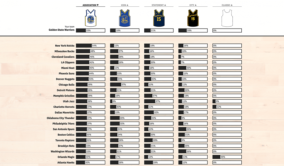
Once, NBA home teams typically wore white uniforms while away teams donned their primary colors. Since Nike became the NBA’s apparel outfitter in 2017, teams have enjoyed more flexibility in uniform choices, and the traditional “home whites” standard has largely disappeared.
The Pudding examines these changes through a variety of visualizations, comparing the 2023-2024 season to the 2013-2014 season. You can select a team to see how its uniform usage has changed over time, with data gathered from NBA.com’s LockerVision and historical imagery for earlier seasons.
Check out the story on The Pudding — by Tyler Machado.
U.S. Internal Migration and Political Polarization
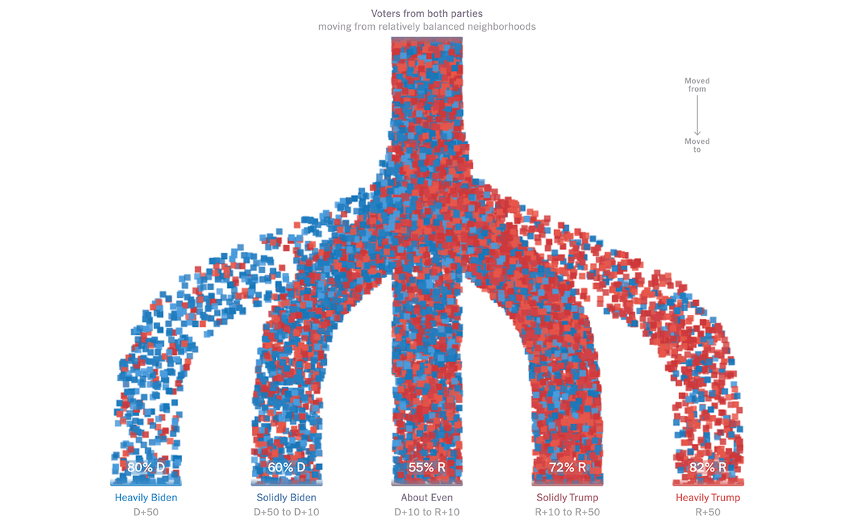
Just a few moments before Election Day in the U.S., we couldn’t avoid featuring a vote-related project in this DataViz Weekly. This one highlights an intriguing trend: how internal migration in the U.S. intensifies geographic political divides, a factor that could play a crucial role in the upcoming presidential election.
The New York Times’s The Upshot examines detailed voter registration data for millions of Americans who relocated since the 2020 presidential election, using records from L2. The analysis reveals that individuals moving from politically mixed neighborhoods tend to resettle in areas that align more closely with their views, widening the divide between predominantly blue and red areas nationwide. This trend is visualized with animated flow charts resembling vertical Sankey diagrams, where each path is composed of small red and blue squares, hinting at respective partisan proportions. Initially, the paths for Republican and Democratic movers are shown separately, then combined in a single, unified view.
Discover the piece on The Upshot — by Ronda Kaysen and Ethan Singer, produced by Ethan Singer and Rumsey Taylor, with additional work by Nate Cohn and Saurabh Datar.
Wrapping Up
These projects showcase the impact of well-designed data visuals in uncovering meaningful stories. Stay tuned for more handpicked examples in the next Data Visualization Weekly on our blog. And if you’re working with Qlik Sense, don’t miss our recent release with new powerful features, including AI Splits that brings unprecedented speed and precision to root cause analysis.
Have a great time!
- Categories: Data Visualization Weekly
- No Comments »