 Curious about what’s new and interesting in the world of data visualization? DataViz Weekly brings you a selection of projects with charts and maps that have caught our attention lately. Here’s what’s lined up this time:
- Threats of light and noise pollution to aquatic ecosystems — AquaPLAN
- 15-minute accessibility in urban areas — The Washington Post / Sony CSL
- Shifting popularity of “All I Want for Christmas Is You” — NBC News
- Taylor Swift’s Eras Tour resale ticket prices — The Economist
Data Visualization Weekly: December 6, 2024 — December 13, 2024
Threats of Light and Noise Pollution to Aquatic Ecosystems
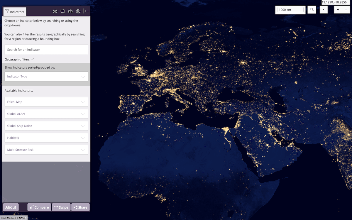
Artificial light and noise pollution disrupt aquatic life, interfering with behaviors like feeding and reproduction, and destabilizing ecosystems. This can pose significant risks to the balance of entire ecosystems and harm the health of water habitats.
The AquaPLAN project (Aquatic Pollution from Light and Anthropogenic Noise: Management of Impacts on Biodiversity), backed by the EU’s Horizon Europe initiative, created an interactive map showcasing the extent of light and noise pollution (LNP) across European aquatic environments. Led by Plymouth Marine Laboratory (PML) and reported as the first of its kind, the map allows you to explore how artificial light at night (ALAN) and human-made noise affect marine and freshwater ecosystems, providing layered data visualization. The project’s authors plan to include habitat maps in the future to assess cumulative risks, supporting the development of targeted biodiversity protection strategies.
Explore the AquaPLAN Visualization Portal.
15-Minute Accessibility in Urban Areas, in U.S. and Globally
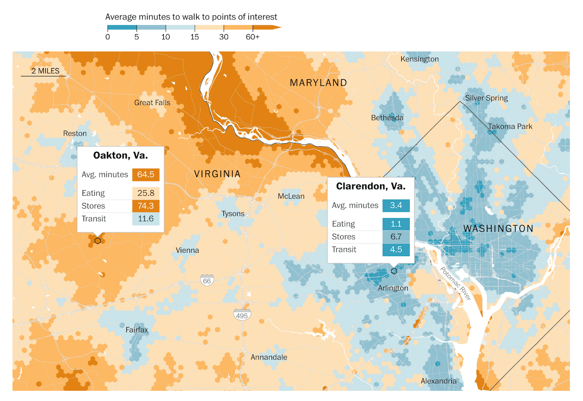
The concept of a 15-minute city envisions neighborhoods where essential amenities — like shops, schools, and parks — are within a 15-minute walk or bike ride. This approach seeks to minimize car use while enhancing local convenience.
The Washington Post made an interactive map showing walking access to critical services in 200 U.S. metro areas based on a study conducted by Sony’s Computer Science Lab (CSL) in Rome. The researchers analyzed walking times to key amenities using OpenStreetMap data, population statistics, and an open-source routing algorithm. The map color-codes neighborhoods in some 200 cities across the United States to indicate their proximity to nine categories of services. For global analysis, Sony’s own map visualizes accessibility in cities around the world, presenting data as hexagonal grids, with options to toggle between walking and cycling times for specific service types.
See the article by Harry Stevens on The Washington Post and Sony CSL’s interactive map here.
Shifting Popularity of “All I Want for Christmas Is You”
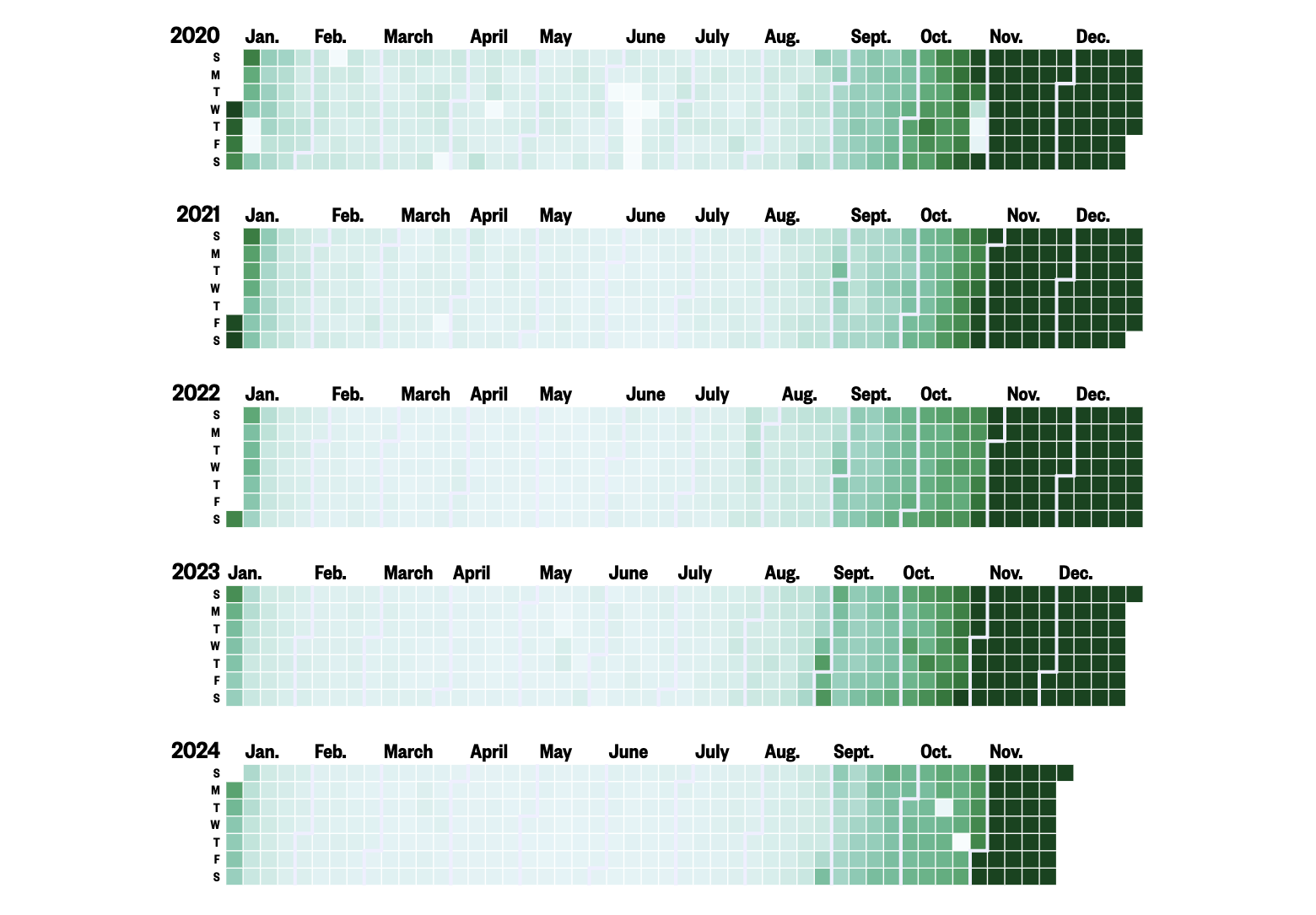
Mariah Carey’s iconic holiday hit, “All I Want for Christmas Is You,” has seen a decline in early-season playtime. Once steadily expanding its reach into October and November, the song’s listenership during these months has dropped noticeably.
NBC News highlights this shift by visualizing 20 years of data from Last.fm. Calendar heatmaps illustrate daily play percentages since 2005, revealing the song’s gradual rise in popularity beyond December starting in the 2010s and capturing its further evolving seasonal dynamics. Line charts detail its decline in October and November streams.
Discover the piece by Joe Murphy on NBC News.
Taylor Swift’s Eras Tour Resale Ticket Prices
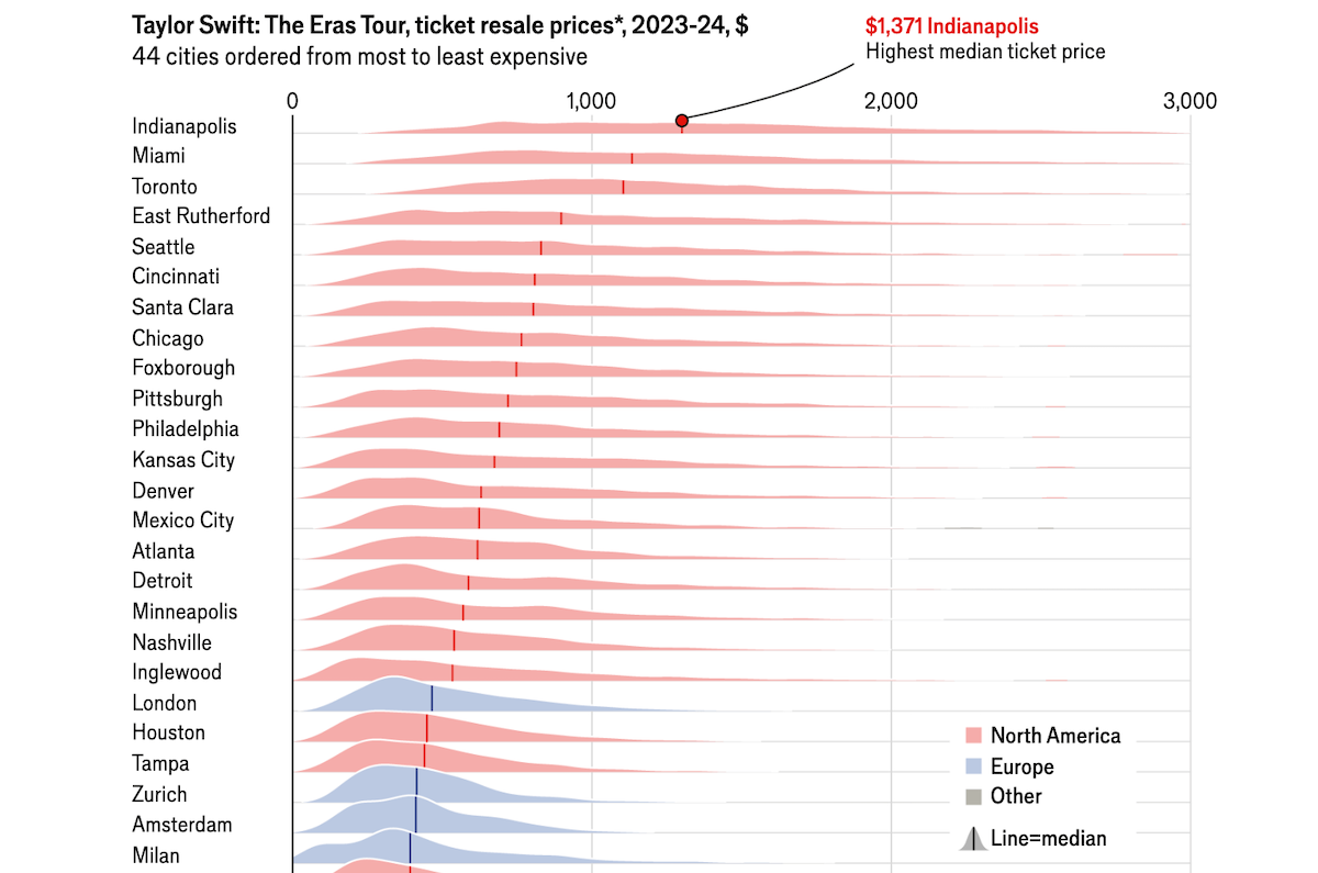
Taylor Swift’s Eras Tour has set unprecedented records, selling over 10 million tickets and becoming the first tour to gross over $1 billion, with final earnings expected to double that. Despite initial criticism over ticket prices, resale data reveals fans were willing to pay significantly more than face value.
The Economist used a density plot based on SeatData.io data to visualize ticket resale prices for Taylor Swift’s Eras Tour across 44 cities. Each area chart-like distribution includes a vertical line marking the median price. The average resale ticket in Europe costs $385, less than half the price in America and Canada.
Check out the article on The Economist.
Wrapping Up
Hope you enjoyed exploring these visualizations and found them interesting! If you’ve come across or created some great charts or maps, feel free to share them with us. Stay tuned for more on DataViz Weekly!
- Categories: Data Visualization Weekly
- No Comments »