 We’re back with DataViz Weekly, where we showcase some of the best new data visualization examples — from individual charts and maps to full-scale visual stories and projects. Take a look at our latest picks:
- Swiss research funding — Colas Droin
- Education and voting patterns in U.S. presidential elections — Jon Boeckenstedt
- City walkability and improvement potential — The Economist & Matteo Bruno et al.
- Self-censorship in Super Bowl halftime shows — Artur Galocha for The Washington Post
Data Visualization Weekly: February 7, 2025 — February 14, 2025
Swiss Research Funding
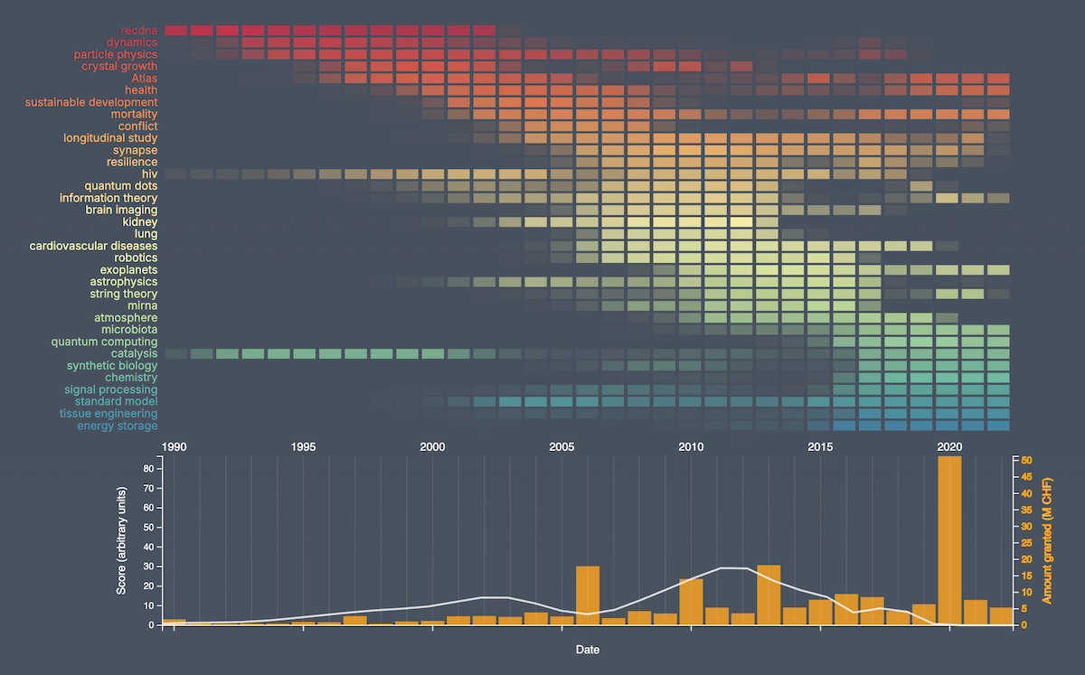
Public funding plays an important role in advancing scientific research, ensuring that researchers have the resources they need to explore new ideas and drive innovation. In Switzerland, the Swiss National Science Foundation (SNSF) is a key institution supporting researchers across disciplines.
Geneva-based data scientist Colas Droin offers an interactive data-driven look at SNSF research grants awarded in 2024 and over time. Through a scrollytelling format, the project begins with bubbles visualizing how grants are distributed by funding type and scientific discipline, followed by bar (column) charts breaking down total funding and grant counts per discipline. A choropleth map displays the geographical distribution of grants across Switzerland, with filters for field, type, and year (1975–2024). Finally, a heatmap paired with a line-and-column combo chart tracks the evolution of research topics since 1990, highlighting over-time shifts in scientific priorities based on keyword analysis of awarded grants.
Check out the project on Colas Droin’s website, based on data from the SNSF Data Portal.
Education and Voting Patterns in U.S. Presidential Elections
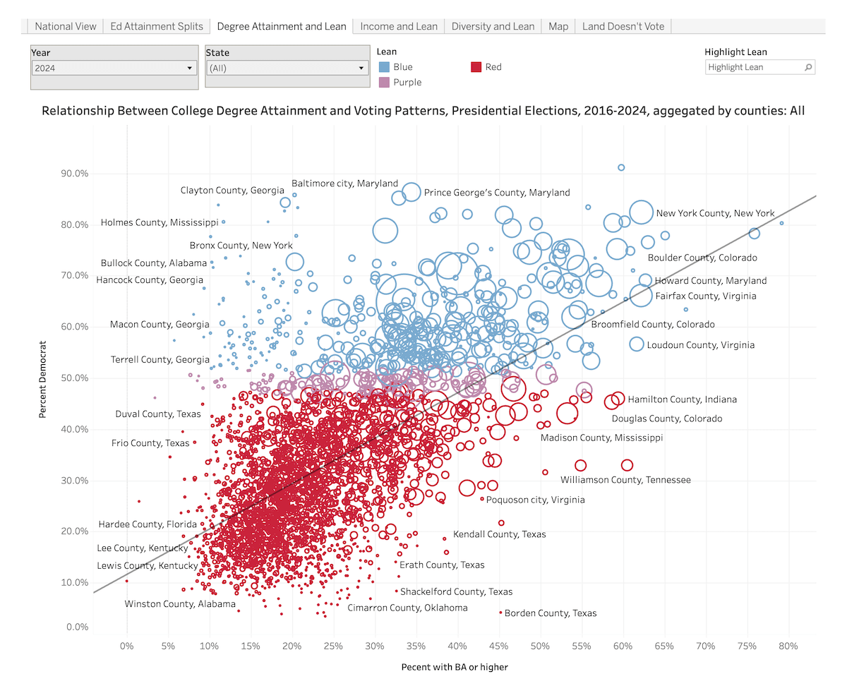
Education levels have long been linked to voting behavior in the United States, with counties that have higher rates of bachelor’s degree attainment tending to vote Democratic. But how strong is this relationship, and has it remained consistent across recent elections?
Jon Boeckenstedt, Vice Provost of Oregon State University, presents an interactive analysis of county-level election results from 2016, 2020, and 2024, focusing on the connection between educational attainment and political preferences. Column charts are used to summarize national voting patterns and provide a breakdown by education level. Scatter plots depict correlations between vote share and college degree attainment, and then also income and diversity. Choropleth maps show a county-by-county breakdown of political leanings and illustrate how population density complicates geographic voting patterns. Data sources include election results compiled by Tony McGovern, U.S. Census Bureau statistics, and Simpson’s Diversity Index.
Explore the visuals on Higher Ed Data Stories by Jon Boeckenstedt.
City Walkability and Improvement Potential
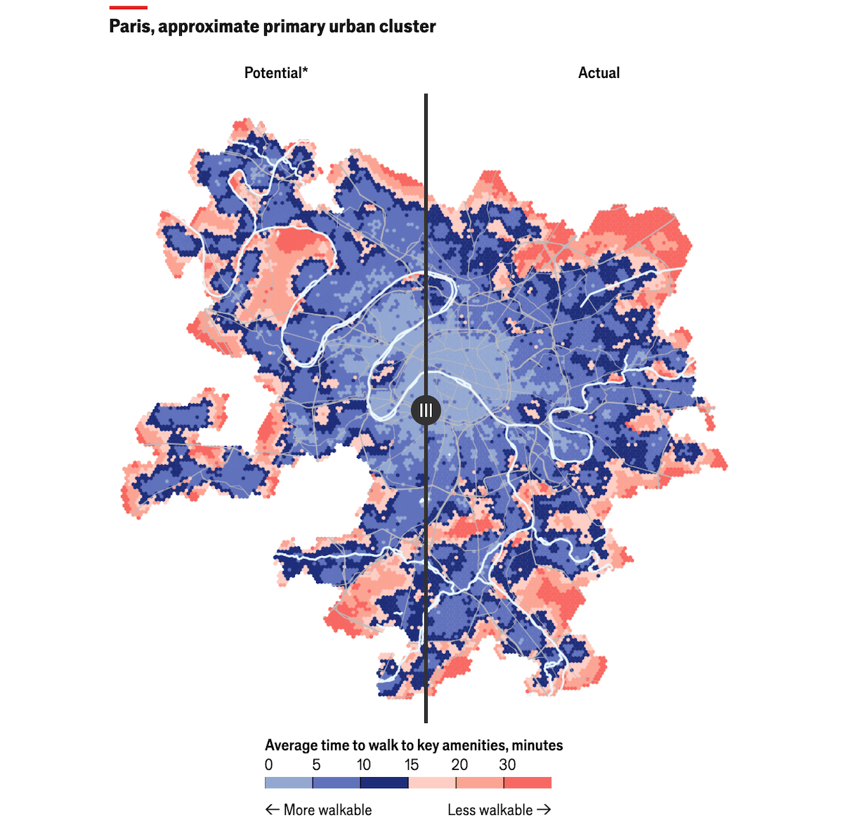
Walkability is a key factor in urban quality of life, influencing accessibility, sustainability, and public health. Some cities already function as “15-minute cities,” where most daily necessities are within walking distance. But even the most pedestrian-friendly places have room for improvement.
The Economist highlights a study by Matteo Bruno and colleagues at Sony Computer Science Laboratories in Rome, which analyzes walkability in over 10,000 cities worldwide and explores how redistributing amenities could further enhance it. A sliding map visualization in the article illustrates how Paris could improve if key services were optimally relocated, allowing for a clear comparison between its current and potential walkability.
See the article on The Economist and explore the full study — packed with even more visualizations — on Nature Cities or arXiv.
Self-Censorship in Super Bowl Halftime Shows
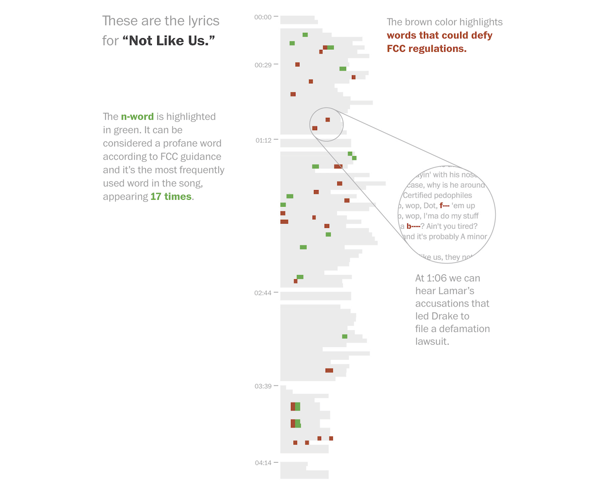
Performing at the Super Bowl halftime show is a major milestone for any artist. But with the event broadcast live, lyrics must comply with Federal Communications Commission (FCC) regulations to avoid violations. This often means artists have to self-censor their songs.
Ahead of Super Bowl LIX, The Washington Post’s Artur Galocha analyzed which words and phrases Kendrick Lamar would likely need to modify in his track “Not Like Us” to meet FCC guidelines. The article features visualizations highlighting potentially problematic lyrics, alongside a look back at how artists — including Lamar — adjusted their performances for the 2022 halftime show.
Check out the piece on The Washington Post.
Wrapping Up
We found these data viz projects particularly engaging this week, and we hope you did too. More great examples of charting and mapping coming your way in the next Data Visualization Weekly!
- Categories: Data Visualization Weekly
- No Comments »