 Our JavaScript charting library, Qlik Sense extensions, and other products give you the flexibility to visualize data how, where, and when you need. But making a chart or map truly effective — whether for exploration or explanation — is an art of its own. That is why we run DataViz Weekly: to share a selection of significant examples we have recently encountered, showcasing how others tackle visualization challenges across different contexts and datasets.
Here are some new examples — take a closer look and see what insights they might inspire:
- All books in the ISBN space — phyresky
- Germany’s 2025 federal election — The New York Times (and more)
- Baby boom in 7 charts — Our World in Data
- School shootings in America — Mohamad Waked
Data Visualization Weekly: February 21, 2025 — February 28, 2025
All Books in ISBN Space
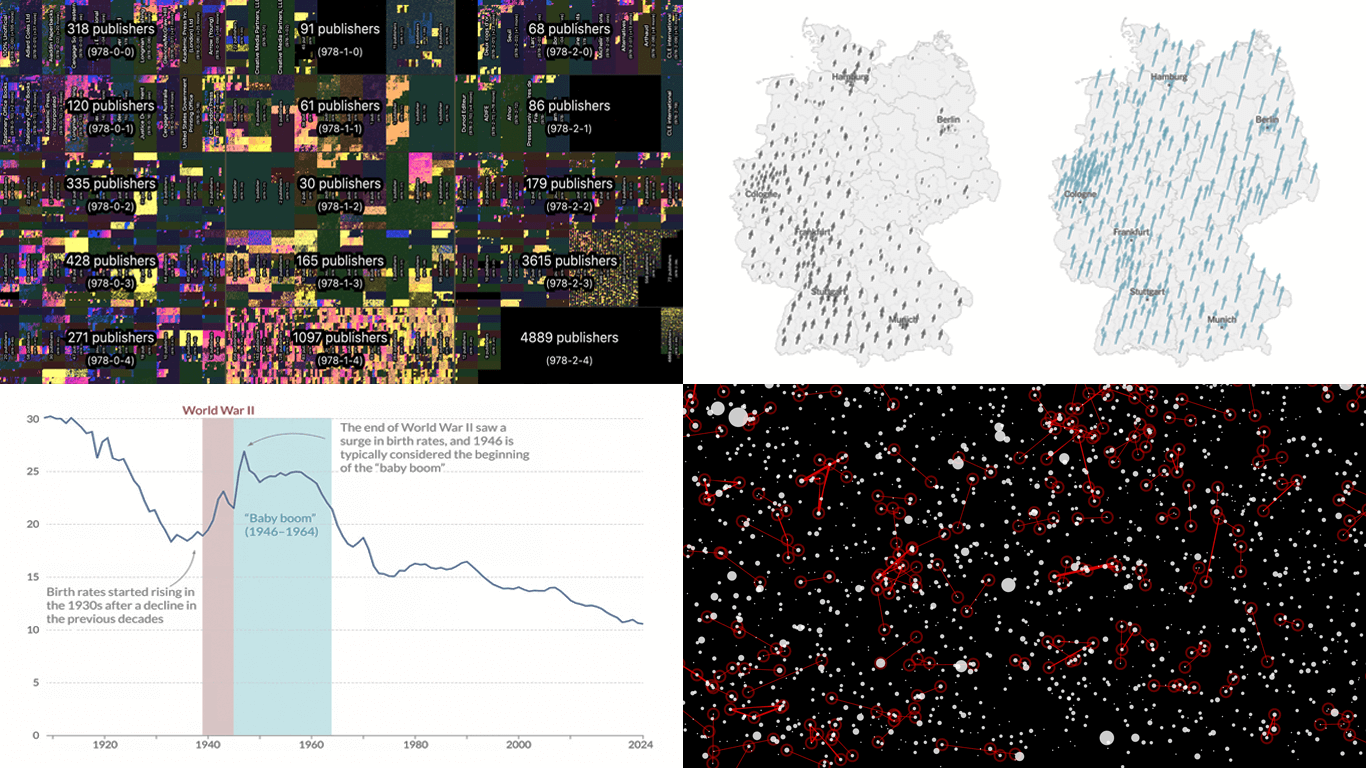
Anna’s Archive recently hosted a competition inviting participants to create compelling visualizations of its data representing the ISBN space. Winners were announced a few days ago, featuring several intriguing projects.
First place went to Phiresky’s project, which presents all possible ISBNs in a structured visual format. The interactive display lets you explore different datasets, search for specific books, filter by publication year, and personalize the presentation using custom shaders and dataset combinations. It functions like a navigable map — drag and zoom to adjust the view, and click on an ISBN to see details. At the deepest zoom level, pixels take on a book-like appearance, creating a bookshelf effect.
Check out ISBN Visualization and read more about it on phiresky’s blog. See other winning entries on Anna’s Blog.
Germany’s 2025 Federal Election
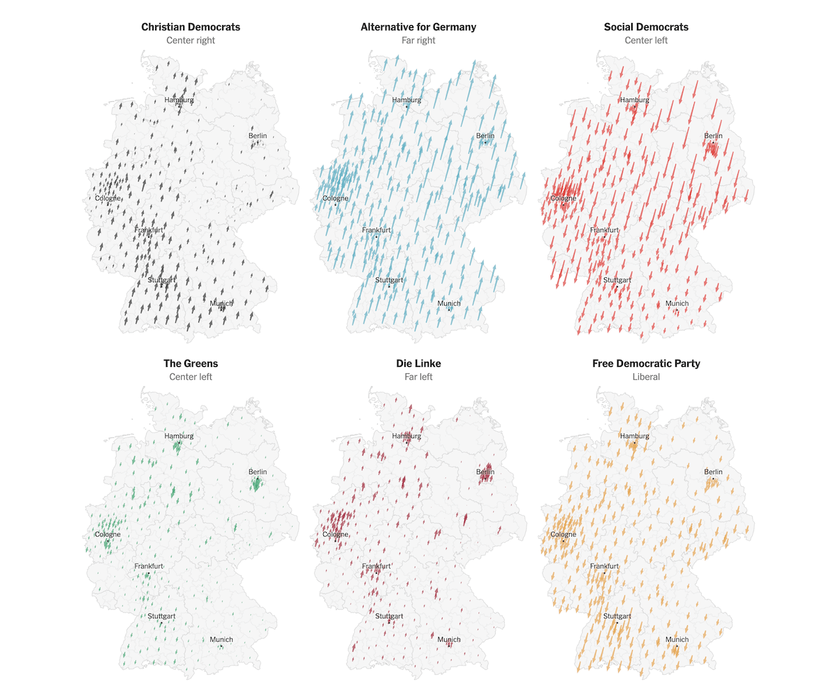
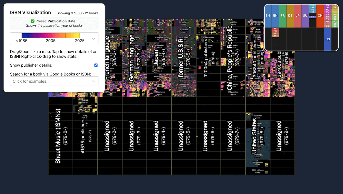
The 2025 German federal election results reflect notable shifts in political preferences across Germany. Voting patterns varied across regions, with different parties gaining or losing support to different extents.
The New York Times visualizes these shifts with arrow maps, showing where each party’s vote share rose or fell compared to the 2021 general election. Additional maps and charts further break down voting patterns, present seat distribution and coalition possibilities, and highlight the AfD’s growing influence alongside the economic disparities shaping political divisions. The visuals are based on data from the Federal Returning Officer.
Explore the full analysis on The New York Times, by Martín González Gómez, Ilana Marcus, Jasmine C. Lee, Christopher F. Schuetze, Josh Holder, and Agnes Chang.
And look at how others visualize Germany’s 2025 election results, such as:
- BBC: Five Key Takeaways from the German Election
- Bloomberg: German Federal Election Results
- Berliner Morgenpost: German Federal Election 2025 in Berlin: How Your Neighborhood Voted and This Is How Germany Voted
- Deutsche Welle: German Election Results Explained in Graphics
- Financial Times: German Federal Election 2025: What’s at Stake?
- elDiario.es: Who Voted for Each Party in Germany: Ten Graphs on Voting by Age, Gender, Geography, and Social Class and Election Results in Germany, District by District
- The Guardian: German Election 2025: Results in Full
- Neue Zürcher Zeitung: Historically Weak Result: The Social Democrats Lose Their Voters to the Union and With These Parties, the Union Could Fulfill the Most Election Promises
- POLITICO: German Election 2025
- Reuters: Live German Election Results
- Der Spiegel: This Is What the New Bundestag Looks Like, German Federal Election 2025
- Süddeutsche Zeitung: The Election Results in Data and Graphics
- Tagesschau: Which Coalition Could Govern Germany?
- Der Tagesspiegel: German Federal Election 2025: All Election Results in Germany on a Map and German Federal Election 2025: All Election Results and Coalition Options
- Die Tageszeitung: Governing Without a Majority
- Die Zeit: These 630 People Were Elected to the Bundestag, All Results from the Electoral Districts, and All Election Results in Berlin-Mitte
- ZDF: How the Electoral Districts Voted
Baby Boom in 7 Charts
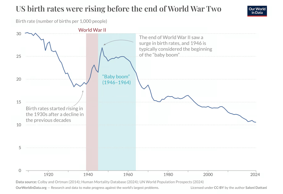
Following World War II, the United States experienced a baby boom — an era of sharply rising birth rates often defined as spanning 1946 to 1964. However, the increase started earlier, and one striking aspect is that similar trends occurred across multiple countries at the same time.
Our World in Data explores key data on the baby boom through seven charts, highlighting its main patterns. The first chart, shown above, illustrates how birth rates in the U.S. began rising in the late 1930s, surged at the end of the war, and continued increasing for decades. Another visualization extends the perspective globally, comparing birth rates across 15 high-income countries, including the U.S. The other charts examine factors that influenced the baby boom, such as marriage trends and maternal age at childbirth, offering a broader view of this demographic shift. Data is taken from the Human Fertility Database and other sources.
Discover the article on Our World in Data, by Saloni Dattani and Lucas Rodés-Guirao.
School Shootings in America
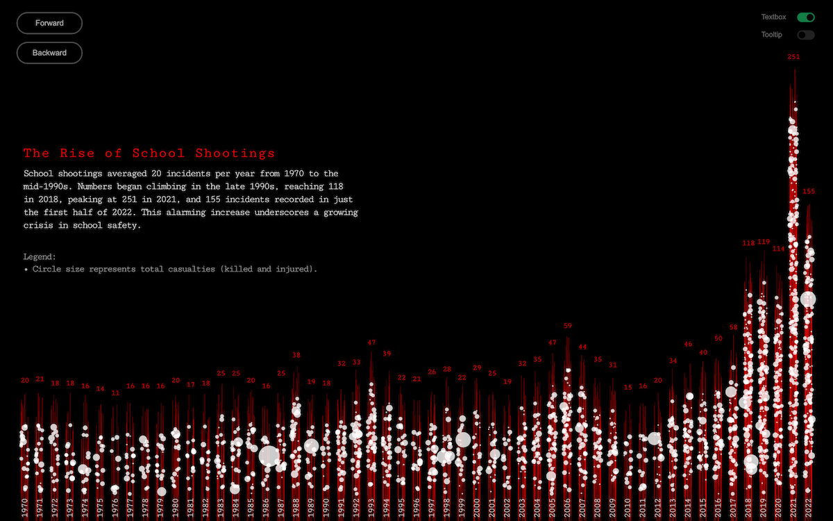
Between January 1970 and June 2022, over 2,000 shooting incidents occurred at K-12 schools in the United States, averaging just under 40 per year. Beyond the numbers, these tragedies leave lasting scars on families and communities.
Mohamad Waked visualizes decades of school shooting data from the Center for Homeland Defense and Security (CHDS) in an interactive format. Opening with an emotional story, the project transitions into a data-driven exploration where circles represent individual incidents, with size indicating total casualties. As you keep going, new layers of data emerge — differentiating fatalities and injuries, detailing demographics, revealing geographic patterns, and more. The result is a progressively deeper exploration of this devastating issue.
See the Wake Up project.
Wrapping Up
That wraps up this edition of Data Visualization Weekly. As always, we hope these examples provide useful insights and inspiration for your own work.
Stay connected for more visual brilliance!
- Categories: Data Visualization Weekly
- No Comments »