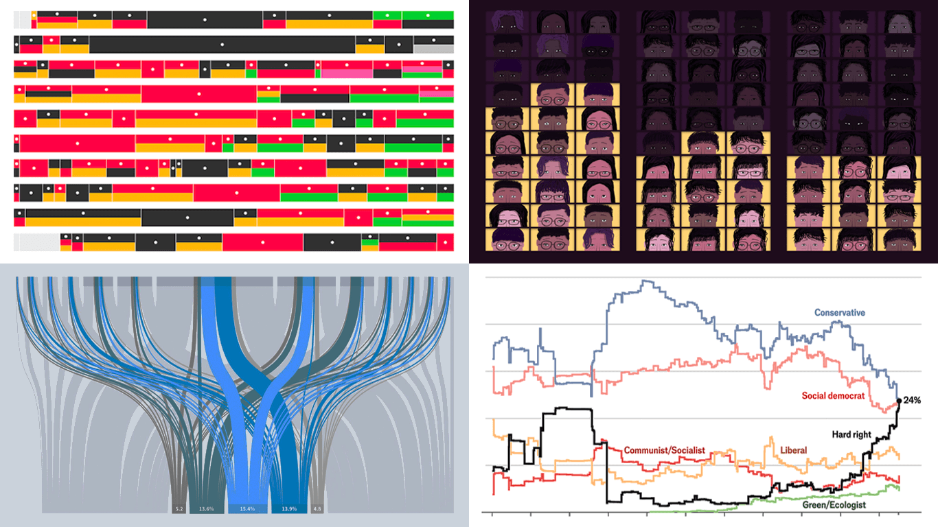
 Data visualization is powerful — when done right, it conveys meaning clearly and helps insights emerge naturally. We continue DataViz Weekly, where we regularly highlight some excellent examples from around the web, offering a firsthand look at how graphical representation can effectively reveal and clarify information. This time, we think you just need to see the following:
- U.S. imports and tariffs — Reuters
- Coalition scenarios in Germany — Bloomberg
- Hard-right parties in Europe — The Economist
- Emotional experiences of middle schoolers — The Pudding
Data Visualization Weekly: February 28, 2025 — March 7, 2025
U.S. Imports and Tariffs
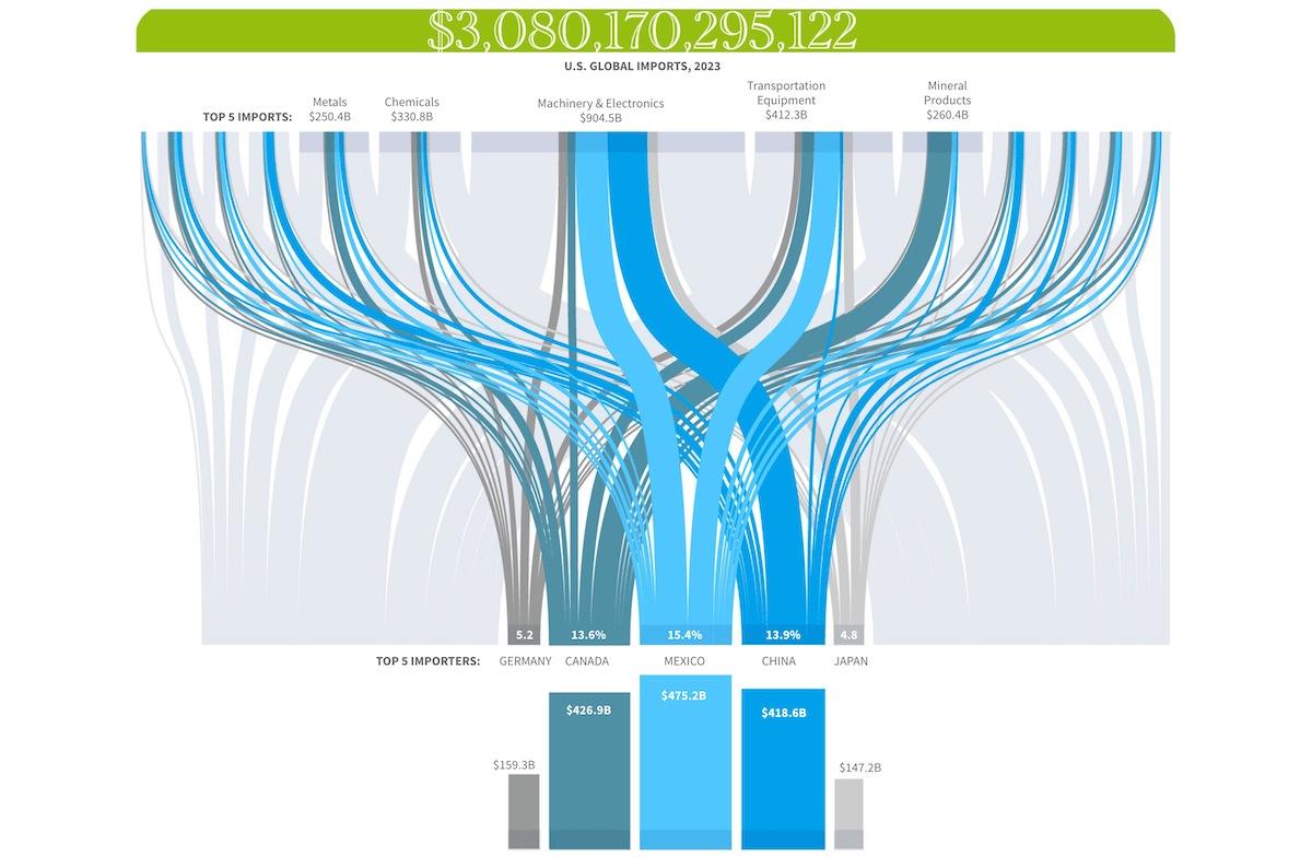
Tariffs have become a hot topic again in light of Donald Trump’s expressed intentions to impose sweeping duties on foreign goods. With some measures already being implemented, U.S. trade policy is back in focus, raising questions about the country’s imports and the potential economic effects of these decisions.
Reuters offers a data-driven overview of America’s trade landscape and the potential impacts of new tariffs through a series of compelling visualizations. The article opens with a Sankey diagram mapping U.S. global imports in 2023 — totaling over $3 trillion — highlighting the top five trading partners along with the leading import categories. The analysis continues with charts that provide both a broad view, such as imports, tariffs, and inflation over time, and granular insights into aspects like breakdowns of imports from Mexico, China, and Canada, as well as survey data on how consumers and businesses might respond to new tariffs. The visuals draw from a wide range of data sources.
Explore the story on Reuters, by Sarah Slobin and Howard Schneider.
Coalition Scenarios in Germany
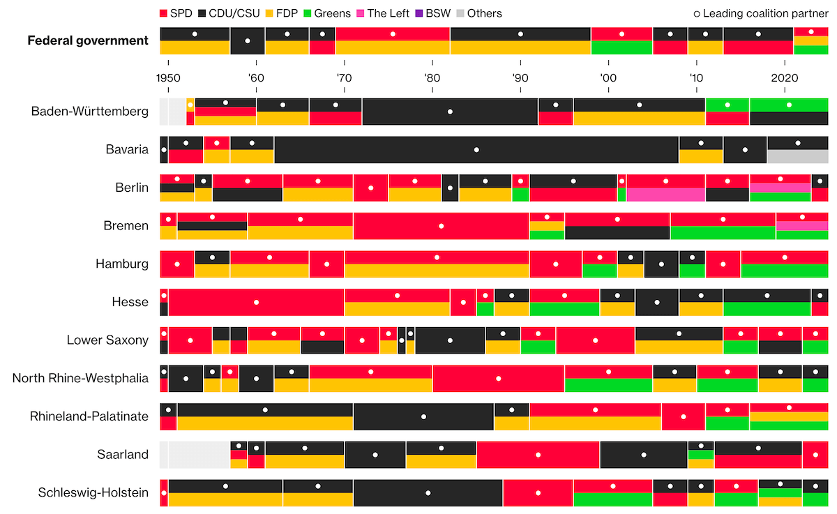
In the previous edition of DataViz Weekly, we shared several projects visualizing the results of Germany’s 2025 federal election. Now it is time to look ahead — specifically, at the possible coalitions that could form a governing majority in the Bundestag.
Bloomberg offers an interactive exploration of coalition options based on the final seat distribution. It begins with a historical perspective on federal government coalitions, then moves on to the current results, examining which party combinations could surpass the 316-seat majority threshold. Next, seven possible coalition scenarios are visualized, allowing you to see at a glance whether each would secure a majority: Grand Coalition, Kiwi, Kenya, Black-Blue, Red-Green, Red-Red, and Red-Red-Green. The project closes with a striking timeline that illustrates coalition histories across Germany’s 16 federal states.
Check out the piece on Bloomberg Politics, by Tom Fevrier.
Hard-Right Parties in Europe
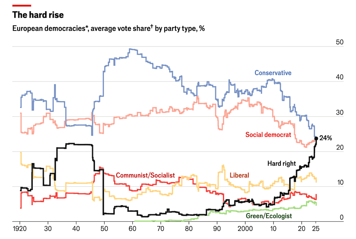
Recent election results across Europe reflect notable shifts in political preferences, with hard-right parties gaining more support in several countries. However, this growing vote share has not consistently translated into equivalent representation in governments, where such parties often remain excluded from power.
The Economist analyzes these dynamics through several visualizations. Two stepped line charts track how hard-right parties’ vote share has increased over time while their presence in governments remains comparatively limited. Additional visuals include a choropleth map showing where support is strongest, and a scatter plot examining the relationship between hard-right vote share and the proportion of foreign-born populations. The analysis is based on data from multiple sources, including Our World in Data, ParlGov, and The PopuList.
See the article in the Graphics Detail section on The Economist.
Emotional Experiences of Middle Schoolers
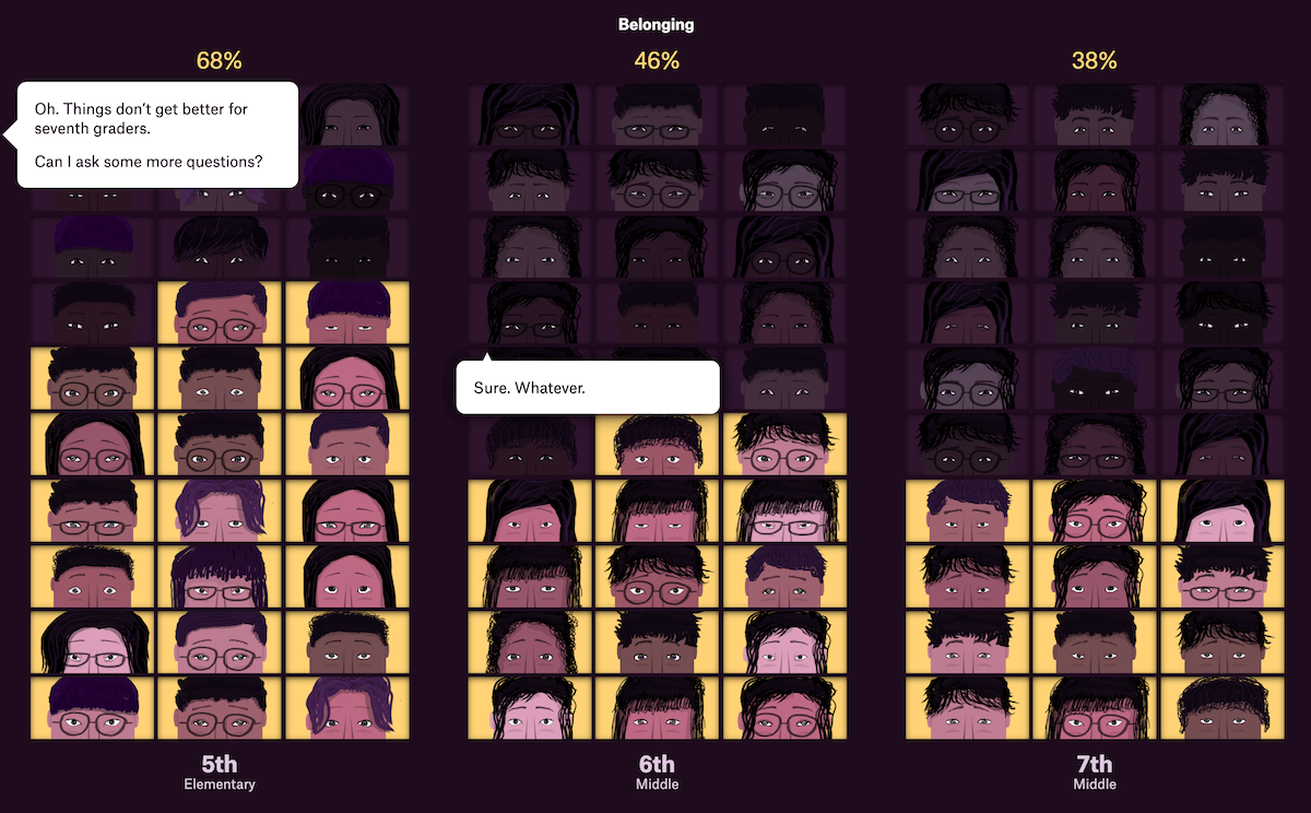
Middle school can be an emotionally challenging period. Student experiences are often captured in abstract statistics, but a new project takes a uniquely human approach.
The Pudding published a story by Alvin Chang that creatively visualizes survey data from Panorama Education, using expressive illustrated faces to represent the feelings of middle school students. Rather than traditional charts, this interactive storytelling format unfolds as if you’re speaking directly with the kids onscreen, effectively conveying the voices of around 40 million students surveyed over the past 3 years.
Discover the project on The Pudding, and check out Alvin Chang’s behind-the-scenes notes on his blog Big Charts.
Wrapping Up
These visualizations demonstrate how effectively graphics can drive meaningful insights. Stay connected for more inspiration in upcoming editions of Data Visualization Weekly!
- Categories: Data Visualization Weekly
- No Comments »