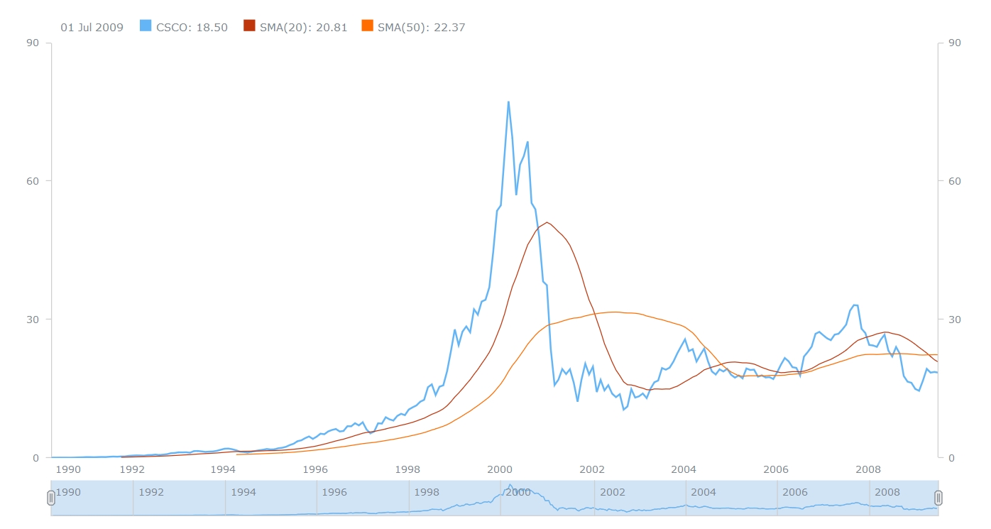
In this post, you will find a recap of the data visualizations that we have shared with you this week on AnyChart Facebook Page and in Twitter. One of them is a JavaScript Stock Chart by AnyChart:
- Here’s Everyone Who’s Immigrated to the U.S. Since 1820 – From 1820 to 2013, 79 million people obtained lawful permanent resident status in the United States. The interactive map by Metrocosm visualizes all of them based on their prior country of residence. The brightness of a country corresponds to its total migration to the U.S. at the given time.
- How Kobe’s game worked (and how it didn’t) – These nice charts by Los Angeles Times illustrate the different playing styles of some of the NBA’s top players. The charts break down the court into hexagonal areas, then calculate the difference between the league average and the player’s shooting percentage. The hexagon sizes are proportional to the number of shots the player took in that area. You can also see a related data visualization showing
” target=”_blank”>every shot Kobe Bryant ever took
. - World population living in extreme poverty, 1820-2015 – Extreme poverty is defined as living at a consumption (or income) level below 1.90 “international $” per day. See this interactive visualization and find out what part of the world’s population lives like that and how the situation has changed since 1820.
- A JavaScript Stock Chart with SMA by AnyChart – This interactive Stock Chart was created with AnyStock (AnyChart Stock and Financial Charts) – our JavaScript-based financial charting solution. Here, the Simple Moving Average (SMA) technical indicator is used, which is on of the most popular technical analysis tools in trading. You can also see the list of supported technical indicators and AnyStock Gallery.
- Categories: AnyChart Charting Component, AnyStock, HTML5, JavaScript, News
- No Comments »
