20+ Years of Advancing Data Visualization: Interview with Our CEO
February 5th, 2025 by AnyChart Team Unicorns Journal just published an interview with our CEO and co-founder, Anton Baranchuk, where he reflects on AnyChart’s journey from a small startup to a global leader in data visualization, trusted by enterprises worldwide.
Anton talks about how we got started, the transition from Flash to JavaScript charting, our work with Qlik, and the vision and values that continue to drive us forward.
- Categories: AnyChart Charting Component, AnyGantt, AnyMap, AnyStock, Big Data, Blogroll, Books, Business Intelligence, Dashboards, Financial Charts, Flash Platform, Gantt Chart, GraphicsJS, HTML5, JavaScript, News, Oracle Apex, Qlik, Stock Charts, Success Stories
- No Comments »
Reflecting on 2024 and Embracing 2025 — Happy New Year!
January 9th, 2025 by AnyChart Team Another remarkable year is officially in the books! Here at AnyChart, 2024 was a truly rewarding journey marked by innovation and impact:
- Named Best Tech in Data Analytics & Visualization — once again!
- Enhanced our JavaScript charting library with exciting new features and tweaks, particularly in Timeline, Waterfall, and Circle Packing charts — plus multiple custom solutions tailored to your specific needs.
- Thrived in the Qlik ecosystem with transformative updates for our extensions for Qlik Sense, rocking Qlik Connect in Orlando, and more — explore our 2024 highlights as Qlik’s Technology Partner.
As we step into 2025, we remain committed to pushing the boundaries of data visualization and analytics, ensuring you always have the tools you need to excel and succeed. Here’s to an even greater year ahead — happy 2025, and stay tuned for what’s coming next!
- Categories: AnyChart Charting Component, AnyGantt, AnyMap, AnyStock, Big Data, Blogroll, Business Intelligence, Charts and Art, Dashboards, Financial Charts, Gantt Chart, HTML5, JavaScript, News, Qlik, Stock Charts
- No Comments »
27 Election Maps of 2024 U.S. Presidential Vote Results — DataViz Weekly Special Edition
November 8th, 2024 by AnyChart Team The 2024 U.S. presidential election has concluded, and media outlets worldwide are offering a plethora of data graphics to convey the election results. In this special edition of DataViz Weekly, we’ve curated a collection of over twenty election maps, showcasing diverse ways to represent voting data — cartograms, choropleth maps, bubble maps, and more. Whether you’re a data enthusiast, professional, or simply intrigued by the 2024 election outcomes, explore the latest U.S. election maps from top media!
💡 Also see our previous special editions with election maps: 2020 U.S. election maps and 2024 UK election maps.
- Categories: AnyMap, Dashboards, Data Visualization Weekly
- No Comments »
Introducing AnyChart 8.13.0 for Elevated JavaScript Charting Experience
October 3rd, 2024 by AnyChart Team AnyChart 8.13.0 is now available, bringing a set of new features and improvements designed to further elevate your data visualization experience. In this release, we’ve focused on enhancing the Timeline, Waterfall, and Circle Packing charts in our JavaScript charting library, making them even more flexible and user-friendly. Read on to explore what’s new!
- Categories: AnyChart Charting Component, AnyGantt, AnyMap, AnyStock, Big Data, Business Intelligence, Dashboards, Financial Charts, Gantt Chart, HTML5, JavaScript, News, Stock Charts
- No Comments »
AnyChart Triumphs Again: Awarded Best in Data Analytics and Visualization in 2024
February 19th, 2024 by AnyChart Team We are delighted to announce that AnyChart has won the prestigious 2024 DEVIES Awards in the Data Analytics & Visualization category, marking our victory for the second consecutive year!
The award celebrates our JavaScript charting library, continuously acknowledged as the world’s leading data visualization solution for developers. As AnyChart JS forms the cornerstone of our broader product line, this recognition once again highlights the technological excellence and innovation inherent in our entire suite of offerings, including the extensions for Qlik Sense.
- Categories: AnyChart Charting Component, AnyGantt, AnyMap, AnyStock, Big Data, Blogroll, Business Intelligence, Dashboards, Financial Charts, Gantt Chart, HTML5, JavaScript, News, Oracle Apex, Qlik, Stock Charts, Success Stories
- No Comments »
Remembering 2023, Welcoming 2024
January 10th, 2024 by AnyChart Team Happy New Year! As the last echoes of festive celebrations fade away and we dive into the adventures of 2024, let’s bid a final farewell to 2023 by reflecting on its best moments.
For us at AnyChart, it was a remarkable year:
- Celebrated our 20th anniversary — indeed, we’ve been innovating since 2003.
- Awarded as the Best in Data Analytics & Visualization.
- Introduced more cool features and tweaks to our JavaScript charting library and other solutions.
- Launched new powerful extensions for Qlik Sense, with the Decomposition Tree taking center stage — join us in reviewing our year in the Qlik ecosystem.
- Reached some noteworthy milestones — now boasting over 80 JS charting tutorials on our blog, our Android charting library gleaming with over 2K stars on GitHub, and our social media family expanded to over 20K followers.
Looking ahead, our dedication remains unwavering: to empower your data viz and analytics journey with new and better tools. Thank you for growing with us, and cheers to your continued success, brighter and bolder in 2024!
- Categories: AnyChart Charting Component, AnyGantt, AnyMap, AnyStock, Big Data, Blogroll, Business Intelligence, Charts and Art, Dashboards, Financial Charts, Gantt Chart, HTML5, JavaScript, News, Qlik, Stock Charts
- No Comments »
How to Build Point Map with JavaScript
December 22nd, 2023 by Awan Shrestha If you’re a budding developer or data enthusiast eager to explore map creation, you’re in the right place. In this tutorial, I’ll guide you through how to easily build an interactive point map using JavaScript.
To make things even more interesting, I’ll use data on the number of millionaires in cities as an example. By the end of this tutorial, you’ll have made a visually stunning JS point map, ready to tell the story of the world’s wealthiest cities and a solid understanding of applying these skills to any data and scenarios. And stick around for a bonus at the end — I’ll also show you how to transform your point map into a bubble map where the size of the markers conveys additional information.
Ready to master the JS point mapping technique? Let’s get started, and don’t forget to join me in the bonus section where size matters!
Read the JS charting tutorial »
- Categories: AnyChart Charting Component, AnyMap, Big Data, HTML5, JavaScript, JavaScript Chart Tutorials, Tips and Tricks
- No Comments »
Unwrapping Enhanced Interactivity for Calendar and Circle Packing Charts in AnyChart 8.12.0
December 7th, 2023 by AnyChart Team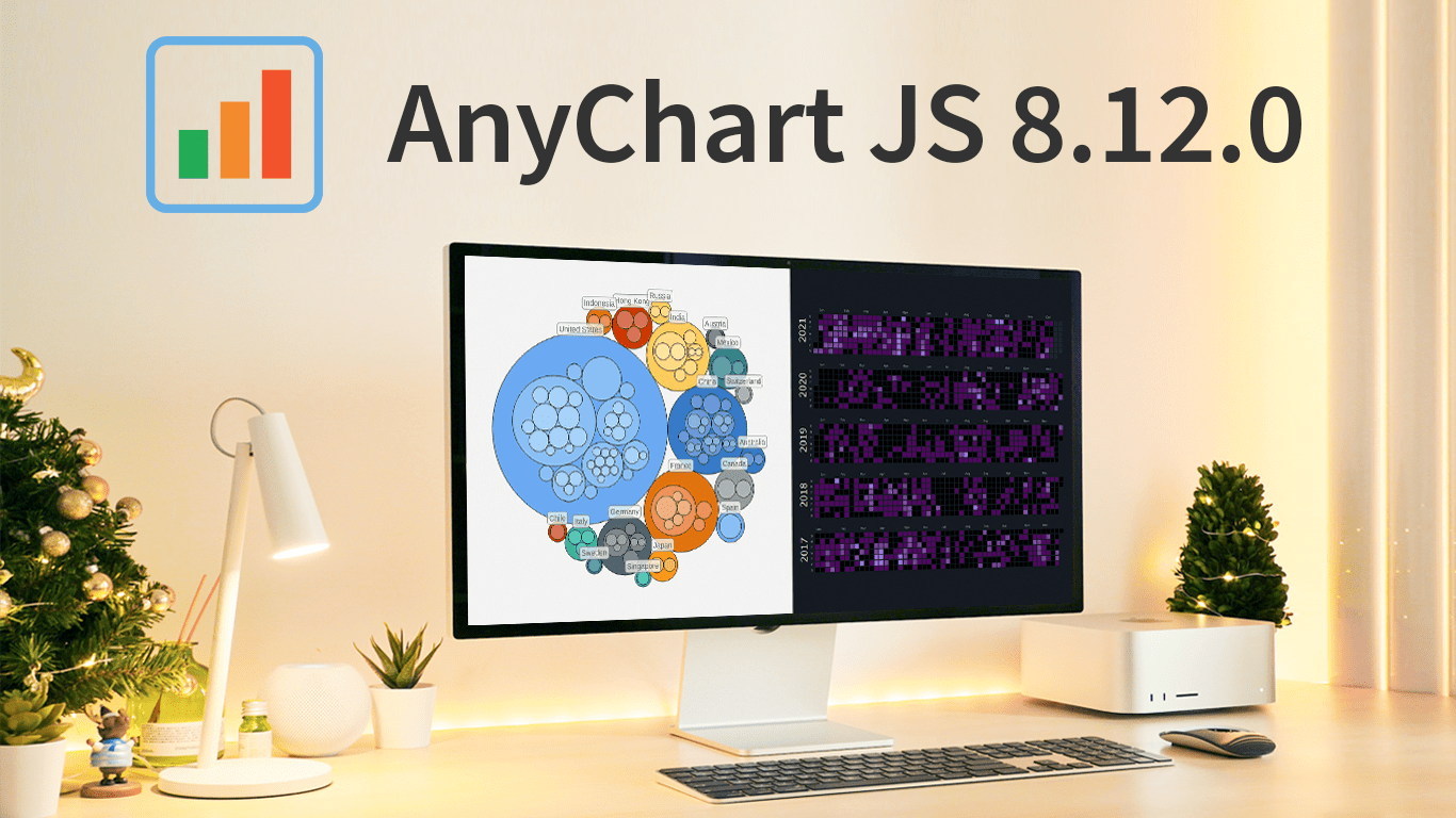 As the magic holiday season approaches, we’re thrilled to unwrap our latest gift of the year — AnyChart 8.12.0, the newest version of our powerful JavaScript charting library. Packed with various bug fixes and improvements, this release introduces a remarkable feature for Calendar and Circle Packing charts — interactivity events. Learn more about it and upgrade right now!
- Categories: AnyChart Charting Component, AnyGantt, AnyMap, AnyStock, Big Data, Business Intelligence, Dashboards, Financial Charts, Gantt Chart, HTML5, JavaScript, News, Stock Charts
- No Comments »
William Dibbern Uses AnyChart JS Charts to Visualize Wedding Guest Data
August 14th, 2023 by AnyChart Team The world’s leader in data visualization, AnyChart has a proven track record of empowering enterprises with robust charting solutions. However, the true essence of AnyChart lies in its versatility — it extends beyond corporate analytics, to making data meaningful in our everyday lives.
For example, meet William Dibbern, an Engineering Manager based in Chicago, who ingeniously applied our JavaScript charting library to his upcoming wedding plans, turning them into a heartfelt blend of technology and emotion.
Join us for an insightful interview with Will as we delve into his journey, exploring how he harnessed the power of AnyChart JS Charts to craft a delightful experience that celebrates love and data in a refreshingly personal way.
- Categories: AnyChart Charting Component, AnyMap, Charts and Art, HTML5, JavaScript, Success Stories, Third-Party Developers
- No Comments »
How to Build Choropleth Map with JavaScript
May 18th, 2023 by Shachee Swadia Are you ready to learn how to create a choropleth map with JavaScript like a boss? Maps are a powerful way to visualize data, but building one from scratch can be a daunting task. Don’t worry, I’m here to help!
In this tutorial, I’ll guide you through the process of building a JavaScript choropleth map step by step. And to make things more interesting, we’ll use Queen Elizabeth II’s state visits as an example to showcase the power of this type of map.
Get ready to impress yourself and your audience with stunning data visualizations, and let’s get started on this exciting journey together!
Read the JS charting tutorial »
- Categories: AnyChart Charting Component, AnyMap, HTML5, JavaScript, JavaScript Chart Tutorials, Tips and Tricks
- No Comments »