How to Build Choropleth Map with JavaScript
May 18th, 2023 by Shachee Swadia Are you ready to learn how to create a choropleth map with JavaScript like a boss? Maps are a powerful way to visualize data, but building one from scratch can be a daunting task. Don’t worry, I’m here to help!
In this tutorial, I’ll guide you through the process of building a JavaScript choropleth map step by step. And to make things more interesting, we’ll use Queen Elizabeth II’s state visits as an example to showcase the power of this type of map.
Get ready to impress yourself and your audience with stunning data visualizations, and let’s get started on this exciting journey together!
Read the JS charting tutorial »
- Categories: AnyChart Charting Component, AnyMap, HTML5, JavaScript, JavaScript Chart Tutorials, Tips and Tricks
- No Comments »
Exciting New Technical Indicators & More in AnyChart JS Charts 8.11.1
May 10th, 2023 by AnyChart Team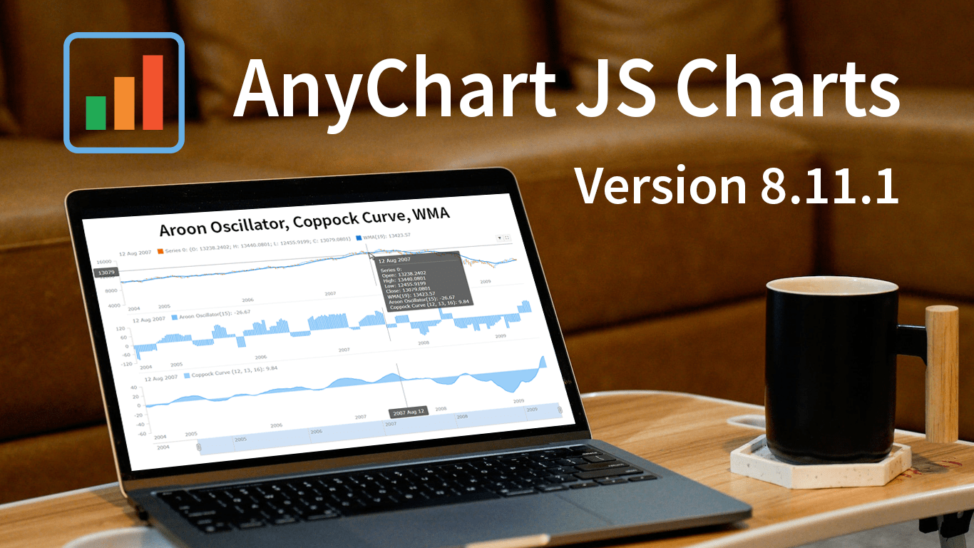 Great news! We’ve just launched version 8.11.1 of our JS charting library, and it comes with some awesome new features and improvements. Our top stars this time around are three new technical indicators that are now available straight out of the box: Aroon Oscillator, Coppock Curve, and WMA. That’s right, now in addition to the dozens of indicators already supported in our stock charts, these new options provide even more ways to improve technical analysis.
But that’s not all! We’ve also updated some of the geo maps in our collection, making them more accurate and detailed. Plus, we’ve squashed some pesky bugs in our Gantt, stock, map, and basic charts, ensuring an even smoother experience when handling specific, advanced cases.
Take a quick tour of the new indicators to discover how they can enhance technical analysis. We’ll also give you a brief overview of the other updates, so you can get the most out of our latest release. Let’s go explore!
- Categories: AnyChart Charting Component, AnyGantt, AnyMap, AnyStock, Big Data, Business Intelligence, Dashboards, Financial Charts, Gantt Chart, HTML5, JavaScript, News, Stock Charts
- No Comments »
Creating Interactive Flow Maps with JavaScript
March 22nd, 2023 by Awan Shrestha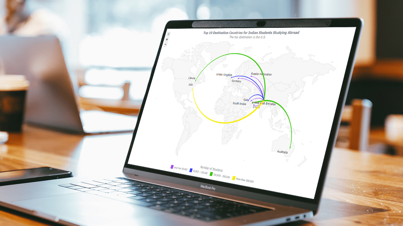 Flow maps are a powerful way to represent the movement of objects between different geographic locations, and with JavaScript, creating an interactive flow map is easier than you might think. Flow maps combine the functionality of a map and a flow diagram; this type of visualization shows the direction of movement of people, goods, money, or information, as well as the quantity of those.
In this step-by-step tutorial, we’ll guide you through the process of creating a JavaScript flow map. To make it more practical, we’ll use the example of visualizing the number of students from India studying abroad in different countries. By following the tutorial, you’ll learn how to create your own flow maps using JavaScript, regardless of the data you choose to use.
So, let’s get started! Follow along with us to learn how to develop your own JS Flow Map.
Read the JS charting tutorial »
- Categories: AnyChart Charting Component, AnyMap, HTML5, JavaScript, JavaScript Chart Tutorials, Tips and Tricks
- No Comments »
CEO Anton Baranchuk Receives 2023 DEVIES Award for AnyChart
February 16th, 2023 by AnyChart Team Last night was amazing: Anton Baranchuk, CEO and Co-founder of AnyChart, received our award for Best in Data Analytics and Visualization at DeveloperWeek’s DEVIES Awards ceremony in Oakland, California!
Check out some photos from the event in this quick story!
- Categories: AnyChart Charting Component, AnyGantt, AnyMap, AnyStock, Big Data, Business Intelligence, Financial Charts, Gantt Chart, GraphicsJS, HTML5, JavaScript, News, Qlik, Stock Charts
- No Comments »
AnyChart Named Best in Data Analytics & Visualization ?
February 3rd, 2023 by AnyChart Team We’re proud to announce that AnyChart has won a prestigious 2023 DEVIES Award in the Data Analytics & Visualization category! Many thanks to the jury and congratulations to all our partners and customers!
Celebrating 20 years in the market this year, we at AnyChart have been working hard to develop the best-in-class data visualization solutions. And we will keep innovating and excelling!
The DEVIES Awards are the definitive annual awards for the software industry, recognizing outstanding design, engineering, and innovation in developer technology across multiple categories. This year’s winners were selected from record-high hundreds of nominations by an expert-led panel of the DevNetwork Advisory Board, including representatives of Accenture, DigitalOcean, EA, Google, IBM, Salesforce, and other great companies.
- Categories: AnyChart Charting Component, AnyGantt, AnyMap, AnyStock, Big Data, Business Intelligence, Dashboards, Financial Charts, Gantt Chart, GraphicsJS, HTML5, JavaScript, News, Oracle Apex, Qlik, Stock Charts, Success Stories
- 2 Comments »
How to Make Bubble Maps in JavaScript
November 16th, 2022 by Shachee Swadia Map charts are a great way to put data in a geographical context. And they are not difficult to create! I am eager to demonstrate that by walking you through the creation of a bubble map, one of the most popular types data maps, with the help of JavaScript.
A bubble map is a combination of a bubble chart and a geographical map. It uses circles of different sizes (and sometimes colors) to indicate numeric values relating to locations or territories.
In this tutorial, I will be visualizing the data on gasoline prices across the United States. They saw record highs this summer after a surge fueled by the outbreak of the Russia–Ukraine conflict. The first, basic bubble map will display the gas prices in July by state. The final one will add the magnitude of the change since February 23, one day before Russia launched an attack on Ukraine.
Follow along and you’ll learn to build beautiful interactive maps in JS with ease and no problem!
Read the JS charting tutorial »
- Categories: AnyChart Charting Component, AnyMap, Big Data, HTML5, JavaScript, JavaScript Chart Tutorials, Tips and Tricks
- No Comments »
Creating Connector Map with JavaScript
July 15th, 2022 by Awan Shrestha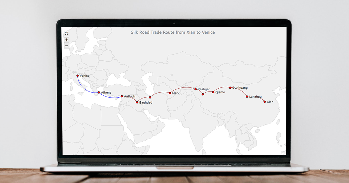 Connector maps are designed to be ideal for visualizing routes and other links between locations in geospatial data analysis. In this tutorial, you’ll learn how to quickly create a compelling interactive one using JavaScript.
Step by step, we will be visualizing a route of the famous ancient Silk Road. We’ll start with the development of a basic JS connector map in four moves and then make a few tweaks to make it look awesome. Let’s start the voyage!
Read the JS charting tutorial »
- Categories: AnyChart Charting Component, AnyMap, HTML5, JavaScript, JavaScript Chart Tutorials, Tips and Tricks
- No Comments »
COVID-19 Risk Assessment App Pandemonium Uses AnyChart for Data Visualization
January 26th, 2022 by AnyChart Team We continue to support initiatives addressing the pandemic crisis by providing them with a full-featured free license for any of our data visualization tools. Today we are honored to be among the first to talk about a new project that joined this program, an innovative COVID-19 risk assessment app and framework called Pandemonium where all charts and maps are powered by AnyChart.
Built by Quantum Risk Analytics, Inc., a charitable nonprofit founded by MIT alumni, Pandemonium uses sophisticated machine learning algorithms to more accurately model the disease spread and provide a highly personalized evaluation of infection risks. It’s not yet publicly launched as the developers want to add a few more major features and data sources before the official release. But the app is already in the testing phase that the team encourages anyone to join.
We asked Richard Hamlin, CEO at Quantum Risk Analytics, Inc., to tell us more about Pandemonium, how it works, and how our data visualization solutions are used. Read on to know all the details.
- Categories: AnyChart Charting Component, AnyMap, Big Data, Dashboards, HTML5, JavaScript, Success Stories
- No Comments »
How to Build Interactive Connector Map with JavaScript
September 21st, 2021 by Shachee Swadia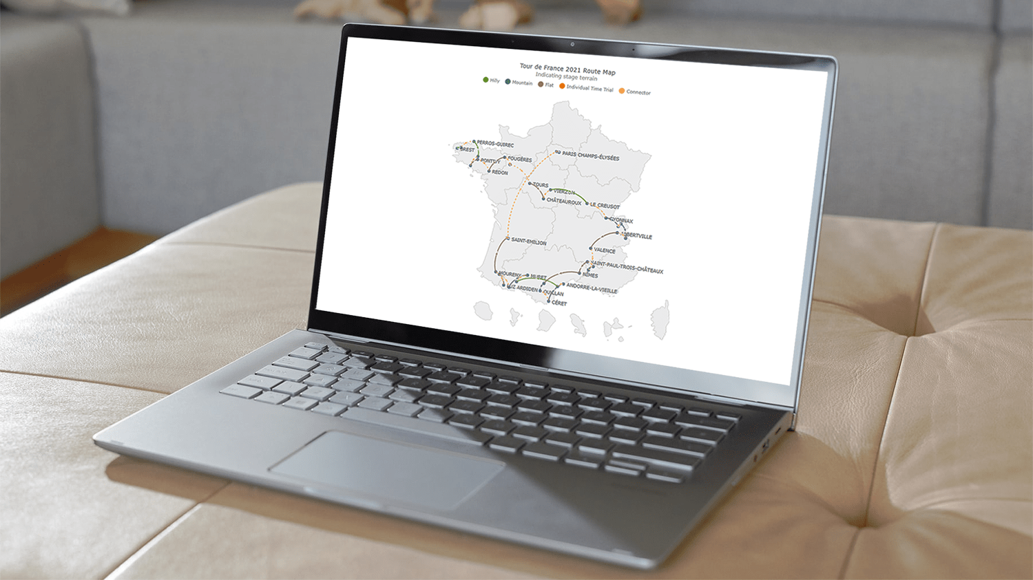 A connector map is a set of straight or curved lines that link points on a geographical map. It is commonly used to graphically represent routes or any other connections between locations. Would you like to learn how to build an attractive data visualization like that for a web page or app?
Actually, it is easy to create an interactive connector map using JavaScript. And I am ready to show you how right now! Follow along with this tutorial as I depict the cycling path of the 2021 Tour de France in the form of a JS connector map and thoroughly explain all steps.
Read the JS charting tutorial »
- Categories: AnyChart Charting Component, AnyMap, HTML5, JavaScript, JavaScript Chart Tutorials, Tips and Tricks
- 2 Comments »
AnyChart Used to Power Charts in Data Science Teaching Project Made at Edinburgh Napier University
September 16th, 2021 by AnyChart Team At AnyChart, we are eager to support education projects by letting their creators work gratis with the same data visualization solutions used by the world’s leading companies to build interactive charts.
Recently, a group of students at Edinburgh Napier University — including Martin McVey, Tibor Toth, Daniel Glen, Flynn Kearney, David Stewart, and John Frampton — reached out to us as they were building a website to assist with the learning of data science. And we were more than happy to provide them with a free license for the use of our JavaScript charting library.
The website is now available to the public, presenting a wide range of chart types with real-world examples along with questions and answers. Acknowledged as one of the top projects in the university year and awarded with a prize from Computershare, it is to be used for teaching about data visualization and analytics in Scottish schools.
We thought you could be interested to not only check out the website but also learn some more about the project and its developers’ experience with AnyChart. So we had a quick talk on that with Martin McVey from the team. Read below.
- Categories: AnyChart Charting Component, AnyMap, HTML5, JavaScript, Success Stories
- No Comments »