AnyChart Charting Framework 7.10.0 Coming Soon
April 16th, 2016 by Margaret SkomorokhReleases announced on our site – AnyChart, AnyStock, and AnyMap 7.10.0 – will be available by the end of April; we are working hard to release the new version of our charting framework as soon as possible. A lot of great and long-awaited features will be added.
In the new version of AnyChart, you will find:
- TreeMap Charts
- Save as Excel/CSV
- Keep Only/Exclude Data Point
- Context Menu
AnyStock will be updated with:
- Common Chart Types (Candlestick, Spline, Area, Marker, and more)
- Legend Interactivity
- Data Grouping Settings
Finally, the following features will be added to AnyMap:
- Dot/Point Maps
- Drill Down
- Points Connection
AnyChart is a robust JavaScript/HTML5 charting framework combining all major features you need. And we do our best to improve our products even more.
By the way, this week we have posted on AnyChart Facebook Page and in Twitter some interesting data visualizations:
- The NYPL Map Warper is a tool for digitally aligning (“rectifying”) historical maps from the The New York Public Library’s collections to match today’s precise maps. Visitors can browse already rectified maps or assist the NYPL by aligning a map.
- How the Rest of the Delegate Race Could Unfold – This interactive delegate calculator by The Upshot lets you simulate how the Republican and Democratic nominating contests could unfold. Adjust the sliders to see how the outcomes can change (each line in the charts represents one possible outcome). The calculator uses each state’s delegate allocation rules, along with estimates of how favorable each district is for each candidate. To compute these estimates, Upshot used a model based on demographics and results from past primaries and caucuses.
- Markov Chains Explained Visually – Enjoy this interactive visual explanation of Markov Chains. In addition, you can use a Markov chain “playground” to make your own Markov chains by messing around with a transition matrix! Markov chains, named after Andrey Markov, are mathematical systems that hop from one “state” (a situation or set of values) to another.
- Categories: AnyChart Charting Component, AnyMap, AnyStock, Financial Charts, HTML5, JavaScript, News, Stock Charts
- 2 Comments »
Woman Suffrage JavaScript Map by AnyChart and More
March 18th, 2016 by Margaret Skomorokh
Here is a quick recap of the visualizations that we have shared with you this week on AnyChart Facebook Page and in Twitter (including a JavaScript Map by AnyChart that shows where and when women were granted suffrage):
- If Countries’ Web Domains Were Land Masses, Earth Would Look Like This – On this map by Nominet, the world is definitely not as it seems. Why? Because countries have been scaled according to the number of country code domain names they have registered, and not by their geographical size.
- Goldilocks – How many habitable exoplanets are out there? According to astrobiology, a planet must neither be too far away from, nor too close to a star to support life; either extreme would result in a planet incapable of supporting life. Such a planet is colloquially called a “Goldilocks Planet”. The Goldilocks project is an interactive map, showing all the known exoplanets, their host stars, composition and atmosphere, and other life-and-death information.
- Charles Darwin first published On the Origin of Species in 1859, and continued revising it for several years. As a result, his final work reads as a composite, containing more than a decade’s worth of shifting approaches to his theory of evolution. In fact, it wasn’t until his fifth edition that he introduced the concept of “survival of the fittest,” a phrase that actually came from philosopher Herbert Spencer. The Preservation of Favoured Traces is a cool interactive data visualization that traces Darwin’s thoughts and revisions by color-coding each word of the final text.
- Ranking of Happiness 2013-2015 – Ken Caldeira on happiness across cultures.
- World JavaScript Map of Woman Suffrage – World JavaScript Map of Woman Suffrage by AnyChart. We’ve used a Choropleth Map to show where and when women were granted suffrage, as you can see, a lot has changed in the last century, and it was a long and bumpy road for the humankind.
- Categories: AnyChart Charting Component, AnyMap, HTML5, JavaScript, News
- No Comments »
Interactive JS Map by AnyChart and More
February 28th, 2016 by Margaret Skomorokh
Here is a quick recap of the visualizations that we have shared with you this week on AnyChart Facebook Page and Twitter (including an interactive JS map by AnyChart):
- Categories: AnyChart Charting Component, AnyMap, HTML5, JavaScript, News
- No Comments »
ACME Corp. Prices – JS Dashboard by AnyChart
February 21st, 2016 by Margaret Skomorokh
A dashboard is a set of charts, which is usually created when you need to show a lot of different information about one particular subject. It can contain as many charts (of the same type or of different types) as it is necessary.
As you can see from the title of this interactive JS dashboard, it shows information about the stock prices of ACME Corporation for the given period. The dashboard contains two charts: the first one is a combination of three chart types (Japanese Candlestick, Range Area, and Spline) and the second one is a simple Column chart.
The Japanese Candlestick series in the upper chart shows us the open, high, low, and closing prices of ACME Stocks for each trading day within the mentioned period. Each vertical line represents the range between the highest and the lowest prices during the trading period, and the body represents the opening and the closing trades. While in classical Candlesticks the rise and fall of a stock price are coded with a white-colored and a black-colored body, in this dashboard light blue and dark blue colors are used.
Besides the Candlestick series, there are Range Area and Spline series in the first chart. The second chart contains a Column series showing the change in the volume of stocks sold.
As you can see, AnyChart is a powerful and flexible tool, allowing you to create sophisticated data visualizations like this JS dashboard. AnyChart offers a wide range of features and chart types, so you can easily implement any visual solution and communicate your data in the best way possible.
By the way, we have recently updated the roadmaps of AnyChart, AnyStock, and AnyMap. Check out all these great features that are coming soon!
- Categories: AnyChart Charting Component, AnyMap, AnyStock, Dashboards, HTML5, JavaScript
- No Comments »
AnyChart JavaScript Charts 7.9.0 Released
January 27th, 2016 by Margaret SkomorokhWe are very glad to announce that we have updated all products in our AnyChart JavaScript Charts Package! Four new releases are now available for download: AnyChart 7.9.0, AnyMap 7.9.0, AnyGantt 7.9.0, and AnyStock 7.9.0.
We have added 3D charts and String Tokens to AnyChart and have significantly improved its performance. AnyMap now supports Longitude and Latitude as well as Move and Zoom; unique projections for more than 220 maps have been added. Other important new features are Event Markers, Timeline Markers, Localization Support (AnyGantt) and Technical Indicators (AnyStock).
AnyChart 7.9.0 New Features
 |
3D Bar/Column Chart Though data visualization specialists take a negative attitude towards any Pseudo 3D graphics, we think that our 3D Bar and Column JavaScript Charts are able to complement and enhance any visualization. You can adjust the angle and depth using the zAngle and zDepth methods. Take a look at 3D Bar/3D Column Chart in the Gallery. Learn more about 3D Bar/3D Column Chart. |
 |
3D Area Chart We are very proud that we have succeeded to create such a beautiful 3D Area JavaScript chart. Just as in the case of 3D Bar/Column Charts, you can adjust the angle and depth using the zAngle and zDepth methods. Take a look at 3D Area Chart in the Gallery >> Learn more about 3D Area Chart >> |
 |
String Tokens The String Tokens feature is an alternative to formatting text in labels and tooltips using formatting functions. Unlike functions, String Tokens are much more convenient in simple cases. They provide more flexibility in terms of settings serialization and are more familiar to the customers that have been using our Flash-based components. Learn more about String Tokens >> |
 |
Migration Tool Migration Tool is a small JavaScript library with an open source code, which is aimed to facilitate the transition from AnyChart 6 to AnyChart 7. Its main function is converting AnyChart 6 XML/JSON settings to AnyChart 7 settings. This library also contains special functions for partial conversion and creating custom converters. Learn more about Migration Tool >> Check out the Github repo >> |
 |
Performance Improvement In this release we have significantly improved performance: the number of points that can be displayed in less than a second has increased from 3000 to 10000. However, it is not the limit of AnyChart capabilities. Every release contains performance improvements, and we are not going to stop! Take a look at the Benchmark Page >> |
AnyMap 7.9.0 New Features
 |
Longitude/Latitude support We have added an option to set coordinates (specify a location) of Bubbles in Bubble JavaScript Charts in longitude and latitude degrees. New methods have been added to the API: the allow to convert mouse coordinates to longitude and latitude (transform) and vice versa (inverseTransform). Take a look at the Bubble Gallery sample >> Take a look at the Lat/Long API Gallery sample >> Learn more about Longitude/Latitude support >> |
 |
Move/Zoom API Now there is a possibility to change the scale and move a map. An API for creating a custom UI (buttons, scrolls, etc.) has been added. Take a look at the Gallery sample >> Learn more about Move/Zoom API >> |
 |
Rich Integration of Keyboard and Mouse Controls Mouse integration: Mouse Wheel – Zoom a map; Mouse Drag – Move a map (works only when the map is zoomed); Keyboard integration: Cmd/Ctrl + – Zoom in; Cmd/Ctrl – – Zoom out; Cmd/Ctrl 0 – Actual size; Arrow up – Move up; Arrow down – Move down; Arrow left – Move left; Arrow right – Move right. Take a look at the Gallery sample >> Learn more about the Integration of Keyboard and Mouse Controls >> |
| Map Collection Improvement We have added unique projections for more than 220 maps, which has significantly improved their appearance. |
AnyGantt 7.9.0 New Features
 |
Localization Support Our new Localization Engine localizes dates and numbers according to the settings of choice. All the functions available work both with the input data and displayed data. Our Localization Engine can be used in custom formatting functions of AnyChart as well as apart from AnyChart to localize your own UI elements. To simplify the integration process, we have prepared more than 180 localization files for various regions of the world. Take a look at the Gallery sample >> Learn more about Localization Support >> |
 |
Event Markers Even Markers is an excellent feature for displaying time intervals and important events on Gantt JavaScript Charts. Take a look at the Gallery sample >> Learn more about Event Markers >> |
") |
Timeline Markers (Multiple Milestones) Timeline Markers are aimed for displaying various events in processes – such as receiving a payment, specifying a task, meeting a customer, etc. Take a look at the Gallery sample >> Learn more about Timeline Markers >> |
AnyStock 7.9.0 New Features
 |
Technical Indicators In this release we are happy to introduce one of the most anticipated features – AnyStock JavaScript Charts Technical Indicators. The advantage of our Technical Indicators is the possibility to create custom indicators. Full customization of both visual and mathematical components is available. This release includes 5 predefined indicators: MACD, RSI, SMA, EMA, ROC. Take a look at Technical Indicators in the Gallery >> Learn more about Technical Indicators >> |
AnyChart version history: https://www.anychart.com/products/anychart/history/
AnyMap version history: https://www.anychart.com/products/anymap/history/
AnyGantt version history: https://www.anychart.com/products/anygantt/history/
AnyStock version history: https://www.anychart.com/products/anystock/history/
Trial download: https://www.anychart.com/download/
- Categories: AnyChart Charting Component, AnyGantt, AnyMap, AnyStock, Gantt Chart, HTML5, JavaScript, News
- No Comments »
Bubble JavaScript Map by AnyChart, Abolitionist infographic, and more
December 13th, 2015 by Margaret Skomorokh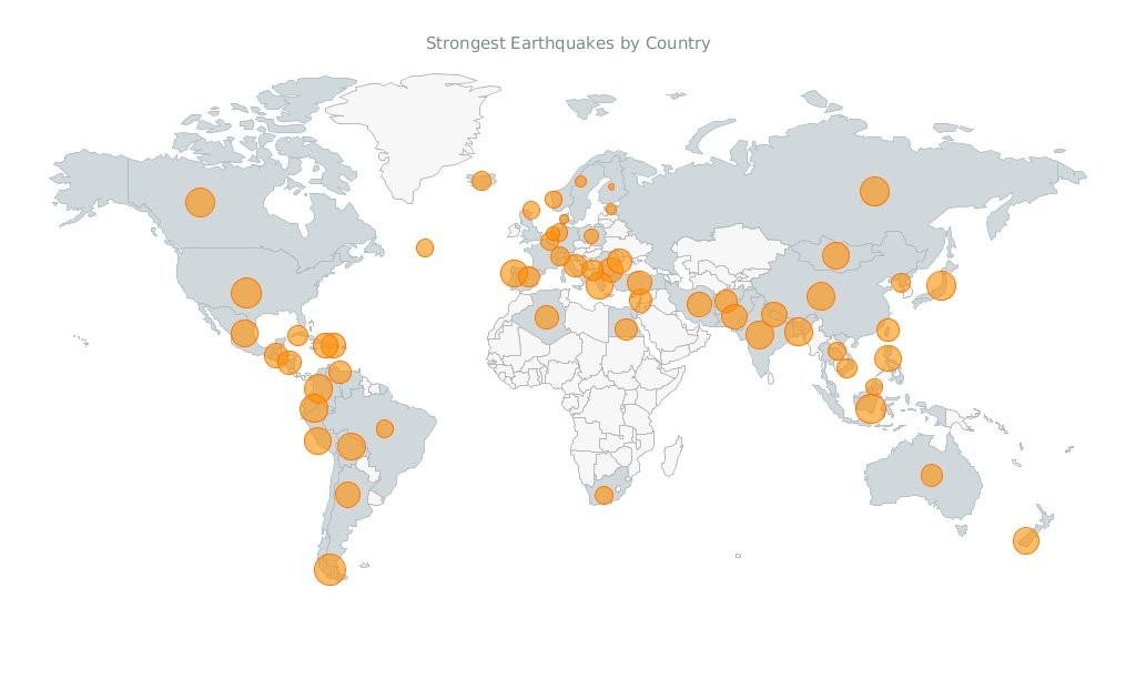
Javascript Map by AnyChart
Have you seen the cool data visualizations (including an interactive JavaScript map by AnyChart) that we have shared this week on AnyChart Facebook Page and Twitter? Here is a quick recap of these posts:
- This abolitionist infographic (1788) shows deck plans and cross sections of British slave ship Brookes. It is a strange, unexamined feature of the bicentenary that this image has still served to shape perceptions over two hundred years since its publication. Its continued usage cannot be explained away with traditional assumptions of its ‘innate power’ or ‘effective communication’. Read more about the poster in this article.
- NARKOZ/hacker-scripts – Hate to waste your time on routine tasks like waiting for the coffee-machine to make your latte? Use scripts to hack your life! LOL “The coffee machines uses telnet not SSH!!! this one waits exactly 17 seconds (!), then opens a telnet session to our coffee-machine (we had no frikin idea the coffee machine is on the network, runs linux and has a TCP socket up and running) and sends something like
sys brew…” - Bubble Earthquakes Map – Visit our gallery and check out this interactive bubble JavaScript map created with AnyMap. It shows where the world’s strongest earthquakes occurred. AnyMap is ideal for interactive dashboards and side-by-side reporting. This JavaScript mapping solution will help you to build interactive maps and display them in any browser on any platform. AnyMap is useful when you need to display sales by region, election results, population density, or any other information related to a geographic area.
- 15 Years of Terror – a time-lapse of all terrorist attacks with more than 20 fatalities between 1.12.2000 and 13.11.2015.
- Categories: AnyChart Charting Component, AnyMap, Charts and Art, HTML5, JavaScript, News
- No Comments »
Recap of the Week – 11/8/2015
November 9th, 2015 by Margaret SkomorokhHere is a quick recap of AnyChart news and interesting information on data vsualization, which we have shared with you this week on AnyChart Facebook Page and Twitter:
- AnyChart 7.8.0 – Good News! We have updated all our products, and now #AnyChart, #AnyGantt, #AnyStock, and #AnyMap 7.8.0 are available for download. We have added a number of important features, including JavaScript Heat Map charts and Zoom & Scroll in AnyChart as well as Editing Mode and UI in AnyGantt.
- Bond v Bond: the return of 007 – The history of Bond… James Bond!
- Data Cycles is a simulated real-time visualization using a year’s worth of Bay Area Bike Share data – just click Play and enjoy all these bikes riding from station to station. You can also see a few nice interactive charts in the Statistics section.
- A Nation of Poverty – Concentrated poverty in the neighborhoods of the largest urban cores in the United States has exploded since the 1970s. Check out the charts illustrating this process.
- Categories: AnyChart Charting Component, AnyGantt, AnyMap, AnyStock, HTML5, JavaScript, News
- No Comments »
Heat Maps, Scrolling, Live Gantt Charts – 7.8.0 Release
November 4th, 2015 by Margaret SkomorokhGood News! We have updated all our products, and now AnyChart, AnyGantt, AnyStock, and AnyMap 7.8.0 are available for download. We have added a number of important features, including JavaScript Heat Map charts and Zoom & Scroll in AnyChart as well as Editing Mode and UI in AnyGantt (see Gantt Interactivity and Gantt Live Edit API and UI).

AnyChart 7.8.0 New Features
 |
Heat Map Chart A Heat Map chart is a graphical representation of data where the individual values contained in a matrix are represented as colors. Take a look at Heat Maps in the Gallery >> Learn more about Heat Maps >> |
 |
Zoom and Scroll (All Basic Chart Types) The Scroller feature works with all basic chart types. It allows users to zoom and scroll. Take a look at the Gallery Sample >> Learn more about the Scroller Feature >> |
- Categories: AnyChart Charting Component, AnyGantt, AnyMap, AnyStock, News
- No Comments »
7.7.0 Release
October 1st, 2015 by Margaret SkomorokhA lot of good things come in this grand package: AnyStock HTML5 release, 200+ Map Collection and Bubble Series for AnyMap, and new types of Tooltips along with the ability to multi-select points in AnyChart.
AnyStock 7.7.0 Features
AnyChart Stock and Financial Charts (AnyStock) is a JavaScript-based financial charting solution. AnyStock technology turns your real-time data into highly sophisticated interactive web charts. Designed to display date- and time-based information, AnyStock is an ideal tool for client reporting and performance reporting applications, bringing the analysis of your financial data to life.
 |
Stock Data Engine We are proud to introduce anychart.data.Table, a data layer designed specifically to meet Stock and Financial Charts needs. Beside basic features like data streaming, data mapping, and transaction-based data flow, anychart.data.Table provides the ability to search and select data by DateTime intervals, which allows to implement custom UI elements based on this data. Learn more about Stock Data Engine >> Take a look at the Gallery sample >> |
 |
Ultimate Performance Good rendering performance is essential for Stock and Financial Charts, and AnyStock meets this requirement in full. Our performance tests show the ability to render 300,000 points in less than a second on an average PC. The data stream can append 10,000 data points in 100 milliseconds. You can test it yourself on the performance test page. Take a look at the Speed Test page >> |
This release of AnyStock includes basic chart and plot layout options and basic features (such as Scroller, Legend, and Value Highlighter), along with the Column, Line, and OHLC series types. If you are wondering where the technical indicators, other series types, event markers and drawings are, the answer is simple: in our roadmap! Check it out and see that we will catch up very fast. See the roadmap>>
AnyMap 7.7.0 New Features
 |
Map Collection Without geographical data, it is impossible to create a data visualization related to geographic areas. We are happy to introduce our new Map Collection. For the moment it contains 200+ country maps and one world map. We are planning to extend this collection, and, of course, the ability to create custom maps is available. See Map Collection CDN Page >> Take a look at the Map Collection in AnyChart Playground >> |
 |
Bubble/Proportion Maps Bubble maps (also known as Proportion maps) are usually used to display or compare quantitative data related to geographic areas, be it election results, sales statistics per region, or earthquake magnitude. Take a look at the Map Gallery sample >> Learn more about Bubble/Proportion maps >> |
- Categories: AnyChart Charting Component, AnyGantt, AnyMap, AnyStock, Gantt Chart, HTML5, JavaScript, News
- No Comments »
AnyChart, AnyMap, and AnyGantt 7.6.0
August 13th, 2015 by Margaret Skomorokh
We are proud to announce 3 new releases – AnyChart 7.6.0, AnyMap 7.6.0, AnyGantt 7.6.0. Our team has been working hard to make our products even more aesthetically pleasing, and now all AnyChart charts have a new modern look and design (See the New Look and Theming feature). We have also added a number of other great improvements, and here are the most important of them:
AnyChart 7.6.0 New Features
 |
All AnyChart products now support the Theming feature which makes customizing and integrating charts easier. With Theming, you can set similar visual and functional settings for all charts without duplicating your code. Take a look at Gallery samples >> Learn more about Theming >> |
 |
Crosshairs are thin vertical and horizontal lines centered on a data point, which are useful when you want to locate a point precisely on your chart or to analyse data by comparing different charts. Take a look at a Gallery sample >> Learn more about Crosshair >> |
 |
Pie/Donut Charts are popular, nice-looking, and very easy to understand, and now you can make them even more attractive by adding 3D! Take a look at Gallery samples >> Learn more about 3D Pie Chart >> |
AnyMap 7.6.0 Features
- Choropleth Maps provide an easy way to visualize how a measurement varies across a geographic area.
- Ordinal Color Range looks like several boxes of different colors which depend on the palette chosen according to the type of a map and its data.
- Quantitative Color Range is a bar colored with a gradient, its colors depend on the palette of a map and its data.
- Full Compatibility with other Charts – when you need to show any extra information along with a map – no problem! Use AnyMap with any other charts.
AnyGantt 7.6.0 New Features
- Now a double-click on borders of data grid columns resets their width to the default value.
- Added the ability to draw the Baseline above the Actual, see API Reference for details.
- AnyGantt now supports formatting for Data Grid Columns, see API Reference for details.
AnyChart version history: https://www.anychart.com/products/anychart/history/
AnyMap version history: https://www.anychart.com/products/anymap/history/
AnyGantt version history: https://www.anychart.com/products/anygantt/history/
Trial download: https://www.anychart.com/download/
P.S. The set of ready-to-use maps is rather small for the moment, but we will add about a hundred maps in a week, and then the list will just keep growing.
- Categories: AnyChart Charting Component, AnyGantt, AnyMap, HTML5, JavaScript, News
- No Comments »