AnyChart Open-Sources Powerful, Draw-Anything JS Graphics Library GraphicsJS
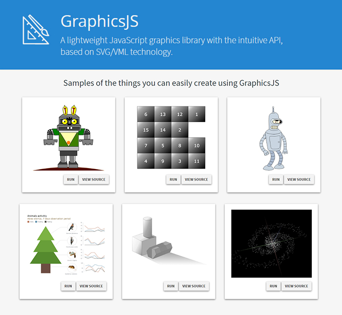
September 15th, 2016 by AnyChart TeamIt is a pleasure for us to announce this today! We have just launched GraphicsJS, a free, open-source, lightweight JavaScript library which allows you to draw any JS graphics and animation for your HTML5 projects very easily. It is significantly more powerful and feature-rich than Raphaël, BonsaiJS, and other formerly leading SVG/VML graphics solutions.
GraphicsJS has always been the graphics engine that our JavaScript (HTML5) charting libraries are built on – AnyChart, AnyStock, AnyGantt, and AnyMap. As a result, it already powers data visualization activities for many of you – Oracle, Microsoft, Volkswagen, AT&T, Samsung, BP, Bosch, Merck, Reuters, Bank of China, Lockheed Martin, and thousands of all the other highly respected AnyChart’s customers including more than 70% of Fortune 1000 companies.
Of course, data visualization is not the only but just one of multiple fields where the library of GraphicsJS can be helpful and even essential. Generally speaking, this solution can help you produce virtually anything graphical from scratch: static and animated images, cartoons, games, interactive infographics, mind maps, and many other amazing things in HTML5.
Key Features of JS Graphics Library
- Mighty line drawing abilities – Bézier curves, arcs, rectangles, and many other kinds of forms and deformations.
- Powerful text manipulation features – multiline texts, measurement, including width, height, as well as wrap, overflow, indent, spacing, align, etc.
- Virtual DOM for drawing fast and only what is necessary.
- Smart layering system with z-index.
- Transformation engine – embarrassing in-browser transformations are not used.
- Legacy browser support (Internet Explorer 6+).
- Concise and convenient JavaScript API with chaining support.
By the way, making our graphics engine open-source is just the beginning as – we are also pleased to tell you – AnyChart is going to open the source code of our charting libraries soon! We believe that our great developments in the fields of graphics and data visualization should be even more visible and reachable to any programmer from any part of the world, not to mention that we would love to allow the community to contribute.
Please refer to GraphicsJS.org to learn more about GraphicsJS. As always, the demos are available on our Playground (Graphics section). Also, let’s not forget about the Graphics Documentation and Graphics API Reference.
What’s more, the GraphicsJS library and all relevant samples can be freely downloaded and forked on GitHub.
- Categories: AnyChart Charting Component, AnyGantt, AnyMap, AnyStock, Charts and Art, Dashboards, Financial Charts, Gantt Chart, GraphicsJS, GraphJam, HTML5, JavaScript, News, Stock Charts, Third-Party Developers, Tips and Tricks, Uncategorized
- 5 Comments »
AnyChart 7.11.0 with JS Stock Drawing Instruments Released
July 27th, 2016 by Timothy LoginovGood news! We have released AnyChart, AnyStock, AnyMap, and AnyGantt 7.11.0. In the new versions of our products, you will find such long-awaited features as JS Stock Drawing Instruments, Pert Charts, Linear Gauges, Seat Maps, and more. Here is the full list of improvements:
AnyStock

Stock Overlay Drawing Instruments are a complete set of drawing tools that allow end users to add drawings to charts. It includes such tools as Line segment, Ray, Trend Line, Vertical Line, Horizontal Line, Rectangle, Ellipse, Triangle, Trend channel, Andrew’s pitchfork, Fibonacci fan, Fibonacci arc, Fibonacci retracement, Fibonacci Time Zones, Buy/Sell Signals, and more – all of them being fully configurable and easily manageable.
Take a look at Stock Overlay Drawing Instruments Demo >>
Take a look at Stock Overlay Drawing Instruments in the Gallery >>
Learn more about Stock Overlay Drawing Instruments >>

AnyStock now supports the Y-Scale “Comparison Mode”, which allows comparing changes in series values. Changes can be shown in two modes: value and percent, and a custom date can be set as the comparison base.
Take a look at Y-Scale Mode in the Gallery >>
Learn more about Y-Scale Mode >>
AnyChart

All AnyChart charts now support AAA-level web accessibility standards (Section 508) using very flexible a11y (accessibility) features. AnyChart supports two accessibility modes:
Learn more about Accessibility Support >>

We have created a very flexible way of building any type of Linear Gauges. You can use built-in constructors for LED, Tank, and Thermometer Gauges or build your own Gauge with simple configurations.
Take a look at Linear Gauges in the Gallery >>
Learn more about Linear Gauges >>

The Chart Editor feature, which makes the integration of AnyChart much easier, is a dialog window that allows to create and set up various chart types. The result can be saved with fixed data in XML or JSON format or in a reusable format with a JavaScript code string.
Take a look at Chart Editor Demo >>
Learn more about Chart Editor >>

The Async Rendering feature allows you to make web pages and applications with a big number of charts more responsive during the page loading process.
Learn more about the Async Rendering feature >>
AnyMap

Seat Maps simplify the process of building interactive Airplane Seating Charts, Opera and Cinema Plans, or any other types of seat maps. It is suitable for building interactive schemes of parks, malls, or virtually any other entities.
Take a look at Seat Maps in the Gallery >>
Learn more about Seat Maps >>

We have added a lot of features to improve visual appearance of geographical maps. Now it is possible to place region labels outside of regions bounds, using Latitude/Longitude data. The Label Overlap Control feature helps to keep a big amount of labels under control. Small regions can be highlighted using the Callout feature.
Learn more about Map Label Positioning Improvements >>

AnyMap now supports loading geodata in TopoJSON format. Geographical data files in TopoJSON format are much smaller, using them allows to reduce map rendering and page loading time.
Take a look at a sample of using TopoJSON format as geodata >>
Read more about TopoJSON Format Support >>

AnyMap now supports loading Geo Data in SVG format. This format may be quite useful if you want to edit a map in a simple vector editor or to create a map of an imaginary place, a road map, or a map with rivers or custom labels.
Take a look at a sample of using SVG format as geodata >>
Read more about the Ability to Use SVG Images as Geo Data >>
AnyGantt

A PERT Chart (Program evaluation and review technique) is a great decision-making tool designed to save time in achieving end-objectives. AnyGantt provides flexible settings of milestones (events), tasks (activities) and critical path.
Take a look at PERT Charts in the Gallery >>
Learn more about PERT Charts >>
AnyChart version history: https://www.anychart.com/products/anychart/history/
AnyStock version history: https://www.anychart.com/products/anystock/history/
AnyMap version history: https://www.anychart.com/products/anymap/history/
AnyGantt version history: https://www.anychart.com/products/anygantt/history/
Trial download of our JS framework: https://www.anychart.com/download/
- Categories: AnyChart Charting Component, AnyGantt, AnyMap, AnyStock, HTML5, JavaScript, News, Stock Charts
- 1 Comment »
JavaScript Stock Chart by AnyChart and More
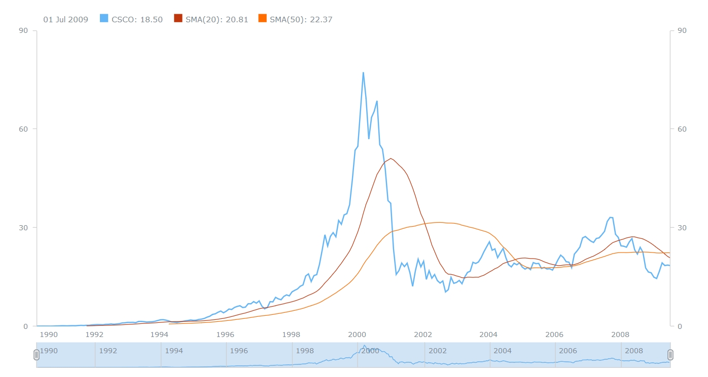
July 22nd, 2016 by Margaret SkomorokhIn this post, you will find a recap of the data visualizations that we have shared with you this week on AnyChart Facebook Page and in Twitter. One of them is a JavaScript Stock Chart by AnyChart:
- Here’s Everyone Who’s Immigrated to the U.S. Since 1820 – From 1820 to 2013, 79 million people obtained lawful permanent resident status in the United States. The interactive map by Metrocosm visualizes all of them based on their prior country of residence. The brightness of a country corresponds to its total migration to the U.S. at the given time.
- How Kobe’s game worked (and how it didn’t) – These nice charts by Los Angeles Times illustrate the different playing styles of some of the NBA’s top players. The charts break down the court into hexagonal areas, then calculate the difference between the league average and the player’s shooting percentage. The hexagon sizes are proportional to the number of shots the player took in that area. You can also see a related data visualization showing
” target=”_blank”>every shot Kobe Bryant ever took
. - World population living in extreme poverty, 1820-2015 – Extreme poverty is defined as living at a consumption (or income) level below 1.90 “international $” per day. See this interactive visualization and find out what part of the world’s population lives like that and how the situation has changed since 1820.
- A JavaScript Stock Chart with SMA by AnyChart – This interactive Stock Chart was created with AnyStock (AnyChart Stock and Financial Charts) – our JavaScript-based financial charting solution. Here, the Simple Moving Average (SMA) technical indicator is used, which is on of the most popular technical analysis tools in trading. You can also see the list of supported technical indicators and AnyStock Gallery.
- Categories: AnyChart Charting Component, AnyStock, HTML5, JavaScript, News
- No Comments »
JS Candlestick Chart by AnyStock and More
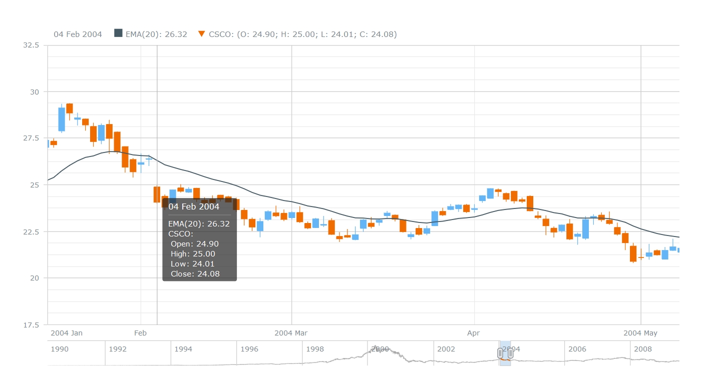
June 28th, 2016 by Margaret SkomorokhLast week we have shared with you on AnyChart Facebook Page and in Twitter the following data visualizations (including a JS Candlestick chart by AnyStock):
- Explore the world with Tim Peake – Use this map to explore ESA astronaut Tim Peake’s stunning photos of Earth, taken from the International Space Station during his six month mission (created by Esri UK). You will find photos of London, Ethiopia, New Orleans, and many other places, all of them looking great from space!
- ThermalPlot – Multi-attribute time-series data plays a vital role in many different domains. An important task when making sense of such data is to provide users with an overview to identify items that show an interesting development over time. However, this is not well supported by existing visualization techniques. ThermalPlot is a technique allowing to visualize multi-attribute time-series data using a thermal metaphor, which helps users to find items that are important (Team: Johannes Kepler Universität, St. Pölten University of Applied Sciences).
- Understanding Millenial Moviegoers – This infographic by the theatrical analytics company Movio reveals the truth about millennial moviegoing. There are some bad news for art-house and indie filmmakers hoping to get young people into the theater: according to these data, the younger millennials are 45% less inclined to see a drama and 52% less interested in an indie film.
- JS Candlestick Chart by AnyStock – A Japanese Candlestick chart is a combination of a line chart and a bar chart used primarily to describe price movements of an equity over time, where each bar represents the range of price movement over a given time interval. It is mostly used in technical analysis of equity and currency price patterns. The interactive Candlestick chart you see here was created using AnyStock – a JavaScript-based financial charting solution by AnyChart.
- Categories: AnyChart Charting Component, AnyStock, Financial Charts, HTML5, JavaScript, News
- No Comments »
AnyChart Charting Library 7.11.0 Coming Soon
June 10th, 2016 by Margaret SkomorokhAnyChart Charting library will be updated in July: we are going to release AnyChart, AnyStock, and AnyMap 7.11.0. Here is a preview of this update:
AnyChart 7.11.0 New Features
 |
PERT Chart A PERT Chart is a project management tool used to schedule, organize, and coordinate tasks within a project. PERT stands for Program Evaluation Review Technique – a methodology developed by the U.S. Navy in the 1950s to manage the Polaris submarine missile program. PERT chart is still a very popular tool when dealing with big and complex projects, and when Gantt Charts are not enough. |
 |
Full Accessibility Support (Section 508) Section 508 Amendment to the Rehabilitation Act of 1973 requires US Federal Agencies to make their electronic and information technology accessible to people with disabilities. Today Section 508 compatibility is a de facto standard for screen readers, and to fit this standard, we are adding out-of-the-box Section 508 compatibility as well as an option to customize replacement texts or show chart as a table. |
 |
Linear/Tank/Thermometer Gauge A Linear Gauge is a slider or a wide line that can hold much information and possess a variety of features: it can be either vertical or horizontal; the line can be of any width; you can add a single pointer or multiple pointers to show data values. As to Tank and Thermometer Gauges, they are a popular element of dashboards used for monitoring the environment or hardware facilities. |
 |
Chart Editor UI Creating charts with AnyChart charting library is going to be easier than ever: our Chart Editor UI will allow you to configure your chart in a WYSWIG environment. No programming – you will get what you see. Not only that: Chart Editor UI can be used by developers to generate presets or as a part of an integration solution. |
 |
Async Rendering With the Asynchronous Rendering feature, you will be able to render several charts on a page one by one. This feature improves user experience and makes big HTML dashboards more responsive. |
AnyStock 7.11.0 New Features
 |
Y Scale Mode: Changes/PercentChanges When you use the Y Scale Mode, the Y-axis of your stock chart automatically displays changes in the data. In some cases, it helps users to evaluate the situation and understand its’ dynamics quickly. Changes can be expressed either in numbers or in percent. |
 |
Event Markers Using Event Markers, you can mark an event that took place at a specific moment of time, which can be extremely helpful if you need to draw users’ attention to this event. In financial charts, this feature is used to show Key Developments, Dividends, Splits, Insider Transactions, Analyst Opinion Changes, or any other relevant events. |
 |
Data Point Markers A Data Point Marker is used to mark an important point on a chart (for example, the highest or the lowest point). In our charting library, you can customize the shape, size, and color of Data Point Markers or use your own image as a marker. |
 |
Stock Overlay Drawing Instruments Stock Overlay Drawing Instruments is a set of tools that provides end users with an ability to add drawings to to stock charts. Users will be able to draw such elements as Line Segments, Rays, Trend lines, Vertical Lines, Horizontal Lines, Rectangle, Ellipses, Triangles, Trend Channels, Andrew’s Pitchforks, Fibonacci Fans, Fibonacci Arcs, Fibonacci Retracements, Fibonacci Time Zones, Buy/Sell Signals, Custom Text Labels and so on. |
AnyMap 7.11.0 New Features
 |
Seat Map A Seat Map, also known as a Seating Chart, is a way to visualize how people will sit in a vehicle (airplane, bus, train), movie theater, stadium, or in any area where some event is going to happen. This map type is used on ticket booking websites or seat map information services. |
 |
Ability to Use SVG Images as Geo Data The Ability to Use SVG Images as Geo Data can be helpful for those who need to design very custom maps, including maps of imaginary ares. With this feature, you will be able to create literally any map you want. |
 |
TopoJSON Format Support To enhance the performance of our charting library and make it more flexible, we are adding the support of the TopoJSON format. TopoJSON is an extension to GeoJSON, encoding topology; one of its’ advantages is that maps in TopoJSON have a smaller file size. |
 |
Label Position We continue improving label algorithms in AnyMap: this time label positioning will we improved. We are introducing callout labels for small regions, as well as a special Callout UI control for groups of regions. |
- Categories: AnyChart Charting Component, AnyMap, AnyStock, HTML5, JavaScript, News
- No Comments »
AnyChart JS Charting Library 7.10.1 Released
June 4th, 2016 by Margaret SkomorokhAnyChart JS charting library has been updated: we have released a hotfix for all our products.
AnyChart, AnyStock, AnyMap, and AnyGantt 7.10.1 contain the following changes:
- Solved compatibility issues between AnyChart UI and other AnyChart products.
- Solved compatibility issues with old versions of ExtJS (3.4 and less).
Also, there are a few other bug fixes:
AnyChart 7.10.1
- Fixed a bug with the scroller and continuous series.
- Fixed a bug with tooltips in the TreeMap Chart.
AnyStock 7.10.1
- Fixed a bug with a single point in Stock Charts.
- Solved issues with EMA/SMA technical indicators.
- Solved issues with the mapAs method being called on an empty data table.
AnyChart version history: https://www.anychart.com/products/anychart/history/
AnyStock version history: https://www.anychart.com/products/anystock/history/
AnyMap version history: https://www.anychart.com/products/anymap/history/
AnyGantt version history: https://www.anychart.com/products/anygantt/history/
Trial download of our products: https://www.anychart.com/download/
- Categories: AnyChart Charting Component, AnyGantt, AnyMap, AnyStock, HTML5, JavaScript, News
- No Comments »
AnyChart JS Framework 7.10.0 Released
April 28th, 2016 by Margaret SkomorokhGood news! We have released AnyChart 7.10.0 , AnyStock 7.10.0, and AnyMap 7.10.0. Enjoy the cool new features that have been added to the updated version of our JS framework:
AnyChart 7.10.0 New Features
 |
TreeMap Chart We are happy to announce that we have added one of the best chart types for showing hierarchical data – TreeMap Chart. It has all the features allowing to create treemap-based solutions: Drill-Down API, Flexible Interactivity Settings, Hint Depth Feature, and smart Labels/Headers display modes. Hierarchical Data Engine allows to add, alter, and search hierarchical data sets. Take a look at TreeMap Chart in the Gallery >> Learn more about TreeMap Chart Chart >> |
 |
Themes To make it easier to integrate AnyChart Charts in your website or application, and to help you to choose matching colors, we present you with 18 out-of-the-box themes. These themes are based on 13 color palettes, which can be used with or without the themes. You can change or use themes how you like, attuning them to your requirements. Take a look at Themes Demo >> Learn more about Themes >> |
 |
Save as Excel/CSV/XML/JSON We have extended our Export API. Now you can not only export your chart as an image or PDF, but also grab data or configuration settings with these four new methods: saveAsCsv (CSV), saveAsXlsx (Excel), saveAsXml(XML), and saveAsJson (JSON). Learn more about Export functions >> |
 |
Chart Statistics By popular request, we have made the getStat method available outside of TextFormatter functions: now you have access to statistical data that AnyChart engine calculates any time you want. Please note that you can use statistical data to fine-tune your visualisation or highlight some data points and that it can be done before the chart is drawn. Learn more about Chart Statistics >> |
 |
Context Menu Context menu now comes out-of-the-box too. By default, it provides Print, Export, and other commonly used items. You can add your own elements or remove default ones; context menu look is customizable too. Learn more about Context Menu >> |
 |
Keep/Exclude Data Point Exclude/Include Points API and ability to use this API in the context menu allows you and any chart viewer to hide some parts of the chart. You can create complex data mining applications that show more information and make it easier to understand. Learn more about Keep only/Exclude Data Point >> |
 |
Improvements for 3D Charts For those of you who like to use 3D charts, we’ve added the Z-Axis Distribution option, animations, and the ability to use hatch fill. Take a look at 3D Charts in the Gallery >> Learn more about 3D Charts >> |
AnyStock 7.10.0 New Features
 |
10 New Series Types Candlestick, Spline, Step Line, Area, Step Area, Spline Area, Marker, Range Column, Range Area, and Range Spline Area series are now available in Stock Charts. All these series can be used in the scroller and technical indicators. Take a look at Stock Chart types in the Gallery >> Learn more about Stock Chart types >> |
 |
Data Grouping Two new important settings for data grouping are now available: setting maximum number of visible points (the maxVisiblePoints method) and minimum number of pixels per point (the minPixPerPoint method). We have also made it possible to tune data grouping levels. Learn more about Data Grouping >> |
 |
Legend Interactivity AnyStock Legend can now be used to show/hide series in Stock Plots and properly handle the mouseClick event. It can be customized using the preventDefault method. Learn more about Legend Interactivity >> |
AnyMap 7.10.0 New Features
 |
Dot (Point) Map The Dot (Point) Map series type has been added to AnyMap. It has the widest application range: showing cities, points of interest, events, creating density maps, and more. In the Dot Distribution Map (also known as Dot Density Map), a dot symbol shows the presence of a feature or phenomenon. Dot maps rely on visual scatters to demonstrate spatial patterns. With AnyMap, you can work with any of predefined marker types, code your own type, or use an image. Take a look at Dot/Point Maps in the Gallery >> Learn more about Dot/Point Maps >> |
 |
Connector Map The Connector Map series type has been added to AnyMap. Connector Maps can be used used to create Flight Maps, Route Maps, Demarcation Maps, and in many other cases. Take a look at Connector Maps in the Gallery >> Learn more about Connector Maps >> |
 |
Drill Down Now you can change detalization level using the Drill Down feature. Source map settings can be preserved when you drill down, or completely reset if needed. Take a look at Drill Down >> Learn more about Drill Down >> |
 |
Common Map Projections Now you can show any map in one of the following projections: Aitoff, August, Bonne, Eckert1, Eckert3, Equirectangular, Fahey, Hammer, Mercator, Orthographic, Robinson, Wagner6, and Wsg84. Please be careful when you change the projection – be aware of how map projections work and when it is appropriate to use them. Take a look at Common Map Projections in the Gallery >> Learn more about Common Map Projections >> |
AnyChart version history: https://www.anychart.com/products/anychart/history/
AnyStock version history: https://www.anychart.com/products/anystock/history/
AnyMap version history: https://www.anychart.com/products/anymap/history/
Trial download of our JS framework: https://www.anychart.com/download/
- Categories: AnyChart Charting Component, AnyMap, AnyStock, HTML5, JavaScript, News, Stock Charts
- 1 Comment »
AnyChart Charting Framework 7.10.0 Coming Soon
April 16th, 2016 by Margaret SkomorokhReleases announced on our site – AnyChart, AnyStock, and AnyMap 7.10.0 – will be available by the end of April; we are working hard to release the new version of our charting framework as soon as possible. A lot of great and long-awaited features will be added.
In the new version of AnyChart, you will find:
- TreeMap Charts
- Save as Excel/CSV
- Keep Only/Exclude Data Point
- Context Menu
AnyStock will be updated with:
- Common Chart Types (Candlestick, Spline, Area, Marker, and more)
- Legend Interactivity
- Data Grouping Settings
Finally, the following features will be added to AnyMap:
- Dot/Point Maps
- Drill Down
- Points Connection
AnyChart is a robust JavaScript/HTML5 charting framework combining all major features you need. And we do our best to improve our products even more.
By the way, this week we have posted on AnyChart Facebook Page and in Twitter some interesting data visualizations:
- The NYPL Map Warper is a tool for digitally aligning (“rectifying”) historical maps from the The New York Public Library’s collections to match today’s precise maps. Visitors can browse already rectified maps or assist the NYPL by aligning a map.
- How the Rest of the Delegate Race Could Unfold – This interactive delegate calculator by The Upshot lets you simulate how the Republican and Democratic nominating contests could unfold. Adjust the sliders to see how the outcomes can change (each line in the charts represents one possible outcome). The calculator uses each state’s delegate allocation rules, along with estimates of how favorable each district is for each candidate. To compute these estimates, Upshot used a model based on demographics and results from past primaries and caucuses.
- Markov Chains Explained Visually – Enjoy this interactive visual explanation of Markov Chains. In addition, you can use a Markov chain “playground” to make your own Markov chains by messing around with a transition matrix! Markov chains, named after Andrey Markov, are mathematical systems that hop from one “state” (a situation or set of values) to another.
- Categories: AnyChart Charting Component, AnyMap, AnyStock, Financial Charts, HTML5, JavaScript, News, Stock Charts
- 2 Comments »
Investment Portfolio Dashboard by AnyChart Charting Framework
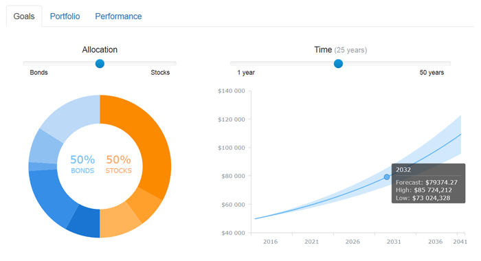
March 26th, 2016 by Margaret SkomorokhWe have added a new dashboard to AnyChart Business Dashboard Solutions – a section of our site with sample dashboards demonstrating how AnyChart charting framework can be applied to various visualization tasks in various industries. Investment Portfolio Dashboard is a sample solution for personal portfolio management, based on data from finance.yahoo.com.
Some say that portfolio management is the art and science, which consists of making decisions about investment content combination and policy, matching investments to objectives, asset allocation for individuals and institutions, and balancing risk against performance.
If you want to be perfectly accurate, investment management is the professional asset management of various securities (shares, bonds, and other securities) and other assets (e.g., real estate) in order to meet specified investment goals for the benefit of the investors. Investors may be institutions (insurance companies, pension funds, corporations, charities, educational establishments, etc.) or private investors (both directly via investment contracts and more commonly via collective investment schemes e.g. mutual funds or exchange-traded funds).
Or, in plain English, managing investment porfolio is creating a collection of assets that can diminish the risk inherent in stock markets by diversification or avoiding having too many eggs in one basket.
Whatever the case is, any porfolio management must include the following steps: choosing investment horizon and goals, building portfolio, and performance monitoring. Each of the steps needs a dashboard of its’ own, so there are three tabs in our dashboard: Goals, Portfolio, and Performance.
The Goals tab provides a user with a way to mix the portfolio and a way to see the prognosis for it, so there are two charts: a Donut chart and a combination of a Line chart and a Range Area chart. The Portfolio tab shows the mix of the instruments and all basic information about them (here you see the same Donut chart and a table). Finally, in the Performance tab you will find a Stock chart demonrtrating the performance of our investment porfolio.
Using AnyChart, we have created a user-friendly and fast-rendering visualization. To learn how it was done, you can see a detailed tutorial: Creating Investment Portfolio Dashboard. Our dashboard is minimalistic, but it can be easily extended, and it does not matter how much additional information you need to show: our charting framework is flexible enough to cope with any task.
- Categories: AnyChart Charting Component, AnyStock, HTML5, JavaScript, News, Stock Charts, Tips and Tricks
- 1 Comment »
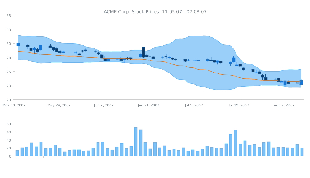
ACME Corp. Prices – JS Dashboard by AnyChart
February 21st, 2016 by Margaret SkomorokhA dashboard is a set of charts, which is usually created when you need to show a lot of different information about one particular subject. It can contain as many charts (of the same type or of different types) as it is necessary.
As you can see from the title of this interactive JS dashboard, it shows information about the stock prices of ACME Corporation for the given period. The dashboard contains two charts: the first one is a combination of three chart types (Japanese Candlestick, Range Area, and Spline) and the second one is a simple Column chart.
The Japanese Candlestick series in the upper chart shows us the open, high, low, and closing prices of ACME Stocks for each trading day within the mentioned period. Each vertical line represents the range between the highest and the lowest prices during the trading period, and the body represents the opening and the closing trades. While in classical Candlesticks the rise and fall of a stock price are coded with a white-colored and a black-colored body, in this dashboard light blue and dark blue colors are used.
Besides the Candlestick series, there are Range Area and Spline series in the first chart. The second chart contains a Column series showing the change in the volume of stocks sold.
As you can see, AnyChart is a powerful and flexible tool, allowing you to create sophisticated data visualizations like this JS dashboard. AnyChart offers a wide range of features and chart types, so you can easily implement any visual solution and communicate your data in the best way possible.
By the way, we have recently updated the roadmaps of AnyChart, AnyStock, and AnyMap. Check out all these great features that are coming soon!
- Categories: AnyChart Charting Component, AnyMap, AnyStock, Dashboards, HTML5, JavaScript
- No Comments »
