How to Create Candlestick Chart with JavaScript for Stock Analysis
May 2nd, 2023 by Awan Shrestha Candlestick charts are a fantastic data visualization tool for tracking the price movements of stocks over a period of time. In this tutorial, I'll show you how to create your own candlestick chart using JavaScript.
We’ll be using TSMC (Taiwan Semiconductor Manufacturing Company) as an example, as they're the largest contract chip maker in the world and have been making waves in the stock market recently.
By the end of this tutorial, you'll be able to create your own JS candlestick charts and analyze stock trends like a pro. So, let's get started and dive into the exciting world of data visualization with JavaScript!
Read the JS charting tutorial »
- Categories: AnyChart Charting Component, AnyStock, Big Data, Financial Charts, HTML5, JavaScript, JavaScript Chart Tutorials, Tips and Tricks
- 2 Comments »
Qlik Gantt & Sunburst’s Exciting New Features + Upgrades Across All Extensions!
April 18th, 2023 by AnyChart Team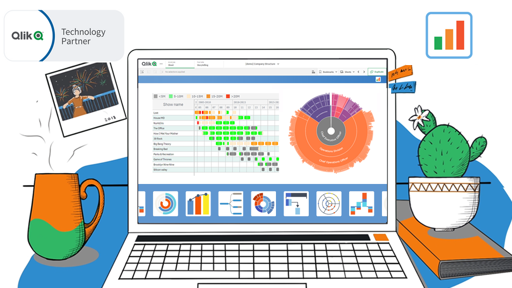 Hey Qlikkies! We have some exciting news to share with you today. AnyChart’s Qlik Sense Extensions have undergone a major update as we’ve made improvements across all of them, including the Decomposition Tree. However, we are particularly thrilled to announce the addition of some major features to our Sunburst Chart and Gantt Chart extensions.
But wait, there’s more! If you’re attending QlikWorld these days, we invite you to visit our team in Booth #180. There, you can try out the new features in action, ask questions, and learn more about how our extensions can improve your visual analytics experience in Qlik Sense. Don’t miss out on this chance to experience the AnyChart difference first-hand!
Our team has been hard at work, listening to your feedback and making improvements. We are confident that these new features will give you greater creative control and better performance in your Qlik-powered environment. So without further ado, let’s dive into the details of the major new upgrades!
Read more at qlik.anychart.com »
- Categories: AnyChart Charting Component, AnyGantt, Big Data, Business Intelligence, Dashboards, Gantt Chart, News, Qlik
- No Comments »
Join AnyChart at QlikWorld 2023: Sponsor & Exhibitor
April 14th, 2023 by AnyChart Team Get ready, because QlikWorld 2023 is coming in hot! From April 17th to 20th, Las Vegas will be bustling with all the latest and greatest in the world of data analytics, and AnyChart is pumped to be part of the action. Meet us in Booth #180!
Read more at qlik.anychart.com »
- Categories: AnyChart Charting Component, AnyGantt, Big Data, Business Intelligence, Dashboards, Gantt Chart, News, Qlik
- No Comments »
Building 3D Surface Plot in JavaScript
April 11th, 2023 by Awan Shrestha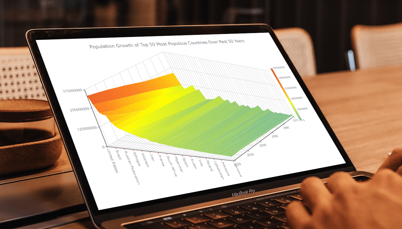 Welcome to this tutorial on creating a visually stunning and interactive 3D surface plot using JavaScript! If you’re passionate about data visualization and want to expand your skills to the next level, this guide is for you. Here, we’ll take you through a step-by-step process to create an engaging 3D surface plot that will make your data come alive.
Sometimes, representing complex information using traditional 2D charts can be difficult, especially when working with large datasets or data that varies over three or more dimensions. This is where a 3D surface plot (or surface chart) can prove to be useful. In this tutorial, we’ll be using real-world population data to create our surface plot, showcasing the population growth trends of the top 50 most populous countries in the world. You don’t need to be a data expert to follow this guide, as we’ll cover everything in detail.
So, sit back, grab your favorite beverage, and let’s dive into the world of data visualization with a 3D surface plot. By the end of this tutorial, you’ll have an impressive chart that you can showcase to your colleagues or friends. Let’s get started!
Read the JS charting tutorial »
- Categories: AnyChart Charting Component, Big Data, HTML5, JavaScript, JavaScript Chart Tutorials, Tips and Tricks
- No Comments »
How to Create Box-and-Whisker Plot in JavaScript
March 16th, 2023 by Awan Shrestha Transform your data into insights with a stunning box-and-whisker plot! Learn what it is and how to create one with ease using JavaScript. In this tutorial, I’ll walk you through the steps to make a neat and visually appealing JS-based (HTML5) box chart with the yearly gross salaries of different IT professions in Europe. Unlock the power of data visualization and start quickly identifying trends and patterns today!
Read the JS charting tutorial »
- Categories: AnyChart Charting Component, Big Data, HTML5, JavaScript, JavaScript Chart Tutorials, Tips and Tricks
- No Comments »
Italian Gruppo Astrofili Galileo Galilei Uses AnyChart JS Charts for Astronomical Data Visualization
March 9th, 2023 by AnyChart Team We are glad to continue supporting non-profit initiatives all over the world by allowing them to use our JavaScript charting library free of charge. Recently, Giorgio Mazzacurati of Gruppo Astrofili Galileo Galilei, an Italian association of amateur astronomers, told us about how AnyChart helps with their visual data analysis. He also shared a few snapshots showing our interactive JS charts in action. Take a look! (Stack: Python/Flask/MySQL.)
- Categories: AnyChart Charting Component, AnyStock, Big Data, Dashboards, HTML5, JavaScript, Success Stories
- No Comments »
CEO Anton Baranchuk Receives 2023 DEVIES Award for AnyChart
February 16th, 2023 by AnyChart Team Last night was amazing: Anton Baranchuk, CEO and Co-founder of AnyChart, received our award for Best in Data Analytics and Visualization at DeveloperWeek’s DEVIES Awards ceremony in Oakland, California!
Check out some photos from the event in this quick story!
- Categories: AnyChart Charting Component, AnyGantt, AnyMap, AnyStock, Big Data, Business Intelligence, Financial Charts, Gantt Chart, GraphicsJS, HTML5, JavaScript, News, Qlik, Stock Charts
- No Comments »
AnyChart Named Best in Data Analytics & Visualization ?
February 3rd, 2023 by AnyChart Team We’re proud to announce that AnyChart has won a prestigious 2023 DEVIES Award in the Data Analytics & Visualization category! Many thanks to the jury and congratulations to all our partners and customers!
Celebrating 20 years in the market this year, we at AnyChart have been working hard to develop the best-in-class data visualization solutions. And we will keep innovating and excelling!
The DEVIES Awards are the definitive annual awards for the software industry, recognizing outstanding design, engineering, and innovation in developer technology across multiple categories. This year’s winners were selected from record-high hundreds of nominations by an expert-led panel of the DevNetwork Advisory Board, including representatives of Accenture, DigitalOcean, EA, Google, IBM, Salesforce, and other great companies.
- Categories: AnyChart Charting Component, AnyGantt, AnyMap, AnyStock, Big Data, Business Intelligence, Dashboards, Financial Charts, Gantt Chart, GraphicsJS, HTML5, JavaScript, News, Oracle Apex, Qlik, Stock Charts, Success Stories
- 2 Comments »
Decomposition Tree Now in Qlik Sense
January 24th, 2023 by AnyChart Team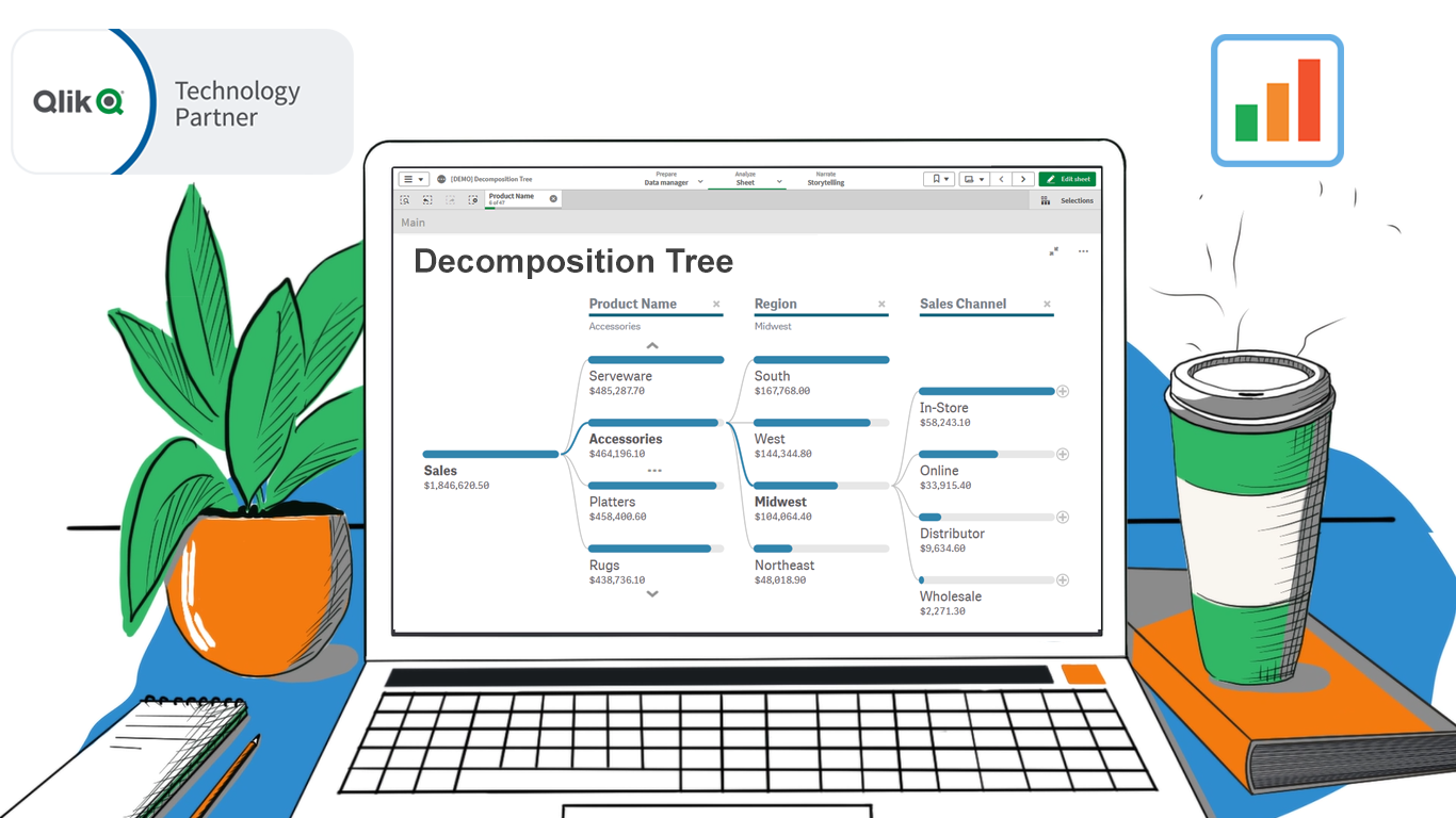 Happy day, data analysts using Qlik! We are thrilled to announce the release of our groundbreaking Decomposition Tree extension for Qlik Sense!
Previously unavailable in Qlik natively or in a third-party extension, a Decomposition Tree is an incredibly powerful technique. It allows you to intuitively explore your core metrics across a number of dimensions, quickly see which factors affect the totals, and make timely decisions to optimize business performance and profits!
Read more at qlik.anychart.com »
- Categories: AnyChart Charting Component, Big Data, Business Intelligence, News, Qlik
- No Comments »
Deluxe Combo Chart & Versatile Circular Gauge for Qlik Sense
January 24th, 2023 by AnyChart Team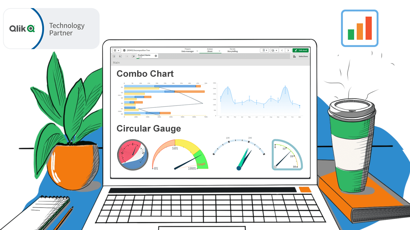 In addition to the Decomposition Tree and new Gantt Chart features, we are excited to release two astonishing extensions. Enjoy making sense of your metrics using the brand new approaches you never had in Qlik before — with our Deluxe Combo Chart and Versatile Circular Gauge for Qlik Sense!
Now, join us for a quick overview of these novel extensions and check them out right away!
Read more at qlik.anychart.com »
- Categories: AnyChart Charting Component, Big Data, Business Intelligence, Dashboards, News, Qlik
- No Comments »