How to Create Line Chart with JavaScript
July 28th, 2021 by Shachee Swadia A line chart is one of the basic and most commonly used techniques of data visualization. Such graphics are known to provide an informative look at the change of one or several variables over time. Right now, I’ll explain how to easily create a cool interactive line chart using JavaScript! The process will be demonstrated with the help of compelling examples that you can play with afterwards to hone your new data visualization development skills.
To make the article especially thrilling for you to read and learn from, I decided to showcase a practical application of a line chart to real-world data. The month of June was celebrated as Pride Month, and I thought it would be great to see how attitudes toward LGBT people have changed over the recent years. Then I found interesting public opinion data from the General Social Survey (GSS), a project of the National Opinion Research Center (NORC) at the University of Chicago, which appeared to be a good fit, and took part of it to visualize in this guide.
So, follow along with the tutorial and you will also be able to explore the shifts in acceptance of same-sex relationships in the United States over the last two decades! We will create a single-series JS line chart first, representing the general trend, and then a multi-series JS line chart to visualize a breakdown by age group.
All aboard!
Read the JS charting tutorial »
- Categories: AnyChart Charting Component, Big Data, Business Intelligence, HTML5, JavaScript, JavaScript Chart Tutorials, Tips and Tricks
- 2 Comments »
Stacked Waterfall Chart for Qlik Sense Upgraded
July 23rd, 2021 by AnyChart Team
You asked, and we listened. We have continued to work on plans to deliver an unprecedented experience with Waterfall Charts in Qlik Sense. And we are pleased to announce that several new valuable features are now there to improve the way you explore not only a by-category but also a by-subcategory breakdown of metrics!
Read below to see what’s new in our Stacked Waterfall Chart for Qlik Sense — just upgraded with the July release of the AnyChart Qlik Extension — and give it a try without delay!
Read more at qlik.anychart.com »
- Categories: AnyChart Charting Component, AnyGantt, Big Data, Business Intelligence, Gantt Chart, News, Qlik
- No Comments »
Creating JS Flow Map in Four Steps
July 13th, 2021 by Shachee Swadia A step-by-step tutorial showing how to create an interactive JS Flow Map. Illustrated by visualizing data on migration to the US.
It may seem to be complicated to create an interactive Flow Map for the Web using JavaScript. But it’s not! This easy-to-follow tutorial will show you how to build beautiful JS flow maps without too much effort.
In these difficult times of the pandemic, there is a lot of confusion and concern about the immigration status of people around the globe. I decided to take a look at the immigration data of the US which has more migrants than any other country in the world. Here, I explore where these immigrants come from and represent the top 15 countries that contributed the highest number of migrants to the US in the year 2019.
A flow map seems the perfect way to showcase the inflow of migrants into the United States from various countries. Before going further, let me give you a brief idea about a flow map and its uses.
Read the JS charting tutorial »
- Categories: AnyChart Charting Component, AnyMap, Big Data, Business Intelligence, HTML5, JavaScript, JavaScript Chart Tutorials, Tips and Tricks
- 2 Comments »
AnyChart JS 8.10.0 Released with Circle Packing & Calendar Charts, Waterfall Arrows, Marker Series in Surface Chart
May 24th, 2021 by AnyChart Team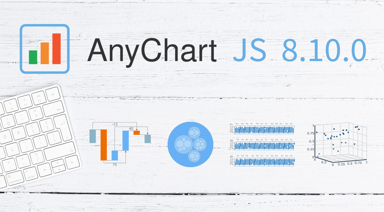 A new version of our JavaScript charting library is now out with a bunch of super wow updates! First, we’ve added two new chart types: Circle Packing and Calendar. Second, now you are more than welcome to make use of the pre-built Arrow Connectors in Waterfall Charts and Marker Series in 3D Surface Charts. Keep reading to learn more about the key new arrivals in AnyChart JS 8.10.0, and enjoy these just-added charts and features in our powerful data visualization tool!
»»» See What’s New in AnyChart 8.10.0! «««
- Categories: AnyChart Charting Component, Big Data, Business Intelligence, Dashboards, HTML5, JavaScript, News
- No Comments »
Creating Waterfall Chart with JS
March 16th, 2021 by Dilhani Withanage Do you want to know how to easily add a waterfall chart to a web page or application using JavaScript? This tutorial will make sure you’re prepared to confidently deal with that sort of interactive data visualization development!
Waterfall charts illuminate how a starting value turns into a final value over a sequence of intermediate additions (positive values) and subtractions (negative values). These additions and subtractions can be time-based or represent categories such as multiple income sources and expenditures. In finance, a waterfall chart is often called a bridge; you may have also heard it referred to as a cascade, Mario, or flying bricks chart.
To see waterfall charts in action and learn how to build them with JavaScript (HTML5), we need some interesting real-world data to visualize. In this tutorial, let’s look at the 2020 income statement for Alphabet Inc. (GOOGL), the parent company of Google.
Hence, be with me to reach our target step by step, so in the end, you’ll see how a lot of numbers can be made sense of with real ease when illustrated as a beautiful, interactive, JS waterfall chart. All aboard!
Read the JS charting tutorial »
- Categories: AnyChart Charting Component, Business Intelligence, HTML5, JavaScript, JavaScript Chart Tutorials, Tips and Tricks
- No Comments »
Bullseye Chart and Gantt Chart Improvements in Qlik Sense Extensions by AnyChart
March 8th, 2021 by AnyChart Team
? Bam! Meet Bullseye charts in Qlik Sense! Qlik counted on us to provide its customers with “additional choices for building even more compelling visualizations.” And we could not stop innovating, so Bullseye has become the 42nd chart type in AnyChart’s extensions for Qlik Sense — enjoy and hit the bull’s-eye in data-driven decision making!
Also, we have added new awesome features to our Gantt charts in Qlik Sense to help expedite actionable insights into your project data. Learn more about the highlights of the March 2021 release of the AnyChart and AnyGantt extensions in a quick overview, and download the latest version!
Read more at qlik.anychart.com »
- Categories: AnyChart Charting Component, AnyGantt, Big Data, Business Intelligence, Gantt Chart, News, Qlik
- No Comments »
Building Marimekko Chart with JavaScript
December 22nd, 2020 by Dilhani Withanage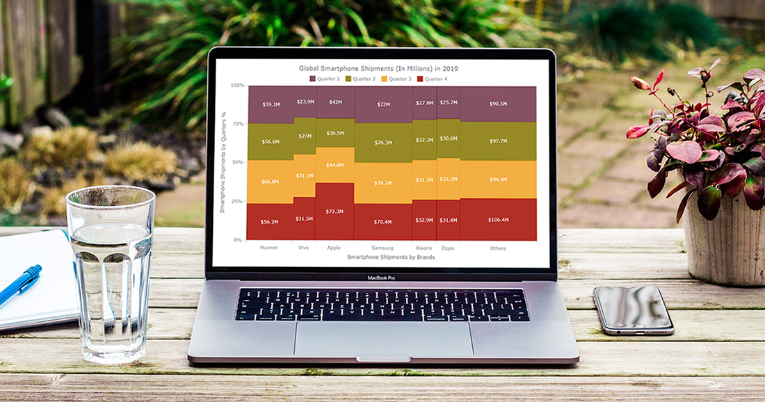 Would you like to know how to easily create an interactive Marimekko chart for HTML5 based apps and Web pages using JavaScript? If yes, you are on the best path to learning this.
Also known as Mekko charts and market maps, Marimekko charts display numerical values that vary from 0% to 100% in its Y-axis. The most exciting part lies in their X-axis, which indicates the sum of values within categories. Each category’s width along the X-axis portraits the whole category’s contribution to a total of all data. In simple words, this is a type of a stacked chart that visualizes categorical data. Still, both the Y and X axes vary in a percentage scale by determining each segment’s width and height.
Are you a smartphone enthusiast and interested to look at the global smartphone shipments in 2019 by quarter and by vendor? Then especially follow the present tutorial as we are to visualize this market data in an elegant Marimekko diagram using simple JS chart coding techniques.
Read the JS charting tutorial »
- Categories: AnyChart Charting Component, Business Intelligence, HTML5, JavaScript, JavaScript Chart Tutorials, Tips and Tricks
- No Comments »
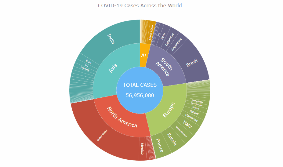
How I Created Sunburst Chart Using JavaScript to Visualize COVID-19 Data
December 8th, 2020 by Shachee Swadia Almost recovered from COVID-19 myself these days, I decided to explore how the world is currently doing, during the pandemic. So I created a sunburst chart to see at a glance what continents and countries are more (and less) affected by the coronavirus than others. The process was quick and I thought someone could be interested to learn about how such data visualizations can be built in a pretty straightforward way, even with very little technical skills. So I also made a tutorial. And here I am — (1) sharing my interactive sunburst chart of COVID cases and (2) describing how I created it using JavaScript in a matter of minutes, step by step!
My JS sunburst chart provides an overview of the situation as of November 24, 2020, and also shows the global count, continent-wide data, and country-wise proportions for the current active COVID-19 cases and deaths. Scroll down to explore it by yourself and check out the tutorial along the way. Here is a sneak peek of the final chart to get you excited:
This sunburst charting tutorial is mainly for beginners to data science. So before we get to business, let’s make sure we’re on the same page. I’ll explain what a sunburst chart is and how it works, to start with. Then I’ll show you how to create a cool and colorful interactive visualization like that with JavaScript (and you can do it even if you don’t know it too well). That’s the plan!
Read the JS charting tutorial »
- Categories: AnyChart Charting Component, Big Data, Business Intelligence, HTML5, JavaScript, JavaScript Chart Tutorials, Tips and Tricks
- No Comments »
New JavaScript Chart Features in AnyChart 8.9.0
September 29th, 2020 by AnyChart Team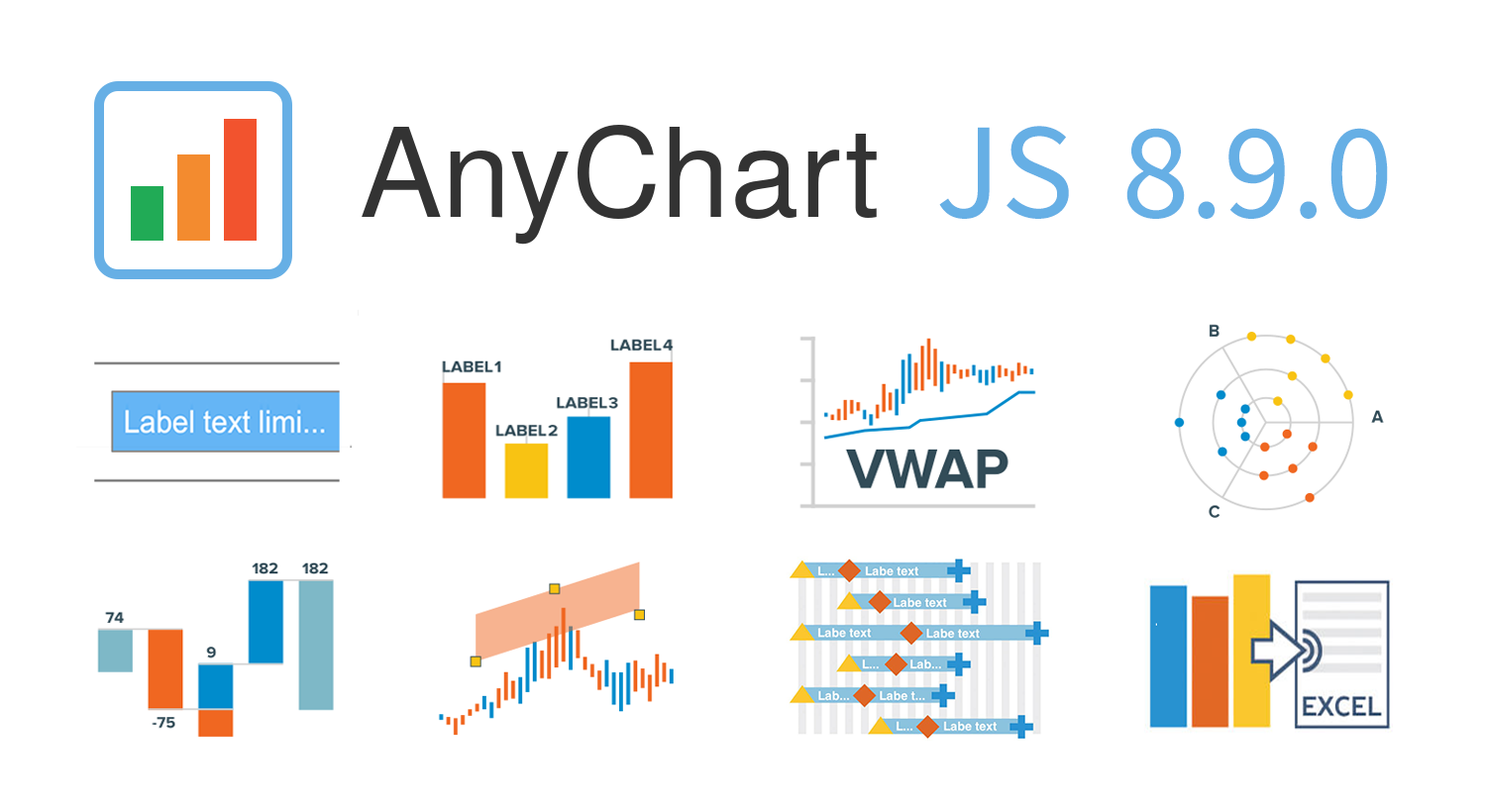 AnyChart 8.9.0 is out! The latest major update brings new exciting out-of-the-box features to our award-winning JavaScript charting library product family — AnyChart, AnyStock, AnyGantt, and AnyMap. Enjoy the improved functionality and build even more compelling data visualizations for your web sites and apps in less time!
»»» See What’s New in AnyChart 8.9.0! «««
- Categories: AnyChart Charting Component, AnyGantt, AnyMap, AnyStock, Big Data, Business Intelligence, Dashboards, Financial Charts, Gantt Chart, HTML5, JavaScript, News, Stock Charts
- 2 Comments »
How to Build Box Plot Using JavaScript: Visualizing World Happiness
September 22nd, 2020 by Wayde Herman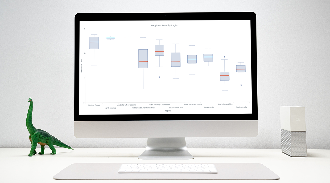 Data visualization is an important and sometimes undervalued tool in a data scientist’s toolkit. It allows us to gain an understanding and intuition about the data, through exploratory data analysis, which influences preprocessing, feature engineering, and the correct machine learning algorithm choice. It also helps to better evaluate models and even allows you to spot areas in the data where models could have poor performance.
Taking data visualization one step further by adding interactivity is even more advantageous. By adding interactive elements to your visualizations you create a more engaging experience. This in turn makes a user ‘explore’ visualizations instead of just reading them!
In this tutorial, I will be covering how to build an interactive data visualization, specifically a box plot as an example, using JavaScript and a charting library. I will begin by first briefly covering the basics of box plots before going through the steps of building one and then finally using the technique in a fun example to investigate the distribution of happiness between the different regions of the planet in an attempt to answer the question: ‘Where should you live to be happier?’.
Read the JS charting tutorial »
- Categories: AnyChart Charting Component, Big Data, Business Intelligence, HTML5, JavaScript, JavaScript Chart Tutorials, Tips and Tricks
- 1 Comment »