AnyChart Joins Qlik Technology Program and Adds 36 Chart Types to Qlik Sense in Just-Launched Extensions
May 7th, 2019 by AnyChart Team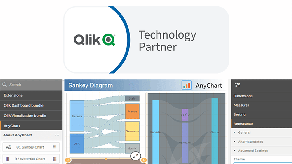
“We’re excited to be partnering with AnyChart, and their extensions will provide customers with additional choices for building even more compelling visualizations.”
— Mike Foster, Vice President, Strategic Partners at Qlik.
(Source: press release as of May 7, 2019.)
AnyChart crosses a new frontier! The vast data visualization capabilities of our award-winning JavaScript charting library, designed primarily for web developers and software engineers, are now available directly to data analysts and BI experts through powerful, flexible, intuitive extensions for Qlik Sense — AnyChart, AnyGantt, and AnyStock!
Read more at qlik.anychart.com »
- Categories: AnyChart Charting Component, AnyGantt, AnyStock, Big Data, Business Intelligence, Qlik
- 13 Comments »
Qlik Data Visualization Extension: Introducing Custom Drawing Over Custom Theme
January 16th, 2019 by Irina Maximova Our Qlik Charts Extension now allows a custom renderer to be set for certain chart types! We’ll show you how to make use of this new great feature in your Qlik data visualization practice, implementing custom drawing over a custom theme.
Before we begin, please note: We recommend getting acquainted with the custom drawing documentation of AnyChart JS Charts if you never worked with it before. When you do that, it will be easier for you to understand what the custom drawing functions are and how to use them right and best.
- Categories: AnyChart Charting Component, Business Intelligence, HTML5, News, Qlik, Tips and Tricks
- No Comments »
What Is Data Visualization? Definition, History, and Examples
November 20th, 2018 by Jay Stevenson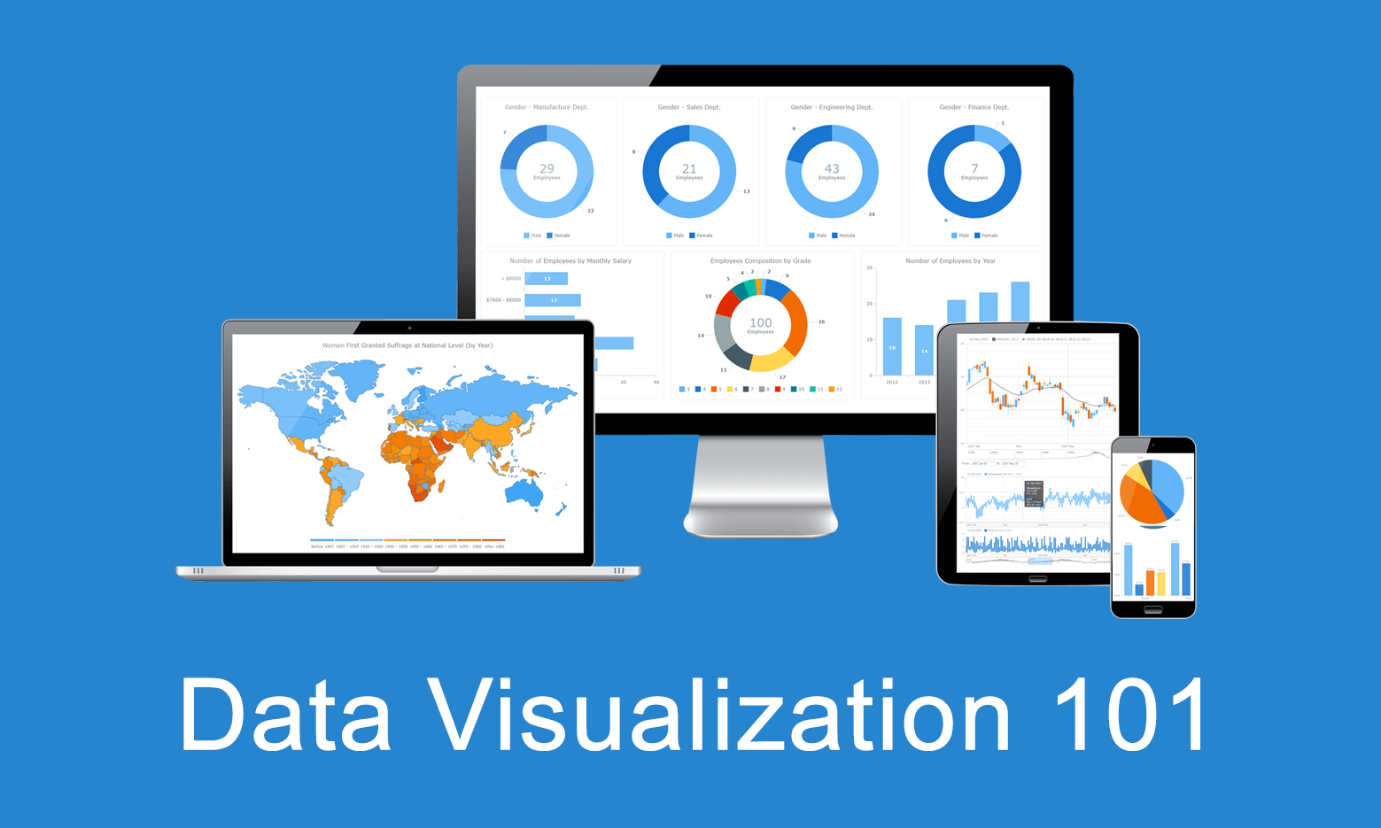 Data visualization is the practice of converting data from raw figures into a graphical representation such as graphs, maps, charts, and complex dashboards. Let’s see what makes it important (meaning), how it has developed (history), and exactly how it can work in real life (examples). Join us on Data Visualization 101, an introduction to dataviz and its power.
Current Price Indicator with Custom Value and Scale Calculation in JavaScript Stock Charts — Challenge AnyChart!
September 19th, 2018 by Irina Maximova Further inspired by noteworthy questions our Support Team receives from customers, we resume the Challenge AnyChart! feature, demonstrating huge flexibility of our JavaScript (HTML5) charting libraries and explaining how exactly you can solve advanced data visualization tasks with the help of AnyChart. Today’s tutorial is about JS stock charts, and more precisely, we’ll dive into how to draw the Current Price Indicator with a custom value and make it visible even when zooming and scrolling, by utilizing Axis Markers.
- Categories: AnyChart Charting Component, AnyStock, Big Data, Business Intelligence, Challenge AnyChart!, Charts and Art, Financial Charts, HTML5, JavaScript, Stock Charts, Tips and Tricks
- No Comments »
Custom Technical Indicators in JavaScript Stock Charts — Challenge AnyChart!
March 14th, 2018 by Irina Maximova
It is a pleasure to present a new Challenge AnyChart article! We love our customers and their original tasks, so we continue to show the unlimited capabilities of our JavaScript charting libraries to the blog readers.
The heroes of today’s tutorial are custom technical indicators. Below we’ll explore how to add them to a JS (HTML5) stock chart step by step. So, let’s begin.
- Categories: AnyChart Charting Component, AnyStock, Big Data, Business Intelligence, Challenge AnyChart!, Charts and Art, Financial Charts, HTML5, JavaScript, Stock Charts, Tips and Tricks
- 1 Comment »
AnyChart Extension 2.0 for Qlik Sense Released, Fueling Flexibility in Data Visualization
November 15th, 2017 by AnyChart Team When AnyChart JS Charts‘ dedicated extension for Qlik Sense first hit the stage on Qlik Branch in the spring of 2017, it was well received by the community. In fact, we delivered what many Qlik users craved: advanced flexibility which at the same time would not affect the ease of interactive data visualization. And that was just the beginning.
Now, we are happy to present version 2.0 of our extension for Qlik Sense!
The major update has brought new chart types and elaborate features out of the box, sharing another portion of the ultimate data visualization power inherent in the AnyChart JavaScript charting library with Qlik users.
- Categories: AnyChart Charting Component, Business Intelligence, HTML5, News, Qlik
- 1 Comment »
Top Big Data Trends for 2017
September 13th, 2017 by Jay Stevenson Big Data has been growing exponentially as a very special segment in the core of today’s data analytics, with all the more organizations and companies collecting, visualizing, exploring and communicating large amounts of various kinds of data. In this article, we will talk about notable big data trends that we see in and for 2017 and also take a quick look at some technologies being widely used in this field today.
- Categories: Big Data, Business Intelligence, Dashboards
- No Comments »
Data Visualization with JavaScript: The Story of AnyChart JS Charts
September 7th, 2017 by AnyChart Team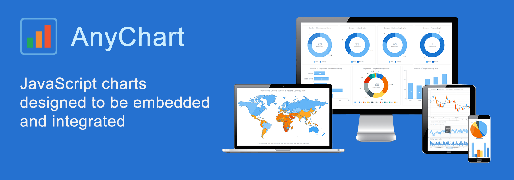 AnyChart is a flexible JavaScript (HTML5) based solution that allows you to create interactive and great looking charts. It is a cross-browser and cross-platform charting solution intended for everybody who deals with creation of dashboard, reporting, analytics, statistical, financial or any other data visualization solutions. AnyChart works everywhere -PCs, Macs, iPhones, iPads, Android devices and helps businesses transform operational data into actionable information.
Kevin William David interviewed Anton Baranchuk, CEO at AnyChart to know more.
- Categories: AnyChart Charting Component, AnyGantt, AnyMap, AnyStock, Business Intelligence, Flash Platform, GraphicsJS, HTML5, JavaScript, Oracle Apex, Qlik, Success Stories
- No Comments »
Top Data Visualization Mistakes to Avoid
August 29th, 2017 by Jay Stevenson Data visualization is a fast and simple way to convey messages and concepts in an efficient manner. Besides improving the information relay, this approach has also changed the way business is done. Organizations that deal with large amounts of information on a daily basis can now process data and have the intended audience decipher it at lightning-fast speeds, thus enhancing the process of information management. However, data visualization mistakes are quite widespread, and let’s take a look what they are, why they are harmful, and how to avoid them.
- Categories: Business Intelligence, Charts and Art, Dashboards, Tips and Tricks
- 1 Comment »
AnyChart JavaScript Charting Libraries 7.14.0 Released: Can’t Stop Perfecting Data Visualization!
May 30th, 2017 by AnyChart Team![]() Here are the spring May flowers we promised. After the hard work put in over the past months, we’re happy to announce that the 7.14.0 release of our JavaScript charting libraries AnyChart, AnyStock, AnyMap, and AnyGantt is out and ready to download! It brings you new cool features and important improvements that will make your data visualization life even better.
Here are the spring May flowers we promised. After the hard work put in over the past months, we’re happy to announce that the 7.14.0 release of our JavaScript charting libraries AnyChart, AnyStock, AnyMap, and AnyGantt is out and ready to download! It brings you new cool features and important improvements that will make your data visualization life even better.
Now, we invite you to discover all the new JavaScript/HTML5 charting capabilities that the 7.14.0 version of AnyChart’s data visualization software product family has to offer to you. Here’s a quick overview…
- Categories: AnyChart Charting Component, AnyGantt, AnyMap, AnyStock, Business Intelligence, Dashboards, Financial Charts, Gantt Chart, HTML5, JavaScript, News, Stock Charts
- 7 Comments »