How to Create Bubble Map with JavaScript to Visualize Election Results
January 25th, 2021 by Shachee Swadia In these times of exponentially growing data, visualization is a necessary skillset to have in your tool box. Popular techniques include bar charts, line graphs, pie charts, and bubble maps among others.
Building interactive charts from scratch with JavaScript can be a difficult endeavor for any developer, especially someone starting out new. That is exactly why we have JS charting libraries which make it much easier and quicker to conjure up insightful visualizations!
Read on to see how I create a JavaScript Bubble Map with one of these libraries.
Read the JS charting tutorial »
- Categories: AnyChart Charting Component, AnyMap, Big Data, Charts and Art, HTML5, JavaScript, JavaScript Chart Tutorials, Tips and Tricks
- No Comments »
Building JavaScript Radar Chart
July 7th, 2020 by Wayde Herman Radar charts, which are also referred to as spider charts or radar plots, are a data visualization used to compare observations with multiple quantitative variables. Each variable is encoded to a spoke which are equidistant apart. The higher the value, the further away from the center of the chart the point is made. Radar charts are best used to compare the ‘profile’ of observations and to detect outliers within the data. They are therefore used quite a bit in sports, most notably in basketball and soccer for profiling players.
In this tutorial I will be teaching you how to build your own radar chart with JavaScript and how to use them to help with one of the toughest decisions in gaming history: which starting pokemon to choose!
That’s right, we will be building radar charts to perform data analysis on Bulbasaur, Charmander and Squirtle to determine, once and for all, which is the best choice.
Read the JS charting tutorial »
- Categories: AnyChart Charting Component, Charts and Art, HTML5, JavaScript, JavaScript Chart Tutorials, Tips and Tricks
- No Comments »
StopCorona Creator Shares How They Visualize COVID-19 Data Using AnyChart
May 21st, 2020 by AnyChart Team![]() Earlier, we introduced you to a new, ever-updating COVID tracker that uses AnyChart to visualize the latest pandemic data in insightful charts, StopCorona.info. To let you know more, we also talked to Vadim Peskov, CEO at Diffco, the app development company behind StopCorona, and asked him a few questions.
Earlier, we introduced you to a new, ever-updating COVID tracker that uses AnyChart to visualize the latest pandemic data in insightful charts, StopCorona.info. To let you know more, we also talked to Vadim Peskov, CEO at Diffco, the app development company behind StopCorona, and asked him a few questions.
Read our quick interview to learn more about StopCorona and their experience using our JavaScript charting library for interactive data visualization. (Stack: MySQL/Symfony/Angular.)
- Categories: AnyChart Charting Component, Big Data, Charts and Art, HTML5, JavaScript, Success Stories
- 3 Comments »
AnyChart Recognized in Top 10 Business Intelligence and Analytics Companies of 2019
November 19th, 2019 by AnyChart Team We are excited to announce that Analytics Insight, a magazine that covers big data and business intelligence developments, included AnyChart in The 10 Next Generation BI and Analytics Companies of 2019 — “for providing the most advanced solutions and playing a significant role in shaping the future of these disruptive technologies.”
The list has been made public in the just-released November issue of the magazine and is accompanied by the stories about each featured company. With permission of Analytics Insight, today we are republishing the magazine’s story about us on our blog — “AnyChart: Turning Data into Actionable Insights with Award-Winning Data Visualization Solutions.”
Read the story of AnyChart as it appeared on Analytics Insight »
- Categories: AnyChart Charting Component, AnyGantt, AnyMap, AnyStock, Big Data, Business Intelligence, Charts and Art, Dashboards, Financial Charts, Flash Platform, Gantt Chart, GraphicsJS, HTML5, Interesting Facts, JavaScript, News, Success Stories
- No Comments »
Create Cool Interactive Sankey Diagram Using JavaScript — Tutorial
June 13th, 2019 by Alfrick Opidi Sankey diagrams are becoming more and more popular in data visualization tasks. So, it’s essential for front-end web developers to know how to create charts of this type. Actually, it is quite a simple and straightforward process, especially if you are using one of the good JavaScript charting libraries.
In my tutorial, I’ll show you how to create beautiful, intuitive, interactive JS (HTML5) Sankey diagrams with no fuss.
Read the JS charting tutorial »
- Categories: AnyChart Charting Component, Big Data, Business Intelligence, Charts and Art, HTML5, JavaScript, JavaScript Chart Tutorials, Tips and Tricks
- No Comments »
How to Create Stunning Interactive Bar Charts Using JavaScript — Tutorial
April 3rd, 2019 by Alfrick Opidi Web developer Alfrick Opidi shows how to create beautiful interactive bar charts using JavaScript (HTML5), taking the AnyChart JS charting library as an example along the tutorial.
Read the JS charting tutorial »
- Categories: AnyChart Charting Component, Charts and Art, HTML5, JavaScript, JavaScript Chart Tutorials, Tips and Tricks
- No Comments »
Stacked Column Charts with Images — Challenge AnyChart!
January 23rd, 2019 by Irina Maximova We are ready to share a new advanced JS (HTML5) data visualization tutorial. Tasks we get from our customers are always interesting, and the Challenge AnyChart! series on our blog proved to be a great way to show you some of the most compelling ones and explain how to solve them, demonstrating the power and flexibility of our JavaScript charts library. Today’s challenge is about adding images to stacked column charts using AnyChart.
- Categories: AnyChart Charting Component, Challenge AnyChart!, Charts and Art, HTML5, JavaScript, Tips and Tricks
- No Comments »
Custom WiFi Polar Chart in JavaScript — Challenge AnyChart!
January 2nd, 2019 by Irina Maximova Solving challenges is a thing that the AnyChart team can’t live without, and we willingly continue to share some of the most interesting customer cases within the framework of Challenge AnyChart! on our blog. This feature gives us a great chance to help customers with similar tasks and demonstrate the unlimited data visualization capabilities of our JavaScript charting library time after time. The challenge being solved along today’s tutorial is about building a beautiful WiFi polar chart — a custom interactive JS (HTML5) polar chart that displays devices depending on the WiFi signal strength.
- Categories: AnyChart Charting Component, Challenge AnyChart!, Charts and Art, HTML5, JavaScript, Tips and Tricks
- No Comments »
What Is Data Visualization? Definition, History, and Examples
November 20th, 2018 by Jay Stevenson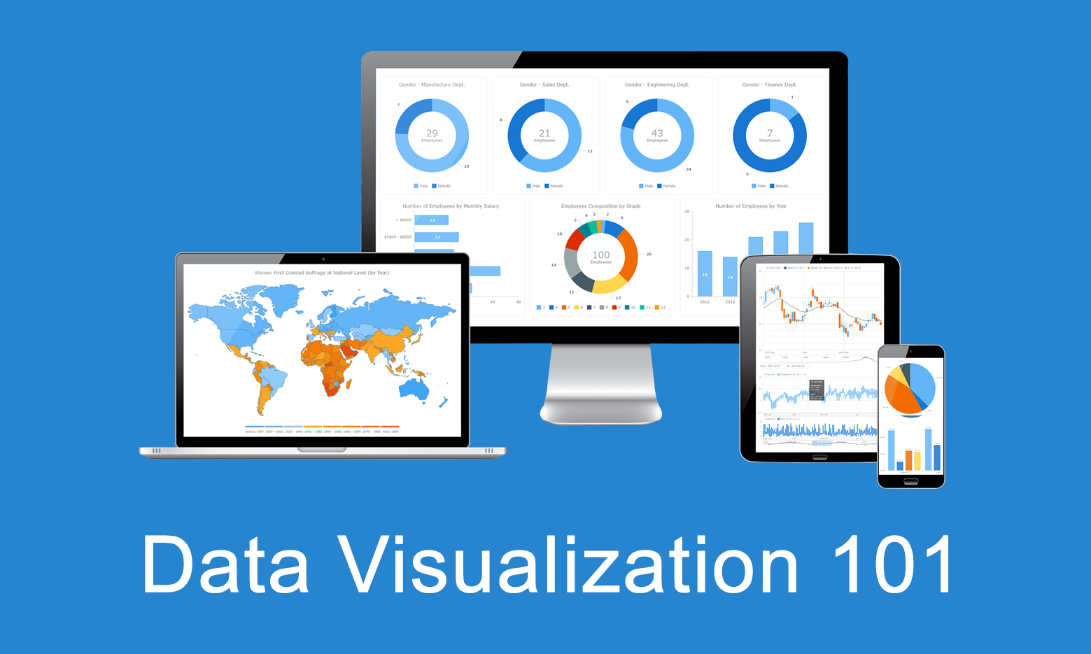 Data visualization is the practice of converting data from raw figures into a graphical representation such as graphs, maps, charts, and complex dashboards. Let’s see what makes it important (meaning), how it has developed (history), and exactly how it can work in real life (examples). Join us on Data Visualization 101, an introduction to dataviz and its power.
Current Price Indicator with Custom Value and Scale Calculation in JavaScript Stock Charts — Challenge AnyChart!
September 19th, 2018 by Irina Maximova Further inspired by noteworthy questions our Support Team receives from customers, we resume the Challenge AnyChart! feature, demonstrating huge flexibility of our JavaScript (HTML5) charting libraries and explaining how exactly you can solve advanced data visualization tasks with the help of AnyChart. Today’s tutorial is about JS stock charts, and more precisely, we’ll dive into how to draw the Current Price Indicator with a custom value and make it visible even when zooming and scrolling, by utilizing Axis Markers.
- Categories: AnyChart Charting Component, AnyStock, Big Data, Business Intelligence, Challenge AnyChart!, Charts and Art, Financial Charts, HTML5, JavaScript, Stock Charts, Tips and Tricks
- No Comments »