Custom Technical Indicators in JavaScript Stock Charts — Challenge AnyChart!
March 14th, 2018 by Irina Maximova
It is a pleasure to present a new Challenge AnyChart article! We love our customers and their original tasks, so we continue to show the unlimited capabilities of our JavaScript charting libraries to the blog readers.
The heroes of today’s tutorial are custom technical indicators. Below we’ll explore how to add them to a JS (HTML5) stock chart step by step. So, let’s begin.
- Categories: AnyChart Charting Component, AnyStock, Big Data, Business Intelligence, Challenge AnyChart!, Charts and Art, Financial Charts, HTML5, JavaScript, Stock Charts, Tips and Tricks
- 1 Comment »
Conditional Custom Drawing in JavaScript Charts — Challenge AnyChart!
December 13th, 2017 by Vitaly Radionov The time has come for a new Challenge AnyChart! article! We continue to receive interesting data visualization tasks from our wonderful customers and are happy to share with our blog readers how to solve some of the most inspiring ones with the help of our JavaScript charting libraries.
In today’s tutorial, let’s dig into custom drawing and create an interactive HTML5 line chart of which the segments with negative values are painted with a different color than the rest of the graph.
- Categories: AnyChart Charting Component, Challenge AnyChart!, Charts and Art, HTML5, JavaScript, Tips and Tricks
- No Comments »
How to Add Multi-level Category Axis — Challenge AnyChart!
November 29th, 2017 by Vitaly Radionov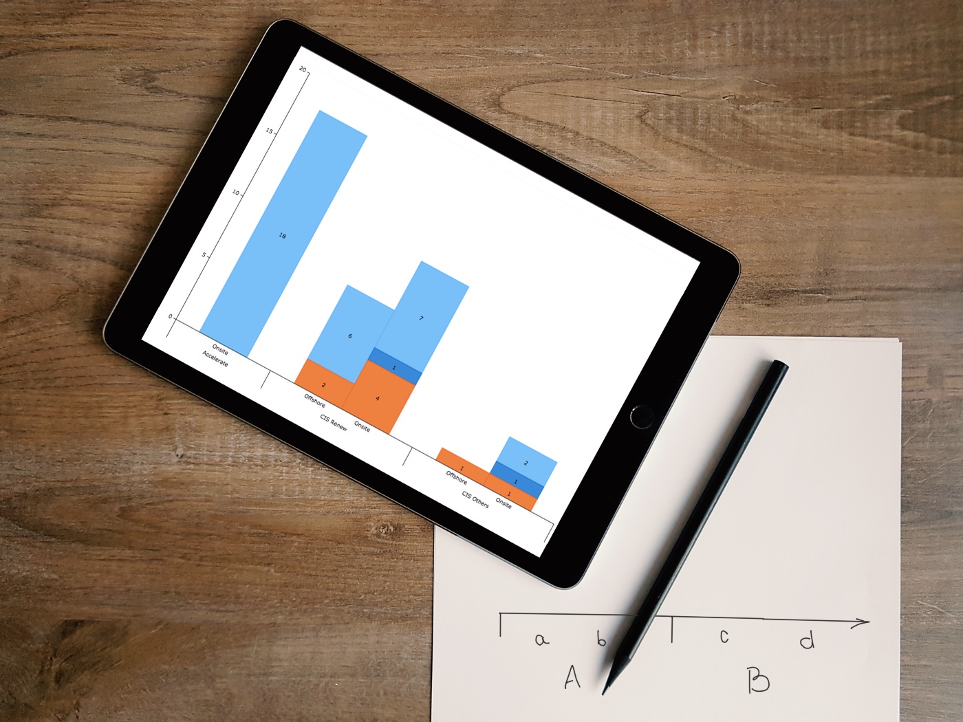 We are glad to present to you a new article in the Challenge AnyChart! series.
Just to remind you, these are articles inspired by your requests to our Support Team and our will to publicly prove that the opportunities of interactive data visualization with our JavaScript (HTML5) charting libraries are profound.
One of our customers asked us how to add a multi-level category axis for categorical data and display subcategories. Ok, there you go! We’ve made a quick tutorial and created the corresponding JavaScript chart example (you can already see it in the title picture).
- Categories: AnyChart Charting Component, Challenge AnyChart!, Charts and Art, HTML5, JavaScript, Tips and Tricks
- 1 Comment »
Advanced Visualization of Spot in JS Polar Charts — Challenge AnyChart!
October 27th, 2017 by Vitaly Radionov Meet Challenge AnyChart, a brand new feature on our blog that every dataviz engineer will fall in love with! Each article in this series will be a quick tutorial on how to complete a specific data visualization task that – at first sight – seems too complicated or even unsolvable with AnyChart JS Charts.
From now on, once in a couple of weeks, we’ll pick a thrilling challenge – one of those you’ve shared with our Support Team. And then we’ll show you the best way to deal with it. So all of you can see: Nothing is impossible in AnyChart!
The first challenge for the very first Challenge AnyChart issue is about making an advanced interactive visualization of the spot in a JavaScript polar chart.
- Categories: AnyChart Charting Component, Challenge AnyChart!, Charts and Art, HTML5, JavaScript, Tips and Tricks
- No Comments »
Top Data Visualization Mistakes to Avoid
August 29th, 2017 by Jay Stevenson Data visualization is a fast and simple way to convey messages and concepts in an efficient manner. Besides improving the information relay, this approach has also changed the way business is done. Organizations that deal with large amounts of information on a daily basis can now process data and have the intended audience decipher it at lightning-fast speeds, thus enhancing the process of information management. However, data visualization mistakes are quite widespread, and let’s take a look what they are, why they are harmful, and how to avoid them.
- Categories: Business Intelligence, Charts and Art, Dashboards, Tips and Tricks
- 1 Comment »
JavaScript Drawing Library GraphicsJS 1.2.0 Released + Introduction from SitePoint
May 3rd, 2017 by AnyChart TeamGraphicsJS, our powerful JavaScript drawing library that we open-sourced last year, has recently got an update to version 1.2.0. It is the next best news of 2017, a great addition to winning a Devies Award with GraphicsJS for the category “JavaScript Technologies” and to the 7.13.0/7.13.1 releases of our JS/HTML5 charting solutions AnyChart, AnyStock, AnyMap, and AnyGantt.
So, we invite you to take a very quick look at the most important updates (we’ll highlight the two below). And then – in case you want to feel the real power of JavaScript drawing and have not used GraphicsJS in your business or fun web projects yet – we are sharing a nice article published on SitePoint just recently. It is an introduction to GraphicsJS based on two tutorials. They will guide you through the most valuable features of this JavaScript drawing library and demonstrate them in action, and you’ll learn how to easily create a naïve art picture and a time-killer game.

JavaScript Drawing with GraphicsJS: Main Improvements
- Closure library and Closure compiler were updated to version 20161024.
- Enjoy an improved JavaScript drawing performance! In particular, we optimized the process of obtaining a link to a container for the stage. Also, resize events are now handled with the help of the Timer object, not the iFrame element.
Now, you are welcome to read the SitePoint article about GraphicsJS. Please do not forget to ask your questions, if any. You may do that by leaving a comment here right below the article.
- Categories: Charts and Art, GraphicsJS, HTML5, JavaScript, News, Tips and Tricks
- 2 Comments »
Stacked Bar Charts Explained, Vizzies 2017 Winners, Global Temperature Graph, Map of Sea Level Rise | DataViz Weekly
March 31st, 2017 by AnyChart Team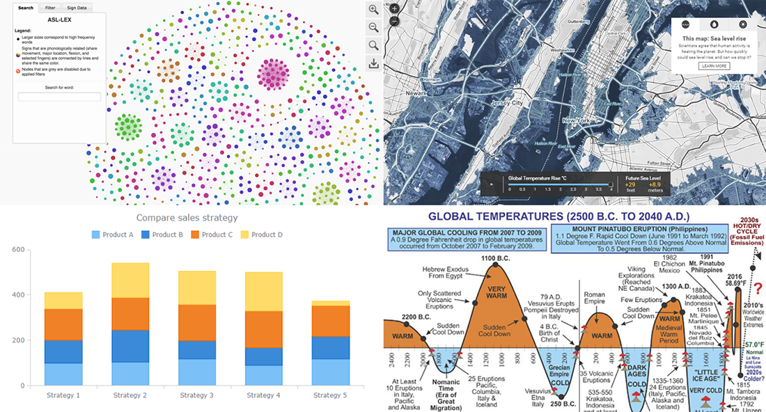
Today is the 13th Friday of the 2017 year, and another weekend is coming! In the meantime, we invite you to enjoy another portion of last week’s notable works in the data visualization field. The first highlight here is the article about stacked bar charts and how to use them, written by our Data Visualization Expert Vitaly Radionov specifically for Smashing Magazine. After briefing you on that, we’ll also take a look at this year’s winners of the Vizzies Challenge, a graph of global temperature change from 2500 BC to 2040 AD, and a (scary) map visualization of the sea level rise expected in the (near?) future.
- Categories: Charts and Art, Data Visualization Weekly
- No Comments »
25 Data Visualization Examples for One Dataset, Animated Map of Twitter Reactions During Oscars, and More | DataViz Weekly
March 17th, 2017 by AnyChart Team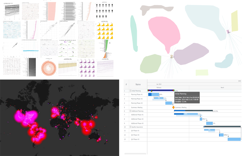 25 data visualization examples of how you can present the same dataset, an animated map of Twitter users’ reaction during this year’s Oscars, JavaScript-based self-driving cars, and an interactive Gantt chart sample with customized connectors in the Live Edit mode. These are the masterpieces that we are highlighting in today’s Data Visualization Weekly post.
Without more ado, let’s get to our latest collection of popular and most shared new charts from around the Web.
- Categories: Charts and Art, Data Visualization Weekly, News
- No Comments »
Data Visualizations of the Week: JS Frog Column Chart, Seeing Theory, and More
March 10th, 2017 by AnyChart Team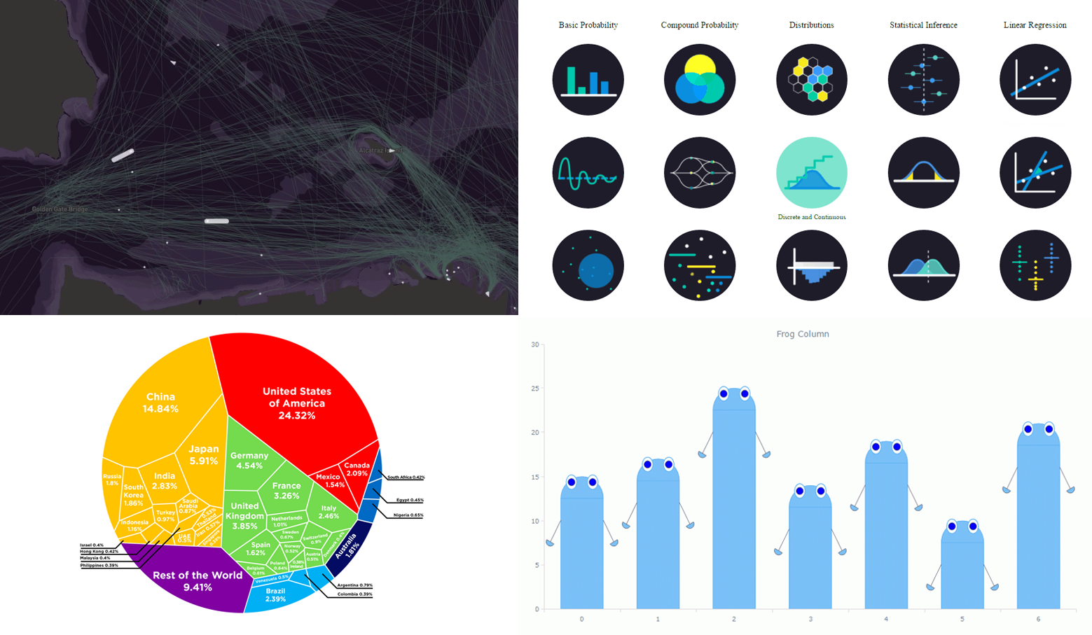 Now it’s time to say hello to last week’s most eye-catching data visualizations. As always, choosing just some of the best new and most popular pieces is a difficult task. But we are more than glad to do that for Data Visualization Weekly! And please don’t stop making more and more charts, people! That’s pleasant and greatly inspiring to see so many cool data visualizations emerge every week. Examining them also allows all of us to keep learning from the best practices, expand the vision, and further improve skills and understanding.
Today’s Data Visualization Weekly issue highlights the following four great presentations:
- animated map of shipping in the San Francisco Bay;
- interactive visualization of statistics and probability;
- Voronoi diagram of the global economy;
- “frog” column chart of whatever you need.
- Categories: Charts and Art, Data Visualization Weekly, News
- No Comments »
Data Visualization Weekly: Recent Popular Interesting Charts, Maps, and Infographics
March 3rd, 2017 by AnyChart Team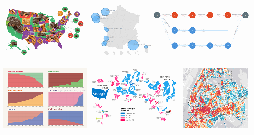 We are back with another collection of interesting charts, maps and infographics being popular lately. As you probably noticed, our Data Visualization Weekly series took a short break. In fact, no new issue came out last week. But the reason is simple and (hopefully) excusable. In fact, we were working really hard to get things done with the exciting major 7.13.0 update that our JavaScript charting libraries has received earlier this week.
Now the source code of AnyChart, AnyMap, AnyStock and AnyGantt is open. Plugins for all popular JS frameworks are available. And all the new features from the 7.13.0 release work great. That means we can finally get back to you to showcase new data visualizations that people followed most on our Twitter, Facebook and LinkedIn accounts over the last days. Moreover, the current issue of Data Visualization Weekly will cover the last two weeks instead of just one, to reimburse you for the delay. So, let’s take a look at the following great visual pieces now:
- Most Popular Girl Scout Cookies;
- History of Global Living Conditions in Interesting Charts;
- Interactive Map of Popular Surfing Areas in France;
- Most Popular Brands in Each Country;
- PERT Chart of Airplane Design Process;
- Revealing Age of Buildings in New York City.
- Categories: Charts and Art, Data Visualization Weekly, News
- No Comments »