Explore U.S. Presidential Elections in Our New Qlik App — Feedback Welcome in Qlik Gallery!
April 3rd, 2025 by AnyChart Team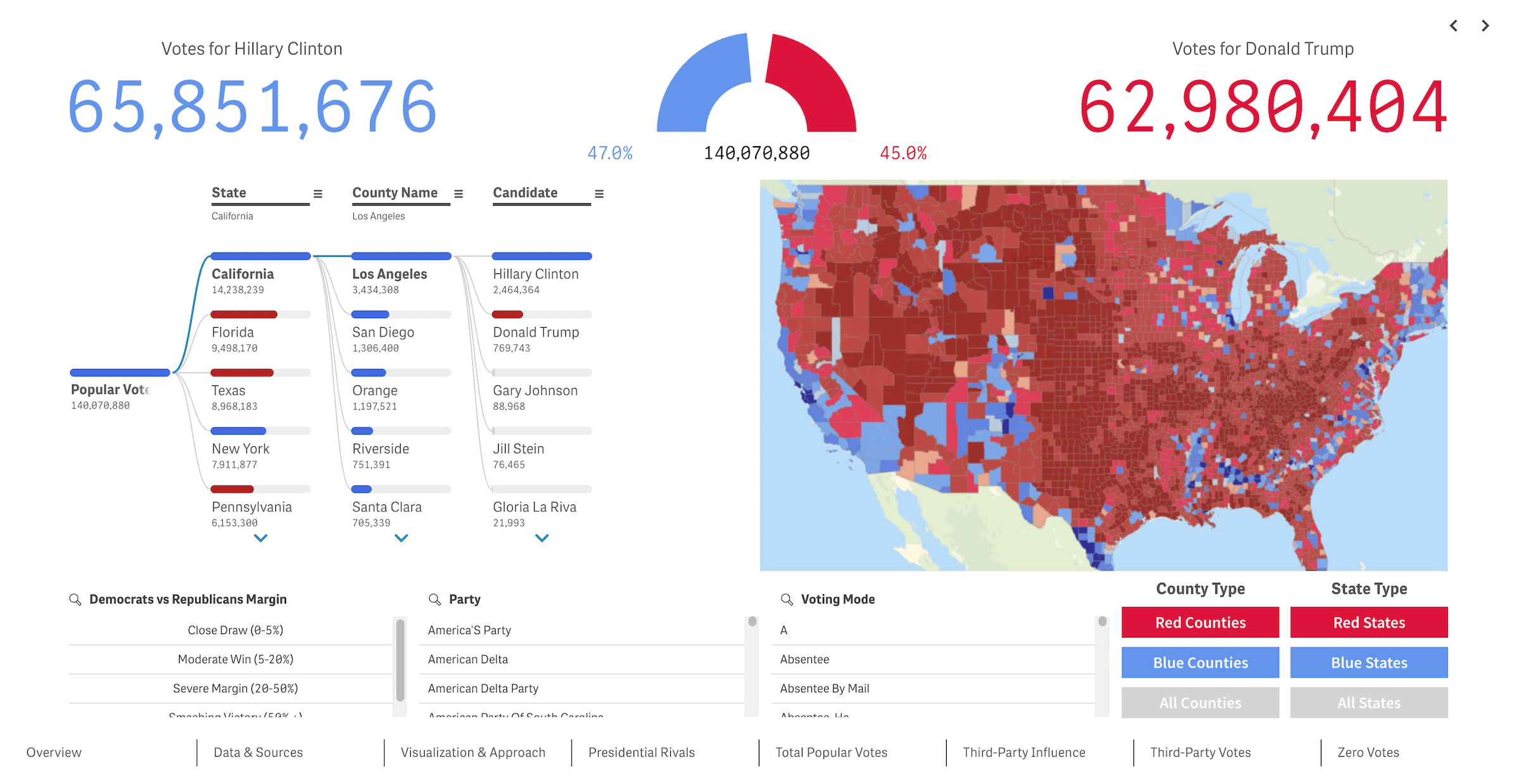 We recently released a new public Qlik Sense application that offers an interactive deep dive into U.S. presidential elections from 2016 through 2024 — our first step toward building the ultimate tool for exploring every presidential election in American history. We’re glad to see it’s already been well-received in the Qlik community and attracted significant attention, especially after being featured in the Qlik Gallery. The app is fully accessible in the browser, even if you do not have Qlik.
Read more at qlik.anychart.com »
- Categories: AnyChart Charting Component, Big Data, Business Intelligence, Dashboards, Qlik
- No Comments »
Heading to Qlik Connect 2025 — Join Us There!
February 25th, 2025 by AnyChart Team We are going to Qlik Connect 2025! 🚀
Not packing just yet — May is still a bit away. But we are getting ready and looking forward to meeting the amazing Qlik community in Orlando, with lots of great presentations and conversations ahead.
We will be there with our Qlik Sense extensions, bringing something special to push the boundaries of visual analytics in Qlik even further. Make sure to stop by if you are around — we would love to connect!
And while we are counting down the days, feel free to check out how great it was last year — take a moment to revisit our Qlik Connect 2024 recap.
See you in Orlando! 📍
- Categories: Big Data, Business Intelligence, Dashboards, News, Qlik
- No Comments »
20+ Years of Advancing Data Visualization: Interview with Our CEO
February 5th, 2025 by AnyChart Team Unicorns Journal just published an interview with our CEO and co-founder, Anton Baranchuk, where he reflects on AnyChart’s journey from a small startup to a global leader in data visualization, trusted by enterprises worldwide.
Anton talks about how we got started, the transition from Flash to JavaScript charting, our work with Qlik, and the vision and values that continue to drive us forward.
- Categories: AnyChart Charting Component, AnyGantt, AnyMap, AnyStock, Big Data, Blogroll, Books, Business Intelligence, Dashboards, Financial Charts, Flash Platform, Gantt Chart, GraphicsJS, HTML5, JavaScript, News, Oracle Apex, Qlik, Stock Charts, Success Stories
- No Comments »
Reflecting on 2024 and Embracing 2025 — Happy New Year!
January 9th, 2025 by AnyChart Team Another remarkable year is officially in the books! Here at AnyChart, 2024 was a truly rewarding journey marked by innovation and impact:
- Named Best Tech in Data Analytics & Visualization — once again!
- Enhanced our JavaScript charting library with exciting new features and tweaks, particularly in Timeline, Waterfall, and Circle Packing charts — plus multiple custom solutions tailored to your specific needs.
- Thrived in the Qlik ecosystem with transformative updates for our extensions for Qlik Sense, rocking Qlik Connect in Orlando, and more — explore our 2024 highlights as Qlik’s Technology Partner.
As we step into 2025, we remain committed to pushing the boundaries of data visualization and analytics, ensuring you always have the tools you need to excel and succeed. Here’s to an even greater year ahead — happy 2025, and stay tuned for what’s coming next!
- Categories: AnyChart Charting Component, AnyGantt, AnyMap, AnyStock, Big Data, Blogroll, Business Intelligence, Charts and Art, Dashboards, Financial Charts, Gantt Chart, HTML5, JavaScript, News, Qlik, Stock Charts
- No Comments »
Integrating AnyChart JS Charts in Python Django Financial Trading Dashboard
December 3rd, 2024 by Michael Whittle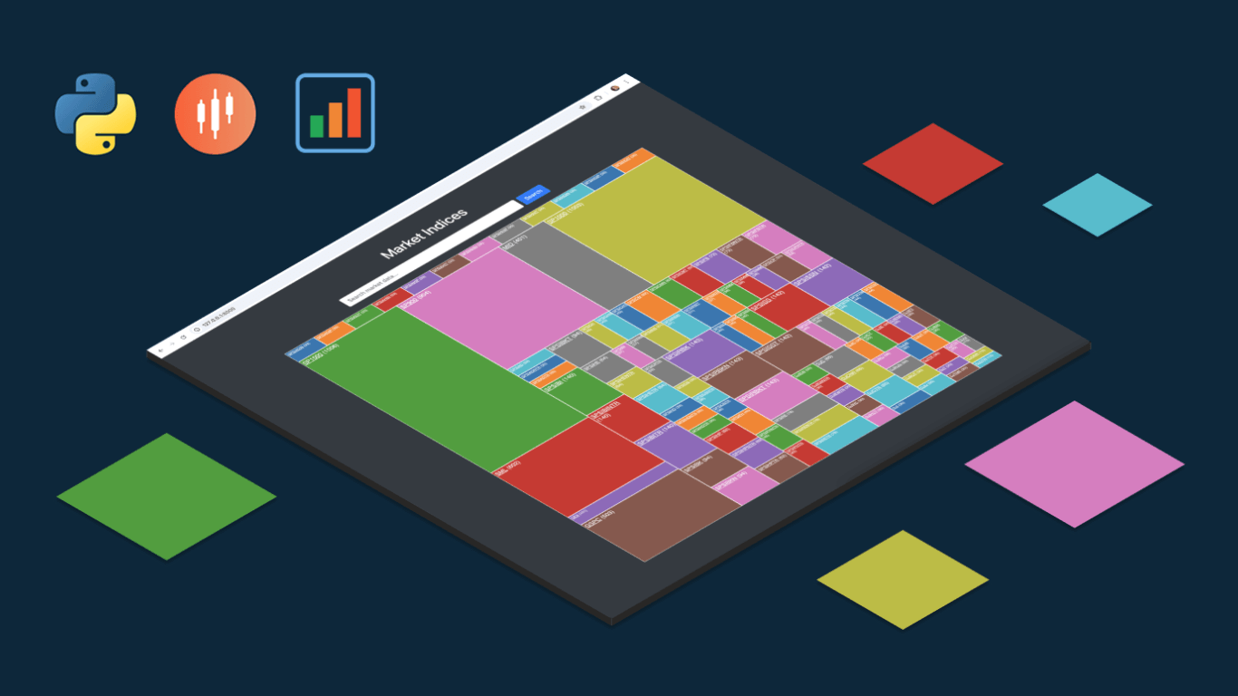 We are pleased to share an insightful article by Michael Whittle, a seasoned solution architect and developer with over 20 years of experience. Originally published on EODHD.com, it explores how he integrated our JavaScript charting library into a financial trading dashboard built with Python Django. Michael also shares his experience migrating a treemap from D3.js to AnyChart and explains why he chose our solution for implementing a stock chart, highlighting the intuitive code and enhanced functionality. Read on to discover how you can elevate your financial data visualizations in Python Django web applications with AnyChart JS Charts.
- Categories: AnyChart Charting Component, AnyStock, Big Data, Dashboards, Financial Charts, HTML5, JavaScript, Stock Charts, Third-Party Developers, Tips and Tricks
- No Comments »
27 Election Maps of 2024 U.S. Presidential Vote Results — DataViz Weekly Special Edition
November 8th, 2024 by AnyChart Team The 2024 U.S. presidential election has concluded, and media outlets worldwide are offering a plethora of data graphics to convey the election results. In this special edition of DataViz Weekly, we’ve curated a collection of over twenty election maps, showcasing diverse ways to represent voting data — cartograms, choropleth maps, bubble maps, and more. Whether you’re a data enthusiast, professional, or simply intrigued by the 2024 election outcomes, explore the latest U.S. election maps from top media!
💡 Also see our previous special editions with election maps: 2020 U.S. election maps and 2024 UK election maps.
- Categories: AnyMap, Dashboards, Data Visualization Weekly
- No Comments »
3 Ways to Set Height and Width of JavaScript Charts — JS Chart Tips
October 17th, 2024 by AnyChart Team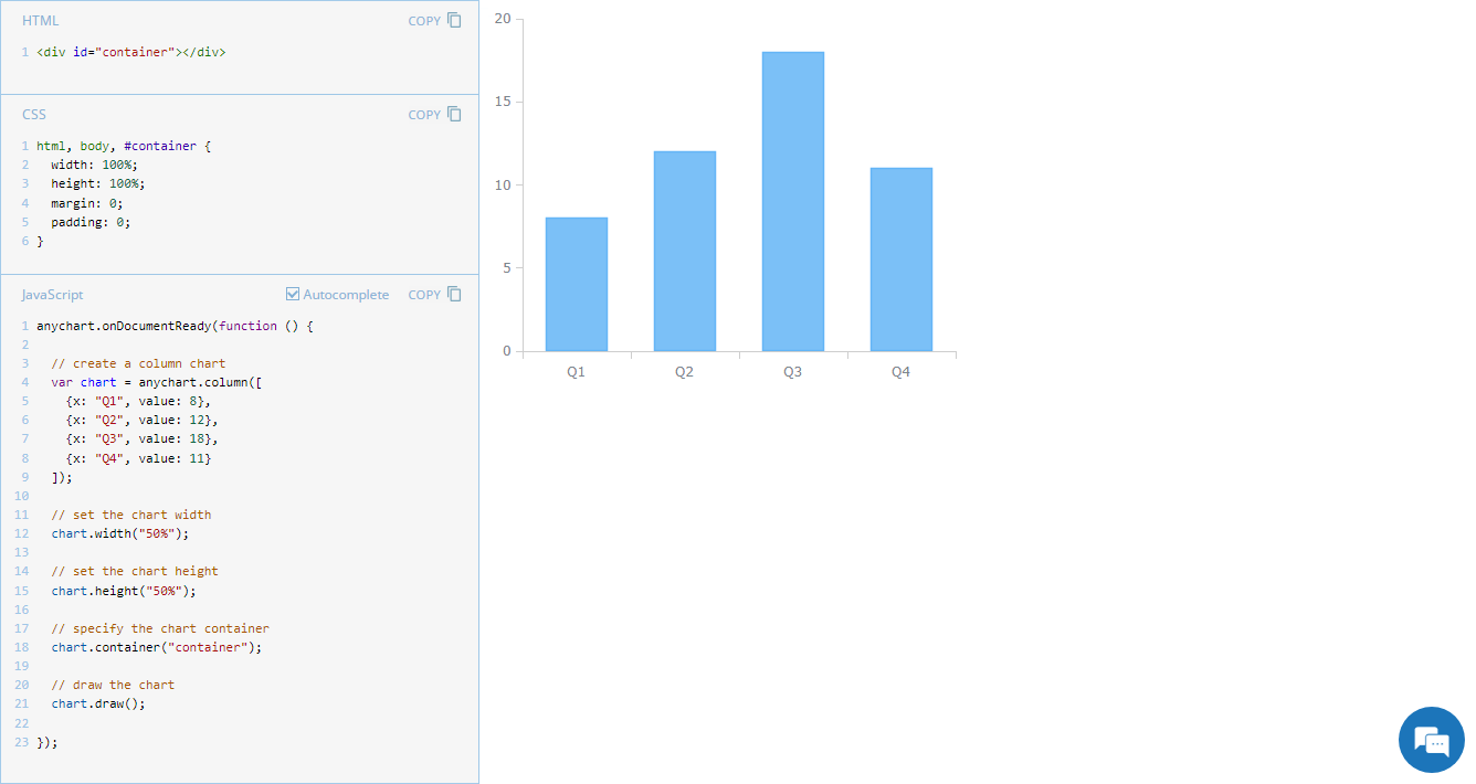 Navigating chart dimensions is key in crafting user-friendly visual presentations, especially when integrating multiple charts into an existing web page or app screen. In our JavaScript chart tutorials, charts are usually showcased as stretching across an entire web page. But it’s far from rocket science to make them smaller. In today’s JS Chart Tips, we explore three effective ways to resize your charts by adjusting their width and height.
- Categories: AnyChart Charting Component, Dashboards, HTML5, JavaScript, JS Chart Tips, Tips and Tricks
- No Comments »
Introducing AnyChart 8.13.0 for Elevated JavaScript Charting Experience
October 3rd, 2024 by AnyChart Team AnyChart 8.13.0 is now available, bringing a set of new features and improvements designed to further elevate your data visualization experience. In this release, we’ve focused on enhancing the Timeline, Waterfall, and Circle Packing charts in our JavaScript charting library, making them even more flexible and user-friendly. Read on to explore what’s new!
- Categories: AnyChart Charting Component, AnyGantt, AnyMap, AnyStock, Big Data, Business Intelligence, Dashboards, Financial Charts, Gantt Chart, HTML5, JavaScript, News, Stock Charts
- No Comments »
Figures Without Any Charts — JS Chart Tips
September 23rd, 2024 by AnyChart Team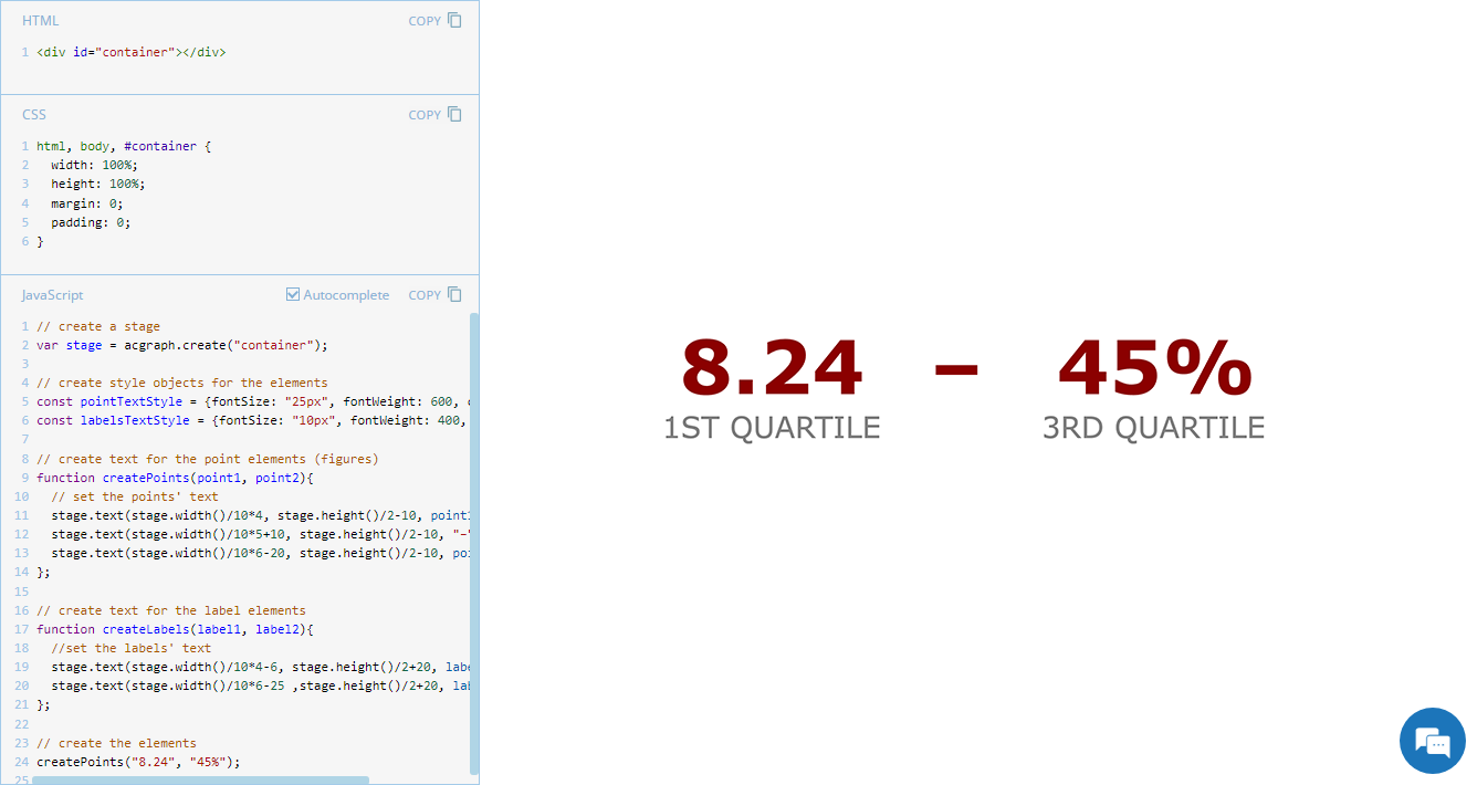 Exploring minimalistic data presentation, this entry of JS Chart Tips shifts focus from complex visualizations to effectively showing raw numerical data. While our JavaScript charting library is designed to enable compelling graphical data displays, sometimes simplicity provides clearer insights. Reflecting on a recent customer request handled by our Support Team, now we’ll delve into how to display figures in a straightforward and direct way without creating any charts, offering a streamlined alternative that may be suitable in specific contexts.
- Categories: AnyChart Charting Component, Dashboards, GraphicsJS, HTML5, JavaScript, JS Chart Tips, Tips and Tricks
- No Comments »
Celebrating Success at Qlik Connect: Recap from AnyChart
July 10th, 2024 by AnyChart Team Qlik Connect 2024 was nothing short of amazing, not just for its vibrant atmosphere but also for the palpable successes we experienced. Beyond the buzz, we showcased our latest advancements for Qlik Sense, gathered a wealth of insights, made meaningful contacts, and ran a hit interactive game that became the talk of the event. We even clinched a win in the social media contest — an unplanned but welcome accolade indeed! Join us for a recap of our time at Qlik Connect in Orlando.
Read more at qlik.anychart.com »
- Categories: Big Data, Business Intelligence, Dashboards, News, Qlik, Success Stories
- No Comments »