Pivot Table vs. Decomposition Tree: Advancing Data Insights
June 27th, 2024 by AnyChart Team In the evolving data landscape, the pivot table has long been a cornerstone of the data analyst’s toolkit. Traditionally used to summarize datasets in a condensed tabular form, pivot tables facilitate quick overviews and basic drill-down capabilities. However, as data sets grow larger and more complex, the static and manual nature of pivot tables can limit their effectiveness.
Enter the decomposition tree, an advanced data visualization technique that not only presents data but also uncovers deeper patterns and insights ad-hoc, all through its dynamic, interactive hierarchical structure. As a relatively new tool in the realm of data analysis and business intelligence, it is increasingly used as an effective alternative to a pivot table yet still often underrated, given its inherent potential.
This article explores several reasons why decomposition trees can be advantageous over traditional pivot tables, illustrated with real-world use cases.
Read more at qlik.anychart.com »
- Categories: Big Data, Business Intelligence, Dashboards, Qlik, Tips and Tricks
- No Comments »
Test Your Data Literacy & Luck — Win iPad at Qlik Connect!
May 30th, 2024 by AnyChart Team If you’re heading to the Qlik Connect show next week (June 3–5), don’t miss out on the chance to test your data smarts with our fun, interactive game, “Connections.” It’s not only a challenge of knowledge but also an opportunity to win an iPad!
Read more at qlik.anychart.com »
- Categories: AnyChart Charting Component, AnyGantt, Big Data, Business Intelligence, Dashboards, Gantt Chart, Qlik
- No Comments »
Let’s Connect at Qlik Connect 2024: AnyChart Booth #807
May 13th, 2024 by AnyChart Team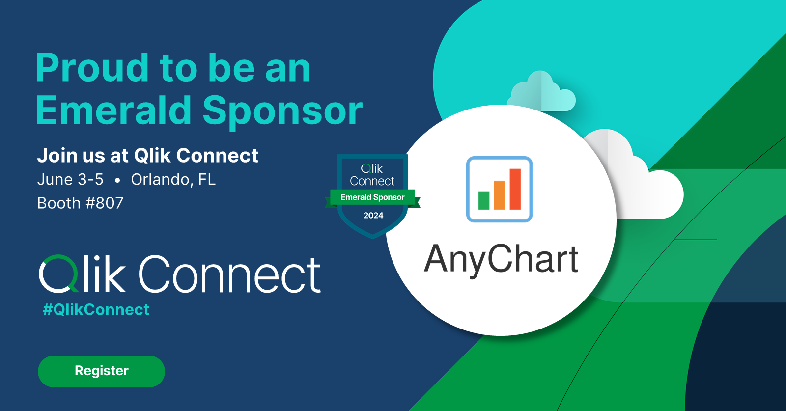 Qlik Connect 2024 is on the horizon, and we’re pleased to announce that AnyChart will be participating as an Emerald sponsor and exhibitor. Join us from June 3–5 at Rosen Shingle Creek in Orlando, Booth #807!
Read more at qlik.anychart.com »
- Categories: AnyChart Charting Component, Business Intelligence, Dashboards, Gantt Chart, News, Qlik
- No Comments »
AnyChart Triumphs Again: Awarded Best in Data Analytics and Visualization in 2024
February 19th, 2024 by AnyChart Team We are delighted to announce that AnyChart has won the prestigious 2024 DEVIES Awards in the Data Analytics & Visualization category, marking our victory for the second consecutive year!
The award celebrates our JavaScript charting library, continuously acknowledged as the world’s leading data visualization solution for developers. As AnyChart JS forms the cornerstone of our broader product line, this recognition once again highlights the technological excellence and innovation inherent in our entire suite of offerings, including the extensions for Qlik Sense.
- Categories: AnyChart Charting Component, AnyGantt, AnyMap, AnyStock, Big Data, Blogroll, Business Intelligence, Dashboards, Financial Charts, Gantt Chart, HTML5, JavaScript, News, Oracle Apex, Qlik, Stock Charts, Success Stories
- No Comments »
Remembering 2023, Welcoming 2024
January 10th, 2024 by AnyChart Team Happy New Year! As the last echoes of festive celebrations fade away and we dive into the adventures of 2024, let’s bid a final farewell to 2023 by reflecting on its best moments.
For us at AnyChart, it was a remarkable year:
- Celebrated our 20th anniversary — indeed, we’ve been innovating since 2003.
- Awarded as the Best in Data Analytics & Visualization.
- Introduced more cool features and tweaks to our JavaScript charting library and other solutions.
- Launched new powerful extensions for Qlik Sense, with the Decomposition Tree taking center stage — join us in reviewing our year in the Qlik ecosystem.
- Reached some noteworthy milestones — now boasting over 80 JS charting tutorials on our blog, our Android charting library gleaming with over 2K stars on GitHub, and our social media family expanded to over 20K followers.
Looking ahead, our dedication remains unwavering: to empower your data viz and analytics journey with new and better tools. Thank you for growing with us, and cheers to your continued success, brighter and bolder in 2024!
- Categories: AnyChart Charting Component, AnyGantt, AnyMap, AnyStock, Big Data, Blogroll, Business Intelligence, Charts and Art, Dashboards, Financial Charts, Gantt Chart, HTML5, JavaScript, News, Qlik, Stock Charts
- No Comments »
Unwrapping Enhanced Interactivity for Calendar and Circle Packing Charts in AnyChart 8.12.0
December 7th, 2023 by AnyChart Team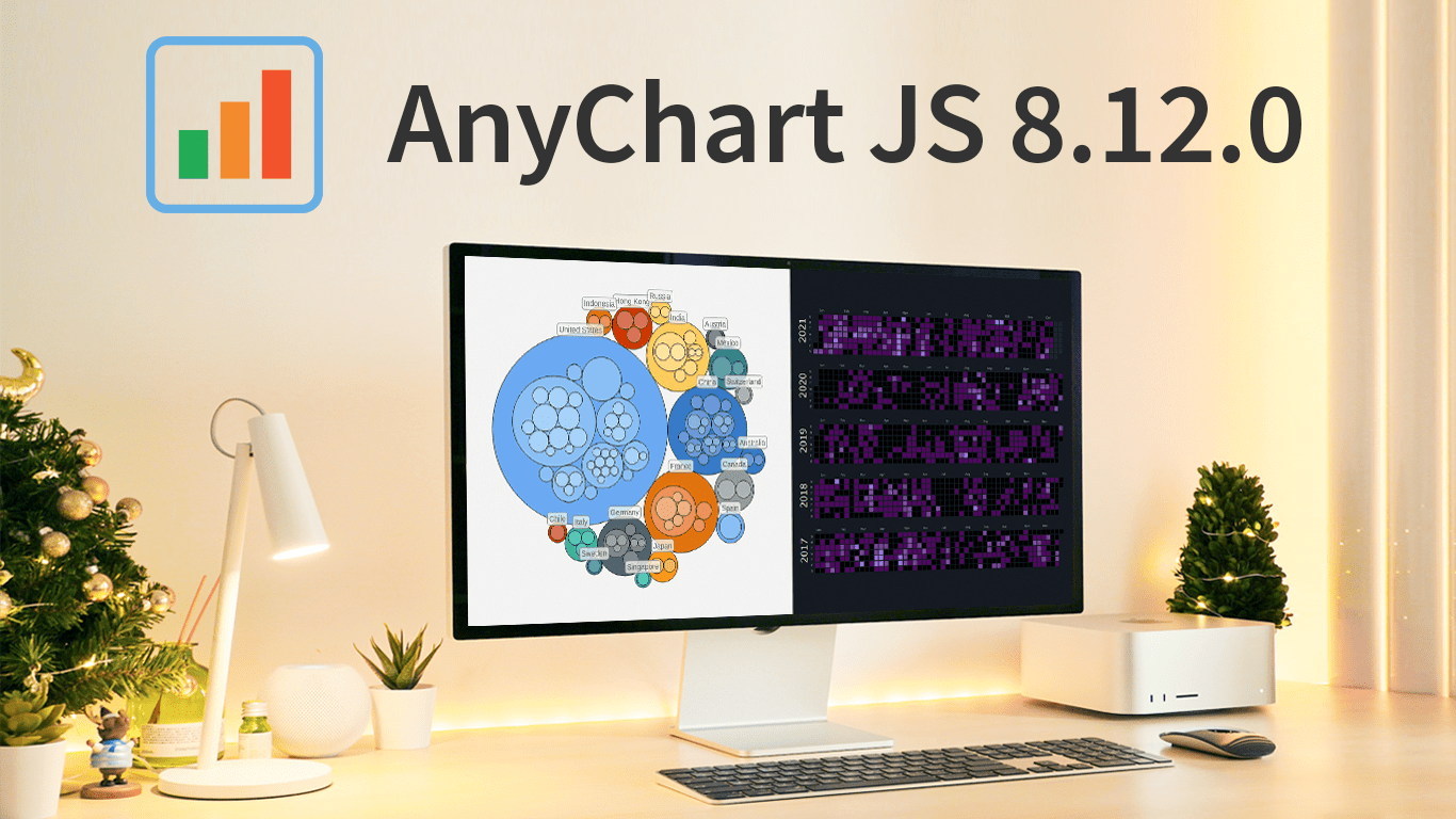 As the magic holiday season approaches, we’re thrilled to unwrap our latest gift of the year — AnyChart 8.12.0, the newest version of our powerful JavaScript charting library. Packed with various bug fixes and improvements, this release introduces a remarkable feature for Calendar and Circle Packing charts — interactivity events. Learn more about it and upgrade right now!
- Categories: AnyChart Charting Component, AnyGantt, AnyMap, AnyStock, Big Data, Business Intelligence, Dashboards, Financial Charts, Gantt Chart, HTML5, JavaScript, News, Stock Charts
- No Comments »
Join AnyChart at QlikWorld Tour 2023
August 10th, 2023 by AnyChart Team Get ready to dive into an exceptional data experience at QlikWorld Tour 2023! We at AnyChart are super stoked to be part of this epic roadshow as proud sponsors and warmly invite you to join us in one of the participating U.S. cities:
- Dallas (The Star in Frisco) — August 10
- San Francisco (Oracle Park) — August 24
- New York (Pier60 at Chelsea Pier) — September 18
- Atlanta (College Football Hall of Fame) — September 20
Spoiler alert: The star of the show will be our first-ever presentation of YODA — Your Own Documents Assistant, the newest, groundbreaking, AI-driven extension for Qlik Sense. Be among the first to witness its power!
Read more at qlik.anychart.com »
- Categories: AnyChart Charting Component, AnyGantt, Big Data, Business Intelligence, Dashboards, Gantt Chart, News, Qlik
- No Comments »
Creating Decomposition Tree in Qlik Sense
June 27th, 2023 by Alejandro Wassermann Hey Qlikkies, are you itching to explore your data ad-hoc across multiple dimensions and conduct root cause analysis like a boss? Look no further than the Decomposition Tree visualization! I first stumbled upon this gem in Power BI, but guess what? Now you can harness its power within the realms of the Qlik Analytics Platform. In this tutorial, I’ll demonstrate how you can easily create amazing decomposition trees for your BI dashboards and apps in Qlik Sense.
A decomposition tree is a type of chart that uses a tree-like structure to represent how a whole metric or outcome can be broken down into its constituent parts or factors. It provides a hierarchical view of the relationships between different dimensions or variables and their contributions to the overall metric. By visually displaying the decomposition of a measure, such as sales or revenue, into various components, such as product categories, regions, or time periods, the decomposition tree helps identify the key drivers and understand the underlying factors influencing the metric. And I’ll use the tech layoffs data to show you how this can look and work in reality.
Let’s dive in and unleash the decomposition tree power in Qlik Sense!
Read more at qlik.anychart.com »
- Categories: AnyChart Charting Component, Big Data, Business Intelligence, Dashboards, Qlik, Tips and Tricks
- No Comments »
Exciting New Technical Indicators & More in AnyChart JS Charts 8.11.1
May 10th, 2023 by AnyChart Team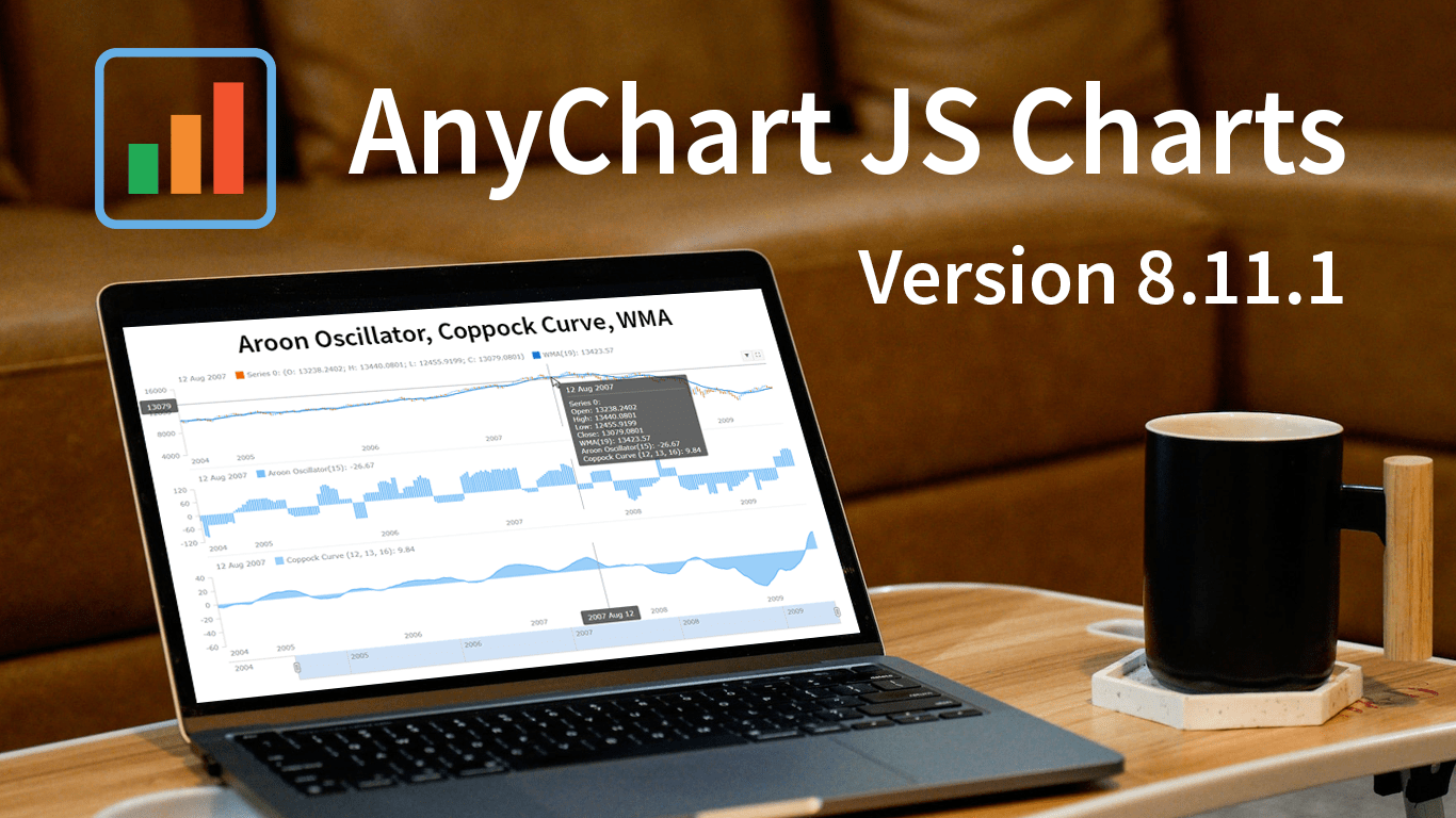 Great news! We’ve just launched version 8.11.1 of our JS charting library, and it comes with some awesome new features and improvements. Our top stars this time around are three new technical indicators that are now available straight out of the box: Aroon Oscillator, Coppock Curve, and WMA. That’s right, now in addition to the dozens of indicators already supported in our stock charts, these new options provide even more ways to improve technical analysis.
But that’s not all! We’ve also updated some of the geo maps in our collection, making them more accurate and detailed. Plus, we’ve squashed some pesky bugs in our Gantt, stock, map, and basic charts, ensuring an even smoother experience when handling specific, advanced cases.
Take a quick tour of the new indicators to discover how they can enhance technical analysis. We’ll also give you a brief overview of the other updates, so you can get the most out of our latest release. Let’s go explore!
- Categories: AnyChart Charting Component, AnyGantt, AnyMap, AnyStock, Big Data, Business Intelligence, Dashboards, Financial Charts, Gantt Chart, HTML5, JavaScript, News, Stock Charts
- No Comments »
Qlik Gantt & Sunburst’s Exciting New Features + Upgrades Across All Extensions!
April 18th, 2023 by AnyChart Team Hey Qlikkies! We have some exciting news to share with you today. AnyChart’s Qlik Sense Extensions have undergone a major update as we’ve made improvements across all of them, including the Decomposition Tree. However, we are particularly thrilled to announce the addition of some major features to our Sunburst Chart and Gantt Chart extensions.
But wait, there’s more! If you’re attending QlikWorld these days, we invite you to visit our team in Booth #180. There, you can try out the new features in action, ask questions, and learn more about how our extensions can improve your visual analytics experience in Qlik Sense. Don’t miss out on this chance to experience the AnyChart difference first-hand!
Our team has been hard at work, listening to your feedback and making improvements. We are confident that these new features will give you greater creative control and better performance in your Qlik-powered environment. So without further ado, let’s dive into the details of the major new upgrades!
Read more at qlik.anychart.com »
- Categories: AnyChart Charting Component, AnyGantt, Big Data, Business Intelligence, Dashboards, Gantt Chart, News, Qlik
- No Comments »