JavaScript Charting Library 8.8.0 Released with New Exciting Data Viz Features
May 22nd, 2020 by AnyChart Team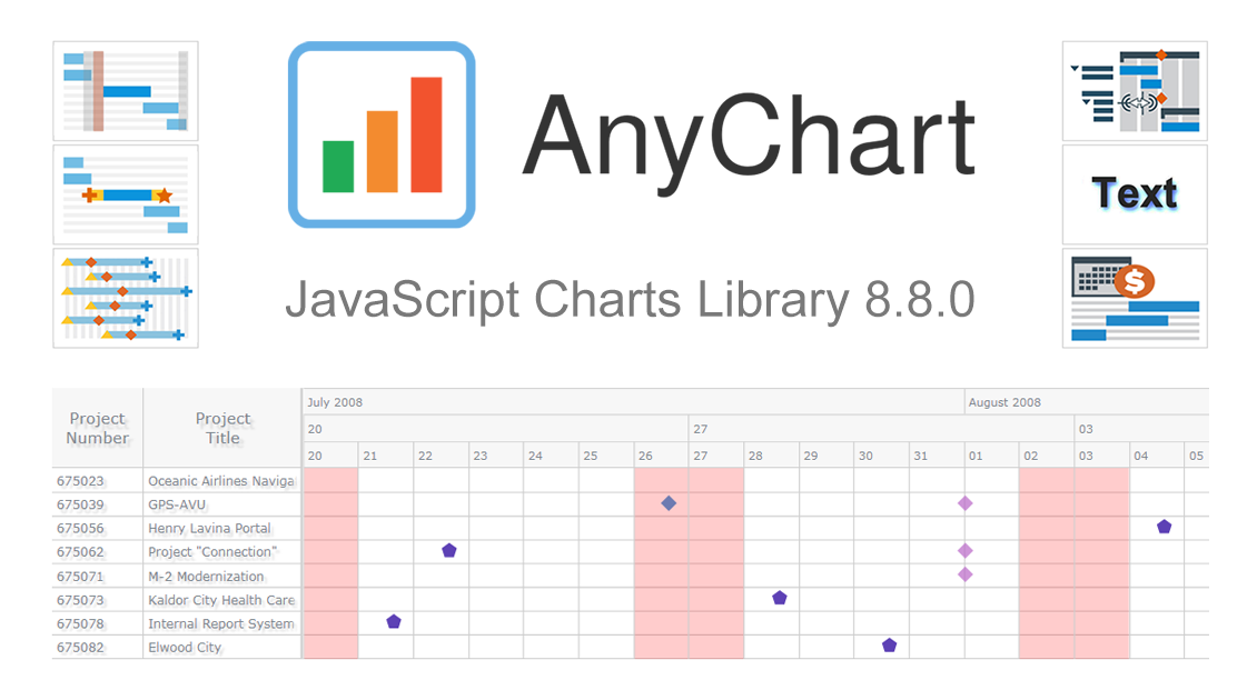 We’ve just updated our JavaScript charting library with new exciting features and improvements! In the 8.8.0 release of AnyChart JS, the focus is put on enhancements for Gantt charts. They will be helpful in making your project and resource data visualizations even more insightful with ease. We’ve also upgraded basic and time-series charts as well as maps. Below is an overview of the new key arrivals. Be sure to check it out, download the updated builds, and enjoy!
»»» See What’s New in AnyChart 8.8.0! «««
- Categories: AnyChart Charting Component, AnyGantt, AnyMap, AnyStock, Big Data, Business Intelligence, Dashboards, Financial Charts, Gantt Chart, HTML5, JavaScript, News, Stock Charts
- 1 Comment »
COVID Tracker StopCorona.info Adds AnyChart JS Charts to Visualize Coronavirus Statistics
May 18th, 2020 by AnyChart Team![]() COVID tracker StopCorona.info is using our JavaScript data visualization library to display up-to-date coronavirus statistics in compelling and insightful charts. (Read our interview with its creator to learn how.)
COVID tracker StopCorona.info is using our JavaScript data visualization library to display up-to-date coronavirus statistics in compelling and insightful charts. (Read our interview with its creator to learn how.)
COVID-19 is a global emergency and the fight against it requires a joint effort. We at AnyChart cannot stay aside, too. With a lot of pandemic data out there, from numerous sources and with constant updates, it’s difficult to keep up with how the situation unfolds, let alone making sense of all relevant information in due course. But this is exactly where we can help, with our established charting solutions that can visualize any data on the fly.
We thought you should know we’re ready to give a full-featured non-profit license to all initiatives aiming to tackle the novel coronavirus outbreak. Moreover, we’ve already allowed one project – StopCorona.info – to use our JavaScript charting library for free.
Developed as a not-for-profit initiative by Diffco, a top Silicon Valley app development company, StopCorona is designed to bring transparency to the pandemic situation worldwide. To achieve that, it collects COVID-19 statistics from more than 20 reliable public open data sources, including WHO, CDC, ECDC, CCDC, and NHC to name a few. Now this enormous (and ever-expanding) set of coronavirus data is graphically represented in an analyst-friendly interface powered by AnyChart JS Charts.
As a global leader of data visualization and reporting tools, we at AnyChart were more than happy to support StopCorona by letting them use our award-winning JS charting library absolutely free, under a full-featured non-profit license.
If you guys are building a useful resource for COVID-19 data analytics, try AnyChart and apply for a free license, too. We will gladly provide you with complimentary access to our flexible data visualization solutions. In this way you will get the industry’s best charts for the web or mobile fully at your service, empowering your website visitors or app users to make sense of the myriad COVID numbers at a glance, with great ease.
- Categories: AnyChart Charting Component, AnyStock, Big Data, Business Intelligence, Dashboards, HTML5, JavaScript, Success Stories
- 5 Comments »
AnyGantt Extension NOW Available in Qlik Sense Cloud Edition! [+ How-to-Install Video]
March 12th, 2020 by AnyChart Team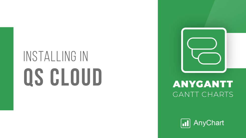 Great news for Qlik users! AnyGantt Extension for Qlik Sense is now available in the cloud!
As of February 2020, customers using Qlik Sense in the cloud can benefit from 3rd party extensions such as those by AnyChart, a trusted Qlik Technology Partner.
Read more at qlik.anychart.com »
- Categories: AnyChart Charting Component, AnyGantt, Big Data, Business Intelligence, Dashboards, Gantt Chart, News, Qlik
- No Comments »
AnyChart JS Charts 8.7.1 Is Ready for Download — Enjoy New Version!
January 28th, 2020 by AnyChart Team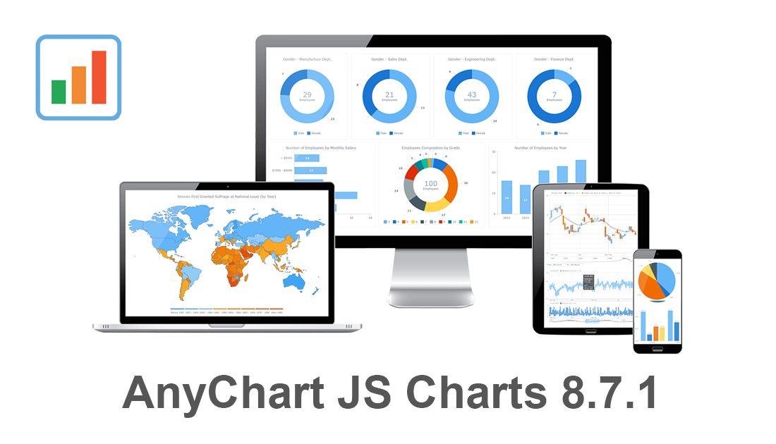 Our JavaScript charting libraries are now updated! Just before the new year, we delivered important fixes and improvements to them in version 8.7.1. These updates make it even better to visualize data using our flexible visualization solutions for cross-platform HTML5 charting — AnyChart JS for basic charts, AnyGantt JS for project and resource charts, AnyStock JS for stock and any other time-series charts, and AnyMap JS for geographical and seat map charts.
Download version 8.7.1 now and start enjoying our updated JavaScript charting libraries!
Check the version history of the library you are using to see exactly what has been improved and fixed in the new release:
Let us know what else we should add or enhance. We’ve been always listening to you and your feedback has always largely determined our roadmap. Of course, this will remain so in the new year (and beyond). Any questions, give us a shout and we’ll be happy to assist you asap.
We wish you a happy and prosperous 2020!
- Categories: AnyChart Charting Component, AnyGantt, AnyMap, AnyStock, Big Data, Business Intelligence, Dashboards, Financial Charts, Gantt Chart, HTML5, JavaScript, News, Stock Charts
- No Comments »
AnyChart Recognized in Top 10 Business Intelligence and Analytics Companies of 2019
November 19th, 2019 by AnyChart Team We are excited to announce that Analytics Insight, a magazine that covers big data and business intelligence developments, included AnyChart in The 10 Next Generation BI and Analytics Companies of 2019 — “for providing the most advanced solutions and playing a significant role in shaping the future of these disruptive technologies.”
The list has been made public in the just-released November issue of the magazine and is accompanied by the stories about each featured company. With permission of Analytics Insight, today we are republishing the magazine’s story about us on our blog — “AnyChart: Turning Data into Actionable Insights with Award-Winning Data Visualization Solutions.”
Read the story of AnyChart as it appeared on Analytics Insight »
- Categories: AnyChart Charting Component, AnyGantt, AnyMap, AnyStock, Big Data, Business Intelligence, Charts and Art, Dashboards, Financial Charts, Flash Platform, Gantt Chart, GraphicsJS, HTML5, Interesting Facts, JavaScript, News, Success Stories
- No Comments »
Modular JavaScript Charting: AnyChart 8 Premiere
October 2nd, 2017 by AnyChart Team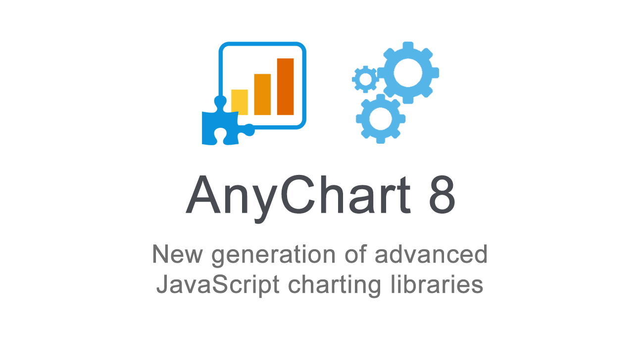 Fall is an amazing time for TV, movie, theater, and other art lovers as that’s when a lot of premieres are being launched. Well, we are happy to contribute to the debut mainstream this time! Meet AnyChart 8, a modular JavaScript charting system taking the convenience, performance, and customization in the art of interactive data visualization to the next level.
Join us in reviewing the core innovations delivered in the 8th, module-based generation of AnyChart, including the brand new features now available in our JS charting libraries AnyChart, AnyStock, AnyGantt, and AnyMap, as well as what else is in our nearest plans.
AnyChart JS Charts 8.0.0: Modules, Custom Builds, and Much More
The 8.0.0 release of the AnyChart, AnyGantt, AnyMap, and AnyStock JavaScript (HTML5) charting libraries delivers a lot of brand new features and technical improvements. Please see the list below for a quick overview of what’s new.
- Categories: AnyChart Charting Component, AnyGantt, AnyMap, AnyStock, Dashboards, Financial Charts, Gantt Chart, HTML5, JavaScript, News, Stock Charts
- 5 Comments »
Top Big Data Trends for 2017
September 13th, 2017 by Jay Stevenson Big Data has been growing exponentially as a very special segment in the core of today’s data analytics, with all the more organizations and companies collecting, visualizing, exploring and communicating large amounts of various kinds of data. In this article, we will talk about notable big data trends that we see in and for 2017 and also take a quick look at some technologies being widely used in this field today.
- Categories: Big Data, Business Intelligence, Dashboards
- No Comments »
Top Data Visualization Mistakes to Avoid
August 29th, 2017 by Jay Stevenson Data visualization is a fast and simple way to convey messages and concepts in an efficient manner. Besides improving the information relay, this approach has also changed the way business is done. Organizations that deal with large amounts of information on a daily basis can now process data and have the intended audience decipher it at lightning-fast speeds, thus enhancing the process of information management. However, data visualization mistakes are quite widespread, and let’s take a look what they are, why they are harmful, and how to avoid them.
- Categories: Business Intelligence, Charts and Art, Dashboards, Tips and Tricks
- 1 Comment »
AnyChart JavaScript Charting Libraries 7.14.0 Released: Can’t Stop Perfecting Data Visualization!
May 30th, 2017 by AnyChart Team![]() Here are the spring May flowers we promised. After the hard work put in over the past months, we’re happy to announce that the 7.14.0 release of our JavaScript charting libraries AnyChart, AnyStock, AnyMap, and AnyGantt is out and ready to download! It brings you new cool features and important improvements that will make your data visualization life even better.
Here are the spring May flowers we promised. After the hard work put in over the past months, we’re happy to announce that the 7.14.0 release of our JavaScript charting libraries AnyChart, AnyStock, AnyMap, and AnyGantt is out and ready to download! It brings you new cool features and important improvements that will make your data visualization life even better.
Now, we invite you to discover all the new JavaScript/HTML5 charting capabilities that the 7.14.0 version of AnyChart’s data visualization software product family has to offer to you. Here’s a quick overview…
- Categories: AnyChart Charting Component, AnyGantt, AnyMap, AnyStock, Business Intelligence, Dashboards, Financial Charts, Gantt Chart, HTML5, JavaScript, News, Stock Charts
- 7 Comments »
How to Integrate AnyChart JavaScript Charts in SAP Web UI
March 30th, 2017 by Sandor van der Neut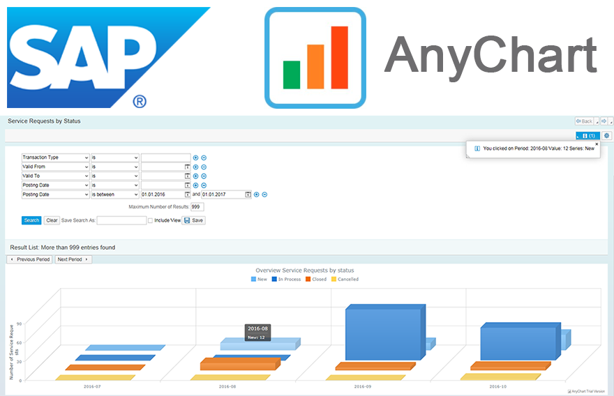 We as ‘mere’ humans are not very good at processing raw statistical data visually when it’s delivered to us in an unrefined form. We are, however, very good in detecting complex patterns when data is presented to us in a graph or a chart. It is therefore no wonder that as a developer you often get the requirement to represent data in a more comprehensible form. When you want to visualize data in the SAP Web UI in a more graphical way the standard possibilities available to you are rather limited. Luckily there are ways to overcome these limitations. When you combine SAP with the graphical power of AnyChart JS Charts a whole range of new possibilities will become available to you.
In this blog I will describe how you can integrate AnyChart in the SAP Web UI with relative ease, how you can feed AnyChart objects with SAP data using both a ‘pull’ and a ‘push’ mechanism and how you can respond in the SAP backend to the events triggered from user interaction with an AnyChart object.
- Categories: AnyChart Charting Component, AnyGantt, AnyMap, AnyStock, Business Intelligence, Dashboards, HTML5, JavaScript, Tips and Tricks
- No Comments »