Politics Across New Data Visualizations — DataViz Weekly
April 4th, 2025 by AnyChart Team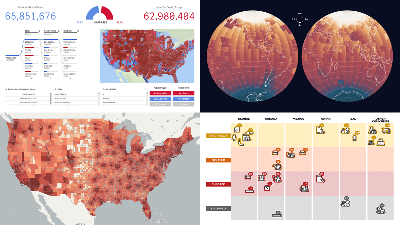 Politics shapes the world in many ways — and, as always, data visualization helps make sense of it all. This time in DataViz Weekly, we are looking at how charts and maps reflect political shifts, decisions, and consequences — from election results and government budgets to tariff policies and even time zones.
One of these projects is ours. We hesitated for a moment — but let’s be honest, we would have featured it anyway if we had stumbled upon it elsewhere.
So, without further ado, here are the four new data visualization projects we think you’ll want to check out:
- U.S. presidential elections — AnyChart
- Trump tariffs timeline — The Washington Post
- Science funding cuts in the United States — SCIMaP
- Politics of time zones — The Economist
- Categories: Data Visualization Weekly
- No Comments »
Fresh Visualizations Giving Data Voice — DataViz Weekly
March 21st, 2025 by AnyChart Team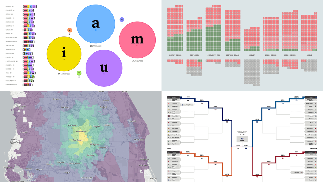 Data can speak — when we let it. Visualization is how we give it a voice. That is what DataViz Weekly is here for: to present real projects showing how data can be expressed through thoughtful visual work. In this edition, we’ve picked four new ones worth your attention:
- Animal sounds across languages — The Pudding
- March Madness 2025 bracket projections — The Athletic
- AI search citation failures — Columbia Journalism Review
- Travel times from any U.S. location — OpenTimes
- Categories: Data Visualization Weekly
- No Comments »
Notable Recent Visuals That Bring Data to Life — DataViz Weekly
March 14th, 2025 by AnyChart Team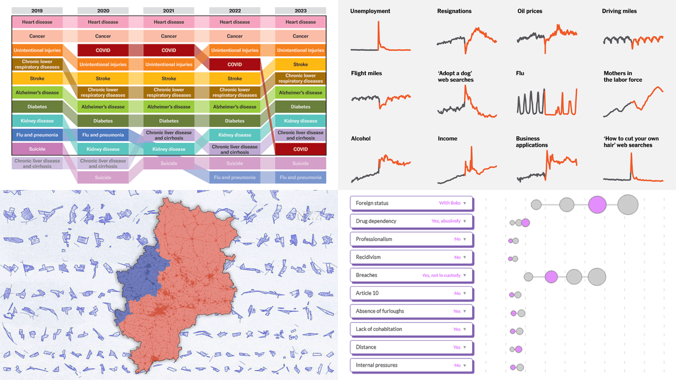 Data has its own language, but humans? We’re wired for visuals. Charts and maps serve as translators, turning raw numbers into something we can instantly grasp. Welcome to DataViz Weekly, where we bring forward compelling visual graphics that bring data to life! Here are the latest we’re glad to feature:
- Looking back at the COVID-19 pandemic — Scientific American
- COVID’s impact in 30 charts — The Upshot
- Prisoner release risk assessment in Spain — Civio
- Settlement sizes in the Donbas region — NZZ
- Categories: Data Visualization Weekly
- No Comments »
Insightful Data Visualizations You Need to See — DataViz Weekly
March 7th, 2025 by AnyChart Team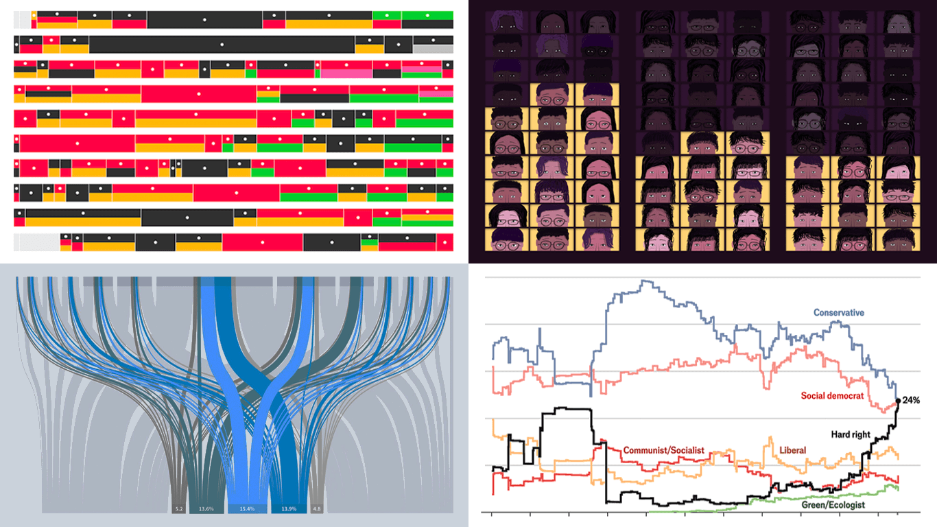 Data visualization is powerful — when done right, it conveys meaning clearly and helps insights emerge naturally. We continue DataViz Weekly, where we regularly highlight some excellent examples from around the internet, offering a firsthand look at how graphical representation can effectively reveal and clarify information. This time, we think you just need to see the following:
- U.S. imports and tariffs — Reuters
- Coalition scenarios in Germany — Bloomberg
- Hard-right parties in Europe — The Economist
- Emotional experiences of middle schoolers — The Pudding
- Categories: Data Visualization Weekly
- No Comments »
New Selection of Significant Data Visualization Examples — DataViz Weekly
February 28th, 2025 by AnyChart Team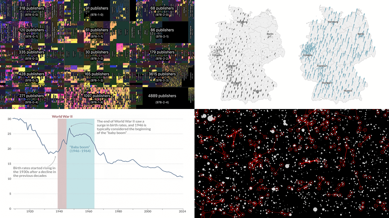 Our JavaScript charting library, Qlik Sense extensions, and other products give you the flexibility to visualize data how, where, and when you need. But making a chart or map truly effective — whether for exploration or explanation — is an art of its own. That is why we run DataViz Weekly: to share a selection of significant examples we have recently encountered, showcasing how others tackle visualization challenges across different contexts and datasets.
Here are some new examples — take a closer look and see what insights they might inspire:
- All books in the ISBN space — phyresky
- Germany’s 2025 federal election — The New York Times (and more)
- Baby boom in 7 charts — Our World in Data
- School shootings in America — Mohamad Waked
- Categories: Data Visualization Weekly
- No Comments »
Recent Data Graphics in Focus — DataViz Weekly
February 21st, 2025 by AnyChart Team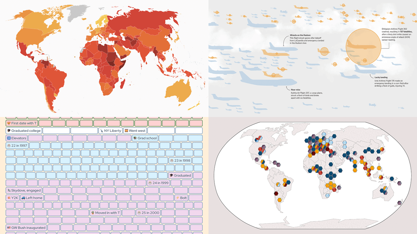 Data holds valuable insights, and well-crafted visualizations help bring them to light. DataViz Weekly is all about demonstrating how that happens in practice, curating compelling recent data graphics from around the web. Check out what we have for you today:
- Corruption perceptions worldwide — Transparency International
- Bird strikes and aviation safety — Reuters
- Crops and extreme weather — Carbon Brief
- Life in weeks — Gina Trapani
- Categories: Data Visualization Weekly
- No Comments »
Data Visualization in Action: Fresh Examples — DataViz Weekly
February 14th, 2025 by AnyChart Team We’re back with DataViz Weekly, where we showcase some of the best new data visualization examples — from individual charts and maps to full-scale visual stories and projects. Take a look at our latest picks:
- Swiss research funding — Colas Droin
- Education and voting patterns in U.S. presidential elections — Jon Boeckenstedt
- City walkability and improvement potential — The Economist & Matteo Bruno et al.
- Self-censorship in Super Bowl halftime shows — Artur Galocha for The Washington Post
- Categories: Data Visualization Weekly
- No Comments »
Noteworthy New Visualizations to Explore — DataViz Weekly
February 7th, 2025 by AnyChart Team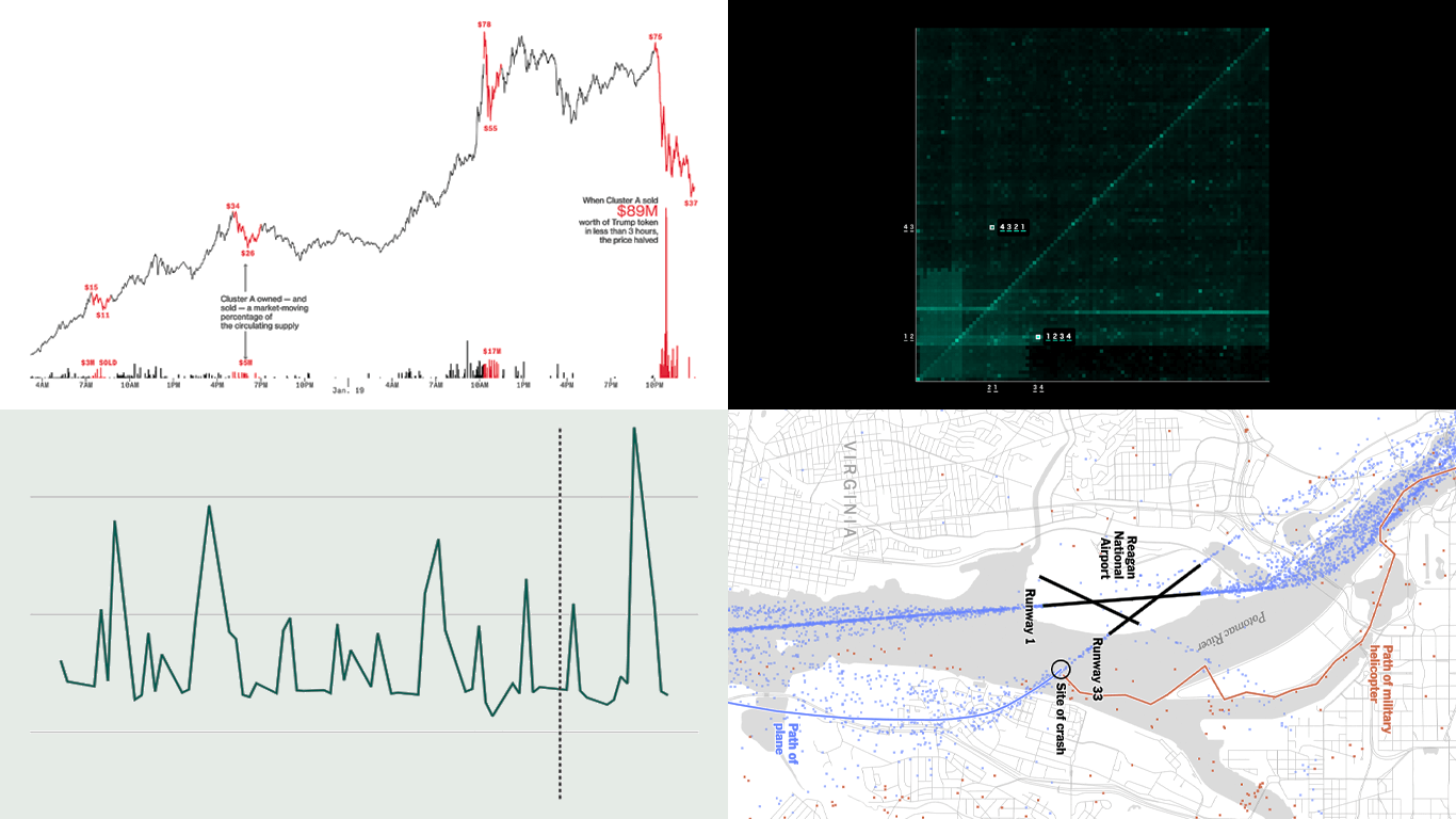 Continuing our regular DataViz Weekly, we’re glad to share the most interesting of all the new data visualizations we’ve recently come across, well worth a look. Here’s what we have lined up this time:
- PIN code popularity — ABC News
- Complexity of D.C. airspace amid the Potomac River midair collision — The New York Times
- Trading patterns in the Trump memecoin — Bloomberg Crypto
- U.S. federal expenditures in real time — The Hamilton Project
- Categories: Data Visualization Weekly
- No Comments »
New Charts & Maps Turning Data Into Insights — DataViz Weekly
January 31st, 2025 by AnyChart Team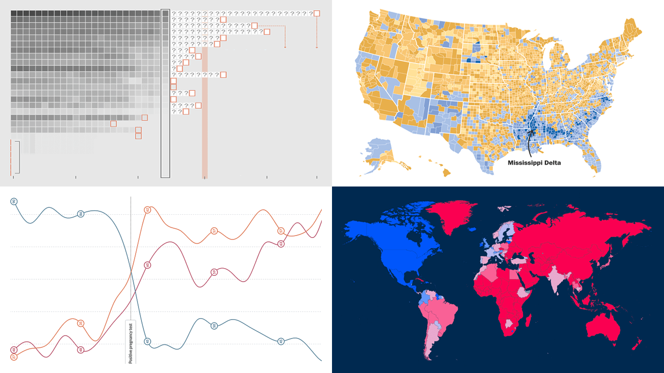 DataViz Weekly is here with a spotlight on new charts and maps that do a great job of turning data into meaningful insights. Today, we invite you to explore the following projects, each demonstrating how data visualization helps reveal patterns, tell stories, and deepen understanding:
- European electricity transition — Ember
- The United States vs. China on global trade — Lowy Institute
- Single-parent families in America — The Washington Post
- Pregnancy through health metric shifts — Maggie Appleton
- Categories: Data Visualization Weekly
- No Comments »
Compelling Fresh Data Visualizations Not to Miss — DataViz Weekly
January 24th, 2025 by AnyChart Team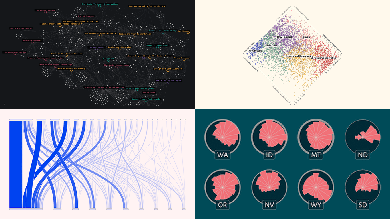 Welcome to the first regular edition of DataViz Weekly in 2025! Last Friday, we wrapped up the year with a special Best Data Visualizations of 2024 post. Now we’re back to our usual format, highlighting some of the most compelling new visuals that caught our attention recently. Here are the first featured projects of the year — dive in and get inspired:
- Nokia Design Archive — Aalto University
- AI research collaborations — Rest of World
- Orientation of ski slopes — OpenSkiStats
- Policy preferences in a hypothetical U.S. multiparty system — NYT Opinion
- Categories: Data Visualization Weekly
- No Comments »