Canadian Elections, Germany Under Merkel, Caracas Sounds, Night Temperatures in U.S. Cities — DataViz Weekly
September 17th, 2021 by AnyChart Team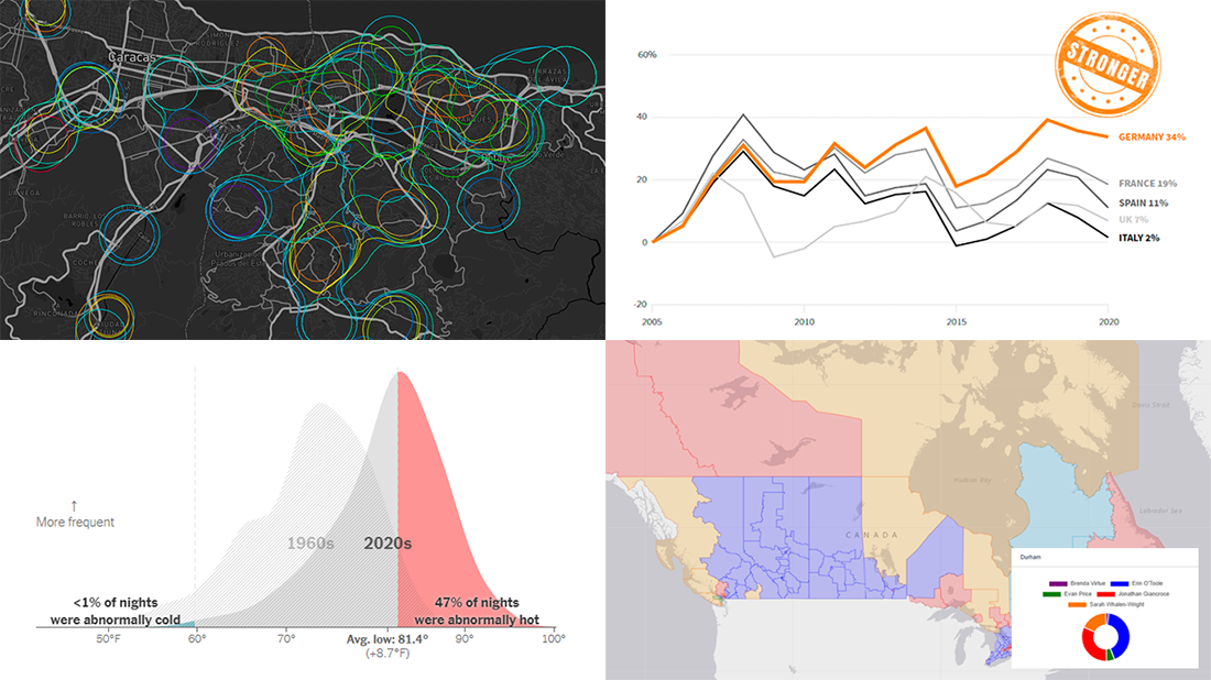 We continue to choose the most interesting out of all the newest data visualizations published here and there and show you them in weekly roundups. It’s time to look at our fresh selection! This time, the following projects are featured in DataViz Weekly:
- Canadian federal elections since 2000 — Stephen Taylor
- Germany under the 16-year leadership of Angela Merkel — Reuters
- Sounds of Caracas — Valeria Escobar
- Abnormally hot summer nights in American cities — The Upshot
- Categories: Data Visualization Weekly
- No Comments »
Visualizing Mortality Statistics and Satellite Imagery Data — DataViz Weekly
September 10th, 2021 by AnyChart Team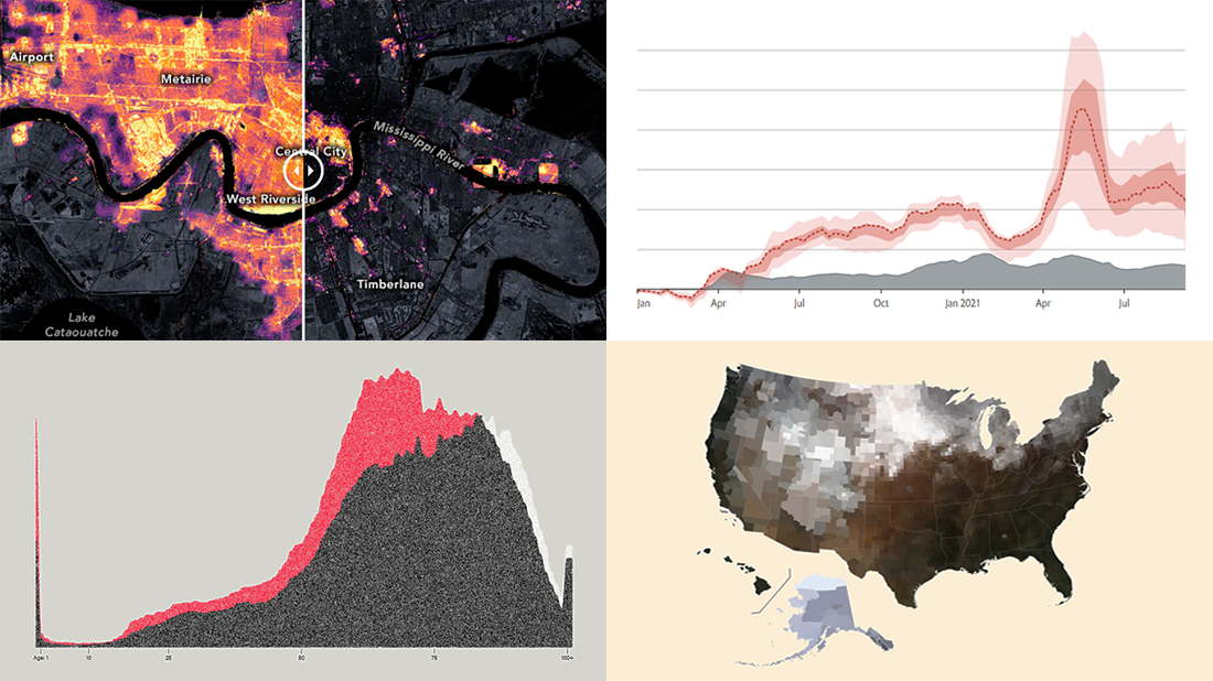 This week, we have come across a number of wonderful new data visualization projects out there. Here are the four that we’ve found most interesting and decided to showcase today in DataViz Weekly. Join us for a quick overview of these works and check them out!
- Black mortality gap in America — The Marshall Project
- Excess deaths worldwide during the COVID-19 pandemic — The Economist
- Ida-caused power outage in New Orleans as seen from space — NASA Earth Observatory
- Average seasonal colors of the United States — Erin Davis
- Categories: Data Visualization Weekly
- No Comments »
New Awesome Charts and Maps Curated for Data Visualization Fans — DataViz Weekly
September 3rd, 2021 by AnyChart Team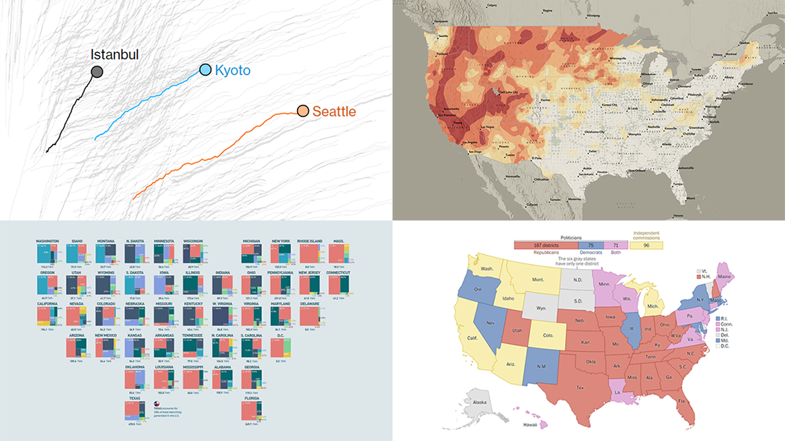 The seven-day wait is over for all data visualization fans wherever you are! DataViz Weekly is back with a selection of new awesome charts and maps curated from around the web. Look at our latest picks.
- Current and historic drought conditions across the United States — Esri
- Relationship between temperature, income, and mortality — Bloomberg Green
- U.S. electricity mix by state — Visual Capitalist
- Congressional redistricting rules and practices — The Washington Post
- Categories: Data Visualization Weekly
- 1 Comment »
Excellent Examples of Data Graphics from Around Internet — DataViz Weekly
August 27th, 2021 by AnyChart Team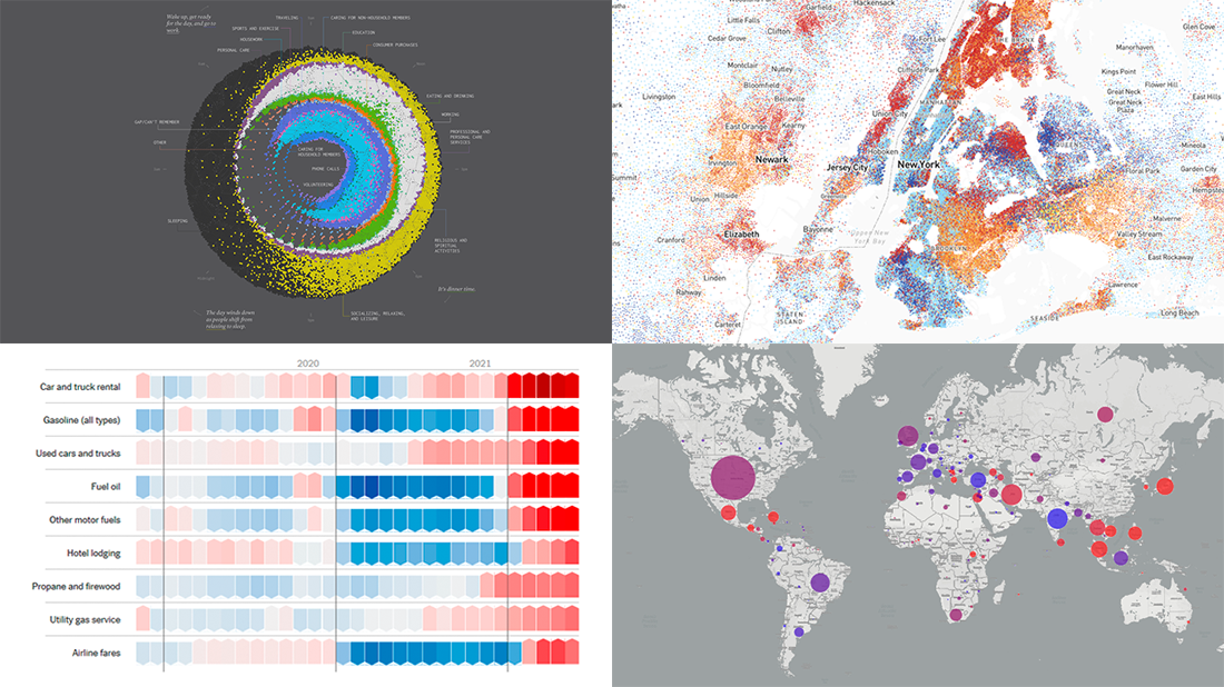 Are you ready for another set of excellent data graphics examples? It’s time! The following projects made it to the newest DataViz Weekly digest — see the list below and keep reading for a closer look!
- Average weekday in the life of Americans — Nathan Yau
- Race and ethnicity across the United States — CNN
- Inflation in the United States — NYT Opinion
- COVID-19 spread across the world over time — Olivia Jack
- Categories: Data Visualization Weekly
- No Comments »
New Impressive Visualizations Making Data Talk — DataViz Weekly
August 20th, 2021 by AnyChart Team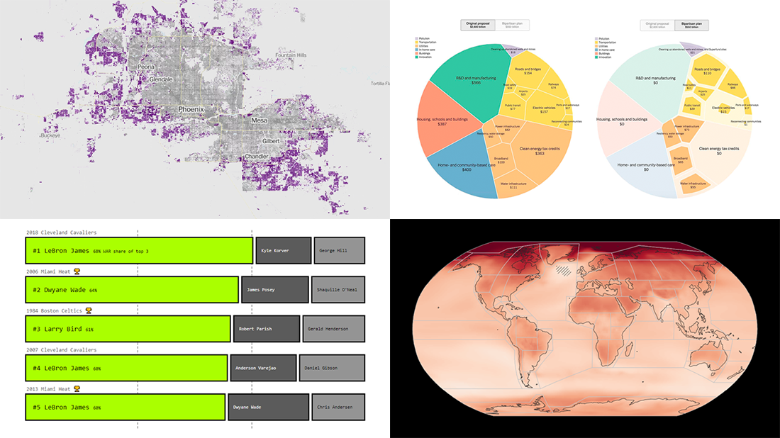 DataViz Weekly is here with an overview of new impressive visualizations that make data talk. These four projects grabbed our attention recently and we could not help telling you about them!
- The biggest carry jobs in NBA history — The Pudding
- Global and regional climate change effects — IPCC
- Presidential and bipartisan infrastructure plans in comparison — The Upshot
- Urban development and sprawl in America between 2001 and 2019 — The Washington Post
- Categories: Data Visualization Weekly
- No Comments »
Visualizing Codebase Structure, Climate Data, Time Use Patterns, and Census Stats — DataViz Weekly
August 13th, 2021 by AnyChart Team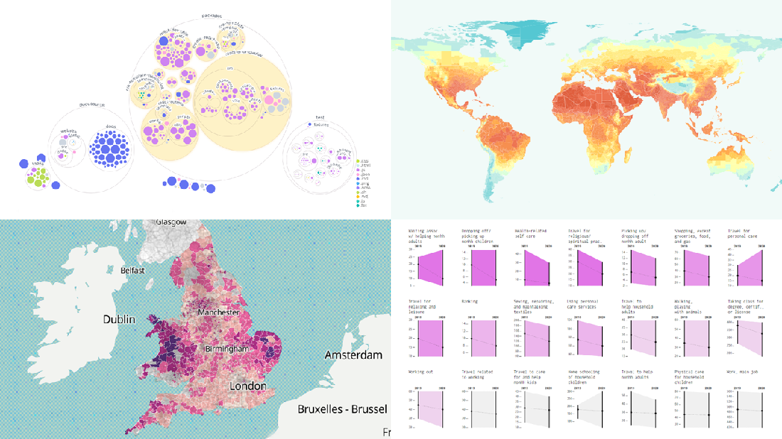 It is Friday the 13th. But don’t worry about the irrational! Check out the four really cool data visualization projects we have discovered around the web these days and you will be fine, entertained, and inspired.
Today on DataViz Weekly:
- Codebase visualization in packed bubble charts — GitHub OCTO
- Climate change impacts through 2099 — Climate Impact Lab
- Shifts in U.S. time use patterns during the pandemic — Nathan Yau
- 50 years of social change in England and Wales — ONS
- Categories: Data Visualization Weekly
- No Comments »
Tokyo Olympics Medal Trackers — DataViz Weekly
August 6th, 2021 by AnyChart Team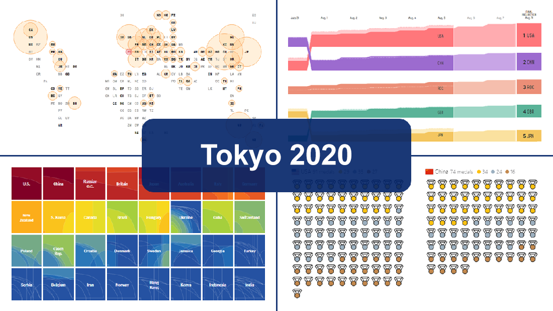 Delayed one year due to the COVID-19 pandemic, the 2020 Summer Olympics officially known as the Games of the XXXII Olympiad and commonly referred to simply as Tokyo 2020 have been underway for two weeks and are already coming to a close, with under 50 medal sets yet to be distributed over the remaining two days.
In this special edition of DataViz Weekly, we are happy to showcase four wonderful Olympic medal trackers providing an insightful view of medal counts and country standings with the help of telling visualizations — from Bloomberg News, The New York Times’s The Upshot, FiveThirtyEight, and Axios.
- Categories: Data Visualization Weekly
- 1 Comment »
Effective Visualizations of Information on Pandemic, Climate, Happiness, Travel Time — DataViz Weekly
July 30th, 2021 by AnyChart Team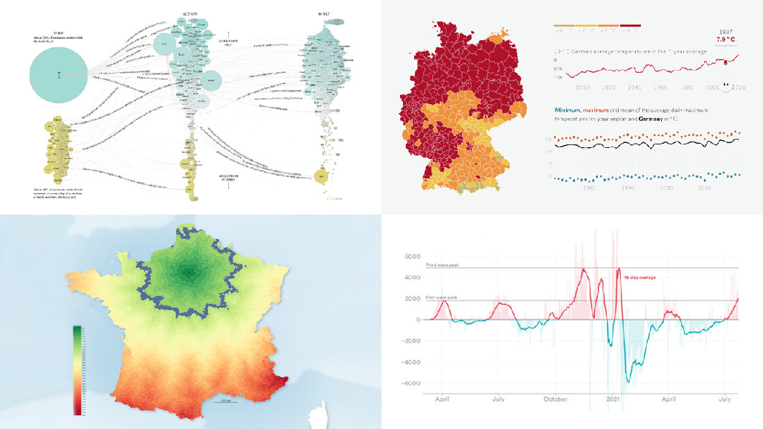 Data becomes easier to perceive and draw insights from when it is properly represented in charts and maps. For everyone interested to check out how information visualization works, we continue our regular feature DataViz Weekly curating the best new examples of effective graphics. Here are our latest picks:
- COVID-19 case acceleration rates — STAT
- Climate change risks across Germany — Vislab
- What makes people happy the most — Nathan Yau
- Driving time to Paris from across France — Nicolas Lambert
- Categories: Data Visualization Weekly
- No Comments »
Discover Some of Most Interesting Recent Data Visualization Projects — DataViz Weekly
July 23rd, 2021 by AnyChart Team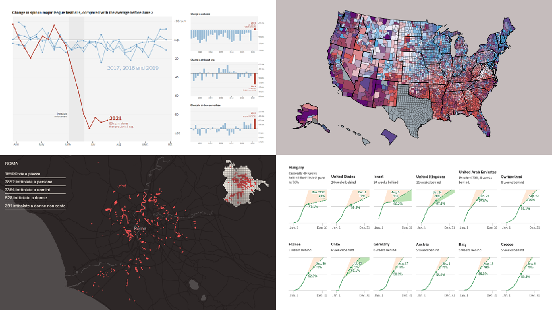 Look at some of the most interesting data visualizations we have come across out there over the last few days! The following projects are deservedly featured in DataViz Weekly this time:
- Falling spin rates in American baseball after a crackdown on sticky substances — The Upshot
- Gender diversity in Italian street names — EDJNet
- Shifts in the COVID-19 vaccination pace worldwide since January 2021 — Reuters
- Vaccination equity in America — CDC
- Categories: Data Visualization Weekly
- No Comments »
New Amazing Graphics for Fans of Data Visualization — DataViz Weekly
July 16th, 2021 by AnyChart Team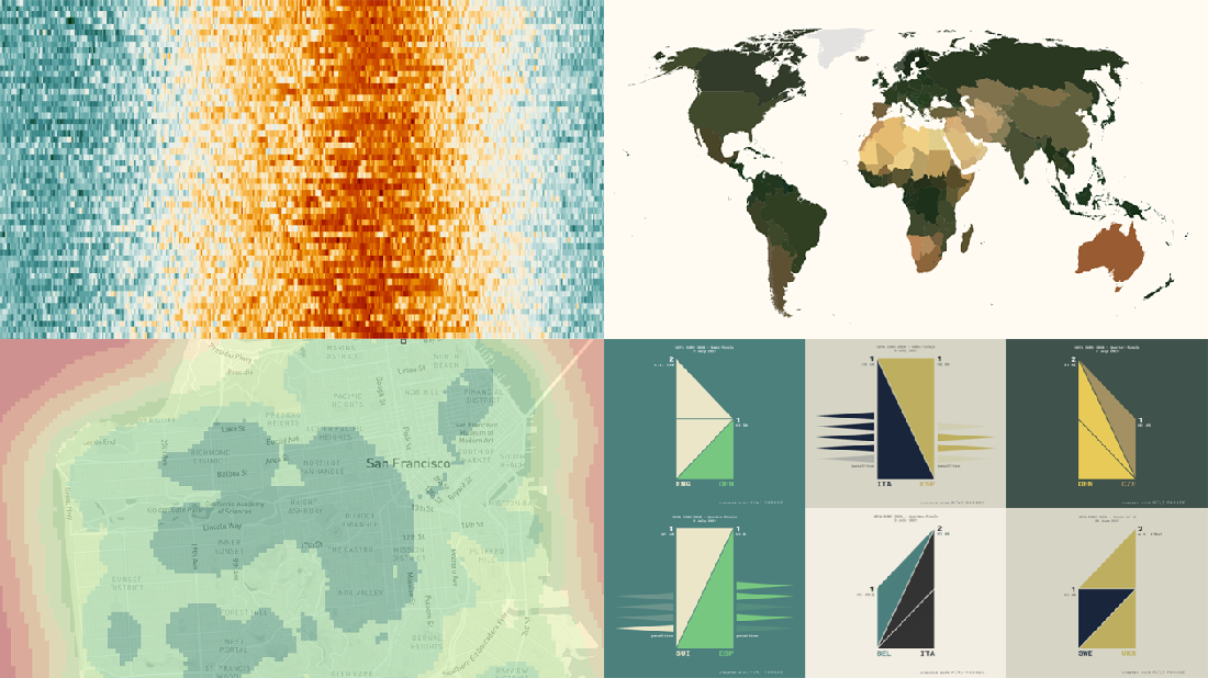 Are you ready for another set of amazing data graphics? It’s Friday, so DataViz Weekly is here to let you know about four great new visualization works worth checking out right now!
- 15-minute cities in Germany and worldwide — Chris and Nils from Gießen
- Daily temperatures in Tokyo since 1964 (and what to expect at the Olympics) — Reuters
- Average colors of countries, as well as U.S. states and counties — Erin Davis
- Euro 2020 and Copa América 2021 playoffs visualized in triangles — Krisztina Szűcs
- Categories: Data Visualization Weekly
- 1 Comment »