FIFA World Cup, Mario Kart, and Global Economic Indicators — DataViz Weekly
June 29th, 2018 by AnyChart Team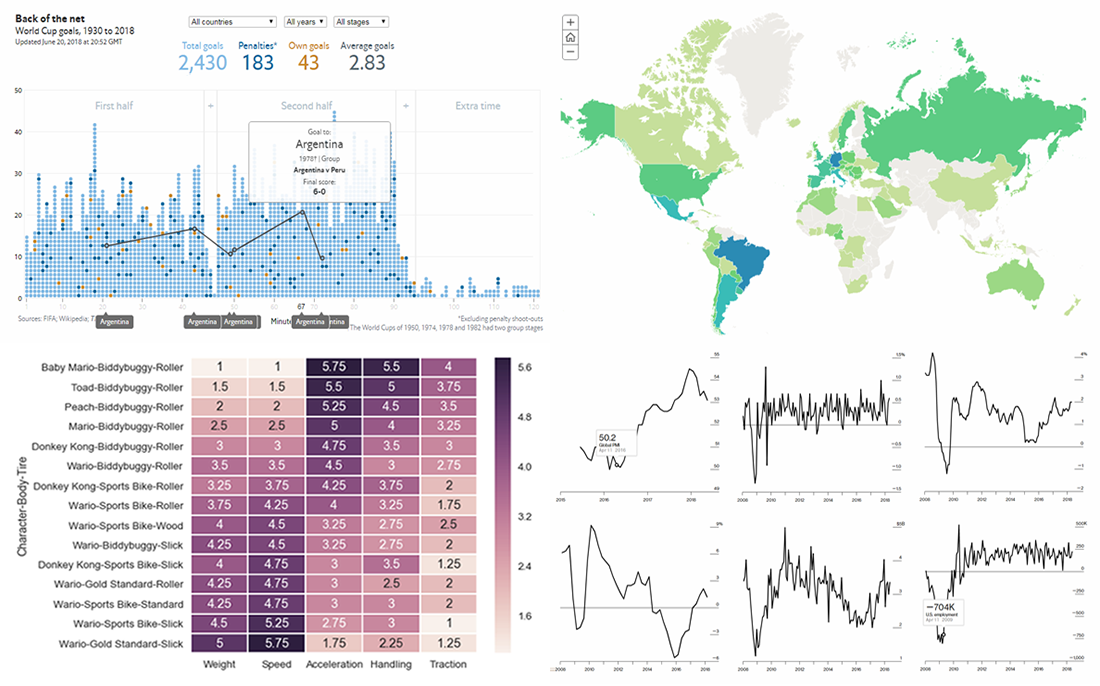 The 21st FIFA World Cup in Russia attracts the attention of many millions around the world who have been thoroughly watching the matches, and the tournament is about to enter the playoff stage. Today’s DataViz Weekly post on our blog will tell you about two cool data visualization works devoted to this competition and its history:
- all (more than 2,400) World Cup goals in one chart, and
- thirty-three maps about the World Cup.
In addition, new DataViz Weekly features the following interesting graphics:
- finding the best characters in Mario Kart, and
- 12 key global economic indicators.
- Categories: Data Visualization Weekly
- No Comments »
Interesting Data Visualizations About Treaties, Earth, Happiness, and World Cup — DataViz Weekly
June 22nd, 2018 by AnyChart Team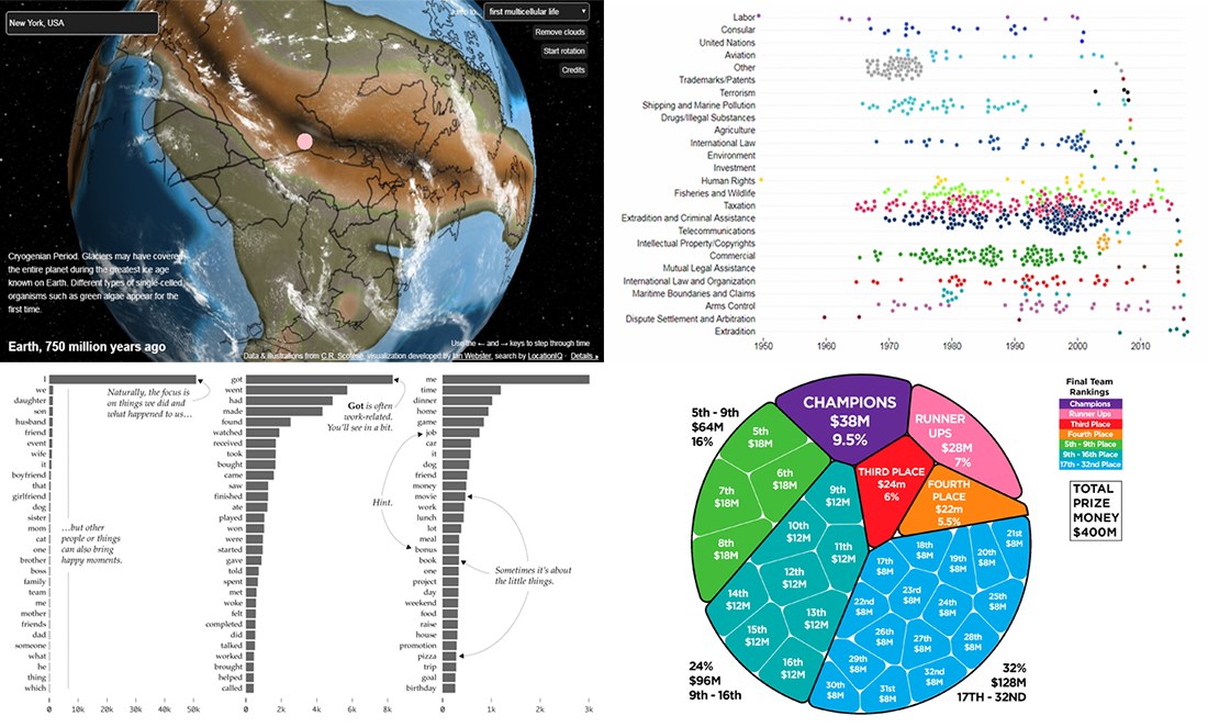 DataViz Weekly continues to share with you interesting data stories and visualizations. Take a look at our new selection:
- U.S. Treaties Explorer;
- ancient Earth globe;
- happy moments in life;
- FIFA World Cup prize money.
- Categories: Data Visualization Weekly
- No Comments »
Understanding Data with Help of Visualization — DataViz Weekly
June 15th, 2018 by AnyChart Team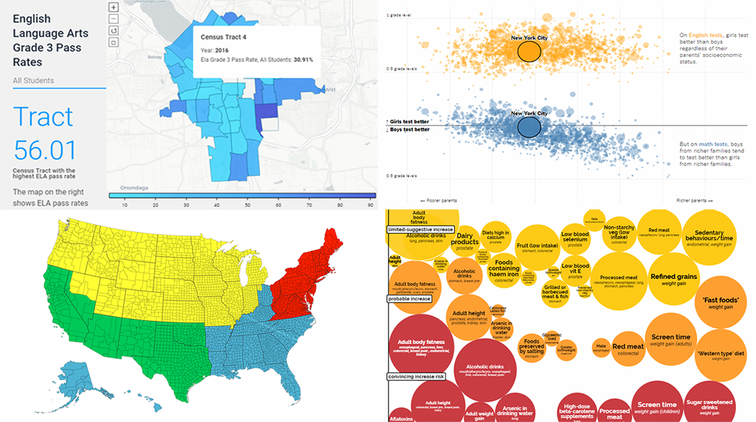 Understanding data gets easier when the data you are looking into is visualized. To illustrate this, here’s a new collection of interesting charts, infographics, and stories based on them that we have found on the web just recently.
Today in Data Visualization Weekly:
- life in Central New York;
- population distribution in the big picture;
- gender gap in school test scores;
- cancer risk factors.
- Categories: Data Visualization Weekly
- No Comments »
Visualizing Data About Volcano Eruptions, Remote Work, Unsolved Homicides, and Russian Economy — DataViz Weekly
June 8th, 2018 by AnyChart Team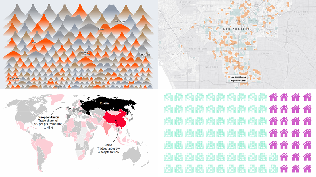 The new DataViz Weekly article is here. Today, we are glad to share with you the following cool data visuals, just in case you missed them out there:
- all known volcano eruptions since 1883;
- remote and non-remote workers’ time usage;
- unsolved murders in major US cities;
- Russia’s economic results.
- Categories: Data Visualization Weekly
- No Comments »
Cool DataViz Examples About Elections, NBA, Energy, and Schools — DataViz Weekly
June 1st, 2018 by AnyChart Team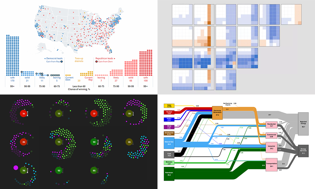 Want to see new cool dataviz examples? We have some right here! Check out our this week’s selection of interesting charts and data stories in Data Visualization Weekly.
Here’s what we are glad to put a spotlight on this time:
- The Economist’s predictive model for November’s mid-term elections;
- key NBA players’ stats vs. their teams’ chance to win;
- US energy flow;
- choosing a school in Chicago.
- Categories: Data Visualization Weekly
- 1 Comment »
Data Visualizations About NYC Subway, Music, Basketball, and Guns — DataViz Weekly
May 25th, 2018 by AnyChart Team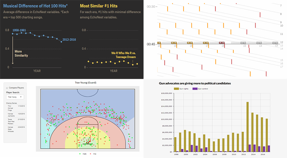 DataViz Weekly is inviting you to check out new cool charts and infographics that we have recently found around the Web. Our today’s selection includes the following data visualizations:
- delays in the New York City subway;
- similarity of top pop music;
- NCAA basketball shot charts;
- guns and opinions in America.
- Categories: Data Visualization Weekly
- No Comments »
Analyzing Data Using Charts, New Interesting Examples — DataViz Weekly
May 18th, 2018 by AnyChart Team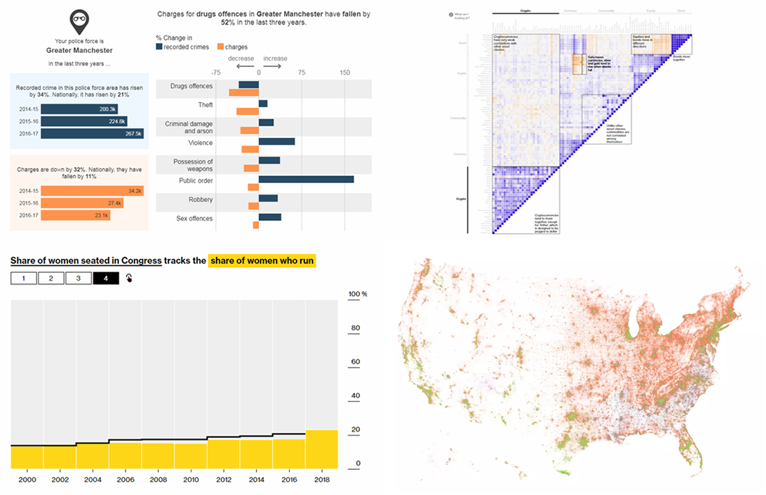 Visualization often makes analyzing data easier and more insightful, allowing us to quickly notice trends, correlations, and make other important conclusions. We continue DataViz Weekly, a series of articles designed to show you interesting real-world examples of charts and how they can let data speak.
Today, we are happy to meet you with the following new pieces:
- cryptocurrencies against other investments;
- more crimes, fewer charges — UK police data;
- what would happen to the US population if all non-natives left;
- record numbers of women in US House and Senate races.
- Categories: Data Visualization Weekly
- No Comments »
Charting Data About Eurovision, Power, Manhattan, and Ocean — DataViz Weekly
May 11th, 2018 by AnyChart Team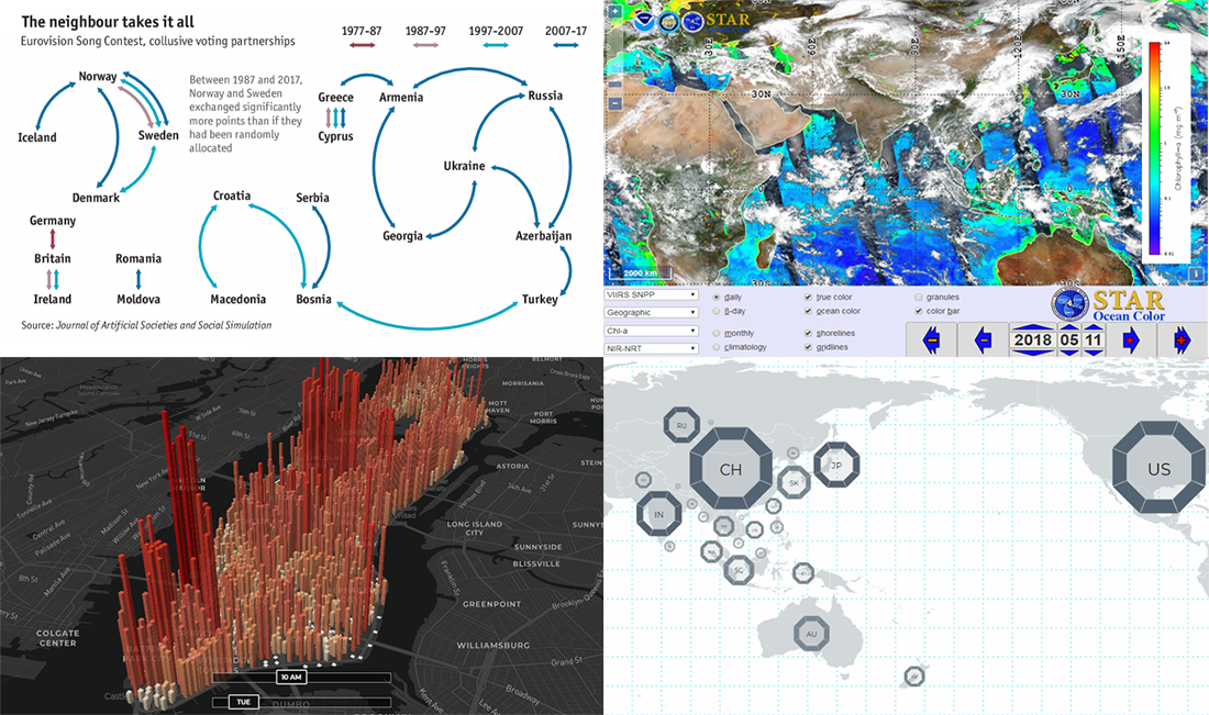 Greet the new issue of Data Visualization Weekly! This time, we are glad to tell you about another four interesting data stories and projects we recently came across. Here’s what each of them is about, to start with:
- voting partnerships at Eurovision;
- Asia Power Index;
- distribution of Manhattan’s population, hour by hour;
- Ocean Color View.
- Categories: Data Visualization Weekly
- No Comments »
Visualizing Data About Diversity, Shipwrecks, Harassments, and NBA Shots — DataViz Weekly
May 4th, 2018 by AnyChart Team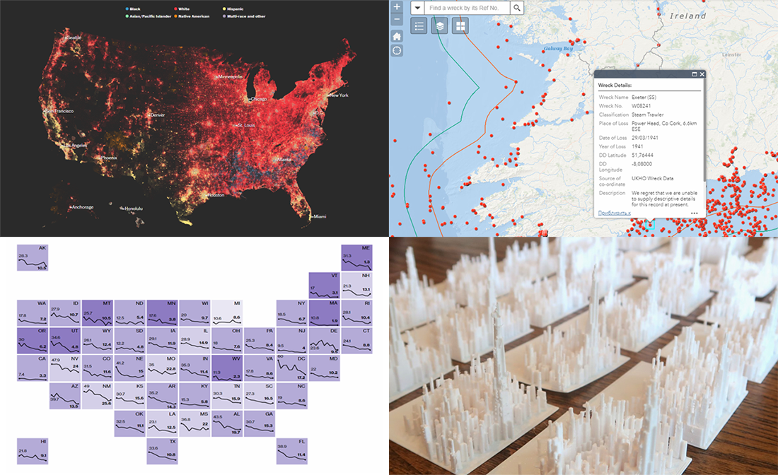 At a time when data is everywhere, anyone can find and look into various statistics about literally anything. But having something does not necessarily mean being able to make the best use of it. In our DataViz Weekly feature, we show you examples of how visualizing data can be helpful in (quickly) delivering much greater insights than raw numbers.
From today’s article, you’ll learn about four new interesting visualizations:
- map of diversity and segregation in America;
- sexual harassment complaints in statistics and reality;
- map of shipwrecks in Irish waters;
- NBA shot charts printed in 3D.
- Categories: Data Visualization Weekly
- No Comments »
Data Visualizations About Manhattan Buildings, Web Search, Chinese Expansion, and Research Productivity — DataViz Weekly
April 27th, 2018 by AnyChart Team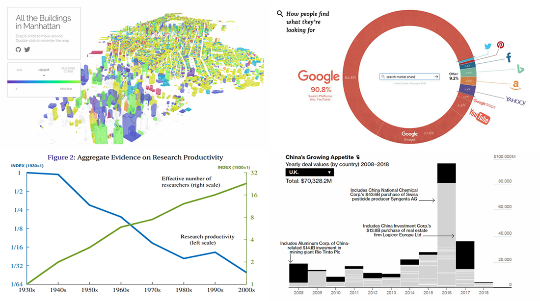 DataViz Weekly is here, bringing you another selection of data visualizations that we’ve found worth seeing. All these pieces were published only a short time ago.
In this article, you will find graphics about the following:
- Manhattan buildings;
- China’s expanding presence in Europe;
- Google’s true dominance in the search market;
- research productivity.
- Categories: Data Visualization Weekly
- No Comments »