New Data Visualization Examples in DataViz Weekly: Charts of Government Spending, Beer Cities, Fortune 500 Leaders, Cherry Blossom Bloom Date
April 29th, 2017 by AnyChart Team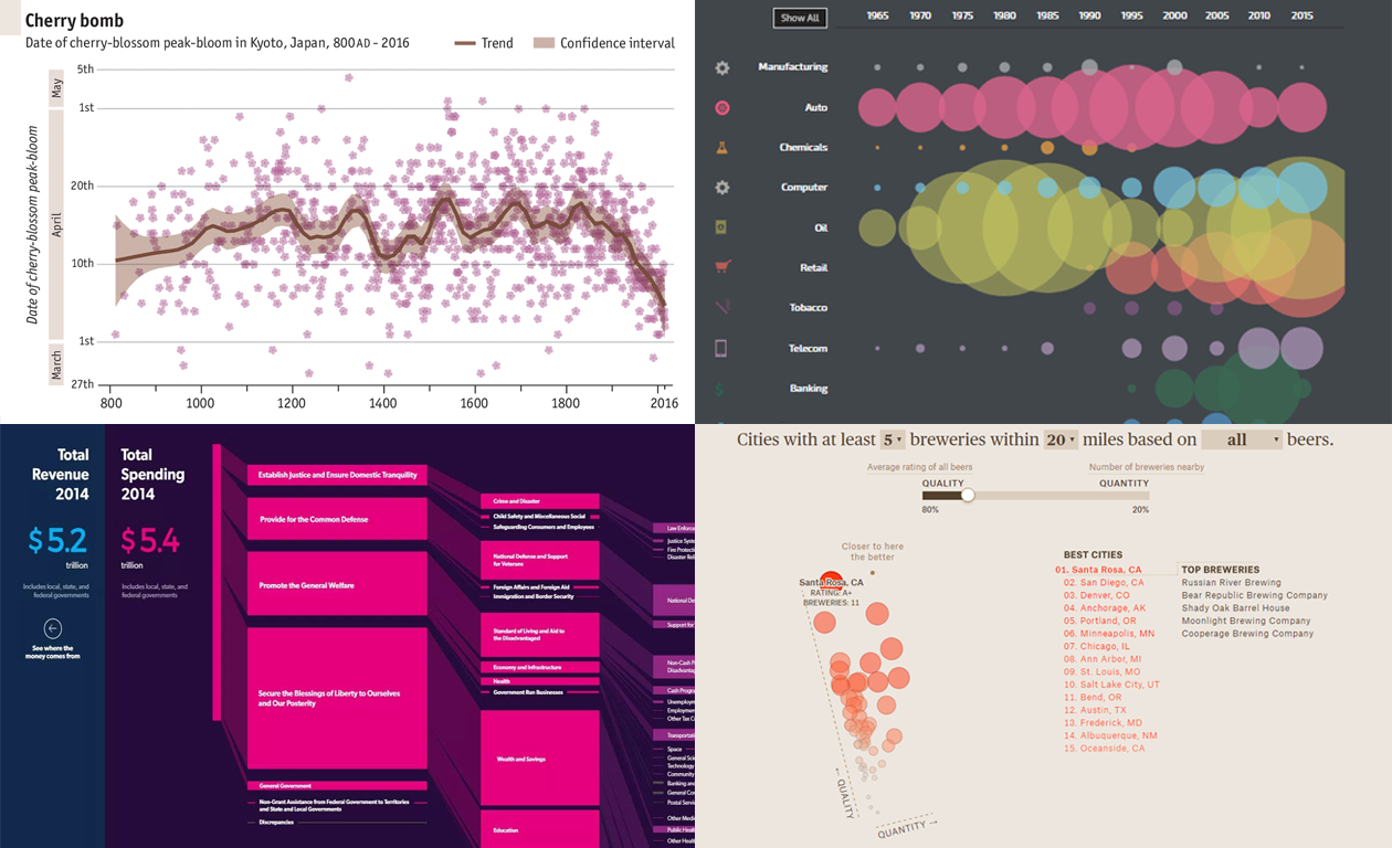 We are glad to present you new data visualization examples within the framework of the weekly recap. These charts – mostly interactive – will definitely catch your eye, if you haven’t seen them before.
The graphics shared today in Data Visualization Weekly are about:
- finding the craft beer brew capital of the U.S.,
- revealing how the date of Japan’s cherry blossom peak-bloom has shifted,
- exploring the evolution of industries atop the Fortune 500 list, and
- making sense of U.S. government spending data.
Now, let’s see all of those cool new data visualization examples.
- Categories: Data Visualization Weekly
- No Comments »
Chart Visualizations of the Week: Data Visualization Weekly
April 21st, 2017 by AnyChart Team Welcome to the new Data Visualization Weekly collection of interesting chart visualizations of the latest 7 days! In this series, it’s always Friday. Not that we are now part of the T.G.I. Friday’s restaurant chain – not at all! But we usually publish DataViz Weekly posts on Friday, in the Friday mood. And our goal here is to let you heave a sigh of relief after another workweek and simply enjoy some cool chart visualization examples before going to a pub (or exactly from there!), home, or wherever else for a Friday night.
See below for four engaging data visualizations. In particular, there you’ll find the animated chart that became one of the most widely liked and shared tweets with third-party charts in our Twitter account‘s history. And it goes first.
- Categories: Data Visualization Weekly
- No Comments »
Interactive Data Visualization Examples (Mid-April): New Peculiar Charts and Maps in DataViz Weekly
April 14th, 2017 by AnyChart Team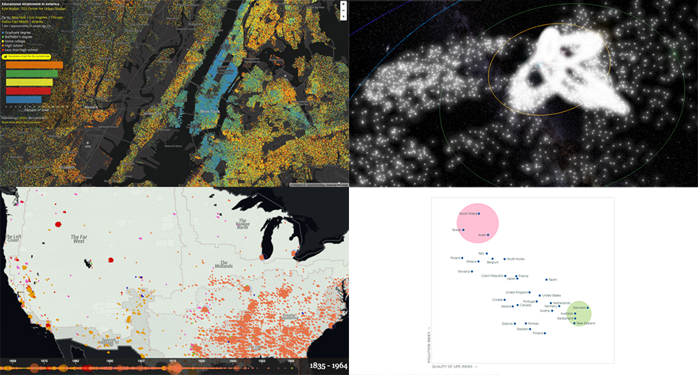 Tired after another workweek? Then now is a great time to lean back and relax and take a quick look at yet another set of interactive data visualization examples! We have shared these visualizations on social networks just recently. They got pretty much attention of our followers (and beyond). So their way to Data Visualization Weekly on the AnyChart blog was quite quick and simple.
Today we are presenting you with interactive visualizations of meteor streams, lynchings in America, JS quadrant chart of top 30 countries by quality of life plotted also according to their pollution indexes, and educational attainment in the United States.
- Categories: Data Visualization Weekly
- No Comments »
“Interactive Maps” Edition | Data Visualization Weekly
April 7th, 2017 by AnyChart Team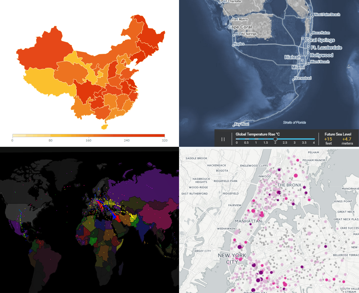 Today’s Data Visualization Weekly issue is fully devoted to interactive maps. To put it precisely, we’ll highlight four of them this time. These maps have been popular on the Web and also most followed on our Facebook and Twitter accounts within the last days. So they’ve completely deserved to be mentioned here.
Here’s what interactive maps we are sharing with you today:
- Lead-Tainted Water Fountains in NYC Schools,
- Surging Seas,
- Asylum Seekers’ Paths, and
- China’s Regions and Counties.
- Categories: Data Visualization Weekly
- No Comments »
Stacked Bar Charts Explained, Vizzies 2017 Winners, Global Temperature Graph, Map of Sea Level Rise | DataViz Weekly
March 31st, 2017 by AnyChart Team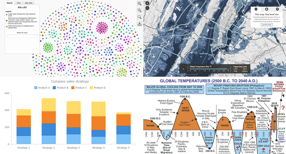
Today is the 13th Friday of the 2017 year, and another weekend is coming! In the meantime, we invite you to enjoy another portion of last week’s notable works in the data visualization field. The first highlight here is the article about stacked bar charts and how to use them, written by our Data Visualization Expert Vitaly Radionov specifically for Smashing Magazine. After briefing you on that, we’ll also take a look at this year’s winners of the Vizzies Challenge, a graph of global temperature change from 2500 BC to 2040 AD, and a (scary) map visualization of the sea level rise expected in the (near?) future.
- Categories: Charts and Art, Data Visualization Weekly
- No Comments »
US Military Expenditure Charts, Resource Management Chart, Color in DataViz | Data Visualization Weekly
March 24th, 2017 by AnyChart Team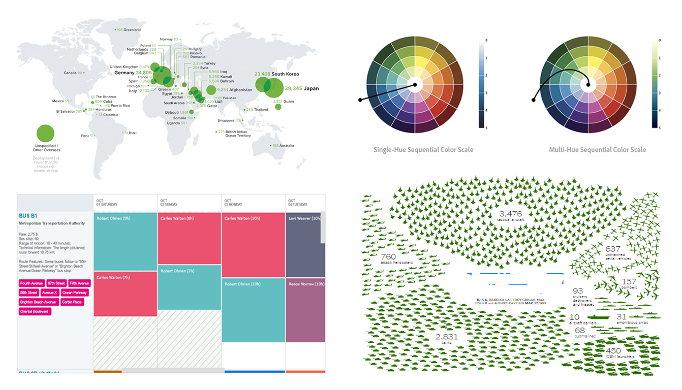 In today’s Data Visualization Weekly issue, you’ll find another set of eye-catching dataviz examples shared and discussed on media within the last seven days. The current issue highlights several visualizations of America’s military expenditure, bus schedule as a chart for resource management, and explanation on how to use color in data visualization to the best effect.
- Categories: Data Visualization Weekly
- No Comments »
25 Data Visualization Examples for One Dataset, Animated Map of Twitter Reactions During Oscars, and More | DataViz Weekly
March 17th, 2017 by AnyChart Team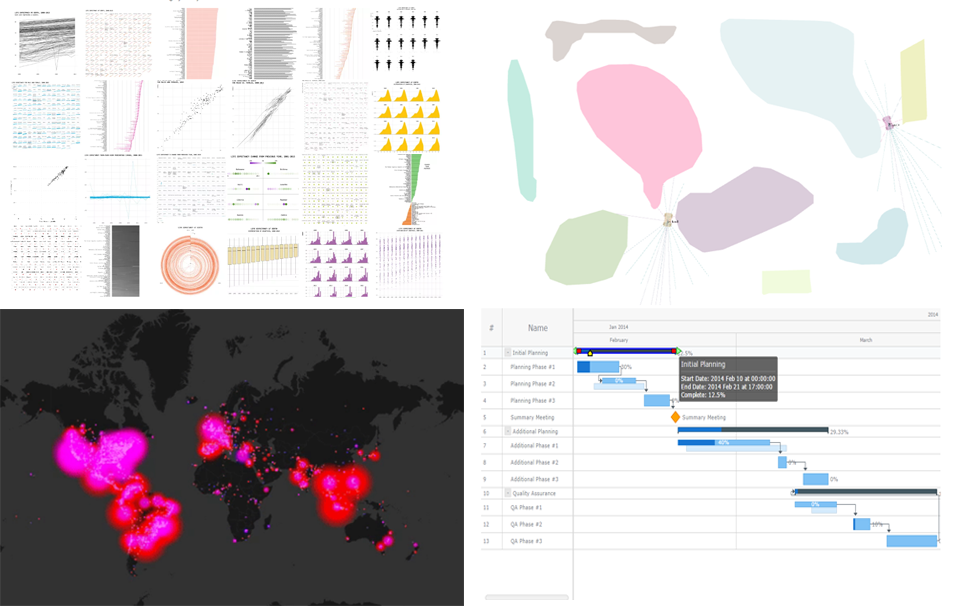 25 data visualization examples of how you can present the same dataset, an animated map of Twitter users’ reaction during this year’s Oscars, JavaScript-based self-driving cars, and an interactive Gantt chart sample with customized connectors in the Live Edit mode. These are the masterpieces that we are highlighting in today’s Data Visualization Weekly post.
Without more ado, let’s get to our latest collection of popular and most shared new charts from around the Web.
- Categories: Charts and Art, Data Visualization Weekly, News
- No Comments »
Data Visualizations of the Week: JS Frog Column Chart, Seeing Theory, and More
March 10th, 2017 by AnyChart Team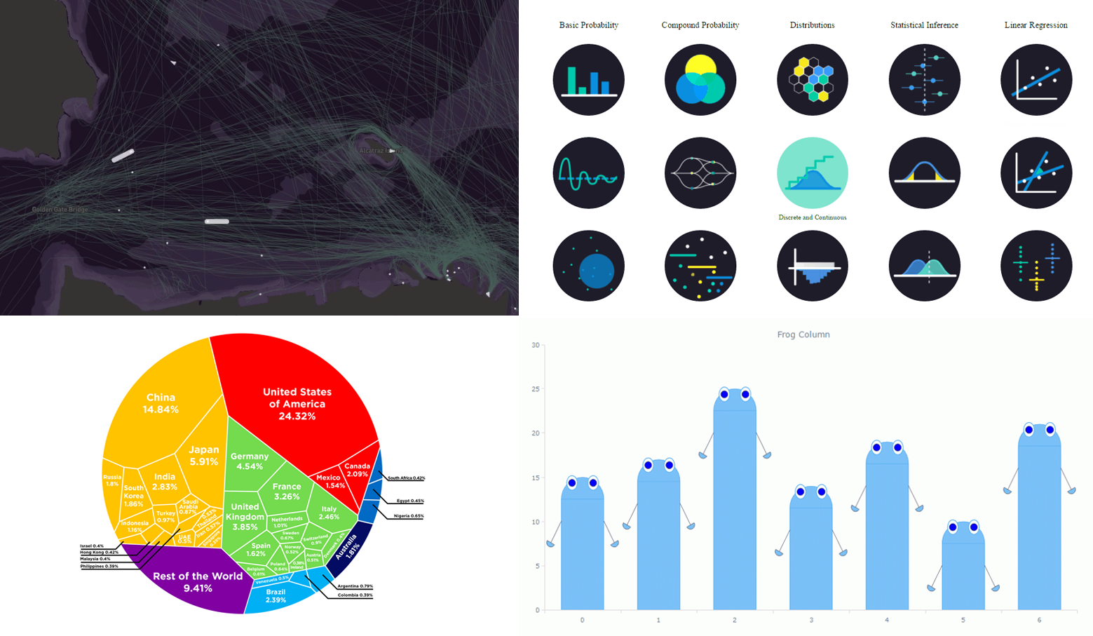 Now it’s time to say hello to last week’s most eye-catching data visualizations. As always, choosing just some of the best new and most popular pieces is a difficult task. But we are more than glad to do that for Data Visualization Weekly! And please don’t stop making more and more charts, people! That’s pleasant and greatly inspiring to see so many cool data visualizations emerge every week. Examining them also allows all of us to keep learning from the best practices, expand the vision, and further improve skills and understanding.
Today’s Data Visualization Weekly issue highlights the following four great presentations:
- animated map of shipping in the San Francisco Bay;
- interactive visualization of statistics and probability;
- Voronoi diagram of the global economy;
- “frog” column chart of whatever you need.
- Categories: Charts and Art, Data Visualization Weekly, News
- No Comments »
Data Visualization Weekly: Recent Popular Interesting Charts, Maps, and Infographics
March 3rd, 2017 by AnyChart Team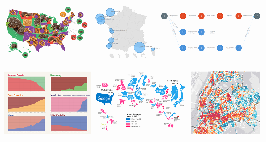 We are back with another collection of interesting charts, maps and infographics being popular lately. As you probably noticed, our Data Visualization Weekly series took a short break. In fact, no new issue came out last week. But the reason is simple and (hopefully) excusable. In fact, we were working really hard to get things done with the exciting major 7.13.0 update that our JavaScript charting libraries has received earlier this week.
Now the source code of AnyChart, AnyMap, AnyStock and AnyGantt is open. Plugins for all popular JS frameworks are available. And all the new features from the 7.13.0 release work great. That means we can finally get back to you to showcase new data visualizations that people followed most on our Twitter, Facebook and LinkedIn accounts over the last days. Moreover, the current issue of Data Visualization Weekly will cover the last two weeks instead of just one, to reimburse you for the delay. So, let’s take a look at the following great visual pieces now:
- Most Popular Girl Scout Cookies;
- History of Global Living Conditions in Interesting Charts;
- Interactive Map of Popular Surfing Areas in France;
- Most Popular Brands in Each Country;
- PERT Chart of Airplane Design Process;
- Revealing Age of Buildings in New York City.
- Categories: Charts and Art, Data Visualization Weekly, News
- No Comments »
Data Visualization Weekly: Interactive Dashboard of US States and More
February 17th, 2017 by AnyChart Team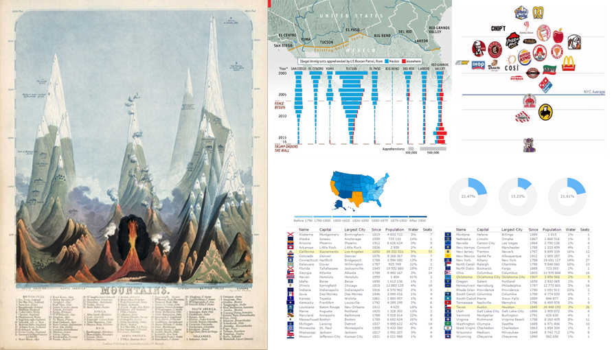 Data Visualization Weekly presented by AnyChart is here! In this new issue, we are glad to show you an interactive dashboard as well as maps and charts in another collection of the best and most followed dataviz masterpieces that we shared on Facebook and Twitter over the course of the last week. These include:
- Interactive Dashboard of US States
- Is Donald Trump’s Wall Necessary?
- Finding the Cleanest Restaurants in NYC
- Early Maps and Infographics of the 1800s
- Categories: Data Visualization Weekly, News
- No Comments »