Data Visualization Weekly: JS Multi-Series Line Chart DataViz and More
February 10th, 2017 by AnyChart Team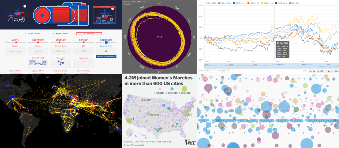 All dataviz lovers are welcome to the new issue of Data Visualization Weekly brought to you by AnyChart JS Charts! Today we are publishing the best and new chart, map and infographic examples shared on our Twitter and Facebook accounts during the last seven days.
So, get ready for the best peculiar practices that made the previous week in data visualization special! And now let’s take a look at what dataviz inspirations were most followed. Read more »
- Categories: Data Visualization Weekly, News
- No Comments »
Data Visualization Weekly: JS Polar Chart of Mic Sensitivity and More
February 2nd, 2017 by AnyChart Team
Data visualization weekly recaps became a tradition for our AnyChart Blog some time ago. Good news: we decided to resume it to highlight the best and new practices shared on our Facebook and Twitter accounts within the previous seven days. This means you will always be in the know of what charts, dashboards, maps, infographics, and video animations are trending and worth seeing.
As a matter of fact, data visualization is further evolving and gaining popularity as the best way to convey various information, whether it is in business reporting, analytics solutions, journalism, presentations, etc. That is why we are trying to monitor a lot of different sources and hope to deliver you the best of noteworthy, peculiar projects and practices for inspiration.
Now, let’s proceed to the visualizations that particularly caught our – and our followers’ – eyes during the last seven days, starting from January 27th, 2017. To put it in a nutshell first, the current data visualization weekly recap includes New York trees, Trump’s emotions, ocean salinity, words from Hamilton, US venture industry, and microphone sensitivity polar pattern. Read more »
- Categories: Data Visualization Weekly, News
- No Comments »