JS Charting Without Borders: 21 New Integration Templates for Popular Stacks
December 19th, 2016 by AnyChart TeamMaking your data visualization life ever easier is what we at AnyChart are boundlessly passionate about. This time we focused on further simplifying the integration of our JS charting solutions into your web development environment.
So, prepare to replan your schedule! From now on, you will spend tangibly less time on charting. And please greet the 21 New Technical Integration Templates that we have just released! They will help you deploy HTML5 graphs, maps, stock charts, dashboards, and Gantt diagrams in your stack as easily (and rapidly!) as never before, no matter what programming languages, frameworks, and databases are used.
You can find the templates right here on our website, in the Technical Integrations section.
Basically, our powerful JavaScript/HTML5 based solutions for interactive data visualization – AnyChart, AnyMap, AnyStock, and AnyGantt – are inherently compatible with all major technologies and platforms. Configuring each JS charting library is easy, and we are sure all of you are more than capable of making even rather complicated integrations prefectly done by yourself. But we keep on doing our best to bring you the ultimate simplicity and clarity so you could get along without additional research and other time-consuming activities.
The integration templates we’ve added cover the most popular languages, frameworks and libraries, and database programs. Below is the list of the newly available combinations.
Templates for easily integrating AnyChart JS charting libraries into your stack:
 |
ASP.NET integration
|
 |
Go integration
|
Java integration
|
 |
Julia integration
|
 |
NodeJS integration
|
 |
Perl integration
|
 |
PHP integration
|
 |
Python integration
|
 |
R integration
|
 |
Ruby on Rails integration
|
 |
Scala integration
|
We hope you agree that this is a tremendous addition to the JS charting integration samples published earlier:
- Clojure, ClojureScript and PostgreSQL,
- iOS, Objective-C and SQLite,
- NodeJS and MongoDB,
- PHP and MySQL,
- PHP, Slim and MySQL.
So, you are welcome to make use of our integration templates and samples for easier data visualization. All of them are released on GitHub under the Apache 2.0 License, rest in the AnyChart Integrations repository, and can be forked and changed in any way.
We are going to keep the collection growing further. Meanwhile, please send us your suggestions on what other particular integration you are interested to learn about first, and – as always! – that one will be prioritized; just contact our Support Team for that and name your stack.
To make your JS charting life even easier, we will release special AnyChart plugins for Angular, Ember, jQuery, Meteor, and React JavaScript frameworks in February 2017, with the 7.13.0 update. But this is a completely other remarkable story. Stay tuned. And thanks for being with us!
- Categories: AnyChart Charting Component, AnyGantt, AnyMap, AnyStock, Business Intelligence, Dashboards, Financial Charts, Gantt Chart, HTML5, JavaScript, News, Stock Charts, Third-Party Developers, Tips and Tricks
- 2 Comments »
AnyChart JS Charting Library 7.12.0 Released
October 31st, 2016 by Margaret SkomorokhAnyChart JS charting library updated! We are glad to announce four new releases: AnyChart, AnyStock, AnyMap, and AnyGantt 7.12.0 are now available for download.
AnyChart 7.12.0 New Features
 |
Localization Support One of the main news of this release: support of localization using locale settings files and special formatting functions. Now our JS charting library allows to switch between 196 different regional settings, and all date/time chart elements update themselves. Take a look at AnyChart Localization demo>> Learn more about Localization Support>> |
 |
Standalone Chart Elements Now you can use all chart building blocks, such as scales, axes, legends and so on to build your own charts and dashboards. Use this feature along with AnyChart’s GraphicsJS graphics library, and you will be able to create your own unique charts and visualizations. Learn more about Standalone Chart Elements>> |
 |
Tooltip Settings Improvement API for tuning chart and series tooltips is improved. These changes allow to make your applications simpler, leaving room for flexibility as well. Learn more about Tooltip Settings Improvement>> |
AnyStock 7.12.0 New Features
 |
Localization Support One of the main news of this release: support of localization using locale settings files and special formatting functions. Now our JS charting library allows to switch between 196 different regional settings, and all date/time chart elements update themselves. Take a look at AnyStock Localization demo>> Learn more about Localization Support>> |
 |
Range Selection UI Controlling data grouping and time interval is paramount when it comes to financial data and stock charts. We are happy to present a set of UI elements that help you to add range selection functionality to your applications. Take a look at Range Selection UI in the Gallery>> Learn more about Range Selection UI>> |
AnyMap 7.12.0 New Features
 |
Localization Support One of the main news of this release: support of localization using locale settings files and special formatting functions. Now our JS charting library allows to switch between 196 different regional settings, and all date/time chart elements update themselves. Take a look at AnyMap Localization demo>> Learn more about Localization Support>> |
 |
Map Grid (Meridians and Parallels) Showing meridians and parallels on a map greatly improves its design and provides a clear view in visualizations where latitude and longitude do matter. Map Grid (Meridians and Parallels) in the Gallery>> Learn more about Map Grid>> |
 |
Map Axes Map axes with latitude and longitude labels complement map grid showing meridians and parallels on a map. Geo Scale that controls Map Axes and grid allows to fine-tune the display and achieve a great variety of looks and feels for map visualizations. Learn more about Map Axes>> |
 |
Map Crosshair Map Crosshair is a visual position tracking element, especially useful in exploratory data analysis visualizations. It works nicely in conjunction with Map Grid and Map Axes. Take a look at Map Crosshair in the Gallery>> Learn more about Map Crosshair>> |
AnyGantt 7.12.0 New Features
 |
Brand New Resource Chart (Beta) We are doing our best to improve our products and this time we decided to take a fresh look at Gantt and Resource charts. We have studied how people manage projects and company resources, what they want to see, how they want to display things happening, and goals they want to achieve. As the result, we understood that we have to redesign Resource and Gantt Charts completely. In this release we present the beta version of new Resource Chart. Take a look at Resource Chart and Resource Chart with Time Tracking in the Gallery. Learn more about Resource Chart and Resource Chart with Time Tracking. |
 |
Calendar Support One of the main features of the new Resource Chart is the ability to set the calendar for all resources or some of them. You can configure weekends, holidays, time of availability, beginning of a calendar year, and so on. Learn more about the Calendar>> |
 |
Smart Timeline New Resource Chart features the improved timeline that looks nice with any data. This new Smart Timeline will be made interactive and available in Gantt Charts in the next update. Learn more about the Smart Timeline >> |
AnyChart version history: https://www.anychart.com/products/anychart/history/
AnyStock version history: https://www.anychart.com/products/anystock/history/
AnyMap version history: https://www.anychart.com/products/anymap/history/
AnyGantt version history: https://www.anychart.com/products/anygantt/history/
Trial download: https://www.anychart.com/download/
- Categories: AnyChart Charting Component, AnyGantt, AnyMap, AnyStock, HTML5, JavaScript, News, Stock Charts
- 1 Comment »
Web Analytics Dashboard – Made With JS Maps and Charts Powered by AnyChart
October 19th, 2016 by AnyChart TeamIn today’s world of data, a well-designed web analytics dashboard is a must-have for everyone who is managing a website, a web app, or a number of various web projects. You get tons of statistics about traffic, and you should make them work and help you make right decisions.
How much traffic are you getting? Who are your visitors? Where are they coming from? And maybe even most important – is your marketing strategy working well? It gets much easier and takes significantly less time to answer all these questions when the data is visualized. Here comes an interactive analytics dashboard that allows you to have your data organized, see everything at-a-glance, and pay sufficient attention to all metrics that are important to you.
First-class dashboarding experience is one of the biggest advantages of our interactive data visualization solutions. JavaScript graphs, maps, and stock charts powered by AnyChart can be easily put on a single, effective, interactive HTML5 dashboard, making your traffic data analytics even more powerful and insightful. And here is another great example – Web Audience Dashboard, freshly made by the team of AnyChart for your inspiration.
Look at this:
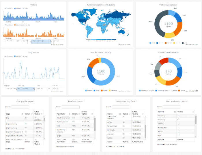
(large image / interactive version)
And now we definitely should take note of some composition and development features of this dashboard.
- Categories: AnyChart Charting Component, AnyMap, Business Intelligence, Dashboards, HTML5, JavaScript, Tips and Tricks
- No Comments »
AnyChart Open-Sources Powerful, Draw-Anything JS Graphics Library GraphicsJS
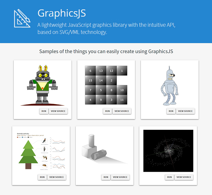
September 15th, 2016 by AnyChart TeamIt is a pleasure for us to announce this today! We have just launched GraphicsJS, a free, open-source, lightweight JavaScript library which allows you to draw any JS graphics and animation for your HTML5 projects very easily. It is significantly more powerful and feature-rich than Raphaël, BonsaiJS, and other formerly leading SVG/VML graphics solutions.
GraphicsJS has always been the graphics engine that our JavaScript (HTML5) charting libraries are built on – AnyChart, AnyStock, AnyGantt, and AnyMap. As a result, it already powers data visualization activities for many of you – Oracle, Microsoft, Volkswagen, AT&T, Samsung, BP, Bosch, Merck, Reuters, Bank of China, Lockheed Martin, and thousands of all the other highly respected AnyChart’s customers including more than 70% of Fortune 1000 companies.
Of course, data visualization is not the only but just one of multiple fields where the library of GraphicsJS can be helpful and even essential. Generally speaking, this solution can help you produce virtually anything graphical from scratch: static and animated images, cartoons, games, interactive infographics, mind maps, and many other amazing things in HTML5.
Key Features of JS Graphics Library
- Mighty line drawing abilities – Bézier curves, arcs, rectangles, and many other kinds of forms and deformations.
- Powerful text manipulation features – multiline texts, measurement, including width, height, as well as wrap, overflow, indent, spacing, align, etc.
- Virtual DOM for drawing fast and only what is necessary.
- Smart layering system with z-index.
- Transformation engine – embarrassing in-browser transformations are not used.
- Legacy browser support (Internet Explorer 6+).
- Concise and convenient JavaScript API with chaining support.
By the way, making our graphics engine open-source is just the beginning as – we are also pleased to tell you – AnyChart is going to open the source code of our charting libraries soon! We believe that our great developments in the fields of graphics and data visualization should be even more visible and reachable to any programmer from any part of the world, not to mention that we would love to allow the community to contribute.
Please refer to GraphicsJS.org to learn more about GraphicsJS. As always, the demos are available on our Playground (Graphics section). Also, let’s not forget about the Graphics Documentation and Graphics API Reference.
What’s more, the GraphicsJS library and all relevant samples can be freely downloaded and forked on GitHub.
- Categories: AnyChart Charting Component, AnyGantt, AnyMap, AnyStock, Charts and Art, Dashboards, Financial Charts, Gantt Chart, GraphicsJS, GraphJam, HTML5, JavaScript, News, Stock Charts, Third-Party Developers, Tips and Tricks, Uncategorized
- 5 Comments »
AnyChart Charting Library 7.11.1 Available
September 2nd, 2016 by Margaret SkomorokhA hotfix for AnyChart charting library is now available: we have released AnyChart, AnyMap, AnyGantt, and AnyStock 7.11.1. Here is a full list of improvements and bug fixes:
All Products
Improvements
- Legend width/height behavior improved.
- Scatter Series behaviour made consistent with other series.
- Credits behaviour improved.
- The appendTheme() method added for easier management of themes.
- Beta version of the Data Adapter Module added for easier management of external files.
- Export Server can now return images as base64 strings or as shareable links.
Bug Fixes
- XML Schema validity problems fixed.
- Various minor Export Server issues fixed.
- Various minor Interactivity issues fixed.
- Inconsistent zIndex behaviour fixed.
- Various XML serialization/deserialization fixed.
- Various JSON serialization/deserialization fixed.
- The toXML() deserialization method no longer adds unnecessary data into XML.
AnyChart
Improvements
- Circular Gauge Ranges and Axis Bar can now be properly rounded.
Bug Fixes
- Pie events fixed.
- Funnel Chart label placement algorithm fixed.
- Series on/off problems fixed.
- 3D Chart events fixed.
- Context Menu in Linear Gauges fixed.
- Series Legend Interactivity issues fixed.
- Seat Map labels fixed.
- Legend Interactivity issues fixed.
- Issues with Ordinal Axis Labels fixed.
- Circular Gauge Gradient display issues fixed.
- Tree Map coloring issues fixed.
- Range Marker issues fixed.
AnyMap
Bug Fixes
- The remove() method problems fixed.
AnyGantt
Bug Fixes
- Problems with inheritance of PERT Chart settings fixed.
- PERT Chart export CSV issues fixed.
AnyStock
Improvements
- Overall Performance improved, especially in Firefox.
AnyChart version history: https://www.anychart.com/products/anychart/history/
AnyMap version history: https://www.anychart.com/products/anymap/history/
AnyGantt version history: https://www.anychart.com/products/anygantt/history/
AnyStock version history: https://www.anychart.com/products/anystock/history/
Trial download of AnyChart charting library: https://www.anychart.com/download/
- Categories: AnyChart Charting Component, AnyGantt, AnyMap, Financial Charts, Gantt Chart, HTML5, JavaScript, News, Stock Charts
- No Comments »
HR Dashboard – Built With AnyChart JavaScript (HTML5) Charts Library
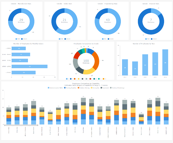
September 1st, 2016 by AnyChart TeamAn HR dashboard is a powerful BI solution that can mightily facilitate making right, data-driven decisions about the workforce in your company – from recruiting and training courses to compensations and job promotions. Smart visualization of all relevant staff-related data, with all charts and graphs on a single page, allows your Human Resources Department to see various metrics at-a-glance. As a result, HR managers are given the power to easily identify trends, outliers, and relationships when it comes to reports and data analysis, and to make sure each decision is well-timed and will drive even more success for your enterprise.
After all, it is the employees that are the most valuable asset.
To inspire and show you how easy it gets to implement this approach with the help of AnyChart JS Charts library, we added an interactive JavaScript-based Human Resources Dashboard to the Business Solutions section of our website as a new HTML5 business dashboard sample with the full source code. It nicely visualizes various employee related data, including demographics, payrolls, performance measurements, and so on. Of course, you are welcome to fork this sample and use our HR Dashboard fully or partially to create your own solution.
Now let’s have a closer look at this interactive HTML5 dashboard, including its composition and some peculiar features. Read more »
- Categories: AnyChart Charting Component, Business Intelligence, Dashboards, HTML5, JavaScript, News
- No Comments »
JS Linear Gauge by AnyChart and More
August 15th, 2016 by Margaret SkomorokhHere are the the data visualizations (and related information) that we have posted this week on AnyChart Facebook Page and in Twitter, including a JS Linear Gauge by AnyChart:
- The Real Value of $100 in Each State – Everything is relative. This map by Tax Foundation shows the real value of $100 in each state in the U.S. Prices for the same goods are often much cheaper in states like Missouri or Ohio than they are in states like New York or California. As a result, the same amount of cash can buy you comparatively more in a low-price state than in a high-price state. (The visualization is based on the data published by The Bureau of Economic Analysis.)
- Sugar Consumption by Mona Chalabi – This chart showing sugar consumption from 1700 to 2000 is only one of many wonderful handmade “data sketches” in Mona Chalabi’s Instagram. Visit it to learn about crying frequency per week, handwriting vs. typing speed, median cost of a funeral, and other facts, visualized in drawings.
- Guide to Figuring out the Age of an Undated World Map – With this visual guide from xkcd.com, you will always be able to figure out the age of an undated world map.
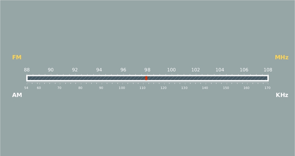
- Radio Scale – JS Linear Gauge by AnyChart – A linear gauge (added in AnyChart 7.11.0) is visual representation of a measuring device with a horizontal or vertical scale and a pointer or multiple pointers indicating particular values. The scale is usually color zoned, which helps to see what range the value of interest falls in. Linear gauges can represent thermometers, battery indicators, rulers, and any other devices with straight line–shaped scales. For example, this interactive gauge from our gallery represents a radio scale. To learn more about linear gauges in AnyChart, see the following article:
- Categories: AnyChart Charting Component, HTML5, JavaScript, News
- No Comments »
HTML5 PERT Chart by AnyGantt and More
August 5th, 2016 by Margaret SkomorokhHere is a quick recap of the visualizations that we have shared with you this week on AnyChart Facebook Page and in Twitter (including an HTML5 PERT Chart by AnyGantt):
- Where Europe is most and least innovative, in 6 maps (a data visualization by The Washington Post) – The continent’s most creative and productive regions are in Germany, France, Britain and the Nordic countries. Southern England, northern Denmark, southern Germany and Paris are particularly successful — whereas Romania, Poland and Spain have disproportionately more regions that lack innovation.
- Pokémon dual-type charts – looks like playing Pokémon Go is not that easy!
- Global Sharknado Threat Map – Created by an unprecedentedly cross-discipline team of nameless chain-smoking scientists in white lab coats, this map is intended as a resource to coastal communities regarding the nature and likelihood of a sharknado incursion. Right?X
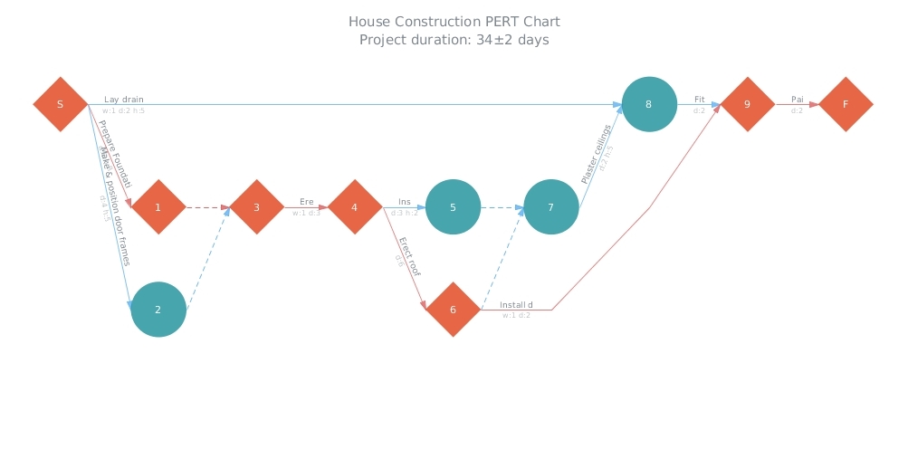
- House Construction (HTML5 PERT Chart by AnyGantt). In AnyGantt 7.11.0, we have added a new decision-making tool – PERT Charts. PERT is an abbreviation for “Program (Project) Evaluation and Review Technique”. This technique, developed by the U.S. Navy in the 1950s, is used in project management to analyze and represent the tasks involved in completing a given project. It is applied mostly in large-scale projects where time is the major factor and allows to schedule a project without knowing precisely the details and durations of all activities. For example, PERT was used in planning the 1968 Winter Olympics in Grenoble. You can see more samples of AnyGantt PERT charts in our PERT Chart Gallery.
- Categories: AnyChart Charting Component, AnyGantt, HTML5, JavaScript, News
- No Comments »
AnyChart 7.11.0 with JS Stock Drawing Instruments Released
July 27th, 2016 by Timothy LoginovGood news! We have released AnyChart, AnyStock, AnyMap, and AnyGantt 7.11.0. In the new versions of our products, you will find such long-awaited features as JS Stock Drawing Instruments, Pert Charts, Linear Gauges, Seat Maps, and more. Here is the full list of improvements:
AnyStock

Stock Overlay Drawing Instruments are a complete set of drawing tools that allow end users to add drawings to charts. It includes such tools as Line segment, Ray, Trend Line, Vertical Line, Horizontal Line, Rectangle, Ellipse, Triangle, Trend channel, Andrew’s pitchfork, Fibonacci fan, Fibonacci arc, Fibonacci retracement, Fibonacci Time Zones, Buy/Sell Signals, and more – all of them being fully configurable and easily manageable.
Take a look at Stock Overlay Drawing Instruments Demo >>
Take a look at Stock Overlay Drawing Instruments in the Gallery >>
Learn more about Stock Overlay Drawing Instruments >>

AnyStock now supports the Y-Scale “Comparison Mode”, which allows comparing changes in series values. Changes can be shown in two modes: value and percent, and a custom date can be set as the comparison base.
Take a look at Y-Scale Mode in the Gallery >>
Learn more about Y-Scale Mode >>
AnyChart

All AnyChart charts now support AAA-level web accessibility standards (Section 508) using very flexible a11y (accessibility) features. AnyChart supports two accessibility modes:
Learn more about Accessibility Support >>

We have created a very flexible way of building any type of Linear Gauges. You can use built-in constructors for LED, Tank, and Thermometer Gauges or build your own Gauge with simple configurations.
Take a look at Linear Gauges in the Gallery >>
Learn more about Linear Gauges >>

The Chart Editor feature, which makes the integration of AnyChart much easier, is a dialog window that allows to create and set up various chart types. The result can be saved with fixed data in XML or JSON format or in a reusable format with a JavaScript code string.
Take a look at Chart Editor Demo >>
Learn more about Chart Editor >>

The Async Rendering feature allows you to make web pages and applications with a big number of charts more responsive during the page loading process.
Learn more about the Async Rendering feature >>
AnyMap

Seat Maps simplify the process of building interactive Airplane Seating Charts, Opera and Cinema Plans, or any other types of seat maps. It is suitable for building interactive schemes of parks, malls, or virtually any other entities.
Take a look at Seat Maps in the Gallery >>
Learn more about Seat Maps >>

We have added a lot of features to improve visual appearance of geographical maps. Now it is possible to place region labels outside of regions bounds, using Latitude/Longitude data. The Label Overlap Control feature helps to keep a big amount of labels under control. Small regions can be highlighted using the Callout feature.
Learn more about Map Label Positioning Improvements >>

AnyMap now supports loading geodata in TopoJSON format. Geographical data files in TopoJSON format are much smaller, using them allows to reduce map rendering and page loading time.
Take a look at a sample of using TopoJSON format as geodata >>
Read more about TopoJSON Format Support >>

AnyMap now supports loading Geo Data in SVG format. This format may be quite useful if you want to edit a map in a simple vector editor or to create a map of an imaginary place, a road map, or a map with rivers or custom labels.
Take a look at a sample of using SVG format as geodata >>
Read more about the Ability to Use SVG Images as Geo Data >>
AnyGantt

A PERT Chart (Program evaluation and review technique) is a great decision-making tool designed to save time in achieving end-objectives. AnyGantt provides flexible settings of milestones (events), tasks (activities) and critical path.
Take a look at PERT Charts in the Gallery >>
Learn more about PERT Charts >>
AnyChart version history: https://www.anychart.com/products/anychart/history/
AnyStock version history: https://www.anychart.com/products/anystock/history/
AnyMap version history: https://www.anychart.com/products/anymap/history/
AnyGantt version history: https://www.anychart.com/products/anygantt/history/
Trial download of our JS framework: https://www.anychart.com/download/
- Categories: AnyChart Charting Component, AnyGantt, AnyMap, AnyStock, HTML5, JavaScript, News, Stock Charts
- 1 Comment »
JavaScript Stock Chart by AnyChart and More
July 22nd, 2016 by Margaret SkomorokhIn this post, you will find a recap of the data visualizations that we have shared with you this week on AnyChart Facebook Page and in Twitter. One of them is a JavaScript Stock Chart by AnyChart:
- Here’s Everyone Who’s Immigrated to the U.S. Since 1820 – From 1820 to 2013, 79 million people obtained lawful permanent resident status in the United States. The interactive map by Metrocosm visualizes all of them based on their prior country of residence. The brightness of a country corresponds to its total migration to the U.S. at the given time.
- How Kobe’s game worked (and how it didn’t) – These nice charts by Los Angeles Times illustrate the different playing styles of some of the NBA’s top players. The charts break down the court into hexagonal areas, then calculate the difference between the league average and the player’s shooting percentage. The hexagon sizes are proportional to the number of shots the player took in that area. You can also see a related data visualization showing
” target=”_blank”>every shot Kobe Bryant ever took
. - World population living in extreme poverty, 1820-2015 – Extreme poverty is defined as living at a consumption (or income) level below 1.90 “international $” per day. See this interactive visualization and find out what part of the world’s population lives like that and how the situation has changed since 1820.
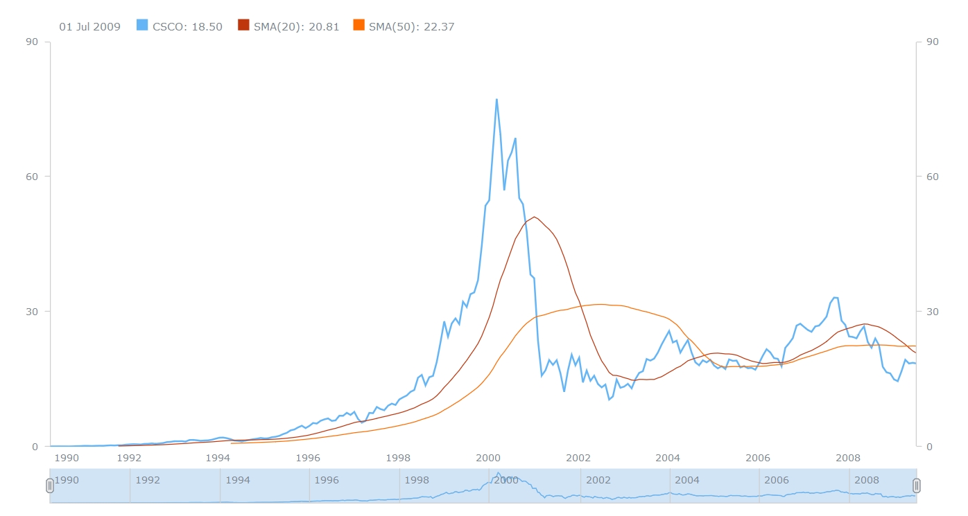
- A JavaScript Stock Chart with SMA by AnyChart – This interactive Stock Chart was created with AnyStock (AnyChart Stock and Financial Charts) – our JavaScript-based financial charting solution. Here, the Simple Moving Average (SMA) technical indicator is used, which is on of the most popular technical analysis tools in trading. You can also see the list of supported technical indicators and AnyStock Gallery.
- Categories: AnyChart Charting Component, AnyStock, HTML5, JavaScript, News
- No Comments »

