JavaScript Dot Map by AnyChart and More
May 21st, 2016 by Margaret SkomorokhThis week we have shared with you on AnyChart Facebook Page and in Twitter a few data visualizations – including a JavaScript Dot Map by AnyChart. You will find a recap of these posts below.
- Holyrood elections see rise of ‘Team Ruth’ and demise of Labour vision – The elections in Scotland have seen the remarkable transformation of Ruth Davidson’s Scottish Conservatives from “toxic Tories” to the second party and official opposition of the Holyrood parliament. In this article on Theguardian.com, you can see a couple of nice interactive charts showing the change in Scotland’s political geography.
- 24 Charts of Leadership Styles Around the World – Look at 24 charts of leadership styles around the world (from the book When Cultures Collide by Richard D. Lewis) and see how remarkably different these styles are, varying from structured individualism in USA and multiple leadership in Israel to national romanticist in Poland and human force in Spain, including some really tricky styles that cannot be described in one term.
- Digital Attack Map is a live data visualization of DDoS attacks around the globe, built through a collaboration between Google Ideas and Arbor Networks. The tool surfaces anonymous attack traffic data to let users explore historic trends and find reports of outages happening on a given day.
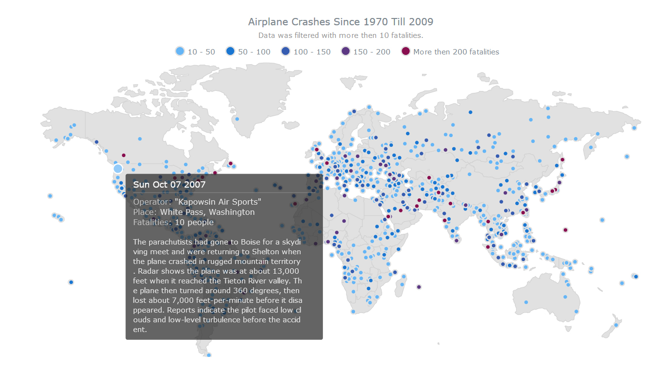
- Airplane Crashes since 1970 till 2009 – The Dot (Point) map type, added in AnyMap 7.10.0, has the widest application range: showing cities, points of interest, events, creating density maps, etc. The JavaScript Dot map you see here shows airplane crashes all over the world (since 1970 till 2009) as dots on a map. The visualization is interactive: each dot is linked to a description of the crash in represents. Please note that in AnyMap dots on Dot maps are fully customizable – you can work with any of predefined marker types, code your own type, or use an image.
- Categories: AnyChart Charting Component, AnyMap, HTML5, JavaScript, News
- No Comments »
HTML5 Connector Map by AnyChart and More
May 13th, 2016 by Margaret SkomorokhIn this post you will find a recap of the cool data visualizations that we have shared with you this week on AnyChart Facebook Page and in Twitter (including an HTML5 Connector Map by AnyChart):
- The Year that Music Died from Polygraph is an animated timeline that shows the Billboard top 5 songs since 1956, all the while playing the top song during a given week (via FlowingData).
- David Rumsey Map Center is a collection of more than 150,000 maps, atlases, globes and other historical treasures. Read more in the article on Smithsonian.com (and check out eight awesome maps from the collection). is a collection of more than 150,000 maps, atlases, globes and other historical treasures donated by the retired San Francisco real estate developer. Read more in the article on Smithsonian (and check out eight awesome maps from the collection).
- The Atlas of Economic Complexity is a great interactive tool that enables users to play around with international trade data. You can visualize a country’s total trade, track how these dynamics change over time, and explore growth opportunities for more than a hundred countries worldwide. As a dynamic resource, The Atlas is continually evolving with new data and features to help analyze economic growth and development.
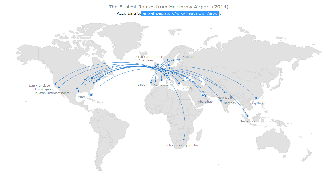
- Busiest Routes From Heathrow Airport – this interactive HTML5 Connector Map by AnyChart shows the most popular flight destinations from Heathrow Airport in London, UK (based on Wikipedia data). Connector Maps can be used used to create Flight Maps, Route Maps, Demarcation Maps, and in many other cases. To take a look at other AnyChart Connector Maps, visit our Gallery, and to read about other new features in AnyMap 7.10.0, see its version history.
- Categories: AnyChart Charting Component, AnyMap, HTML5, JavaScript, News
- No Comments »
JS TreeMap Chart by AnyChart (and More)
May 6th, 2016 by Margaret SkomorokhHere is a quick recap of the visualizations that we have shared with you this week on AnyChart Facebook Page and in Twitter (including a JS TreeMap chart by AnyChart).
- Why so many celebrities have died in 2016 statistics analyzed and visualized by BBC News. It now seems rare for a week to pass without a significant celebrity death being reported – from David Bowie in the second week of January, to actor Alan Rickman a week later, to comedian Victoria Wood and Prince this week. “Enough, 2016” and a more vulgar alternative are phrases people are uttering more and more regularly. So is this wave of celebrity deaths the new normal?
- Insightful human portraits made from data – Artist R. Luke DuBois makes unique portraits of presidents, cities, himself and even Britney Spears using data and personality. In this TED talk, he shares nine projects — from maps of the country built using information taken from millions of dating profiles to a gun that fires a blank every time a shooting is reported in New Orleans. His point: the way we use technology reflects on us and our culture, and we reduce others to data points at our own peril.
- A New Map for America – this data visualization by The New York Times shows how the lower 48 could be realigned into seven mega-regions. These days, in the thick of the American presidential primaries, it’s easy to see how the 50 states continue to drive the political system. But increasingly, that’s all they drive — socially and economically, America is reorganizing itself around regional infrastructure lines and metropolitan clusters that ignore state and even national borders.
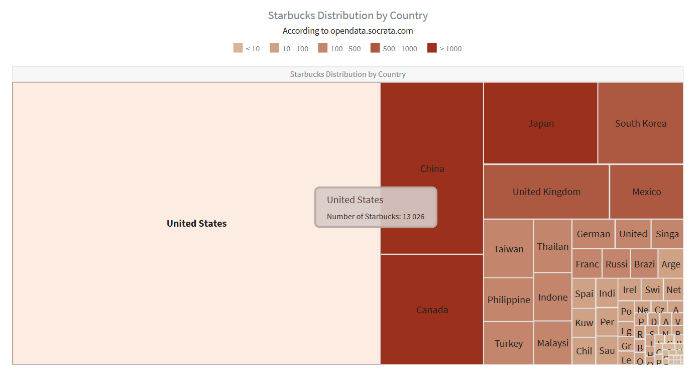
- Starbucks Distribution by Country – In the recent update of AnyChart, we have added TreeMap charts, which are great for showing hierarchical data. This particular interactive JS TreeMap chart (based on data from opendata.socrata.com) allows to compare (at a glance!) the number of Starbucks in different countries. AnyChart 7.10.0 has all the features allowing to create treemap-based solutions: Drill-Down API, Flexible Interactivity Settings, Hint Depth Feature, and smart Labels/Headers display modes. Hierarchical Data Engine allows to add, alter, and search hierarchical data sets.
- Categories: AnyChart Charting Component, HTML5, JavaScript, News
- No Comments »
AnyChart JS Framework 7.10.0 Released
April 28th, 2016 by Margaret SkomorokhGood news! We have released AnyChart 7.10.0 , AnyStock 7.10.0, and AnyMap 7.10.0. Enjoy the cool new features that have been added to the updated version of our JS framework:
AnyChart 7.10.0 New Features
 |
TreeMap Chart We are happy to announce that we have added one of the best chart types for showing hierarchical data – TreeMap Chart. It has all the features allowing to create treemap-based solutions: Drill-Down API, Flexible Interactivity Settings, Hint Depth Feature, and smart Labels/Headers display modes. Hierarchical Data Engine allows to add, alter, and search hierarchical data sets. Take a look at TreeMap Chart in the Gallery >> Learn more about TreeMap Chart Chart >> |
 |
Themes To make it easier to integrate AnyChart Charts in your website or application, and to help you to choose matching colors, we present you with 18 out-of-the-box themes. These themes are based on 13 color palettes, which can be used with or without the themes. You can change or use themes how you like, attuning them to your requirements. Take a look at Themes Demo >> Learn more about Themes >> |
 |
Save as Excel/CSV/XML/JSON We have extended our Export API. Now you can not only export your chart as an image or PDF, but also grab data or configuration settings with these four new methods: saveAsCsv (CSV), saveAsXlsx (Excel), saveAsXml(XML), and saveAsJson (JSON). Learn more about Export functions >> |
 |
Chart Statistics By popular request, we have made the getStat method available outside of TextFormatter functions: now you have access to statistical data that AnyChart engine calculates any time you want. Please note that you can use statistical data to fine-tune your visualisation or highlight some data points and that it can be done before the chart is drawn. Learn more about Chart Statistics >> |
 |
Context Menu Context menu now comes out-of-the-box too. By default, it provides Print, Export, and other commonly used items. You can add your own elements or remove default ones; context menu look is customizable too. Learn more about Context Menu >> |
 |
Keep/Exclude Data Point Exclude/Include Points API and ability to use this API in the context menu allows you and any chart viewer to hide some parts of the chart. You can create complex data mining applications that show more information and make it easier to understand. Learn more about Keep only/Exclude Data Point >> |
 |
Improvements for 3D Charts For those of you who like to use 3D charts, we’ve added the Z-Axis Distribution option, animations, and the ability to use hatch fill. Take a look at 3D Charts in the Gallery >> Learn more about 3D Charts >> |
AnyStock 7.10.0 New Features
 |
10 New Series Types Candlestick, Spline, Step Line, Area, Step Area, Spline Area, Marker, Range Column, Range Area, and Range Spline Area series are now available in Stock Charts. All these series can be used in the scroller and technical indicators. Take a look at Stock Chart types in the Gallery >> Learn more about Stock Chart types >> |
 |
Data Grouping Two new important settings for data grouping are now available: setting maximum number of visible points (the maxVisiblePoints method) and minimum number of pixels per point (the minPixPerPoint method). We have also made it possible to tune data grouping levels. Learn more about Data Grouping >> |
 |
Legend Interactivity AnyStock Legend can now be used to show/hide series in Stock Plots and properly handle the mouseClick event. It can be customized using the preventDefault method. Learn more about Legend Interactivity >> |
AnyMap 7.10.0 New Features
 |
Dot (Point) Map The Dot (Point) Map series type has been added to AnyMap. It has the widest application range: showing cities, points of interest, events, creating density maps, and more. In the Dot Distribution Map (also known as Dot Density Map), a dot symbol shows the presence of a feature or phenomenon. Dot maps rely on visual scatters to demonstrate spatial patterns. With AnyMap, you can work with any of predefined marker types, code your own type, or use an image. Take a look at Dot/Point Maps in the Gallery >> Learn more about Dot/Point Maps >> |
 |
Connector Map The Connector Map series type has been added to AnyMap. Connector Maps can be used used to create Flight Maps, Route Maps, Demarcation Maps, and in many other cases. Take a look at Connector Maps in the Gallery >> Learn more about Connector Maps >> |
 |
Drill Down Now you can change detalization level using the Drill Down feature. Source map settings can be preserved when you drill down, or completely reset if needed. Take a look at Drill Down >> Learn more about Drill Down >> |
 |
Common Map Projections Now you can show any map in one of the following projections: Aitoff, August, Bonne, Eckert1, Eckert3, Equirectangular, Fahey, Hammer, Mercator, Orthographic, Robinson, Wagner6, and Wsg84. Please be careful when you change the projection – be aware of how map projections work and when it is appropriate to use them. Take a look at Common Map Projections in the Gallery >> Learn more about Common Map Projections >> |
AnyChart version history: https://www.anychart.com/products/anychart/history/
AnyStock version history: https://www.anychart.com/products/anystock/history/
AnyMap version history: https://www.anychart.com/products/anymap/history/
Trial download of our JS framework: https://www.anychart.com/download/
- Categories: AnyChart Charting Component, AnyMap, AnyStock, HTML5, JavaScript, News, Stock Charts
- 1 Comment »
JavaScript Donut Charts: No Problems with Hole Size
April 22nd, 2016 by Margaret SkomorokhHow was the science of data visualization born? Maybe like this:

Sally L. Steinberg Collection of Doughnut Ephemera, Archives Center, National Museum of American History
We have no idea what it is and who it is, but this image is a part of Sally L. Steinberg Collection of Doughnut Ephemera of the Smithsonian Institution. You can read about the collection here and here. It includes a lot of nice pieces like this vintage donut-related infographic:

Sally L. Steinberg Collection of Doughnut Ephemera, Archives Center, National Museum of American History
So, does the mysterious chart tell the truth? Has donut hole size really shrunk over the years? It seems that this question is of great public interest! It is thoroughly discussed in this article on Vox.com: Have donut holes gotten smaller? There is also a fierce discussion on Reddit, where one of the participants wisely notes that “1927 was a sad time to be alive”.
However, our customers should not worry: when you work with AnyChart JavaScript donut charts, you can easily configure the size of the hole! Visit our Gallery to see some samples of our donut charts.
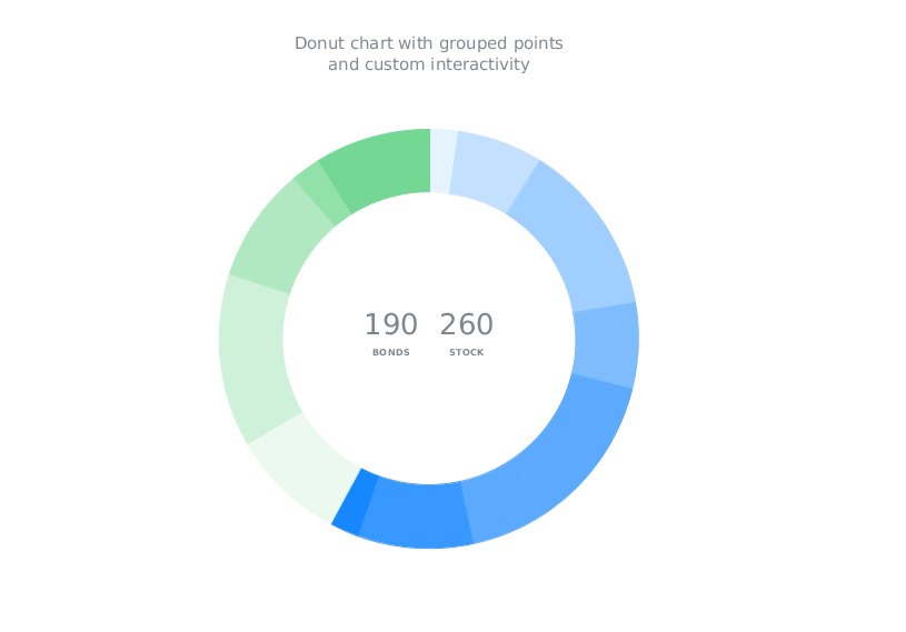
With AnyChart, you can create highly customized interactive donut charts like this one:
This chart was used in our Investment Portfolio Dashboard – we wrote about it earlier: Investment Portfolio Dashboard by AnyChart Charting Framework.
Stay tuned, we have something to say about pie charts too!
- Categories: AnyChart Charting Component, Charts and Art, HTML5, Humor, Interesting Facts, JavaScript
- 1 Comment »
AnyChart Charting Framework 7.10.0 Coming Soon
April 16th, 2016 by Margaret SkomorokhReleases announced on our site – AnyChart, AnyStock, and AnyMap 7.10.0 – will be available by the end of April; we are working hard to release the new version of our charting framework as soon as possible. A lot of great and long-awaited features will be added.
In the new version of AnyChart, you will find:
- TreeMap Charts
- Save as Excel/CSV
- Keep Only/Exclude Data Point
- Context Menu
AnyStock will be updated with:
- Common Chart Types (Candlestick, Spline, Area, Marker, and more)
- Legend Interactivity
- Data Grouping Settings
Finally, the following features will be added to AnyMap:
- Dot/Point Maps
- Drill Down
- Points Connection
AnyChart is a robust JavaScript/HTML5 charting framework combining all major features you need. And we do our best to improve our products even more.
By the way, this week we have posted on AnyChart Facebook Page and in Twitter some interesting data visualizations:
- The NYPL Map Warper is a tool for digitally aligning (“rectifying”) historical maps from the The New York Public Library’s collections to match today’s precise maps. Visitors can browse already rectified maps or assist the NYPL by aligning a map.
- How the Rest of the Delegate Race Could Unfold – This interactive delegate calculator by The Upshot lets you simulate how the Republican and Democratic nominating contests could unfold. Adjust the sliders to see how the outcomes can change (each line in the charts represents one possible outcome). The calculator uses each state’s delegate allocation rules, along with estimates of how favorable each district is for each candidate. To compute these estimates, Upshot used a model based on demographics and results from past primaries and caucuses.
- Markov Chains Explained Visually – Enjoy this interactive visual explanation of Markov Chains. In addition, you can use a Markov chain “playground” to make your own Markov chains by messing around with a transition matrix! Markov chains, named after Andrey Markov, are mathematical systems that hop from one “state” (a situation or set of values) to another.
- Categories: AnyChart Charting Component, AnyMap, AnyStock, Financial Charts, HTML5, JavaScript, News, Stock Charts
- 2 Comments »
HTML5 Gauge by AnyChart and More
April 8th, 2016 by Margaret SkomorokhHave you seen data visualizations (including an HTML5 Gauge by AnyChart) that we have shared this week on AnyChart Facebook Page and in Twitter? Here is a quick recap of these posts:
- The Speed of a Unicorn – Do you believe in magic? And do you know where the fastest unicorns live? To find out, check out this interactive data visualization by Fleximize. (Unicorns are rare beasts of the business world, startup companies that are valued at $1B or more. Once considered the stuff of myth, there are now over 180.)
- How Machines Destroy (And Create!) Jobs, In 4 Graphs – For hundreds of years, people have been talking about machines taking jobs from people. Less often discussed: machines creating new jobs. See 4 graphs on NPR demonstrating how machines influence the job market. All in all, technology gives, and technology takes.
- Vienna electorate poster – This elegant data-driven infographic illustrates Vienna’s electorate gap related to the increasing number of foreign nationals who are usually ineligible to vote in citywide or national elections. How did the share of foreign nationals in Vienna evolve since 1971? What are the changes of the total population in relation to changes in the electorate since 2002? Are there any significant differences by age? The poster provides answers to these questions – district by district.
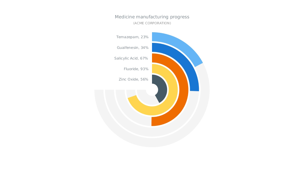
- Solid Gauge (an HTML5 gauge by AnyChart) – Is it a Pie Chart? Is it a bar chart? No! It is an interesting way to use Circular Gauge by AnyChart to show manufacturing process. Circular Gauge is a visual representation of a measuring device with radial axes that sweep any angle from 0 to 360 degrees and pointers (Needles, Knobs, Markers) that indicate values. Circular Gauges can look like speedometers, clocks, compasses, volume controls, or any other similar tools.
- Categories: AnyChart Charting Component, HTML5, JavaScript, News
- No Comments »
WinLoss (JavaScript Sparkline chart by AnyChart) and More
April 2nd, 2016 by Margaret SkomorokhThis week we have posted on AnyChart Facebook Page and in Twitter the following data visualizations (including WinLoss – a JavaScript Sparkline chart by AnyChart):
- FBI vs Apple Map – Want to know where your state sides on the Apple vs FBI debate? Check its voting record. While the FBI and Apple case is on hiatus until April 5, the public debate rages on about whether Apple should assist the FBI in unlocking the San Bernadino shooter’s iPhone. Turns out, it’s pretty easy to find out if your state supports Apple or the FBI: just look at its voting results from the 2012 presidential election. This map on The Next Web clearly demonstrates the correlation.
- The SORTING project by Carlo Zapponi is an attempt to visualize and help to understand how some of the most famous sorting algorithms work. This project provides two standpoints to look at algorithms, one is more artistic, the other is more analytical aiming at explaining algorithm step by step.
- Who is the oldest person in the world? What are the worst games ever made? What is the best way to visualize data on marijuana laws? Enjoy this selection of 47 weirdest charts from 2015 (picked up FiveThirtyEight), and you will learn everything you need and do not need to know!
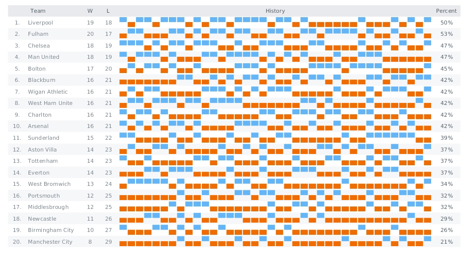
- WinLoss (JavaScript Sparkline chart by AnyChart) – Sparklines are small charts: lines, areas, or columns without labels and any decorations. They can be intertwined with text or placed into table cells. While most of chart types are aimed to present as much data as possible, sparklines is a way to focus on the main point of interest and create a compact data visualization. These charts are good at showing a general shape of any measurement; there is also a special type of Sparklines (called WinLoss) that is used predominantly for scores in sports and games. It shows no values but positive and negative positions. Here we see a score table for English football teams. The first and second columns contain the numbers of the teams and their names, the two next columns contain win and loss scores, and in the fifth column, which is the widest, there are WinLoss SparkLines. Negative values are colored in red, and positive ones are blue. The last column contains the percentage of victories.
- Categories: AnyChart Charting Component, HTML5, JavaScript, News
- No Comments »
Investment Portfolio Dashboard by AnyChart Charting Framework
March 26th, 2016 by Margaret SkomorokhWe have added a new dashboard to AnyChart Business Dashboard Solutions – a section of our site with sample dashboards demonstrating how AnyChart charting framework can be applied to various visualization tasks in various industries. Investment Portfolio Dashboard is a sample solution for personal portfolio management, based on data from finance.yahoo.com.
Some say that portfolio management is the art and science, which consists of making decisions about investment content combination and policy, matching investments to objectives, asset allocation for individuals and institutions, and balancing risk against performance.
If you want to be perfectly accurate, investment management is the professional asset management of various securities (shares, bonds, and other securities) and other assets (e.g., real estate) in order to meet specified investment goals for the benefit of the investors. Investors may be institutions (insurance companies, pension funds, corporations, charities, educational establishments, etc.) or private investors (both directly via investment contracts and more commonly via collective investment schemes e.g. mutual funds or exchange-traded funds).
Or, in plain English, managing investment porfolio is creating a collection of assets that can diminish the risk inherent in stock markets by diversification or avoiding having too many eggs in one basket.
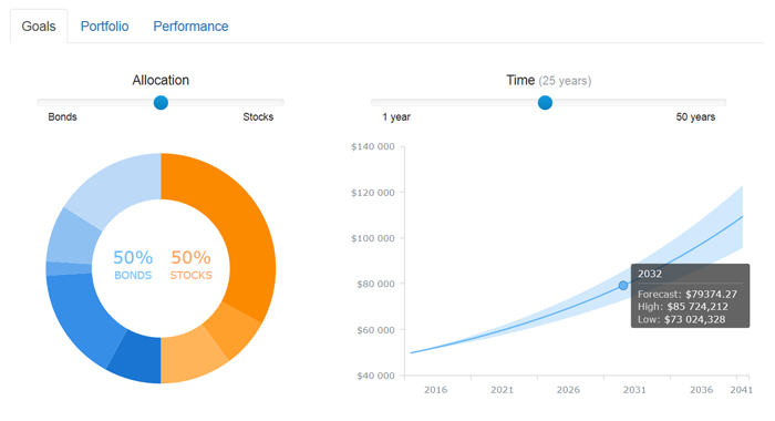
Whatever the case is, any porfolio management must include the following steps: choosing investment horizon and goals, building portfolio, and performance monitoring. Each of the steps needs a dashboard of its’ own, so there are three tabs in our dashboard: Goals, Portfolio, and Performance.
The Goals tab provides a user with a way to mix the portfolio and a way to see the prognosis for it, so there are two charts: a Donut chart and a combination of a Line chart and a Range Area chart. The Portfolio tab shows the mix of the instruments and all basic information about them (here you see the same Donut chart and a table). Finally, in the Performance tab you will find a Stock chart demonrtrating the performance of our investment porfolio.
Using AnyChart, we have created a user-friendly and fast-rendering visualization. To learn how it was done, you can see a detailed tutorial: Creating Investment Portfolio Dashboard. Our dashboard is minimalistic, but it can be easily extended, and it does not matter how much additional information you need to show: our charting framework is flexible enough to cope with any task.
- Categories: AnyChart Charting Component, AnyStock, HTML5, JavaScript, News, Stock Charts, Tips and Tricks
- 1 Comment »
Woman Suffrage JavaScript Map by AnyChart and More
March 18th, 2016 by Margaret SkomorokhHere is a quick recap of the visualizations that we have shared with you this week on AnyChart Facebook Page and in Twitter (including a JavaScript Map by AnyChart that shows where and when women were granted suffrage):
- If Countries’ Web Domains Were Land Masses, Earth Would Look Like This – On this map by Nominet, the world is definitely not as it seems. Why? Because countries have been scaled according to the number of country code domain names they have registered, and not by their geographical size.
- Goldilocks – How many habitable exoplanets are out there? According to astrobiology, a planet must neither be too far away from, nor too close to a star to support life; either extreme would result in a planet incapable of supporting life. Such a planet is colloquially called a “Goldilocks Planet”. The Goldilocks project is an interactive map, showing all the known exoplanets, their host stars, composition and atmosphere, and other life-and-death information.
- Charles Darwin first published On the Origin of Species in 1859, and continued revising it for several years. As a result, his final work reads as a composite, containing more than a decade’s worth of shifting approaches to his theory of evolution. In fact, it wasn’t until his fifth edition that he introduced the concept of “survival of the fittest,” a phrase that actually came from philosopher Herbert Spencer. The Preservation of Favoured Traces is a cool interactive data visualization that traces Darwin’s thoughts and revisions by color-coding each word of the final text.
- Ranking of Happiness 2013-2015 – Ken Caldeira on happiness across cultures.
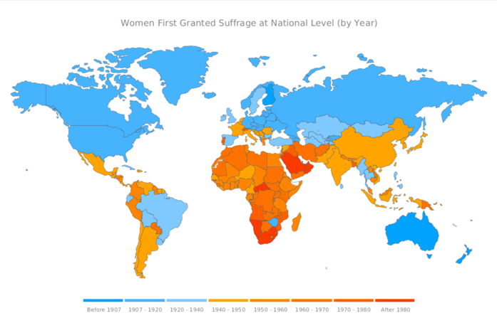
- World JavaScript Map of Woman Suffrage – World JavaScript Map of Woman Suffrage by AnyChart. We’ve used a Choropleth Map to show where and when women were granted suffrage, as you can see, a lot has changed in the last century, and it was a long and bumpy road for the humankind.
- Categories: AnyChart Charting Component, AnyMap, HTML5, JavaScript, News
- No Comments »
