How to Build Circle Packing Chart in JavaScript
March 15th, 2022 by Shachee Swadia A clear step-by-step guide for building an interactive JS Circle Packing Chart to visualize the top 100 most streamed songs on Spotify.
Want to learn to visualize hierarchical data in stunning circle packing charts that can be added to a web page or app in a hassle-free manner? Don’t feel overwhelmed and just follow my stepwise data visualization tutorial! Using a cool example of data on the top 100 most streamed songs on Spotify, I will show you how to easily create and customize a great-looking interactive circle packing chart with JavaScript.
Read the JS charting tutorial »
- Categories: AnyChart Charting Component, Big Data, HTML5, JavaScript, JavaScript Chart Tutorials, Tips and Tricks
- No Comments »
Building Stock Chart with JavaScript
February 24th, 2022 by Shachee Swadia Data visualization is vastly applied in various fields. One such domain is financial trading, where stock charts are essential for smart market data analysis and decision making. Whether you invest in stocks or not, I am pretty sure that you have come across such graphics or even might need to build one right now. So, would you like to know how to make a stock chart? I’m ready to show you an easy path using the Tesla stock price data and JavaScript! Come along with me throughout this tutorial and you’ll learn how to quickly create elegant, interactive JS stock charts like the one you see in the picture.
Read the JS charting tutorial »
- Categories: AnyChart Charting Component, AnyStock, Big Data, Financial Charts, HTML5, JavaScript, JavaScript Chart Tutorials, Stock Charts, Tips and Tricks
- No Comments »
SunnyByte Chooses AnyChart for Native American Cancer Data Visualization
February 16th, 2022 by AnyChart Team Out-of-the-box error bars and the ability to create a cool error chart without hassle have always been a major attraction of AnyChart, among other great features prompting developers to choose our JavaScript charting library. If you want to look at some real-world examples of such visualizations in action, Shen DeShayne, a partner at SunnyByte has recently brought a new interesting use case for them to our attention. The American Indian & Alaska Native Cancer Data website, his web development agency built for the University of New Mexico, represents information in interactive error charts powered by AnyChart. Learn more about the project and how our JS library is used, from a quick interview. (Stack: Craft CMS/Vue.js.)
- Categories: AnyChart Charting Component, Big Data, HTML5, JavaScript, Success Stories
- No Comments »
How to Create Calendar Chart in JavaScript
February 11th, 2022 by Shachee Swadia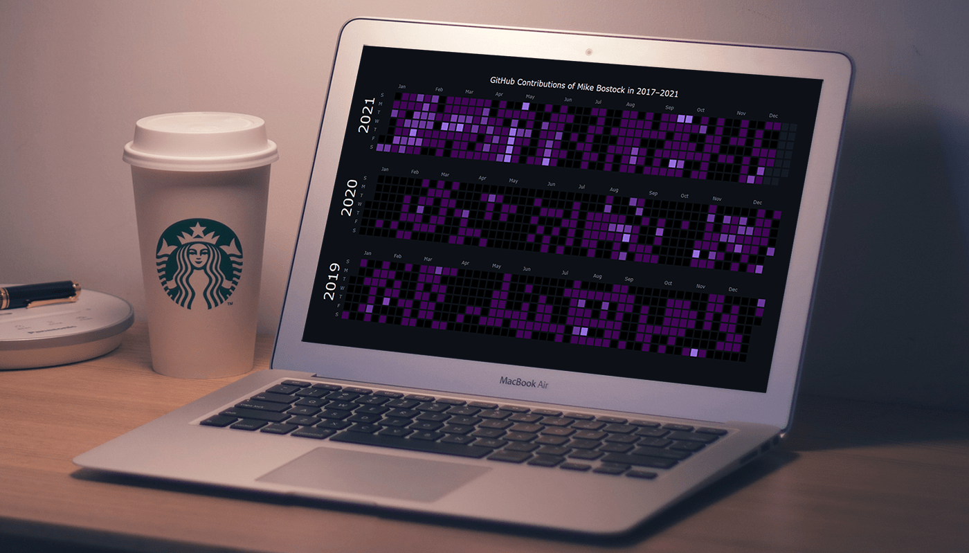 A calendar chart is an effective way to represent activity over time graphically. It can nicely display how a quantity varies with the days, weeks, months, and years. If you want to learn to build stylish interactive calendar charts easily using JavaScript, welcome to my step-by-step tutorial!
To make this guide not only educating but also entertaining, I decided to reproduce GitHub’s calendar graph and visualize the repository contribution activity of Mike Bostock, a prominent computer scientist known globally as one of the creators of the open-source JavaScript charting library D3.js and of the interactive data visualization development platform Observable. So, we’ll also get a telling picture of how he performed in that regard!
Read the JS charting tutorial »
- Categories: AnyChart Charting Component, Big Data, HTML5, JavaScript, JavaScript Chart Tutorials, Tips and Tricks
- No Comments »
Creating Error Chart in JavaScript
February 3rd, 2022 by Shachee Swadia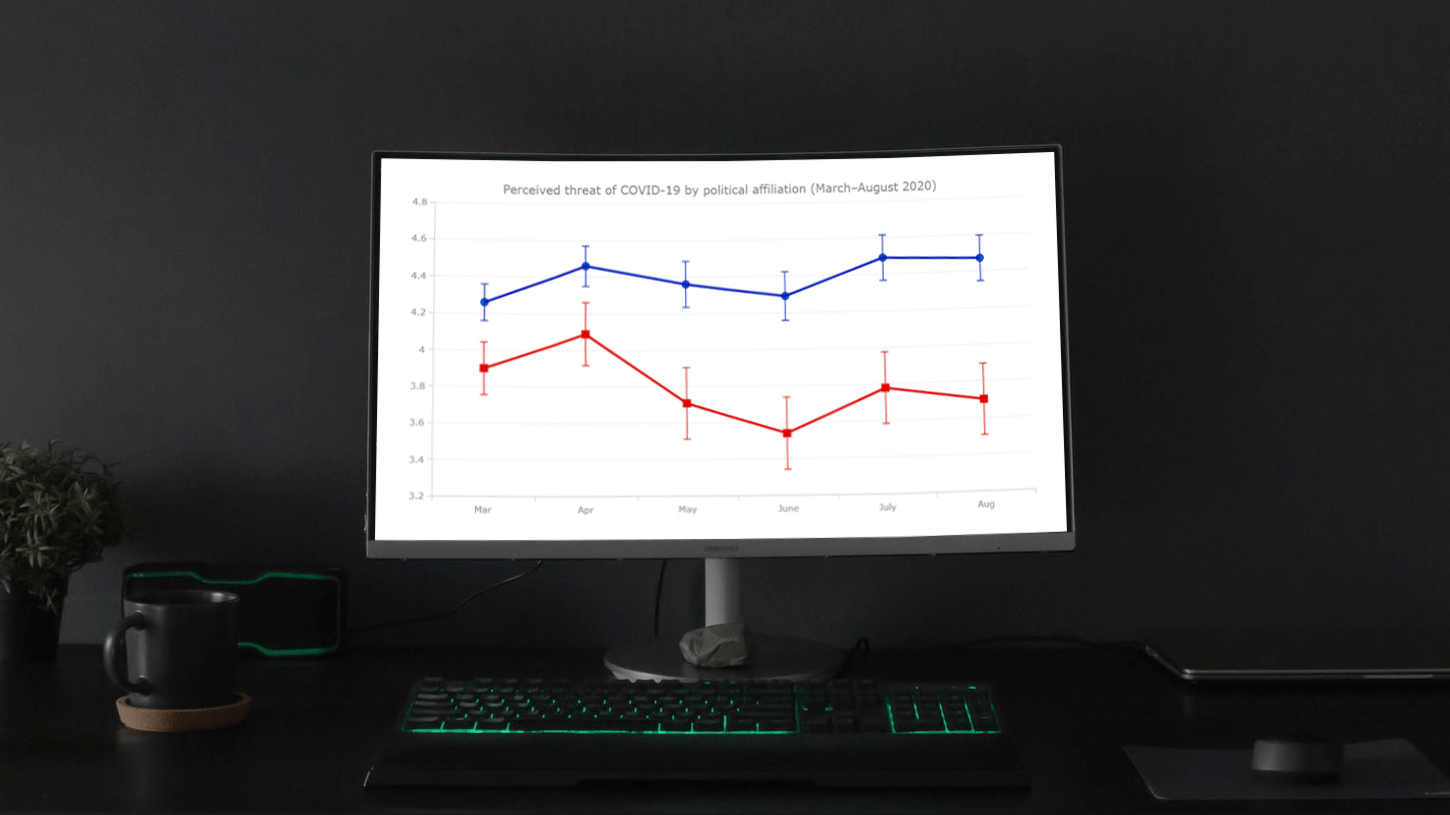 Need a cool interactive error chart visualization for your web page or app? Let me be your guide! Follow this tutorial and you’ll learn how to easily create elegant interactive error charts using JavaScript.
Here, I will be visualizing data on COVID-19 threat perceptions in the United States during the first six months of the pandemic, by political affiliation. So you will also be able to explore the divergence in those attitudes between Democrats and Republicans. The data originates from the article “COVID-19 and vaccine hesitancy: A longitudinal study” published in the Plos One journal.
Read the JS charting tutorial »
- Categories: AnyChart Charting Component, Big Data, HTML5, JavaScript, JavaScript Chart Tutorials, Tips and Tricks
- 1 Comment »
COVID-19 Risk Assessment App Pandemonium Uses AnyChart for Data Visualization
January 26th, 2022 by AnyChart Team We continue to support initiatives addressing the pandemic crisis by providing them with a full-featured free license for any of our data visualization tools. Today we are honored to be among the first to talk about a new project that joined this program, an innovative COVID-19 risk assessment app and framework called Pandemonium where all charts and maps are powered by AnyChart.
Built by Quantum Risk Analytics, Inc., a charitable nonprofit founded by MIT alumni, Pandemonium uses sophisticated machine learning algorithms to more accurately model the disease spread and provide a highly personalized evaluation of infection risks. It’s not yet publicly launched as the developers want to add a few more major features and data sources before the official release. But the app is already in the testing phase that the team encourages anyone to join.
We asked Richard Hamlin, CEO at Quantum Risk Analytics, Inc., to tell us more about Pandemonium, how it works, and how our data visualization solutions are used. Read on to know all the details.
- Categories: AnyChart Charting Component, AnyMap, Big Data, Dashboards, HTML5, JavaScript, Success Stories
- No Comments »
How to Create Sparklines with JavaScript
January 13th, 2022 by Shachee Swadia Sparklines are elegant microcharts introduced by Edward Tufte, a renowned statistician and data visualization pioneer. Drawn without any axis and occupying minimal space, these tiny graphs are designed to represent the big picture displaying trends in line with text and within table cells. If you want to learn about an easy way of building a sparkline chart, it is the right place!
In this article, I will show you how to quickly create cool sparkline charts using JavaScript. With OTT content ruling the world of entertainment these days, let’s have fun learning and look at the IMDb ratings of one of the most popular shows nowadays — Money Heist (La Casa de Papel in its original Spanish).
Without more ado, come along on this journey of knowledge heist!
Read the JS charting tutorial »
- Categories: AnyChart Charting Component, Big Data, HTML5, JavaScript, JavaScript Chart Tutorials, Tips and Tricks
- No Comments »
Maigret.de Picks AnyChart JS Charts to Visualize Data on Georges Simenon’s Work
December 29th, 2021 by AnyChart Team When data is all around, it’s no wonder to see charts here or there as they greatly help make sense of it. With thousands of happy customers worldwide, both for our JS charting library and Qlik charting extensions, we have seen countless applications for data visualization across all fields and industries. Some use cases, however, might be less expected than others. What about a website dedicated to literature?
Maigret.de — a remarkable resource about Georges Simenon, a famous Belgian writer best known for creating police detective Jules Maigret — has recently started to publish interactive data graphics revealing interesting patterns and facts in his immense work. All the charts on the website are built with AnyChart.
We have chatted with Maigret.de’s creator Oliver Hahn about his project, data visualizations, and experience using our solutions. Read the quick interview and go check out the website. (Stack: HTML/MySQL.)
- Categories: AnyChart Charting Component, Books, HTML5, JavaScript, Success Stories
- No Comments »
How to Build Surface Chart Using JavaScript
December 15th, 2021 by Shachee Swadia Data visualization is a must-have skill today with ever-growing data and the need to analyze as well as present that data. You will definitely come across data charts whether you are in the technology industry or not and therefore, it is a good idea to learn how to build visualizations.
I will show you here that building charts is not very tough and with the right tools, you can start creating interactive, interesting visualizations in little time and effort!
In this step-by-step tutorial, I will demonstrate how to represent GDP values of various countries for the past 15 years on a beautiful interactive 3D surface chart using a JavaScript library for data visualization.
The surface plot looks quite complex, but I will show you how straightforward it is to make a compelling and fully functional one.
Read the JS charting tutorial »
- Categories: AnyChart Charting Component, Big Data, HTML5, JavaScript, JavaScript Chart Tutorials, Tips and Tricks
- No Comments »
AnyChart JS Charts 8.11.0 Released with Awesome New Data Visualization Features
December 7th, 2021 by AnyChart Team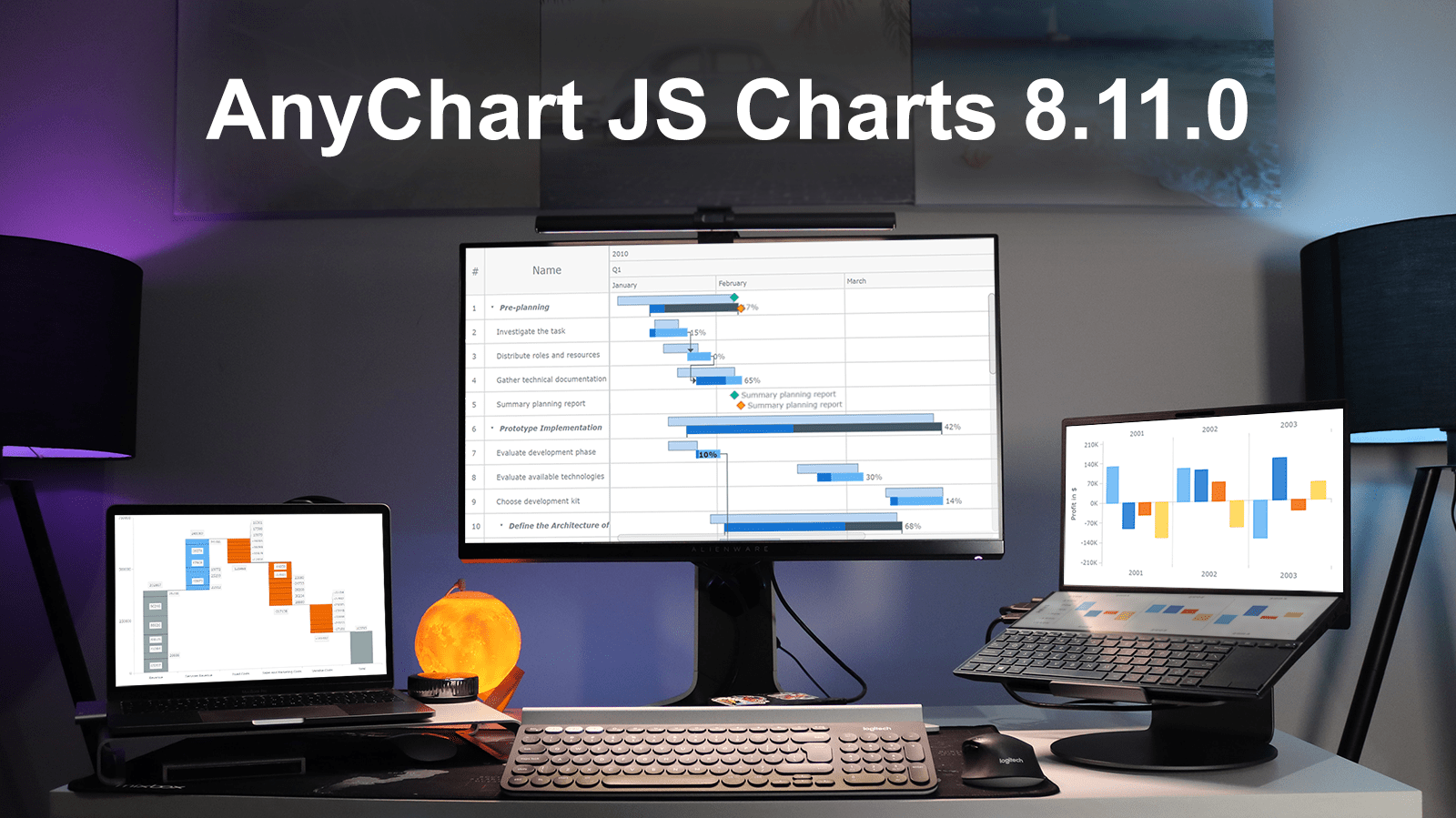 Excited to tell you we’ve just pushed a major update to our JavaScript charting library! The newly arrived features and improvements make our core solution even more flexible, adding awesome fresh capabilities designed to further help you on your data visualization development journey. Intrigued? Let us show what’s new in AnyChart JS Charts 8.11.0 right away!
»»» See What’s New in AnyChart 8.11.0! «««
- Categories: AnyChart Charting Component, AnyGantt, Gantt Chart, HTML5, JavaScript, News
- 3 Comments »