New JavaScript Chart Features in AnyChart 8.9.0
September 29th, 2020 by AnyChart Team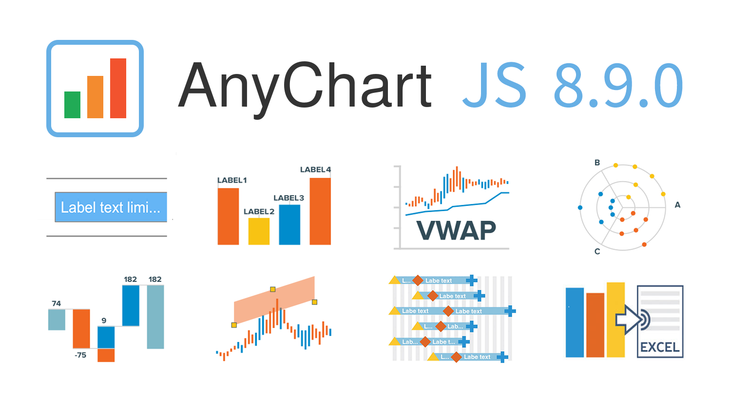 AnyChart 8.9.0 is out! The latest major update brings new exciting out-of-the-box features to our award-winning JavaScript charting library product family — AnyChart, AnyStock, AnyGantt, and AnyMap. Enjoy the improved functionality and build even more compelling data visualizations for your web sites and apps in less time!
»»» See What’s New in AnyChart 8.9.0! «««
- Categories: AnyChart Charting Component, AnyGantt, AnyMap, AnyStock, Big Data, Business Intelligence, Dashboards, Financial Charts, Gantt Chart, HTML5, JavaScript, News, Stock Charts
- 2 Comments »
How to Build Box Plot Using JavaScript: Visualizing World Happiness
September 22nd, 2020 by Wayde Herman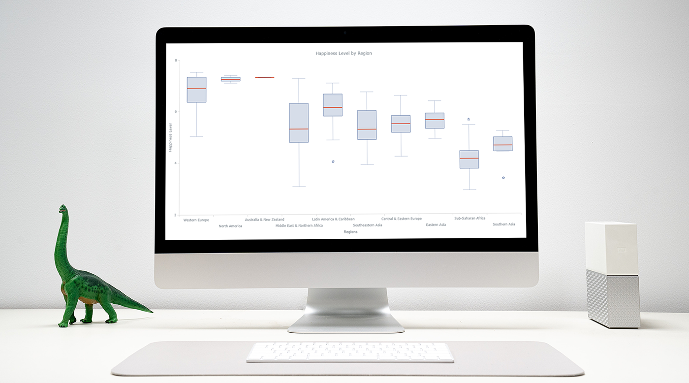 Data visualization is an important and sometimes undervalued tool in a data scientist’s toolkit. It allows us to gain an understanding and intuition about the data, through exploratory data analysis, which influences preprocessing, feature engineering, and the correct machine learning algorithm choice. It also helps to better evaluate models and even allows you to spot areas in the data where models could have poor performance.
Taking data visualization one step further by adding interactivity is even more advantageous. By adding interactive elements to your visualizations you create a more engaging experience. This in turn makes a user ‘explore’ visualizations instead of just reading them!
In this tutorial, I will be covering how to build an interactive data visualization, specifically a box plot as an example, using JavaScript and a charting library. I will begin by first briefly covering the basics of box plots before going through the steps of building one and then finally using the technique in a fun example to investigate the distribution of happiness between the different regions of the planet in an attempt to answer the question: ‘Where should you live to be happier?’.
Read the JS charting tutorial »
- Categories: AnyChart Charting Component, Big Data, Business Intelligence, HTML5, JavaScript, JavaScript Chart Tutorials, Tips and Tricks
- 1 Comment »
Connecting MySQL Database to JS Chart Using PHP
August 4th, 2020 by Wayde Herman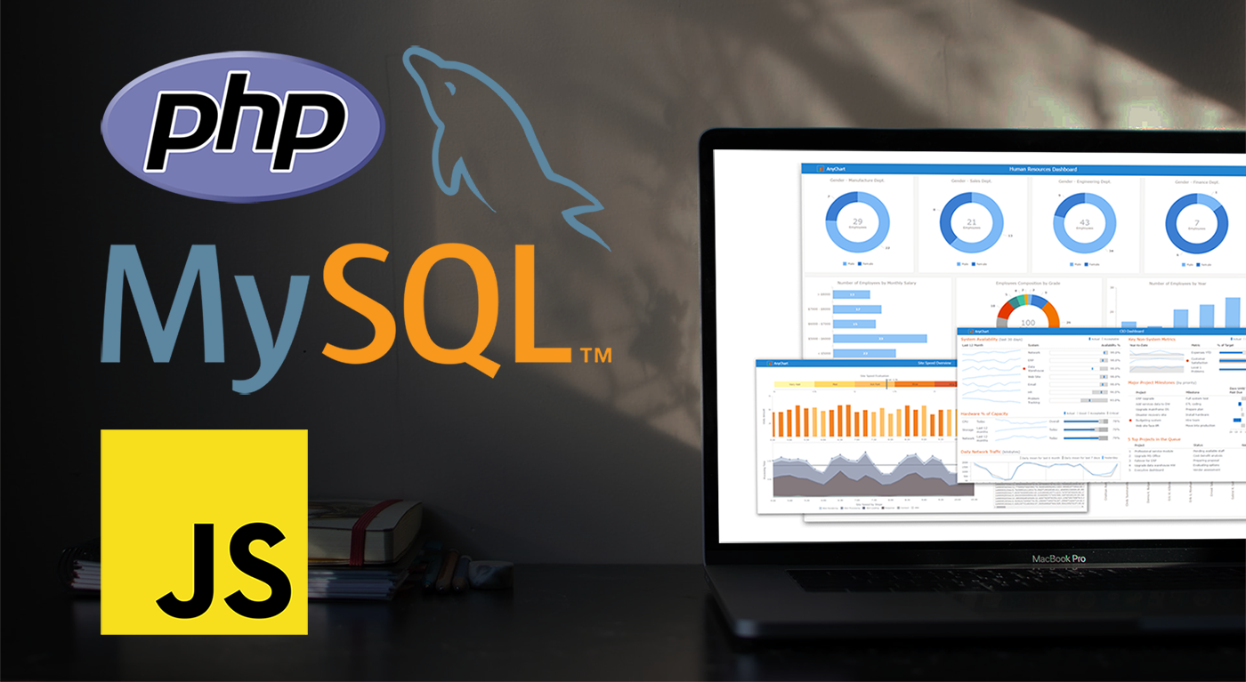 When using a charting library like AnyChart, which makes visualizing data so quick and easy, often the most challenging step for beginners is loading data. I think this is largely a result of the fact that while the ways we output the data are quite similar, the input data is commonly very different. The data may differ in many ways including the number of features in the dataset, what type these features may be, the format of the data, and how the data is stored. It is this final issue which we will be addressing today.
There is a lot of coverage in the documentation of using a data object declared within the code as well as importing your data from a file using AnyChart’s data loader. But what about importing the data from an SQL database? This is an easily done but often misunderstood approach to handling and loading data for data visualizations.
Unfortunately, it is not possible to use JavaScript to query a database because JavaScript is a client side solution and querying a database requires a server side approach due to security concerns — you just can’t store database login and password in your JavaScript code. There are many workarounds for this problem including approaches involving PHP, Ajax, Node.js, and many more. Today we will focus on using PHP to handle this task for us when our data is stored in MySQL.
In this tutorial, we will be covering how to query a MySQL database using PHP. We will describe the steps involved and reveal that it is in fact not challenging at all, just different!
- Categories: AnyChart Charting Component, AnyGantt, AnyMap, AnyStock, HTML5, JavaScript, JavaScript Chart Tutorials, Tips and Tricks
- 2 Comments »
How to Create JavaScript Network Graph
July 22nd, 2020 by Wayde Herman Network graphs are a special, very interesting form of data visualization. Unlike more traditional chart types like bar graphs or pie charts, a network graph does a bit more than visualize numerical data. With these charts, you represent each object as a point, referred to as a node, and the connections between the objects as a line, referred to as either a link or an edge. Here, we do not focus on representing objects with the same precision we are typically used to. Instead, we are trying to discover relationships in a network or sections of a network and are less worried about individual nodes.
Right now, I will guide you through how to develop an interactive network graph for the web using JavaScript (HTML5). Inspired by one fun visualization created by Ben Sullins, I decided to take data about the last decade’s biggest TV series, Game of Thrones. It is an epic fantasy tale revolving around the quabbles of various faction-like houses. So in this tutorial, I will be visualizing the relationships in the world of Game of Thrones by showing who attacked whom. Follow me, it’s going to be a cool adventure!
Read the JS charting tutorial »
- Categories: AnyChart Charting Component, HTML5, JavaScript, JavaScript Chart Tutorials, Tips and Tricks
- 7 Comments »
Building JavaScript Radar Chart
July 7th, 2020 by Wayde Herman Radar charts, which are also referred to as spider charts or radar plots, are a data visualization used to compare observations with multiple quantitative variables. Each variable is encoded to a spoke which are equidistant apart. The higher the value, the further away from the center of the chart the point is made. Radar charts are best used to compare the ‘profile’ of observations and to detect outliers within the data. They are therefore used quite a bit in sports, most notably in basketball and soccer for profiling players.
In this tutorial I will be teaching you how to build your own radar chart with JavaScript and how to use them to help with one of the toughest decisions in gaming history: which starting pokemon to choose!
That’s right, we will be building radar charts to perform data analysis on Bulbasaur, Charmander and Squirtle to determine, once and for all, which is the best choice.
Read the JS charting tutorial »
- Categories: AnyChart Charting Component, Charts and Art, HTML5, JavaScript, JavaScript Chart Tutorials, Tips and Tricks
- No Comments »
How to Create Stacked Area Chart with JavaScript
June 10th, 2020 by Anastasia Zoumpliou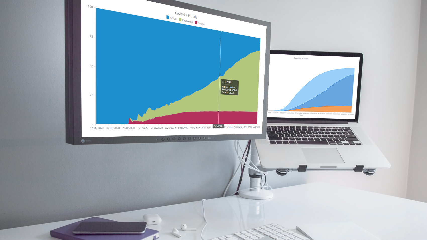 Stacked area charts, a variation of classic area charts, are quite a popular form of data visualization. They work great to graphically represent how multiple variables and their totals are changing over time. In this tutorial, I will show you how to easily create an interactive JavaScript stacked area chart which will look compelling in any HTML5 project, web site or app.
To demonstrate this way, which is quite simple to master even if you only have basic HTML coding skills, I am going to visualize official data about the outbreak of the COVID-19 pandemic in Italy. The visualizations built along the tutorial will display how the numbers of cases, recoveries, and deaths have been changing — from January 31, when the first two cases were confirmed, to yesterday, June 9, when the total number of coronavirus cases in Italy reached 235,561.
Read the JS charting tutorial »
- Categories: AnyChart Charting Component, HTML5, JavaScript, JavaScript Chart Tutorials, Tips and Tricks
- No Comments »
Building JavaScript Scatter Plot Module
May 27th, 2020 by Wayde Herman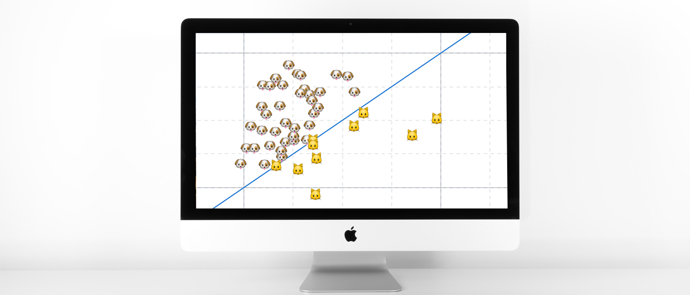 Scatter plots are a great way to visualize data. Data is represented as points on a Cartesian plane where the x and y coordinate of each point represents a variable. These charts let you investigate the relationship between two variables, detect outliers in the data set as well as detect trends. They are one of the most commonly used data visualization techniques and are a must have for your data visualization arsenal!
In this tutorial, I will teach you how to build your very own interactive scatter plot charts using JavaScript.
Ever wondered whether the population of the United States of America were dog people? Well, you’re about to find out! To help you learn more about building scatter plots I will be using the Cat vs Dog Popularity in US dataset. This dataset contains the percentage of homes with dogs and cats for each US state.
Read the JS charting tutorial »
- Categories: AnyChart Charting Component, Big Data, HTML5, JavaScript, JavaScript Chart Tutorials, Tips and Tricks
- 1 Comment »
JavaScript Charting Library 8.8.0 Released with New Exciting Data Viz Features
May 22nd, 2020 by AnyChart Team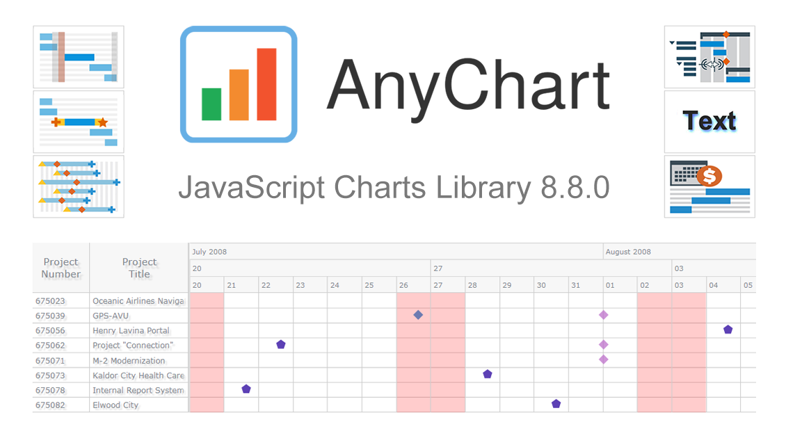 We’ve just updated our JavaScript charting library with new exciting features and improvements! In the 8.8.0 release of AnyChart JS, the focus is put on enhancements for Gantt charts. They will be helpful in making your project and resource data visualizations even more insightful with ease. We’ve also upgraded basic and time-series charts as well as maps. Below is an overview of the new key arrivals. Be sure to check it out, download the updated builds, and enjoy!
»»» See What’s New in AnyChart 8.8.0! «««
- Categories: AnyChart Charting Component, AnyGantt, AnyMap, AnyStock, Big Data, Business Intelligence, Dashboards, Financial Charts, Gantt Chart, HTML5, JavaScript, News, Stock Charts
- 1 Comment »
StopCorona Creator Shares How They Visualize COVID-19 Data Using AnyChart
May 21st, 2020 by AnyChart Team![]() Earlier, we introduced you to a new, ever-updating COVID tracker that uses AnyChart to visualize the latest pandemic data in insightful charts, StopCorona.info. To let you know more, we also talked to Vadim Peskov, CEO at Diffco, the app development company behind StopCorona, and asked him a few questions.
Earlier, we introduced you to a new, ever-updating COVID tracker that uses AnyChart to visualize the latest pandemic data in insightful charts, StopCorona.info. To let you know more, we also talked to Vadim Peskov, CEO at Diffco, the app development company behind StopCorona, and asked him a few questions.
Read our quick interview to learn more about StopCorona and their experience using our JavaScript charting library for interactive data visualization. (Stack: MySQL/Symfony/Angular.)
- Categories: AnyChart Charting Component, Big Data, Charts and Art, HTML5, JavaScript, Success Stories
- 3 Comments »
COVID Tracker StopCorona.info Adds AnyChart JS Charts to Visualize Coronavirus Statistics
May 18th, 2020 by AnyChart Team![]() COVID tracker StopCorona.info is using our JavaScript data visualization library to display up-to-date coronavirus statistics in compelling and insightful charts. (Read our interview with its creator to learn how.)
COVID tracker StopCorona.info is using our JavaScript data visualization library to display up-to-date coronavirus statistics in compelling and insightful charts. (Read our interview with its creator to learn how.)
COVID-19 is a global emergency and the fight against it requires a joint effort. We at AnyChart cannot stay aside, too. With a lot of pandemic data out there, from numerous sources and with constant updates, it’s difficult to keep up with how the situation unfolds, let alone making sense of all relevant information in due course. But this is exactly where we can help, with our established charting solutions that can visualize any data on the fly.
We thought you should know we’re ready to give a full-featured non-profit license to all initiatives aiming to tackle the novel coronavirus outbreak. Moreover, we’ve already allowed one project – StopCorona.info – to use our JavaScript charting library for free.
Developed as a not-for-profit initiative by Diffco, a top Silicon Valley app development company, StopCorona is designed to bring transparency to the pandemic situation worldwide. To achieve that, it collects COVID-19 statistics from more than 20 reliable public open data sources, including WHO, CDC, ECDC, CCDC, and NHC to name a few. Now this enormous (and ever-expanding) set of coronavirus data is graphically represented in an analyst-friendly interface powered by AnyChart JS Charts.
As a global leader of data visualization and reporting tools, we at AnyChart were more than happy to support StopCorona by letting them use our award-winning JS charting library absolutely free, under a full-featured non-profit license.
If you guys are building a useful resource for COVID-19 data analytics, try AnyChart and apply for a free license, too. We will gladly provide you with complimentary access to our flexible data visualization solutions. In this way you will get the industry’s best charts for the web or mobile fully at your service, empowering your website visitors or app users to make sense of the myriad COVID numbers at a glance, with great ease.
- Categories: AnyChart Charting Component, AnyStock, Big Data, Business Intelligence, Dashboards, HTML5, JavaScript, Success Stories
- 5 Comments »