Current Price Indicator with Custom Value and Scale Calculation in JavaScript Stock Charts — Challenge AnyChart!
September 19th, 2018 by Irina Maximova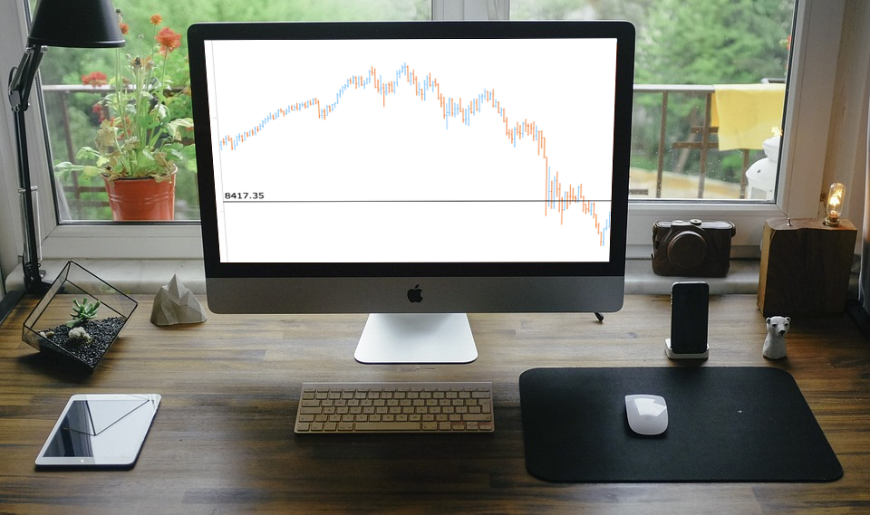 Further inspired by noteworthy questions our Support Team receives from customers, we resume the Challenge AnyChart! feature, demonstrating huge flexibility of our JavaScript (HTML5) charting libraries and explaining how exactly you can solve advanced data visualization tasks with the help of AnyChart. Today’s tutorial is about JS stock charts, and more precisely, we’ll dive into how to draw the Current Price Indicator with a custom value and make it visible even when zooming and scrolling, by utilizing Axis Markers.
- Categories: AnyChart Charting Component, AnyStock, Big Data, Business Intelligence, Challenge AnyChart!, Charts and Art, Financial Charts, HTML5, JavaScript, Stock Charts, Tips and Tricks
- No Comments »
Data Visualization with Elasticsearch and AnyChart JavaScript Charts — Integration Sample
June 21st, 2018 by Irina Maximova
It’s always been important to AnyChart to make JavaScript charts run in HTML5 projects fast regardless of the users’ technology stack. Our AnyChart, AnyMap, AnyStock, and AnyGantt libraries for data visualization are compatible with all major technologies and platforms, and there is a bunch of different integration samples already available. All of them are a great help in making the process of chart creation more pleasant and less time-consuming. In this article, we will tell you how to integrate AnyChart JS Charts with Elasticsearch. To begin with, let’s find out what Elasticsearch is and what makes it special.
- Categories: AnyChart Charting Component, HTML5, JavaScript, News, Tips and Tricks
- 7 Comments »
Regression Analysis in AnyChart JavaScript Charts
May 29th, 2018 by Irina Maximova
AnyChart is not only a beautiful charting library but also a multifunctional one. We’ve got lots of questions from our customers on how they can integrate regression analysis into AnyChart JavaScript Charts. There are many approaches that may be adopted in order to interpolate and approximate data. And the one we’re going to share with you today involves the use of the popular regression.js library along with AnyChart.
- Categories: AnyChart Charting Component, HTML5, JavaScript, News, Tips and Tricks
- 1 Comment »
Creating Half Polar Chart with JavaScript — Challenge AnyChart!
May 2nd, 2018 by Irina Maximova
Challenges are always fun, and we at AnyChart adore taking them up from our customers. AnyChart Support Team is happy to show how flexible AnyChart JS Charts are. Today’s Challenge AnyChart tutorial is about JS polar charts. Spend about 5 minutes and you’ll find out how to draw a beautiful polar chart, but display only its one half, making it a half polar chart.
- Categories: AnyChart Charting Component, Challenge AnyChart!, Charts and Art, HTML5, JavaScript, Tips and Tricks
- No Comments »
Custom Technical Indicators in JavaScript Stock Charts — Challenge AnyChart!
March 14th, 2018 by Irina Maximova
It is a pleasure to present a new Challenge AnyChart article! We love our customers and their original tasks, so we continue to show the unlimited capabilities of our JavaScript charting libraries to the blog readers.
The heroes of today’s tutorial are custom technical indicators. Below we’ll explore how to add them to a JS (HTML5) stock chart step by step. So, let’s begin.
- Categories: AnyChart Charting Component, AnyStock, Big Data, Business Intelligence, Challenge AnyChart!, Charts and Art, Financial Charts, HTML5, JavaScript, Stock Charts, Tips and Tricks
- 1 Comment »
Conditional Custom Drawing in JavaScript Charts — Challenge AnyChart!
December 13th, 2017 by Vitaly Radionov The time has come for a new Challenge AnyChart! article! We continue to receive interesting data visualization tasks from our wonderful customers and are happy to share with our blog readers how to solve some of the most inspiring ones with the help of our JavaScript charting libraries.
In today’s tutorial, let’s dig into custom drawing and create an interactive HTML5 line chart of which the segments with negative values are painted with a different color than the rest of the graph.
- Categories: AnyChart Charting Component, Challenge AnyChart!, Charts and Art, HTML5, JavaScript, Tips and Tricks
- No Comments »
How to Create Pie Chart with JavaScript
December 6th, 2017 by Timothy Loginov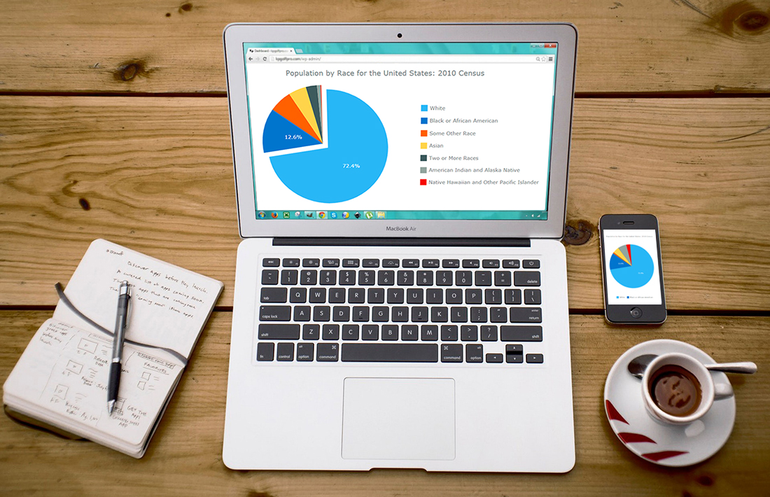 Have you ever wondered, how web developers create and integrate interactive JavaScript pie charts into HTML5 apps and web pages? If the answer is yes – keep on reading! This article explains how to create, change and integrate a pie chart into your web page. Beware! A hot-button political issue is present in this article. But we will not offend anyone!
Pie chart is one of the most popular chart types. Mathematically speaking it looks like a circle divided into sectors which represent a part of a whole. For the most of us, pie charts look like real pies or pizzas cut into several slices. In this article, you will find a detailed tutorial on how to build one, with JS chart code samples.
Read the JS charting tutorial »
- Categories: AnyChart Charting Component, HTML5, JavaScript, JavaScript Chart Tutorials, Tips and Tricks
- 29 Comments »
How to Add Multi-level Category Axis — Challenge AnyChart!
November 29th, 2017 by Vitaly Radionov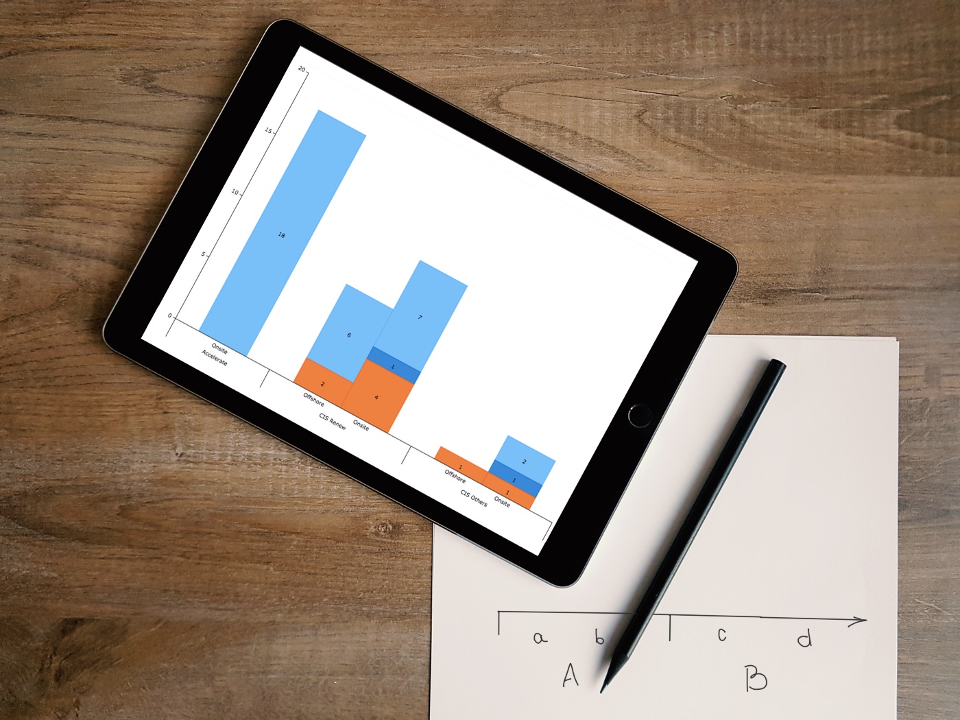 We are glad to present to you a new article in the Challenge AnyChart! series.
Just to remind you, these are articles inspired by your requests to our Support Team and our will to publicly prove that the opportunities of interactive data visualization with our JavaScript (HTML5) charting libraries are profound.
One of our customers asked us how to add a multi-level category axis for categorical data and display subcategories. Ok, there you go! We’ve made a quick tutorial and created the corresponding JavaScript chart example (you can already see it in the title picture).
- Categories: AnyChart Charting Component, Challenge AnyChart!, Charts and Art, HTML5, JavaScript, Tips and Tricks
- 1 Comment »
Android Charts Made Easy – Meet AnyChart Library for Data Visualization in Android Apps!
November 21st, 2017 by AnyChart Team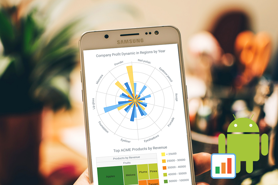 Android app developers can now use AnyChart Java wrapper to run our interactive data visualization solutions in native Android apps! Meet AnyChart Android Charts!
It’s a stunning data visualization library for making interactive HTML5 charts in Android apps, running on API 14+ (Android 4.0). AnyChart supplies dozens of different chart types and seamlessly works with any data from any database.
- Categories: AnyChart Charting Component, HTML5, News, Tips and Tricks
- 12 Comments »
How to Create JavaScript Area Chart
October 28th, 2017 by Timothy Loginov Want to know how to build a JavaScript area chart? This article will show you how to do that and tell you who invented area charts in the late 18th century.
The area chart is one of the basic charts used to show changes in data over time. The key feature of this chart type is a colored area between the horizontal X-axis and the line marking the changing value. It can be filled with a color, gradient color, or with a hatch fill.
Look at the chart on the title image. That’s the data visualization being created along the tutorial. Such a JavaScript-based area chart will be interactive and good-looking in any browser, on any website and in any app in HTML5. All samples used in the article are available in our collection on CodePen.
Read the JS charting tutorial »
- Categories: AnyChart Charting Component, HTML5, JavaScript, JavaScript Chart Tutorials, Tips and Tricks
- 3 Comments »