JavaScript Pie Chart with Radial Scale — JS Chart Tips
September 9th, 2024 by AnyChart Team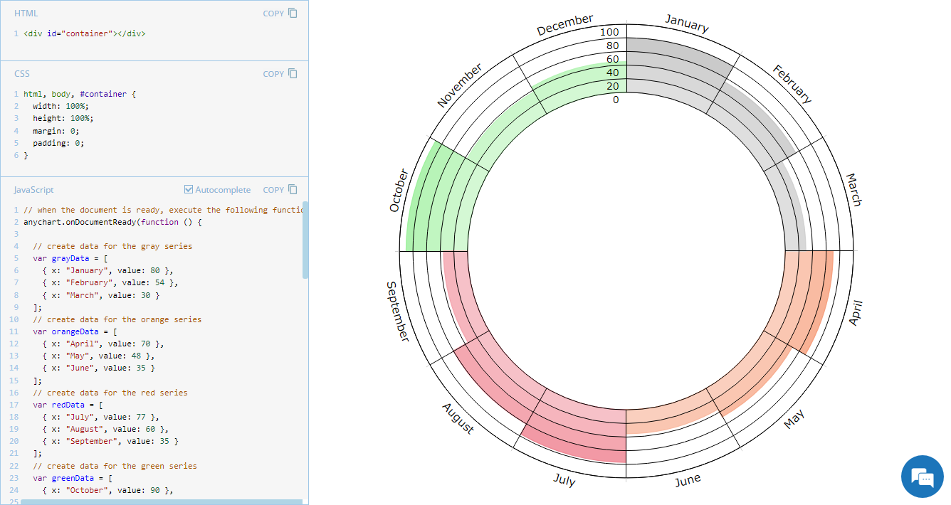 Welcome to JS Chart Tips, our new blog series where we showcase practical solutions to common and unique challenges our Support Team has helped customers overcome. This time, we’re eager to explain how to build a sophisticated circular diagram that may resemble a pie chart with a radial scale. Just a heads-up: this type of visualization is technically a polar column chart.
- Categories: AnyChart Charting Component, Business Intelligence, HTML5, JavaScript, JS Chart Tips, Tips and Tricks
- No Comments »
JavaScript Gantt Chart with Custom Data Grid Header Font — JS Chart Tips
August 20th, 2024 by AnyChart Team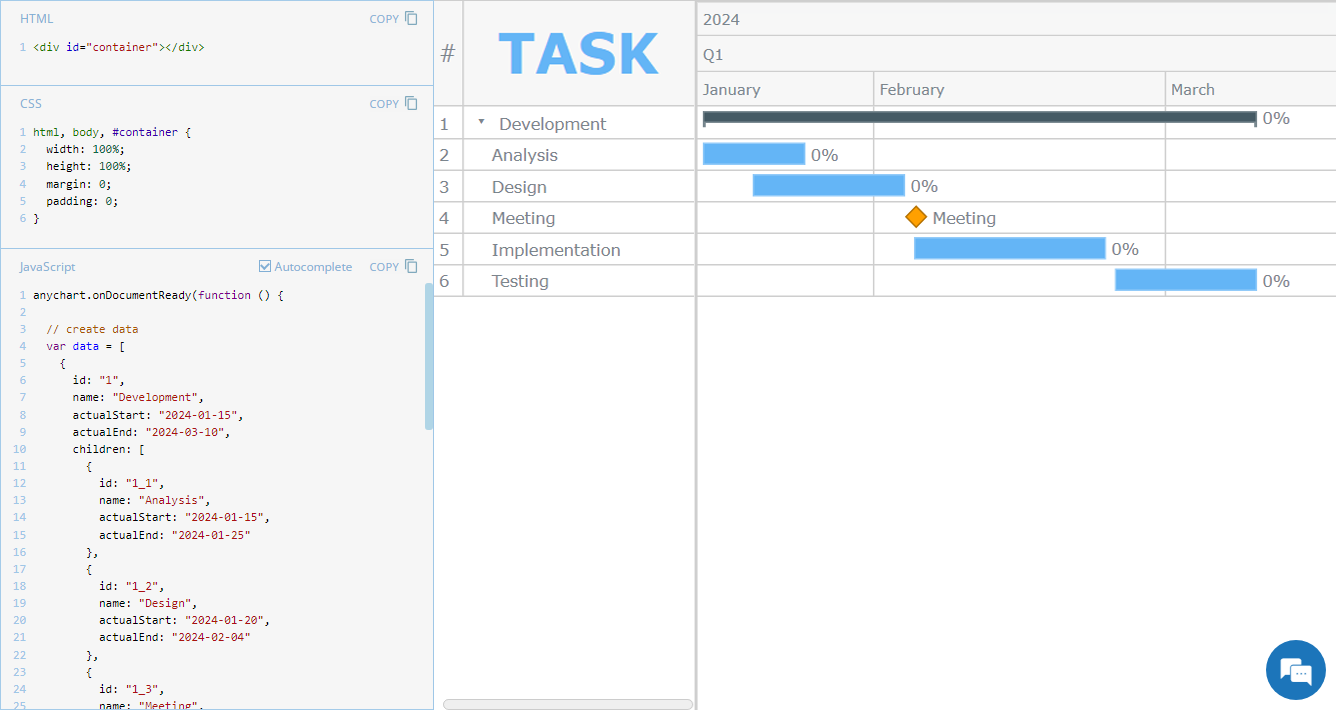 Hey everyone! We’re excited to launch a new regular feature on our blog called JS Chart Tips. In this series, we’ll share some recent cases handled by our Support Team for users of our JavaScript charting library, highlighting both frequent questions and those unique solutions that shouldn’t remain hidden.
Whether these scenarios directly resonate with a challenge you’re facing or simply spark an idea for your current or future data visualization development tasks, we hope you’ll find valuable insights. Each entry will include code snippets and JS chart examples to illustrate the solutions. If you get additional questions or need more details, simply comment below or contact our Support Team directly. We’re here to help enhance your JavaScript charting experience!
Without further ado, welcome to the first edition of JS Chart Tips! Today, you’ll learn how to customize the font of the data grid header in a JavaScript Gantt chart.
- Categories: AnyChart Charting Component, AnyGantt, Business Intelligence, Gantt Chart, HTML5, JavaScript, JS Chart Tips, Tips and Tricks
- No Comments »
Pivot Table vs. Decomposition Tree: Advancing Data Insights
June 27th, 2024 by AnyChart Team In the evolving data landscape, the pivot table has long been a cornerstone of the data analyst’s toolkit. Traditionally used to summarize datasets in a condensed tabular form, pivot tables facilitate quick overviews and basic drill-down capabilities. However, as data sets grow larger and more complex, the static and manual nature of pivot tables can limit their effectiveness.
Enter the decomposition tree, an advanced data visualization technique that not only presents data but also uncovers deeper patterns and insights ad-hoc, all through its dynamic, interactive hierarchical structure. As a relatively new tool in the realm of data analysis and business intelligence, it is increasingly used as an effective alternative to a pivot table yet still often underrated, given its inherent potential.
This article explores several reasons why decomposition trees can be advantageous over traditional pivot tables, illustrated with real-world use cases.
Read more at qlik.anychart.com »
- Categories: Big Data, Business Intelligence, Dashboards, Qlik, Tips and Tricks
- No Comments »
How to Build Network Graph with JavaScript
May 23rd, 2024 by Alex Carter | DZone Network graphs are a practical and effective tool in data visualization, particularly useful for illustrating the relationships and connections within complex systems. These charts are useful for understanding structures in various contexts, from social networks to corporate hierarchies. In this tutorial, we’ll delve into a quick path to creating a compelling, interactive network graph using JavaScript.
We’ll use the Volkswagen Group as our example, mapping out its subsidiaries and product lines to showcase how network graphs can make complex organizational structures understandable and accessible. By the end of this step-by-step guide, you’ll have a clear understanding of how to quickly construct and customize a JS-based network graph. Buckle up, as it’s time to hit the road!
Read the JS charting tutorial »
- Categories: AnyChart Charting Component, Big Data, HTML5, JavaScript, JavaScript Chart Tutorials, Tips and Tricks
- No Comments »
Creating Interactive Network Graph Using JavaScript with Ease
April 18th, 2024 by Taylor Brooks Creating a vibrant network graph in JavaScript might seem like crafting a digital cosmos: intricate, fascinating, yet entirely within reach. Whether you’re aiming to illustrate the complex interconnections within a galaxy, a social network, or the internal hierarchy of a multinational corporation, network graphs serve as a powerful tool to bring data to life, revealing hidden patterns and insights through visual representation.
Let’s embark on a journey to demystify the process, guiding you step-by-step on how to construct your very own network graph, with the Solar System as our illustrative example.
Read the JS charting tutorial »
- Categories: AnyChart Charting Component, HTML5, JavaScript, JavaScript Chart Tutorials, Tips and Tricks
- No Comments »
Creating Calendar Charts with JavaScript
March 4th, 2024 by Nick Gogin Building an interactive calendar chart from scratch may initially seem daunting and time-consuming. However, I'm here to show you it's not only manageable but straightforward once you know the steps. Whether you're developing a scheduling application, tracking events, or looking to enhance your web page with a sleek calendar graphic, this tutorial is designed specifically for you. I'll guide you through the steps to create impressive interactive calendar charts using JavaScript, simplifying what may seem complex.
We'll delve into this process using a JavaScript charting library. As a support engineer at AnyChart, and with our JS library recently named best in data visualization, it was a natural choice to use our tool for this tutorial. What about the example data? Other tutorials! There's a treasure trove of JS charting tutorials on our blog, and it occurred to me that compiling these tutorials into a calendar chart would serve as a unique, engaging, and practical example for this guide.
Therefore, the calendar chart created by the end of this tutorial will offer a concise overview of all tutorials published on the AnyChart blog over the last four years, enabling you to quickly discover the ones that interest you the most. All aboard, fellow web developers and data enthusiasts!
Read the JS charting tutorial »
- Categories: AnyChart Charting Component, HTML5, JavaScript, JavaScript Chart Tutorials, Tips and Tricks
- No Comments »
How to Build Point Map with JavaScript
December 22nd, 2023 by Awan Shrestha If you’re a budding developer or data enthusiast eager to explore map creation, you’re in the right place. In this tutorial, I’ll guide you through how to easily build an interactive point map using JavaScript.
To make things even more interesting, I’ll use data on the number of millionaires in cities as an example. By the end of this tutorial, you’ll have made a visually stunning JS point map, ready to tell the story of the world’s wealthiest cities and a solid understanding of applying these skills to any data and scenarios. And stick around for a bonus at the end — I’ll also show you how to transform your point map into a bubble map where the size of the markers conveys additional information.
Ready to master the JS point mapping technique? Let’s get started, and don’t forget to join me in the bonus section where size matters!
Read the JS charting tutorial »
- Categories: AnyChart Charting Component, AnyMap, Big Data, HTML5, JavaScript, JavaScript Chart Tutorials, Tips and Tricks
- No Comments »
How to Make Mekko Chart Using JavaScript
November 27th, 2023 by Awan Shrestha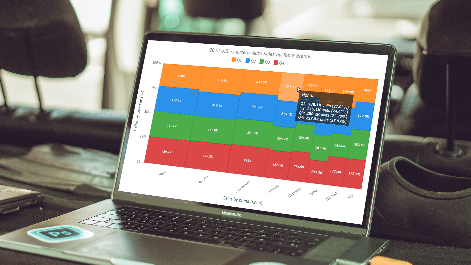 Data visualization plays a pivotal role in comprehending complex information and conveying insights clearly. Among the diverse array of techniques, the Mekko chart stands out for its ability to vividly represent categorical data and illuminate relationships between categories and subcategories.
In this tutorial, we will delve into the world of Mekko charts. First, let’s take a moment to explore what they are and how they function. Then, we’ll get to the focal point, a step-by-step guide on how to quickly create a Mekko chart using JavaScript.
The data used for illustration is the U.S. car sales data for the top eight car brands in 2022. By the end of this tutorial, you will have crafted a cool interactive JS Mekko chart that graphically represents the respective proportions within this data by brand and by quarter.
So, ignite your data visualization engines, and let’s go!
Read the JS charting tutorial »
- Categories: AnyChart Charting Component, HTML5, JavaScript, JavaScript Chart Tutorials, Tips and Tricks
- No Comments »
OHLC Chart: Understanding & Creating in JavaScript Step-by-Step
November 13th, 2023 by Awan Shrestha Unearthing insights from vast datasets is an intricate blend of art and science. In the realm of financial analysis, a pivotal instrument for visually exploring complex data is the Open-High-Low-Close (OHLC) chart. This tutorial is your roadmap to swiftly crafting your OHLC chart using JavaScript, a step-by-step journey. We’ll harness S&P 500 data, and by the end of this article, you’ll possess the skills to orchestrate visual stock analysis adeptly.
Read the JS charting tutorial »
- Categories: AnyChart Charting Component, AnyStock, Big Data, Business Intelligence, Financial Charts, HTML5, JavaScript, JavaScript Chart Tutorials, Stock Charts, Tips and Tricks
- No Comments »
Building Waterfall Charts in JS
November 2nd, 2023 by Awan Shrestha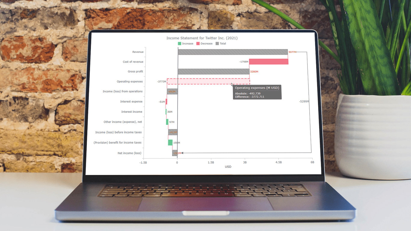 Data visualization is an essential tool for understanding complex data sets and effectively conveying insights. Among the various types of charts and graphs used for this purpose, the waterfall chart stands out as a powerful way to represent changes in financial data, such as revenue, expenses, and profits over a specific period.
In this tutorial, we'll explore how to create a waterfall chart using JavaScript. To illustrate the process, we'll use the example of an income statement for a company, in this case, Twitter Inc.’s latest (and last) one.
Whether it’s to analyze a company's financial performance, project budgets, or inventory fluctuations, this step-by-step guide will help you easily create a useful interactive JS-based waterfall chart.
Read the JS charting tutorial »
- Categories: AnyChart Charting Component, Big Data, Business Intelligence, HTML5, JavaScript, JavaScript Chart Tutorials, Tips and Tricks
- No Comments »