June 27th, 2024 by AnyChart Team
 In the evolving data landscape, the pivot table has long been a cornerstone of the data analyst’s toolkit. Traditionally used to summarize datasets in a condensed tabular form, pivot tables facilitate quick overviews and basic drill-down capabilities. However, as data sets grow larger and more complex, the static and manual nature of pivot tables can limit their effectiveness.
Enter the decomposition tree, an advanced data visualization technique that not only presents data but also uncovers deeper patterns and insights ad-hoc, all through its dynamic, interactive hierarchical structure. As a relatively new tool in the realm of data analysis and business intelligence, it is increasingly used as an effective alternative to a pivot table yet still often underrated, given its inherent potential.
This article explores several reasons why decomposition trees can be advantageous over traditional pivot tables, illustrated with real-world use cases.
Read more at qlik.anychart.com »
June 21st, 2024 by AnyChart Team
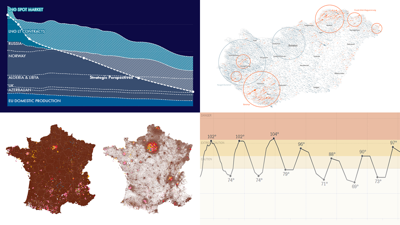
 Welcome to another edition of DataViz Weekly, where we bring you some of the most interesting data visualizations we’ve recently come across. This week, we’re highlighting four fresh projects that effectively use data visualization to provide valuable insights:
- Tracking heat across the United States — The New York Times
- EU gas insights — Strategic Perspectives
- European Parliament election vote in France — Karim Douïeb (Jetpack.ai)
- European Parliament election vote in Hungary — Attila Bátorfy (atlo.team)
Read more »
June 14th, 2024 by AnyChart Team
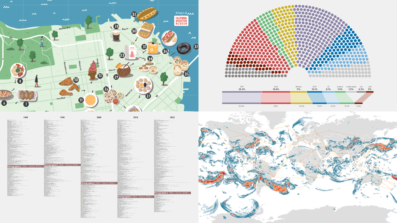
 Data visualizations bridge the gap between raw numbers and clear, understandable insights. This week on DataViz Weekly, we showcase four remarkable new examples of how charts and maps illuminate diverse topics in a comprehensible and engaging manner:
- In-flight turbulence — South China Morning Post
- Shifts in occupation and income — FlowingData
- San Francisco’s culinary diversity — California Migration Museum
- EU election results — Reuters
Read more »
May 30th, 2024 by AnyChart Team
 If you’re heading to the Qlik Connect show next week (June 3–5), don’t miss out on the chance to test your data smarts with our fun, interactive game, “Connections.” It’s not only a challenge of knowledge but also an opportunity to win an iPad!
Read more at qlik.anychart.com »
May 23rd, 2024 by Alex Carter | DZone
 Network graphs are a practical and effective tool in data visualization, particularly useful for illustrating the relationships and connections within complex systems. These charts are useful for understanding structures in various contexts, from social networks to corporate hierarchies. In this tutorial, we’ll delve into a quick path to creating a compelling, interactive network graph using JavaScript.
We’ll use the Volkswagen Group as our example, mapping out its subsidiaries and product lines to showcase how network graphs can make complex organizational structures understandable and accessible. By the end of this step-by-step guide, you’ll have a clear understanding of how to quickly construct and customize a JS-based network graph. Buckle up, as it’s time to hit the road!
Read the JS charting tutorial »
May 17th, 2024 by AnyChart Team
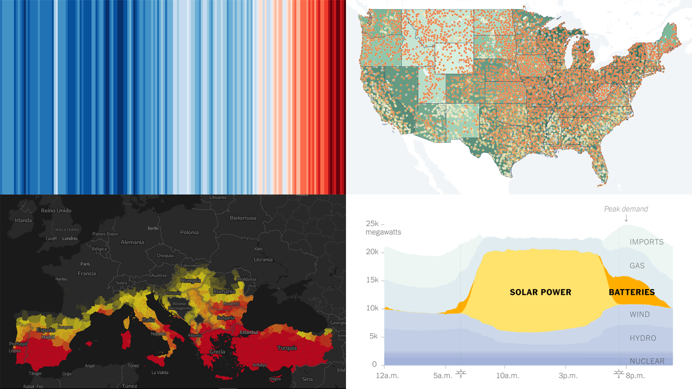
 Data visualization is not just about making data look pretty; it’s about uncovering hidden patterns, revealing trends, and providing a clearer understanding of information. Through innovative visual techniques, we can explore data in ways that traditional methods can’t match. This week on DataViz Weekly, we bring you four compelling projects that showcase the transformative power of data visualization:
- Revealing the warming stripe for 2023 — Ed Hawkins
- Analyzing and predicting megafires in Europe — elDiario.es
- Understanding the growing role of giant batteries in electricity grids — NYT
- Analyzing segregation in U.S. schools — Stanford University
Read more »
May 13th, 2024 by AnyChart Team
 Qlik Connect 2024 is on the horizon, and we’re pleased to announce that AnyChart will be participating as an Emerald sponsor and exhibitor. Join us from June 3–5 at Rosen Shingle Creek in Orlando, Booth #807!
Read more at qlik.anychart.com »
May 10th, 2024 by AnyChart Team
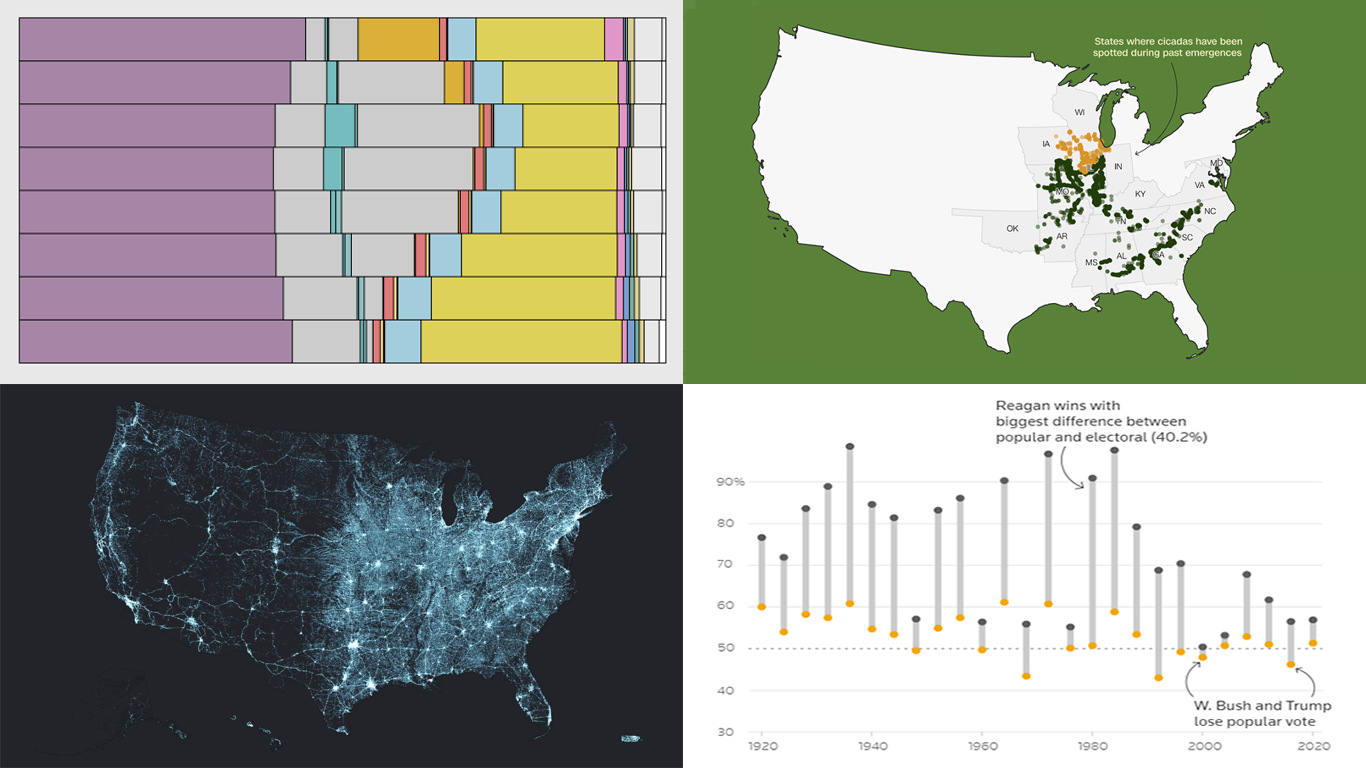
 Data visualization serves as a powerful tool that enhances our understanding of complex data, transforming raw figures into insights. DataViz Weekly is here to share several great examples that demonstrate this capability in action. This week, we highlight four data visualization projects that have recently captured our attention:
- Exploring the U.S. bridges — Esri
- Analyzing time use by age — FlowingData
- Tracking historic cicada emergence 2024 — CNN
- Understanding election polls — Reuters
Read more »
May 3rd, 2024 by AnyChart Team
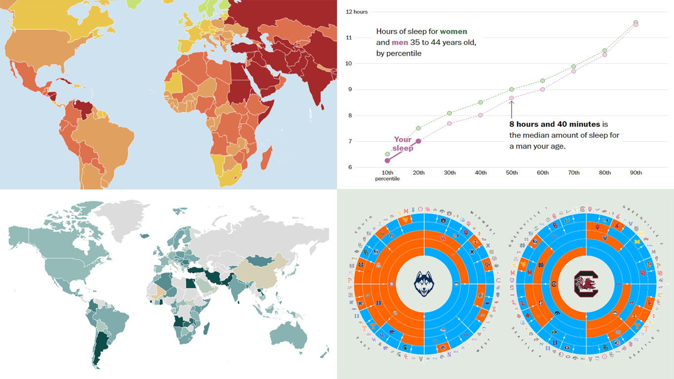
 Welcome to the new DataViz Weekly, where we continue exploring the transformative power of data visualization. This edition presents a selection of new examples of how charts and maps can help us understand trends and patterns in various subjects — from sports and philanthropy to global challenges like press freedom and inflation, and everyday topics such as sleep. Here are the projects featured this time:
- March Madness philanthropy challenge — Bloomberg
- 2024 World Press Freedom Index — Reporters Without Borders
- Global Inflation Tracker — Council on Foreign Relations
- Sleep trends in America — The Washington Post
Read more »
April 26th, 2024 by AnyChart Team
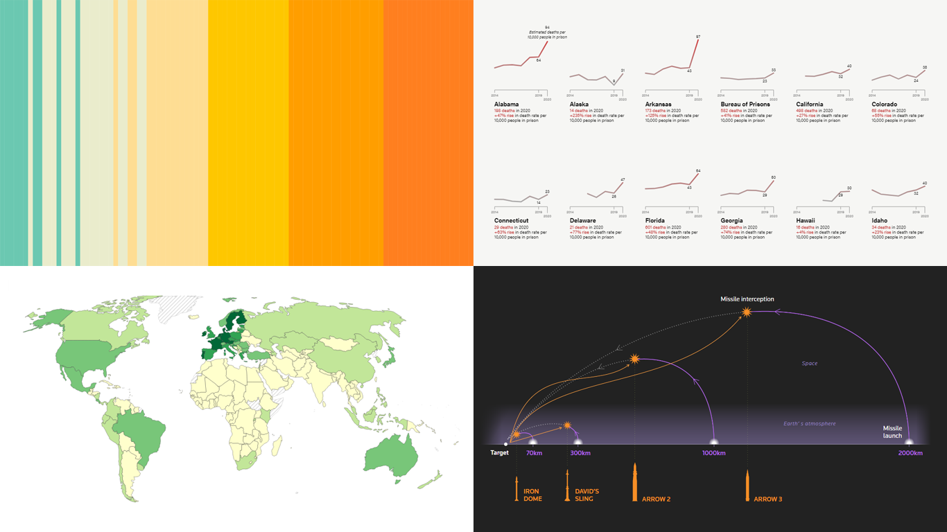
 DataViz Weekly is here! Today, we spotlight cool new projects that illuminate how complex topics can be presented and explored in a comprehendible and impactful manner with the help of appropriate data graphics. Here’s a quick look at what we’re covering today:
- Evaluating agri-environmental policy effectiveness globally — Our World in Data
- Visualizing сlimate сhange across generations — The Tardigrade
- Revealing pandemic toll on U.S. prison populations — The Marshall Project
- Exploring Israel’s integrated air defense capabilities in action — Reuters
Read more »
 In the evolving data landscape, the pivot table has long been a cornerstone of the data analyst’s toolkit. Traditionally used to summarize datasets in a condensed tabular form, pivot tables facilitate quick overviews and basic drill-down capabilities. However, as data sets grow larger and more complex, the static and manual nature of pivot tables can limit their effectiveness.