February 21st, 2025 by AnyChart Team
 Data holds valuable insights, and well-crafted visualizations help bring them to light. DataViz Weekly is all about demonstrating how that happens in practice, curating compelling recent data graphics from around the web. Check out what we have for you today:
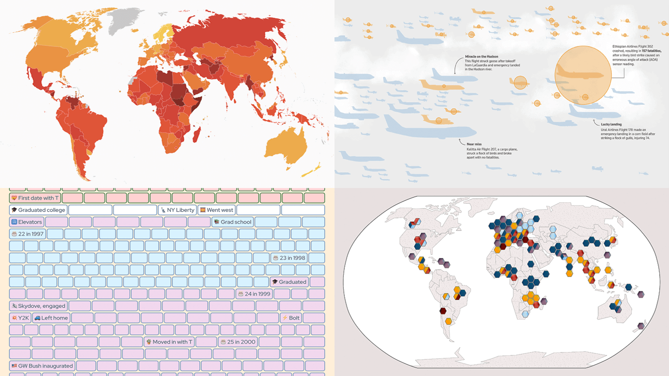
- Corruption perceptions worldwide — Transparency International
- Bird strikes and aviation safety — Reuters
- Crops and extreme weather — Carbon Brief
- Life in weeks — Gina Trapani
Read more »
February 14th, 2025 by AnyChart Team
 We’re back with DataViz Weekly, where we showcase some of the best new data visualization examples — from individual charts and maps to full-scale visual stories and projects. Take a look at our latest picks:
- Swiss research funding — Colas Droin
- Education and voting patterns in U.S. presidential elections — Jon Boeckenstedt
- City walkability and improvement potential — The Economist & Matteo Bruno et al.
- Self-censorship in Super Bowl halftime shows — Artur Galocha for The Washington Post
Read more »
February 11th, 2025 by AnyChart Team
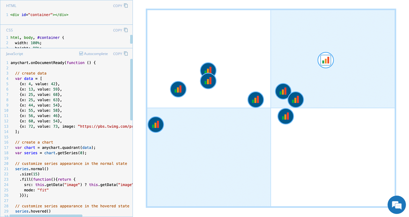 Displaying unique images as markers can add a distinctive touch to your charts, making data visualization more engaging and informative. In this edition of JS Chart Tips, we will guide you through the process of using custom image markers for each data point in a quadrant chart with our JavaScript charting library.
Read more »
February 7th, 2025 by AnyChart Team
 Continuing our regular DataViz Weekly, we’re glad to share the most interesting of all the new data visualizations we’ve recently come across, well worth a look. Here’s what we have lined up this time:
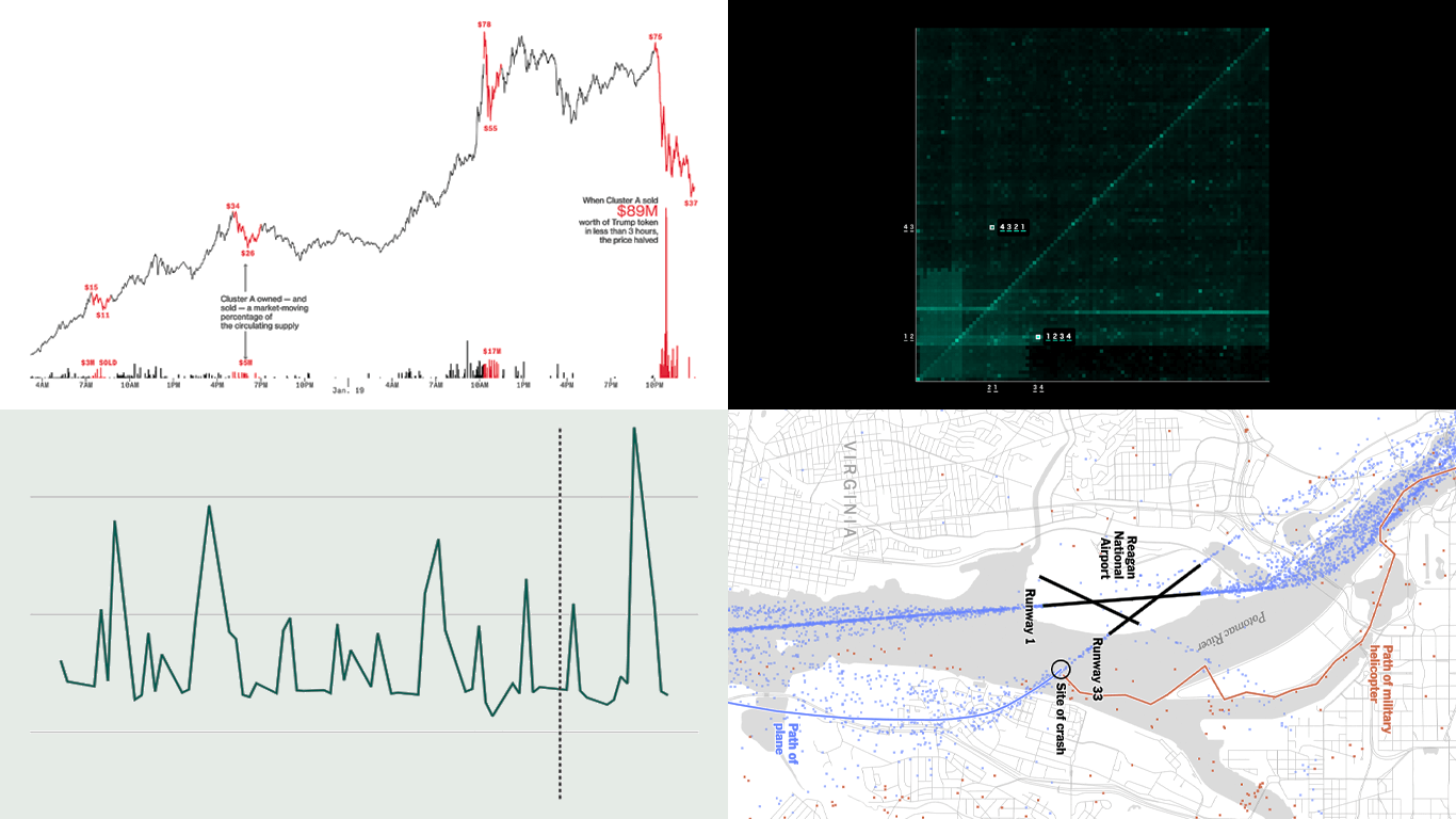
- PIN code popularity — ABC News
- Complexity of D.C. airspace amid the Potomac River midair collision — The New York Times
- Trading patterns in the Trump memecoin — Bloomberg Crypto
- U.S. federal expenditures in real time — The Hamilton Project
Read more »
February 5th, 2025 by AnyChart Team
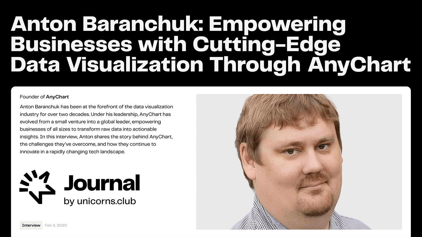 Unicorns Journal just published an interview with our CEO and co-founder, Anton Baranchuk, where he reflects on AnyChart’s journey from a small startup to a global leader in data visualization, trusted by enterprises worldwide.
Anton talks about how we got started, the transition from Flash to JavaScript charting, our work with Qlik, and the vision and values that continue to drive us forward.
Read the interview »
- Categories: AnyChart Charting Component, AnyGantt, AnyMap, AnyStock, Big Data, Blogroll, Books, Business Intelligence, Dashboards, Financial Charts, Flash Platform, Gantt Chart, GraphicsJS, HTML5, JavaScript, News, Oracle Apex, Qlik, Stock Charts, Success Stories
- No Comments »
January 31st, 2025 by AnyChart Team
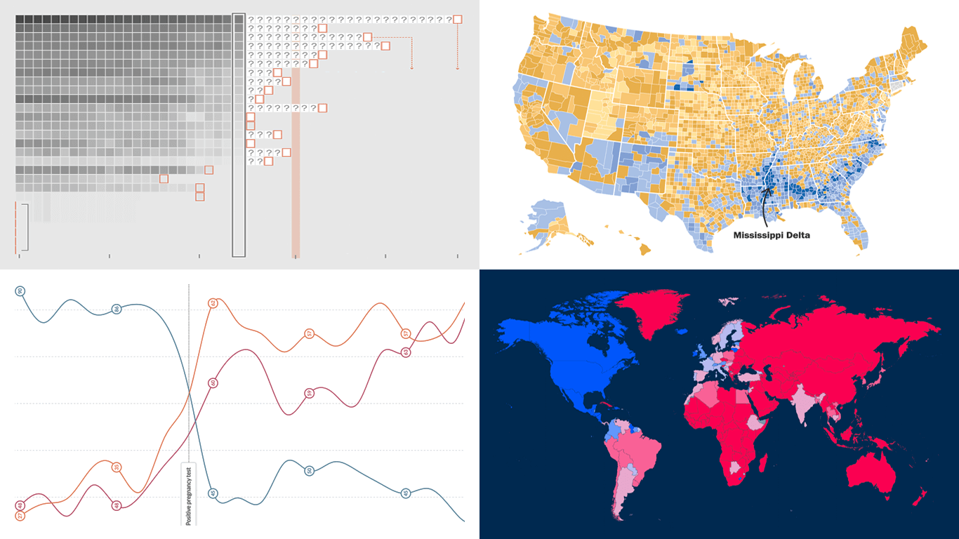 DataViz Weekly is here with a spotlight on new charts and maps that do a great job of turning data into meaningful insights. Today, we invite you to explore the following projects, each demonstrating how data visualization helps reveal patterns, tell stories, and deepen understanding:
- European electricity transition — Ember
- The United States vs. China on global trade — Lowy Institute
- Single-parent families in America — The Washington Post
- Pregnancy through health metric shifts — Maggie Appleton
Read more »
January 30th, 2025 by AnyChart Team
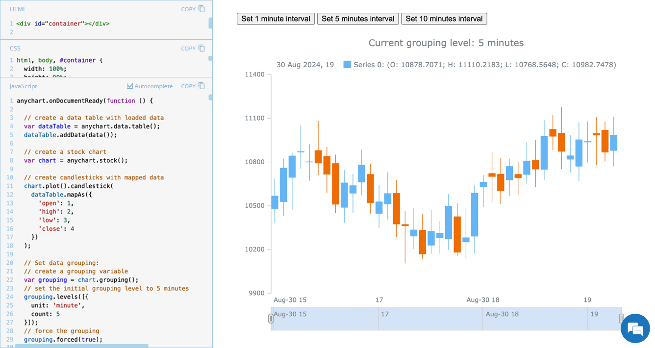 Grouping data points into appropriate time intervals is essential for making stock charts more readable and insightful. While raw data may be collected at a high frequency, such as every minute, financial analysts and traders often need to view broader trends, where grouping data into 5-minute, 15-minute, 1-hour, 1-day, and other time frames can provide clearer insights. In this edition of JS Chart Tips, we will walk you through the process of setting a custom time interval for a stock chart using our JavaScript charting library.
Read more »
January 24th, 2025 by AnyChart Team
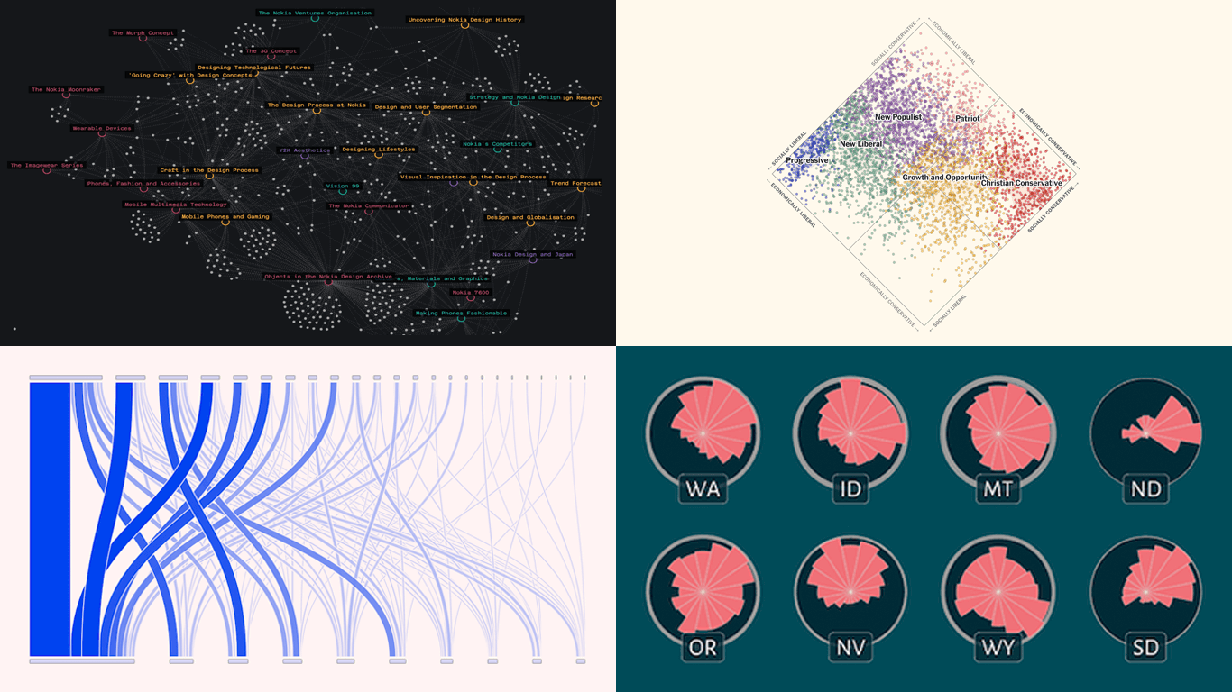 Welcome to the first regular edition of DataViz Weekly in 2025! Last Friday, we wrapped up the year with a special Best Data Visualizations of 2024 post. Now we’re back to our usual format, highlighting some of the most compelling new visuals that caught our attention recently. Here are the first featured projects of the year — dive in and get inspired:
- Nokia Design Archive — Aalto University
- AI research collaborations — Rest of World
- Orientation of ski slopes — OpenSkiStats
- Policy preferences in a hypothetical U.S. multiparty system — NYT Opinion
Read more »
January 17th, 2025 by AnyChart Team
 In 2024, data visualization remained a vital tool for exploring complex topics and presenting insights in engaging ways. From global conflicts and environmental challenges to cultural phenomena and historical trends, charts and maps provided valuable perspectives and captivated audiences.
This special edition of DataViz Weekly highlights the best data visualizations of 2024. Featuring projects selected by FlowingData, The Pudding, and the Global Investigative Journalism Network (GIJN), as well as year-in-review collections from leading media sources, it offers a curated look at some of the most compelling visual storytelling created during the year. All aboard!
Read more »
January 9th, 2025 by AnyChart Team
 Another remarkable year is officially in the books! Here at AnyChart, 2024 was a truly rewarding journey marked by innovation and impact:
As we step into 2025, we remain committed to pushing the boundaries of data visualization and analytics, ensuring you always have the tools you need to excel and succeed. Here’s to an even greater year ahead — happy 2025, and stay tuned for what’s coming next!
- Categories: AnyChart Charting Component, AnyGantt, AnyMap, AnyStock, Big Data, Blogroll, Business Intelligence, Charts and Art, Dashboards, Financial Charts, Gantt Chart, HTML5, JavaScript, News, Qlik, Stock Charts
- No Comments »