June 17th, 2021 by Shachee Swadia
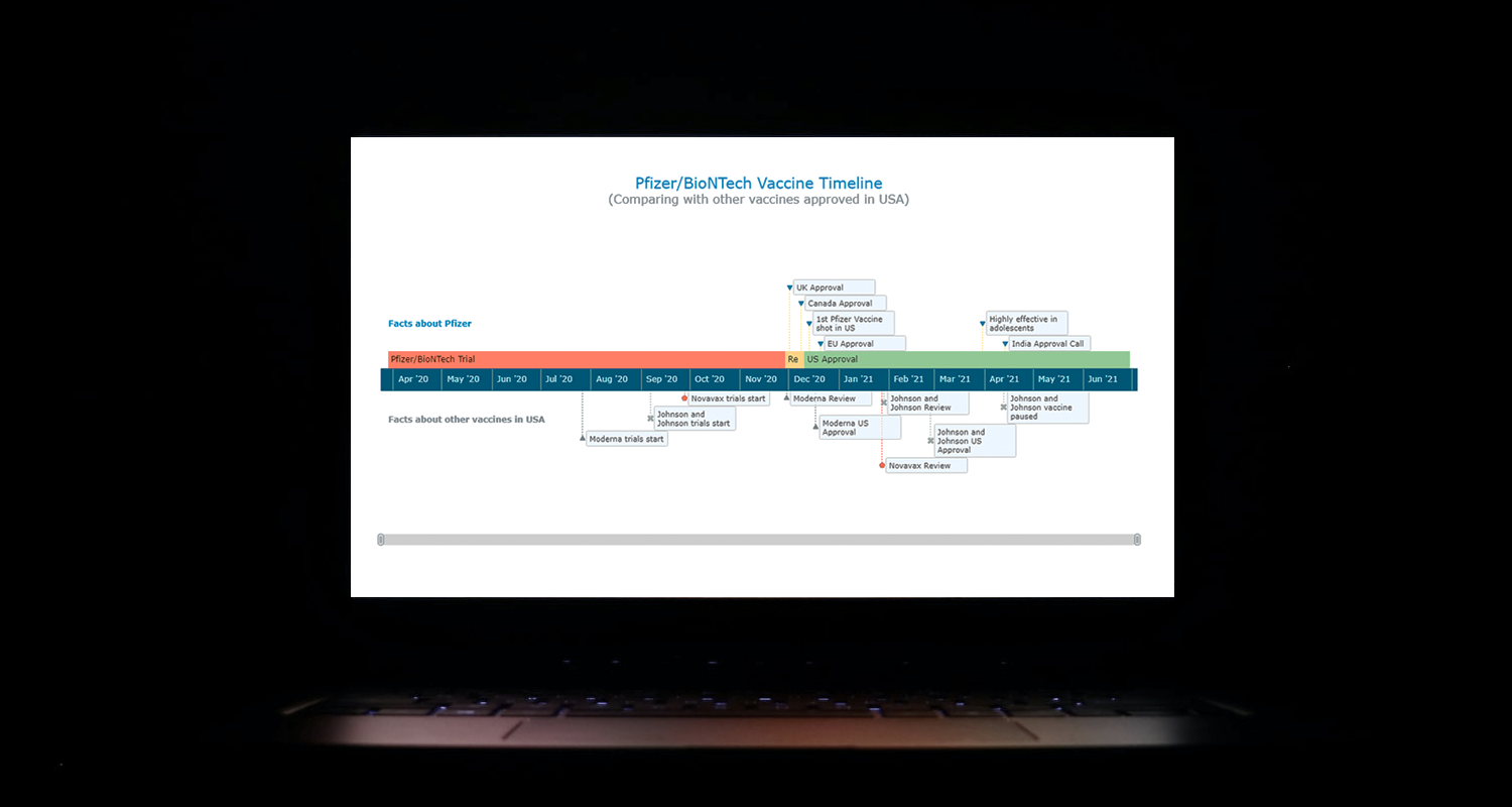 I think all of us have come across timelines somewhere or the other; as a means of conveying chronological information, the classic timeline is unmatched, both in the depth of information conveyed and the “cool” factor, when done with a deft creative touch. So, with that said, would you like to learn how to build a timeline chart using JavaScript that both looks great and is simple to create? (Of course, you do!) Follow along with me as I take you through the step-by-step breakdown for developing your own JS timeline with a practical example.
As the world continues to battle with COVID-19, the long-awaited good news is the development of vaccines across the globe. Here, I decided to build an interactive timeline that showcases the phases of Pfizer-BioNTech vaccine development in the United States. To add more contextual information, I also wanted to show approvals from other countries and some related facts, including the dates for the development of the 3 other vaccines approved for usage in the US.
Read the JS charting tutorial »
June 11th, 2021 by AnyChart Team
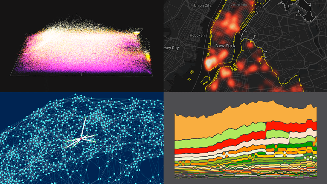 DataViz Weekly is here with a new dose of fascinating data graphics for visualization addicts! Check out some of the most interesting recent projects right away!
- Changes in the American diet over the past 40 years — Nathan Yau
- Surveillance cameras in New York City — Amnesty International
- Cities with similar street networks — Andrei Kashcha
- A million soccer passes visualized at once — Karim Douïeb
Read more »
June 4th, 2021 by AnyChart Team
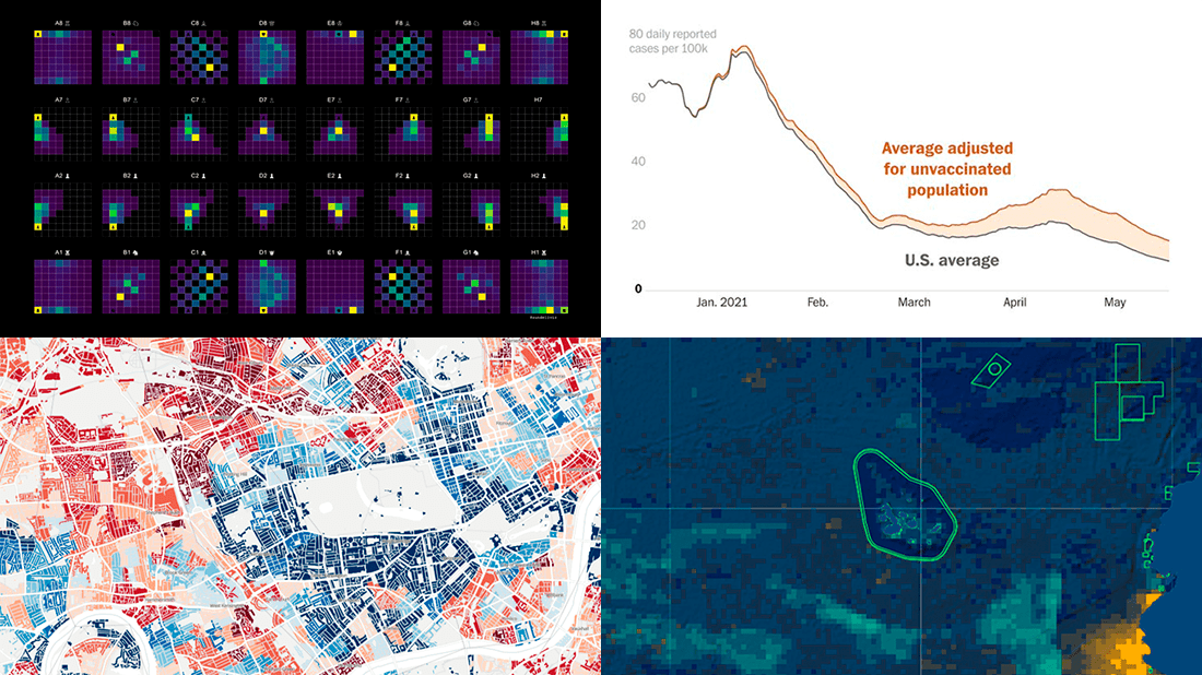 Each Friday, we pick the most compelling new data visualizations and show them in a quick overview. Take a look at our latest DataViz Weekly collection and feel the power of charts and maps!
- COVID-19 rates for unvaccinated people in the U.S. — The Washington Post
- Income deprivation within English local authorities — ONS
- Where chess pieces are usually captured — Anders Sundell
- Global Fishing Watch Marine Manager — Global Fishing Watch
Read more »
May 28th, 2021 by AnyChart Team
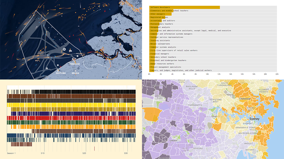 Hey guys, check out new awesome graphics! We have come across these works just about now and decided to highlight them today in DataViz Weekly as really cool data visualization examples. See them now for fun and inspiration!
- Human activity in the Belgian part of the North Sea — De Tijd
- Colors of Bob Ross’s TV artwork — Connor Rothschild
- Housing affordability in Australia — Aussie
- Jobs that tend to marry together — Nathan Yau
Read more »
May 24th, 2021 by AnyChart Team
 A new version of our JavaScript charting library is now out with a bunch of super wow updates! First, we’ve added two new chart types: Circle Packing and Calendar. Second, now you are more than welcome to make use of the pre-built Arrow Connectors in Waterfall Charts and Marker Series in 3D Surface Charts. Keep reading to learn more about the key new arrivals in AnyChart JS 8.10.0, and enjoy these just-added charts and features in our powerful data visualization tool!
»»» See What’s New in AnyChart 8.10.0! «««
May 21st, 2021 by AnyChart Team
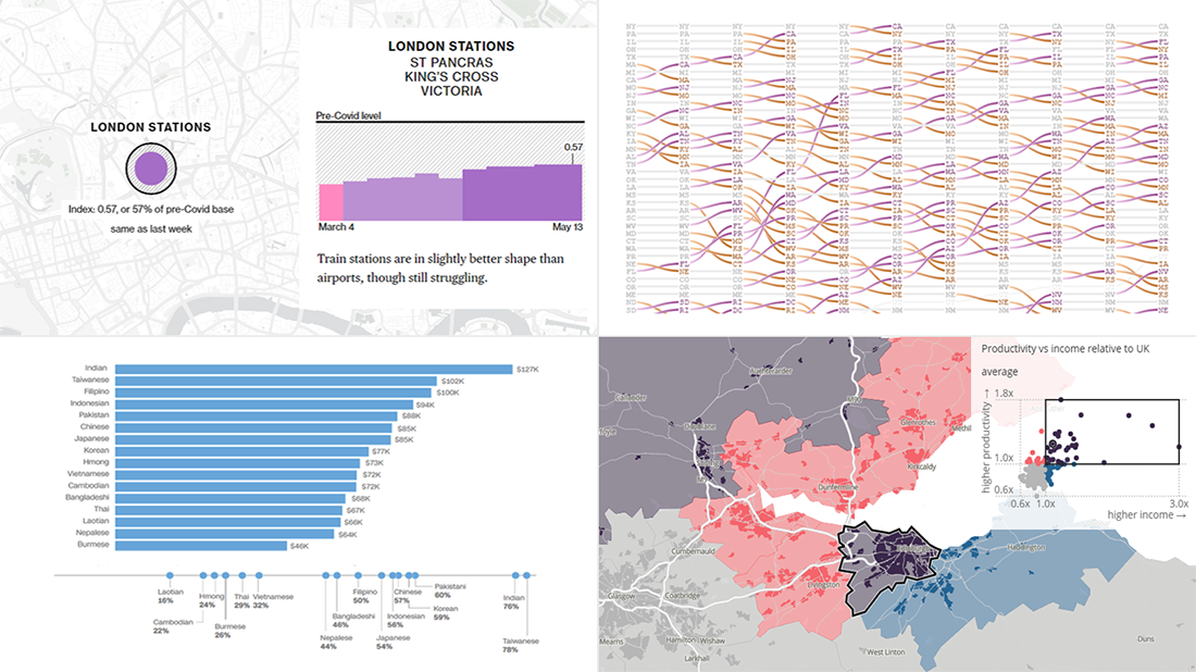 Not too long ago, visual communication skills were nice to have. But that has changed. Nowadays, the ability to visualize data in charts and maps is a must-have and not only for analysts. Stay tuned for DataViz Weekly to see the most interesting examples of smart graphics in action!
Join us today as we look at the following new data visualization projects worth checking out:
- Historical shifts in U.S. state population rankings — The Washington Post
- Diversity of Asian Americans — CNN
- Regional differences in income and productivity across the U.K. — ONS
- Pret A Manger sandwich sales as a proxy to measure pandemic recovery — Bloomberg
Read more »
May 18th, 2021 by AnyChart Team
 Anton Baranchuk, our CEO, has been recognized by CIOLook Magazine as one of the 10 Most Innovative Business Leaders Revamping the Future! Great news and congratulations to the boss!
Right now, we are excited to share with you the story of his success with AnyChart, the company he co-founded when pursuing a Ph.D. back in 2003 that turned from a small startup to a global data visualization software market leader. This article is published in the dedicated special edition of CIOLook and we are thankful for the opportunity to repost it on our blog.
Read more »
May 14th, 2021 by AnyChart Team
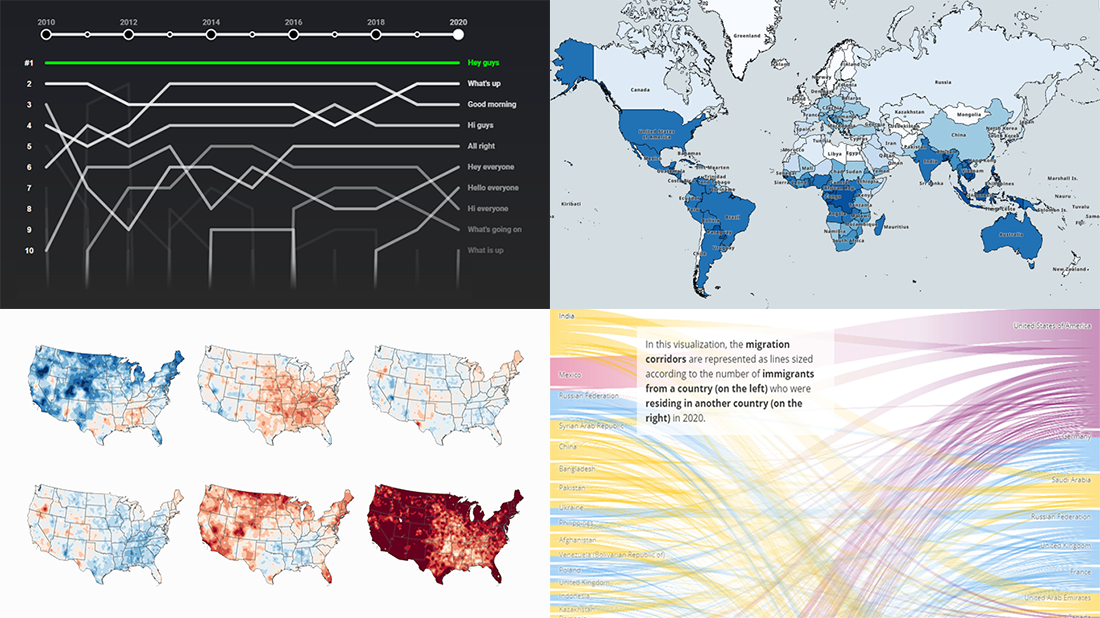 Clear visualizations make it easier to understand complex information and take the right action based on it. DataViz Weekly is here to show you some of the best examples of charts and maps that let data speak. This time, we are happy to put a spotlight on the following great new data visualization projects:
- Top YouTube video greetings — YouTube and Polygraph
- World migration statistics — IOM
- U.S. climate normals — NOAA
- Lightning stroke density worldwide — Vaisala
Read more »
May 11th, 2021 by Shachee Swadia
 A step-by-step guide for building an interactive JS Mosaic Chart. Illustrated by visualizing data on quarterly PC shipments by brand in 2020.
Data visualization is a valuable tool in today’s scenario, with data everywhere and various opportunities to tap into that data to find insights. Visual charts are imperative to communicate ideas, identify patterns, and make the most of the available data.
So then, would you like to quickly and easily learn how to create a really cool chart that showcases data interestingly?
A mosaic chart is a multi-series chart that effectively represents data with over 2 parameters and is so-called because each data point has distinctive indents, making it visually similar to a piece of mosaic art. Not only is this chart beautiful to look at, but is also very helpful in representing multiple variables and recognizing the relationship between these different variables.
The year 2020 was not all bad, at least for the market of personal computers. The sales of PCs increased throughout each quarter of 2020, with more people working and studying from home. I explored how each brand fared in every quarter based on the number of global shipments.
Read the JS charting tutorial »
May 7th, 2021 by AnyChart Team
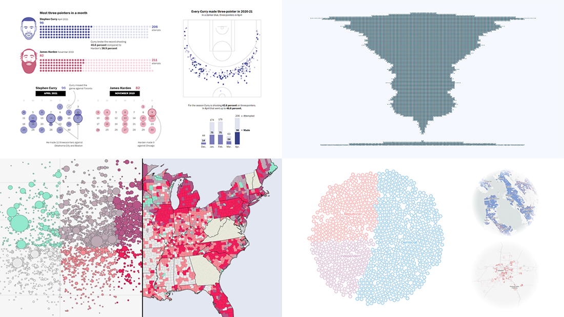 Every week, we choose the four most interesting visualizations from all we came across these days and present them to you in a quick review. Below is a list of the ones that made it to this new DataViz Weekly — take a glance and keep reading for a closer look at each!
- Vaccination rates in comparison with case metrics across the U.S. — McKinsey & Company
- Political bubbles across the U.S. — The New York Times Opinion
- Stephen Curry’s record-setting April scoring spree — The Washington Post
- World justified, left-aligned, centered, right-aligned — Nicolas Lambert
Read more »
 I think all of us have come across timelines somewhere or the other; as a means of conveying chronological information, the classic timeline is unmatched, both in the depth of information conveyed and the “cool” factor, when done with a deft creative touch. So, with that said, would you like to learn how to build a timeline chart using JavaScript that both looks great and is simple to create? (Of course, you do!) Follow along with me as I take you through the step-by-step breakdown for developing your own JS timeline with a practical example.
 Each Friday, we pick the most compelling new data visualizations and show them in a quick overview. Take a look at our latest
  Hey guys, check out new awesome graphics! We have come across these works just about now and decided to highlight them today in
  A new version of our
  Not too long ago, visual communication skills were nice to have. But that has changed. Nowadays, the ability to visualize data in charts and maps is a must-have and not only for analysts. Stay tuned for
 Clear visualizations make it easier to understand complex information and take the right action based on it.
 Every week, we choose the four most interesting visualizations from all we came across these days and present them to you in a quick review. Below is a list of the ones that made it to this new