October 18th, 2019 by AnyChart Team
 This week, we’ve found more new cool projects that wonderfully demonstrate the power of visualizing numbers. Here are the four most interesting ones where charts and maps actually let data speak — join us as we quickly present them in today’s DataViz Weekly:
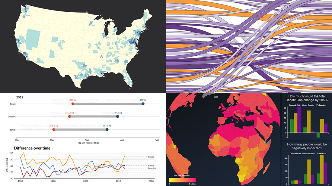
- Charting migration pathways worldwide — Bloomberg
- Plotting differences between men’s and women’s top lifts at IPF events — Connor Rothschild, Rice University
- Mapping commute thresholds across the United States of America — Nathan Yau, FlowingData
- Visualizing nature’s contributions to people globally — Natural Capital Project
Read more »
October 11th, 2019 by AnyChart Team
 Exploring data visualized in cleverly made charts and maps not only provides quicker and better insight. It is also an aesthetically pleasing process. We’ve got examples to illustrate this point — check out our new DataViz Weekly post highlighting the following interesting projects we’ve recently come across:
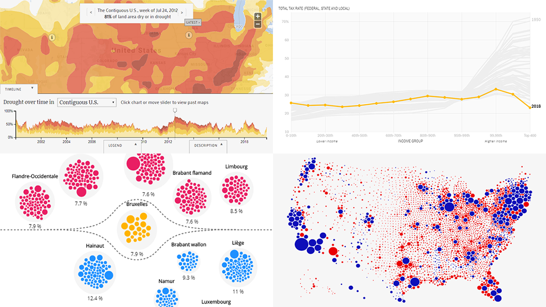
- Weekly drought reports for the United States — EcoWest & Bill Lane Center for the American West at Stanford University
- Trump’s impeachment map vs cartogram — Karim Douïeb
- Opioid consumption in Belgium — Médor & Jetpack AI
- Total tax rate change in the United States in 1950-2018 — David Leonhardt for The New York Times
Read more »
October 4th, 2019 by AnyChart Team
 Look how data visualization works in reality, bringing insight into large amounts of structured and unstructured data for the sake of efficient and effective analysis. Here’s what new interesting visualizations we are excited to feature today on DataViz Weekly as very good, inspiring examples:
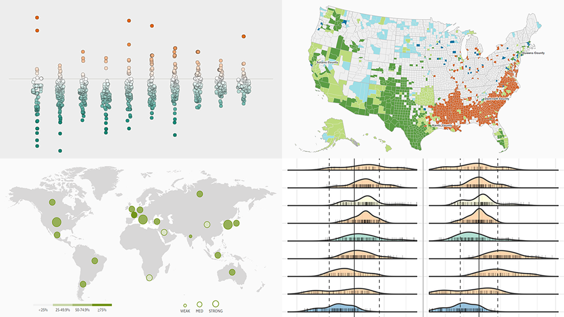
- Finding a link between deportations and crime in the United States — The Marshall Project
- Exploring racial diversity in America — Brookings Institution
- Comparing the encoding efficiency of languages — Science Advances
- Analyzing the availability of critical data in G20 countries — The Evidence Initiative
Read more »
September 27th, 2019 by AnyChart Team
 Analyzing data is always easier when it’s graphically represented and integrated in a convenient interactive data visualization tool. We’ll show you four great examples of such tools created by different groups of researchers from around the world just recently.
Today’s DataViz Weekly post highlights projects on the following topics:
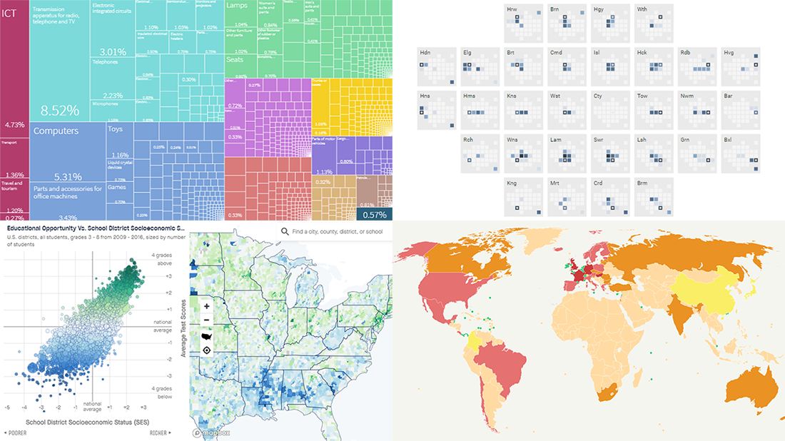
- Economic complexity of 130 countries — Growth Lab at Harvard’s Center for International Development
- Educational opportunities in the United States of America — Stanford University’s Educational Opportunity Project
- Commuter flows in London — GLA City Intelligence Unit
- Global corporate profit shifts — Researchers from UC Berkeley and UCPH
Read more »
September 20th, 2019 by AnyChart Team
 Enjoy new awesome chart examples! The following cool projects visualizing diversity and integration, presidential debate topics, and more have captured our attention this week, and we’re excited to feature them now within the framework of the DataViz Weekly series on AnyChart Blog:
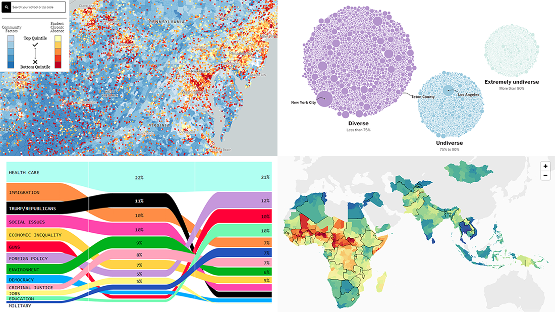
- Chronic absence in U.S. schools
- Racial diversity across all America’s school districts
- Child mortality in low-to-middle-income countries
- Top issues discussed at the first three Democratic debates
Read more »
September 13th, 2019 by AnyChart Team
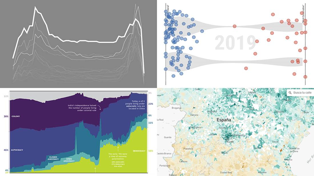 It’s Friday, so we continue the DataViz Weekly series on our blog. Today we praise new interesting projects with charts and infographics visualizing income of Spaniards (El País), restless sleep with age (FlowingData), ideological polarization in the California legislature in 1993-2019 (CalMatters), and political regime changes worldwide since 1816 (Visual Capitalist). Look at these cool examples of the power of data visualization in action.
Read more »
September 11th, 2019 by AnyChart Team
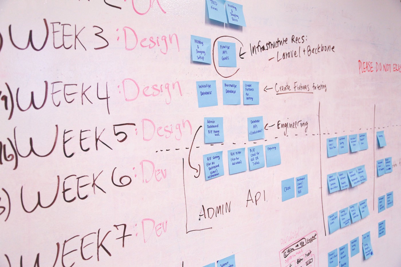
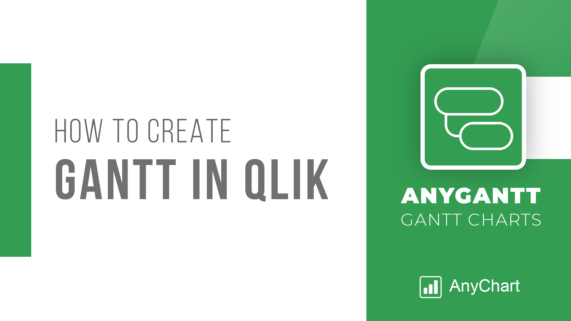 Looking for the simplest way to create a Gantt chart in Qlik Sense to further streamline data-driven project management in your company or organization? We’ll show you one right now! Follow this quick tutorial and you’ll learn how to easily visualize project tasks and activities as data in a matter of minutes — on smart, interactive Gantt charts using the intuitive AnyGantt extension for Qlik by AnyChart.
Watch the video tutorial or follow the text-and-pictures version — you choose!
Read more at qlik.anychart.com »
September 6th, 2019 by AnyChart Team
 Hey, check out some more of the new awesome data projects we’ve come across this week! It’s a new DataViz Weekly article, and today we are glad to show you cool charts and maps visualizing costs and fires:
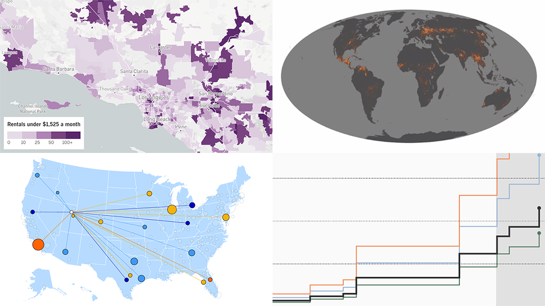
- Salaries adjusted for cost of living across the United States
- U.S.-China trade war costs for American families
- Affordable home rentals in California
- Long-term record of fires worldwide
Read more »
September 4th, 2019 by Alfrick Opidi
Use a JavaScript library to create a Gantt chart and take your project management efforts to the next level.
Earlier this year, my team was looking for a project management tool that could assist us in charting the various tasks related to our app development project against some specific timelines. After doing some research, we finally settled on Gantt charts. However, some people think Gantts are complicated to create. Not true! Thanks to numerous JavaScript chart libraries, data visualization is now simple, flexible, and embeddable.
In our situation, we settled on AnyChart’s JS Charts library because of its ease of use, extensive documentation, flexible code playground for trying out stuff, and other powerful features.
In this tutorial, I’ll walk you through how to create a simple interactive Gantt chart using this data visualization library. Here’s what we’ll be making and you can get the entire code for creating such a Gantt chart at the end of the tutorial:
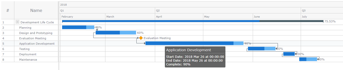
Read the JS charting tutorial »
August 30th, 2019 by AnyChart Team
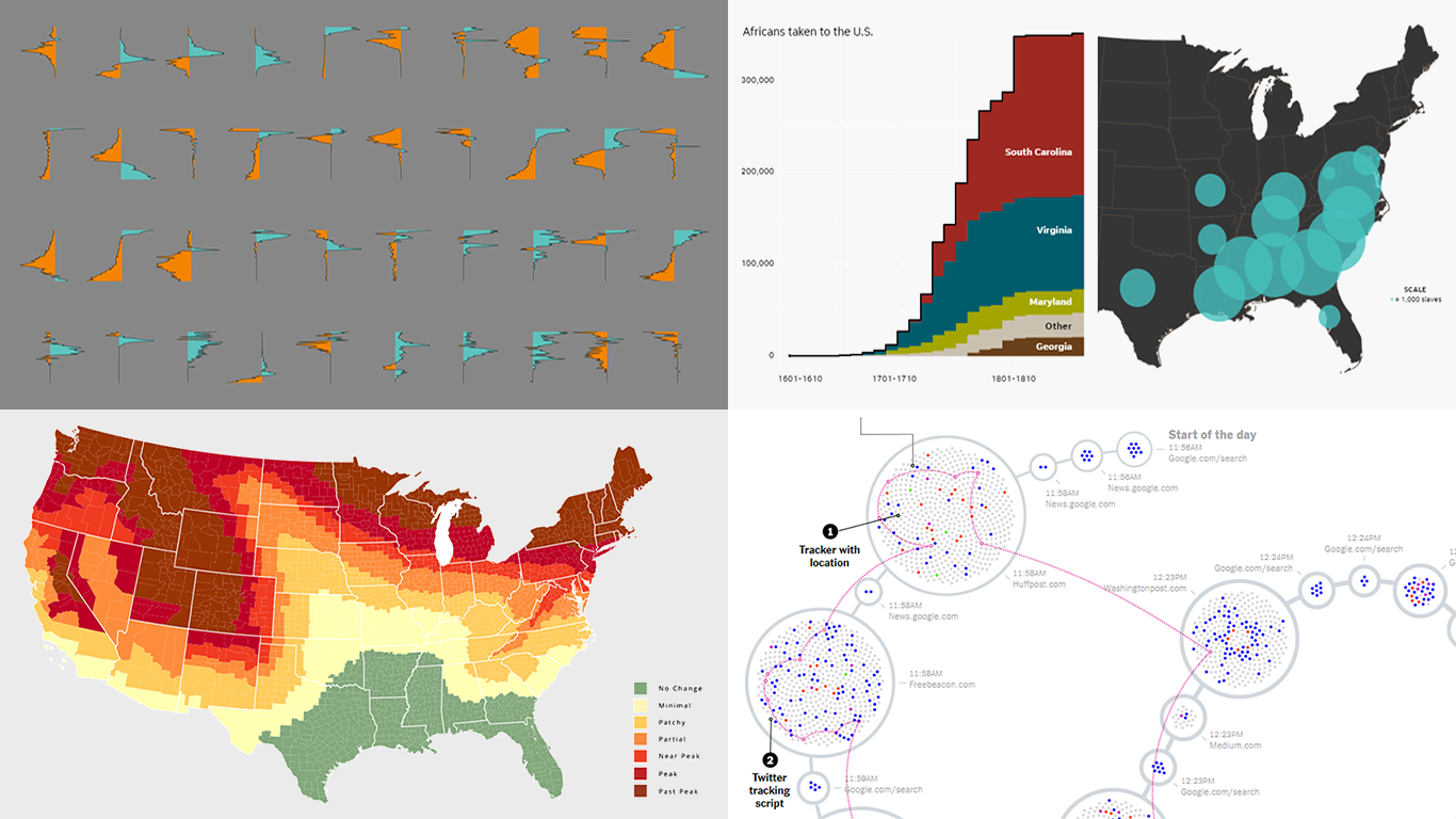 Are you ready for a new dose of stunning data visuals? Today is Friday, and DataViz Weekly is already here! Today we invite you to take a look at the following new interesting projects with charts and infographics:
- Gender-switched names in the United States
- Growth of slavery in America
- Website user data trackers
- Peak fall foliage color across the U.S.
Read more »