August 29th, 2019 by AnyChart Team
 As a globally leading, award-winning data visualization solution, our JavaScript charting library is used not only in commercial apps but also by governments of all levels worldwide. Devon County Council, a UK local authority administering the English county of Devon, is one such customer.
In particular, Mark Painter from Devon County Council’s Community and Public Health Intelligence Team told us they use AnyChart to generate all the charts in their Health and Wellbeing Profiles. We’ve interviewed him to learn more. (Stack: WordPress/CSV.)
Read more »
August 23rd, 2019 by AnyChart Team
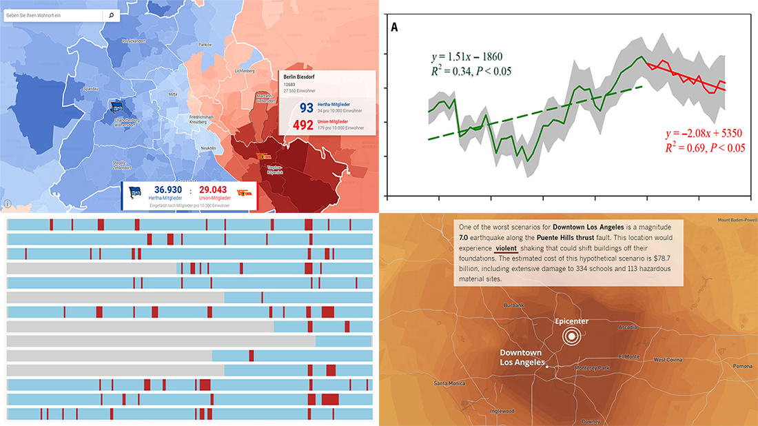 Continuing our DataViz Weekly series, we’ve put together a fresh selection of cool new charts and maps that are worth looking at and exploring. The visualizations we feature this time provide interesting insight into the following topics:
- Economic recessions worldwide in 1960-2019 — Business Insider
- Football divide in Berlin — Berliner Morgenpost
- Earthquake scenarios for California landmarks — Los Angeles Times
- Decline in the global vegetation growth — Science Advances
Read more »
August 16th, 2019 by AnyChart Team
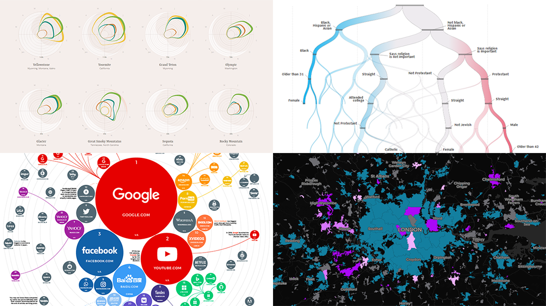 Check out some of the new exciting visual data projects that we’ve recently found around the web. Here’s a quick list of what’s featured today on DataViz Weekly:
- Discovering the best time to visit a national park in the United States
- Revealing drug crime trends in England and Wales
- Analyzing demographics to predict a preferred political party
- Ranking the top 100 websites
Read more »
August 13th, 2019 by AnyChart Team
 Insights Success magazine has named Anton Baranchuk, CEO and Co-founder of AnyChart, one of The Most Promising CEOs of 2019. Celebrating this exciting recognition, we are pleased to share with you a special article about him and our company. Published in the latest issue of Insights Success, the story is based on Anton’s recent interview with the magazine. Take a read.
Read now »
August 9th, 2019 by AnyChart Team
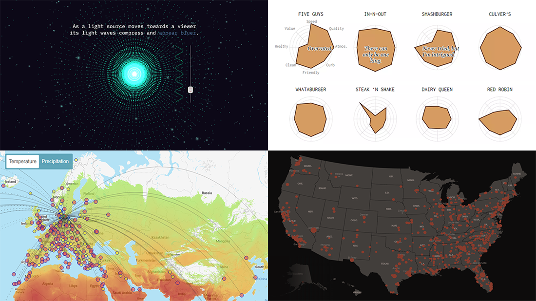 Greet a new post in the DataViz Weekly series, presenting new awesome, top data visualizations from various authors. Here’s what projects we’ve chosen to feature this time:
- Routitude, a smart map tool for travelers
- Fast-food burger restaurant rankings
- Mass shootings in the United States since Sandy Hook
- Using light from the center of the galaxy as a measure
Read more »
August 8th, 2019 by AnyChart Team
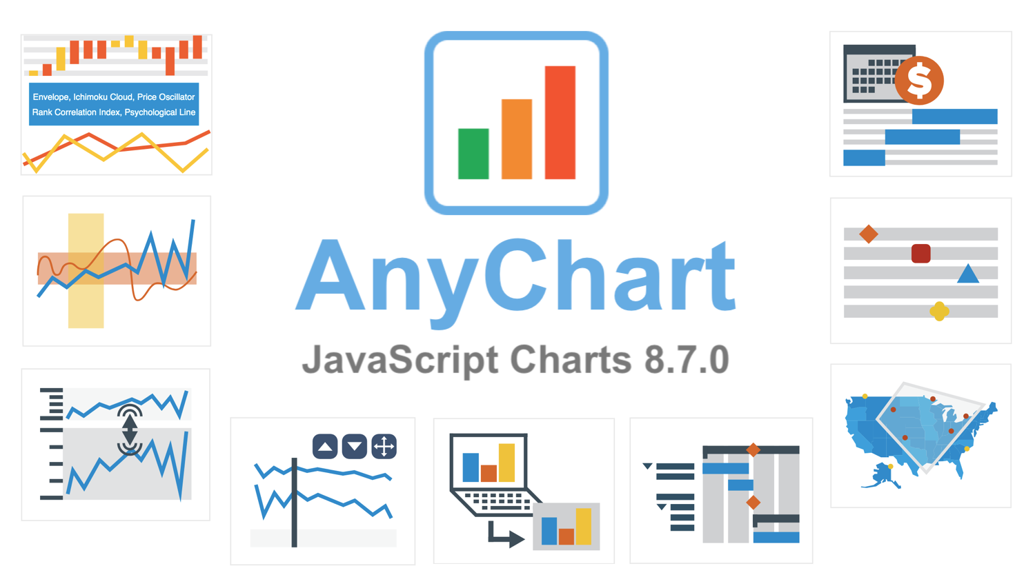 AnyChart 8.7.0 is out with a lot of new awesome data visualization features. Look what we’ve added to our JavaScript graph libraries in this major update.
»»» See What’s New in AnyChart 8.7.0! «««
- Categories: AnyChart Charting Component, AnyGantt, AnyMap, AnyStock, Big Data, Business Intelligence, Financial Charts, Gantt Chart, HTML5, JavaScript, News, Stock Charts
- 4 Comments »
August 2nd, 2019 by AnyChart Team
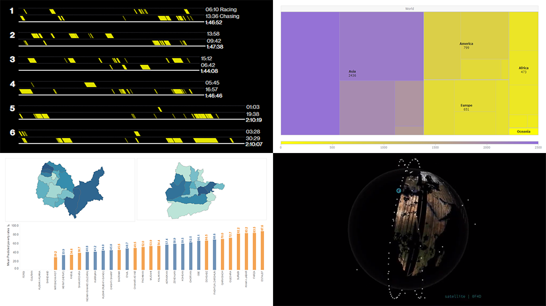 Enjoy our new selection of cool visual statistics projects that have been recently created around the web. These are worth seeing and we are glad to feature them on DataViz Weekly:
- All eight Fast & Furious movies in data
- Worldwide internet users statistics by region
- Economic and other indicators across 401 districts of Afghanistan
- Satellites imaging our Earth every day
Read more »
August 1st, 2019 by Douglas "Bugggster" Baxter
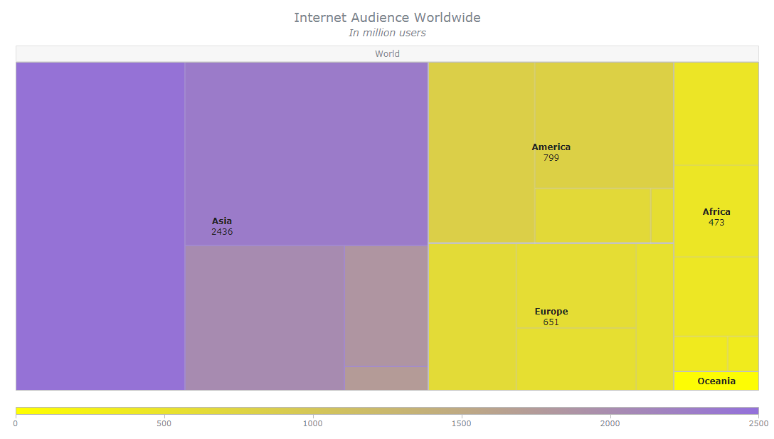 Treemap is a popular chart type for hierarchical data visualization. I’ll show you how to create a cool interactive treemap chart using JavaScript in four simple steps right now. Join me on this quick tutorial for front-end web developers and data viz enthusiasts to understand the core principles of the process. Basically, I am sure everyone at least a little familiar with coding in HTML5 will love the presented, easy way to make beautiful JavaScript treemap charts that are perfectly suitable to be embedded into any web page or app.
In honor of World Wide Web Day celebrated today, August 1, I will develop a JS treemap visualizing data about the number of worldwide internet users as of January 2019, by region, available on Statista.
Read the JS charting tutorial »
July 26th, 2019 by AnyChart Team
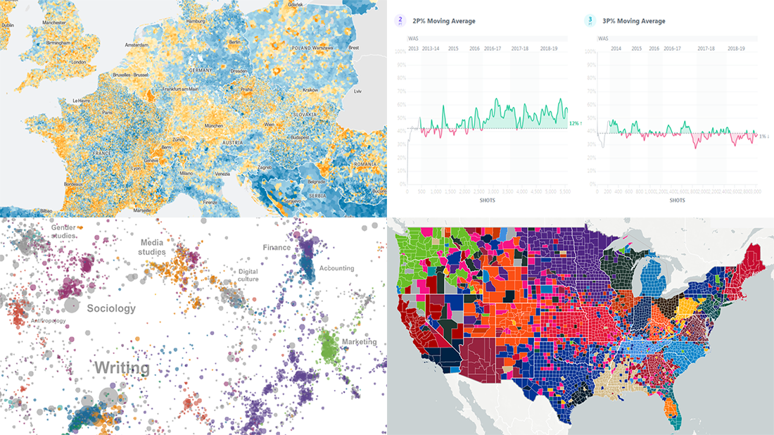 It’s Friday, and we have a pleasure to show you another four new awesome data visualizations we’ve been delighted to check out these days. Look what’s presented on DataViz Weekly this time:
- NBA players’ shot improvement
- Population trends in Europe
- The most-assigned texts from college syllabi worldwide
- The most popular NFL teams and players in every county of the United States
Read more »
July 19th, 2019 by AnyChart Team
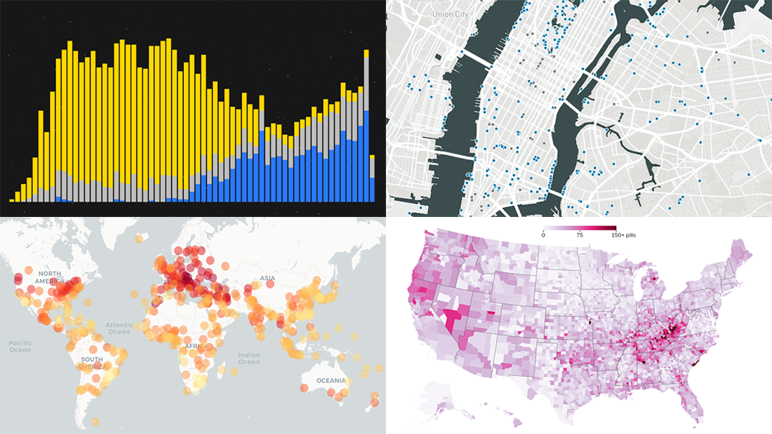 Enjoy another selection of new cool data visualization projects as great examples of visual analytics in action. Here’s what questions the charts featured today on DataViz Weekly show answers to:
- What city’s current climate will your city’s climate resemble in 2050? — Crowther Lab
- How legal pain pills were distributed across the United States in 2006-2012? — The Washington Post
- Where is the nearest water fountain? — Matthew Moy de Vitry
- How space travel has developed since Sputnik in 1957? — Reuters
Read more »