January 2nd, 2019 by Irina Maximova
 Solving challenges is a thing that the AnyChart team can’t live without, and we willingly continue to share some of the most interesting customer cases within the framework of Challenge AnyChart! on our blog. This feature gives us a great chance to help customers with similar tasks and demonstrate the unlimited data visualization capabilities of our JavaScript charting library time after time. The challenge being solved along today’s tutorial is about building a beautiful WiFi polar chart — a custom interactive JS (HTML5) polar chart that displays devices depending on the WiFi signal strength.
Read more »
December 28th, 2018 by AnyChart Team
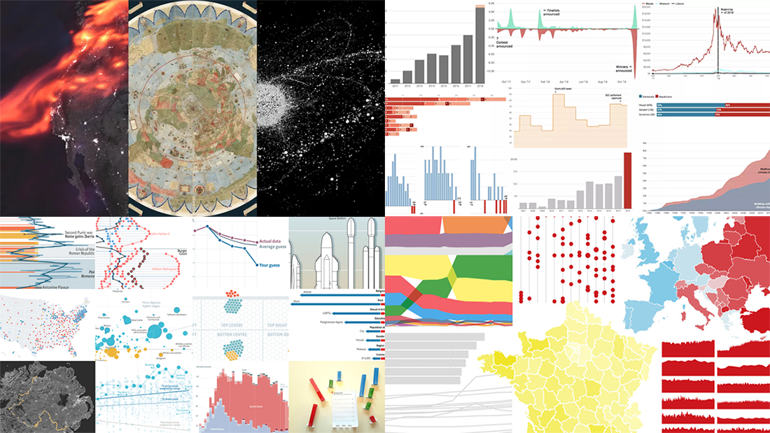 The last days of 2018 are a great time to look back at these 12 months. The year’s final issue of DataViz Weekly is here to familiarize you with four cool selections of the best data visualizations that show the picture of 2018, curated by four major media outlets: POLITICO, Recode, The Economist, and Fast Company. Take a quick look at the lists and check out the charts.
Read more »
December 25th, 2018 by AnyChart Team
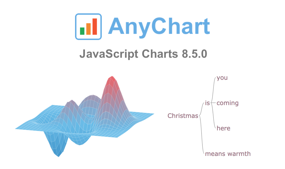 On this wonderful day, we are excited to announce a new major update for our JavaScript data visualization libraries: AnyChart 8.5.0 is released!
The new version brings a lot of advanced features and improvements that make our JS (HTML5) charting solutions even more powerful. 3D Surface Plot, Word Tree, and much more — spare a minute to look through the highlights of the 8.5.0 release of AnyChart, AnyStock, AnyGantt, and AnyMap.
Read more »
December 21st, 2018 by AnyChart Team
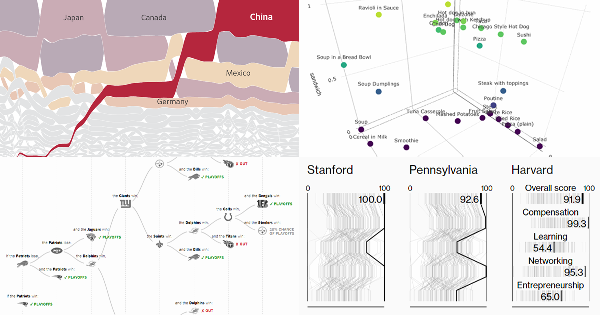 Get ready for another portion of new interesting charts from around the web! Here’s what topics are covered in the data visualization projects that have made it to DataViz Weekly this time:
- China as a trade Leviathan;
- top business schools in America and worldwide;
- NFL playoff paths for each team;
- food categorization as a sandwich, salad, or soup.
Read more »
December 20th, 2018 by Irina Maximova
 Another brand new AnyChart Qlik plugin feature has arrived: Now it is possible to change the default settings in the configuration file of our Qlik extension for data visualization!
AnyChart Qlik plugin’s configuration file allows you to apply the default settings to all charts and dashboards created by the extension and customize them, which is impossible to achieve in the chart editor itself.
Read more »
December 14th, 2018 by AnyChart Team
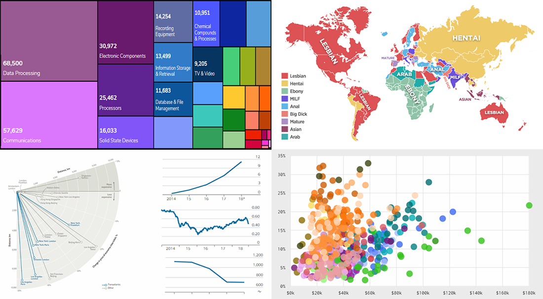 DataViz Weekly is here to tell you about new web projects and articles that feature interesting data graphics. This time, we showcase charts and infographics visualizing data about occupations of single earners in couple households in America, companies winning patent wars, change in air ticket prices globally, and Pornhub trends in 2018.
Read more »
December 7th, 2018 by AnyChart Team
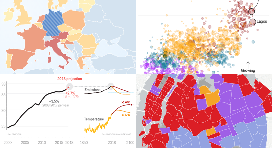 Take a look at new cool data visualizations recently published on the web. In today’s DataViz Weekly, we are glad to feature interesting information graphics from the Global Carbon Project, BBC News, Berliner Morgenpost, and Vivid Seats, dedicated to the following subjects:
- carbon dioxide emissions;
- current state of climate change;
- top 2018 summer travel destinations for Germans;
- top music genres and artists in NYC by neighborhood.
Read more »
November 30th, 2018 by AnyChart Team
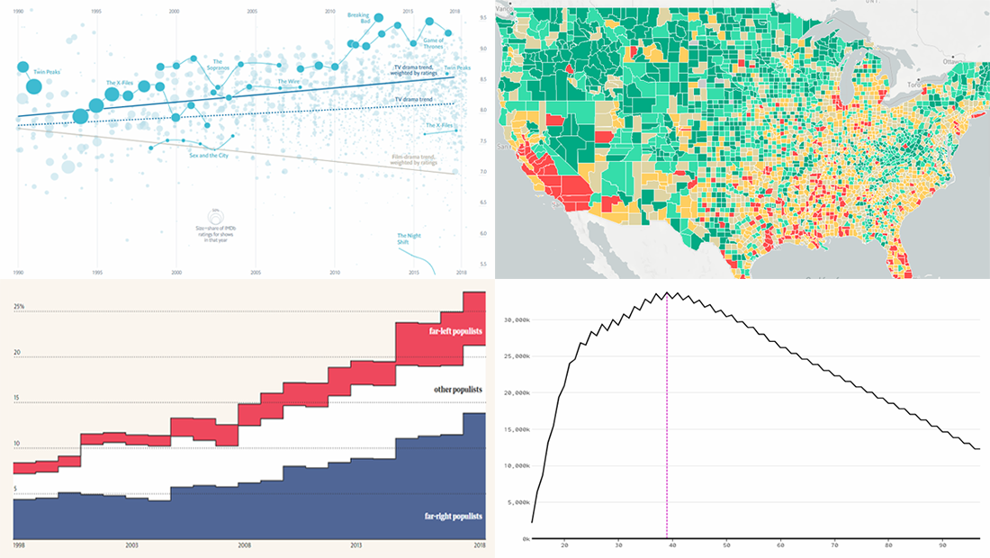 Data visualization is a wonderful way to represent data for intuitive, insightful exploration. The following new dataviz works we’ve found are actually good examples to prove this point.
Today on Data Visualization Weekly:
- dating pool by age;
- TV shows in IMDb user ratings;
- rise of populist parties in Europe;
- safety on the roads around American schools.
Read more »
November 23rd, 2018 by AnyChart Team
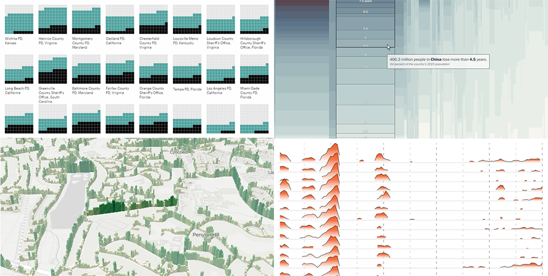 Happy Thanksgiving holiday! While the traditional Black Friday rush is getting into the full swing, we hope you can spare a minute to check out new interesting data visualization projects. Let’s see a list of what’s featured this time on DataViz Weekly and without more ado proceed to the charts:
- years lost due to air pollution;
- urban greenery in Cardiff and Newport;
- rape case clearance rates across the United States;
- Thanksgiving holiday trends.
Read more »
November 20th, 2018 by Jay Stevenson
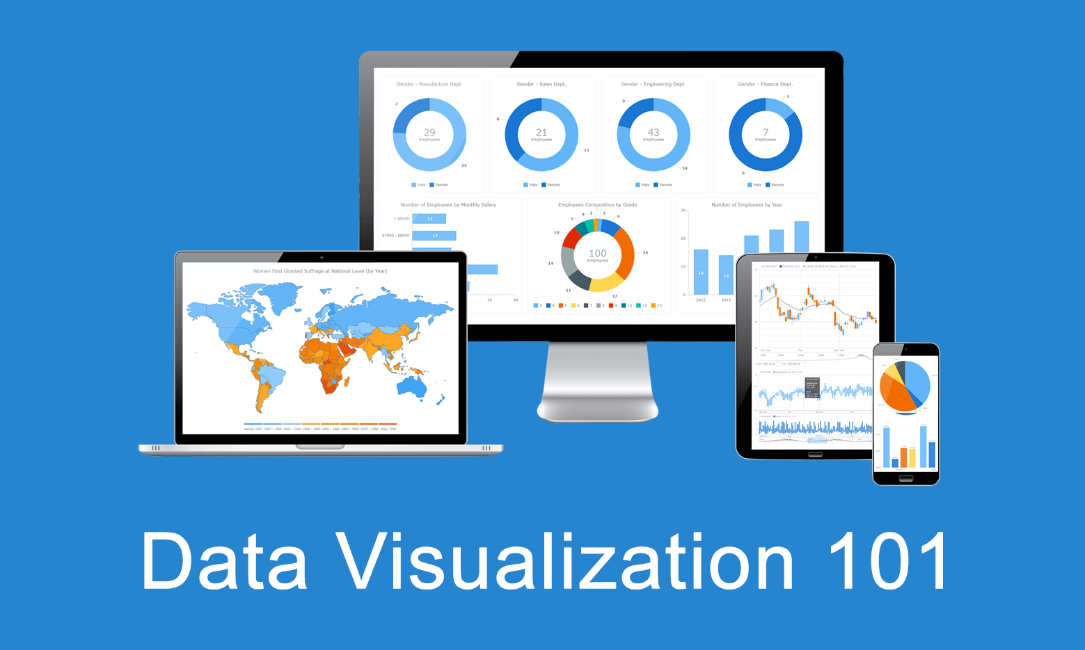 Data visualization is the practice of converting data from raw figures into a graphical representation such as graphs, maps, charts, and complex dashboards. Let’s see what makes it important (meaning), how it has developed (history), and exactly how it can work in real life (examples). Join us on Data Visualization 101, an introduction to dataviz and its power.
Read more »