November 16th, 2018 by AnyChart Team
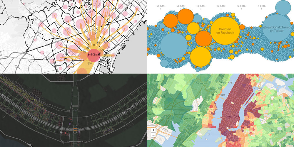 With visualization, data analysis can get easier, faster, and more insightful. In this DataViz Weekly article, we’ll share a few more interesting practical examples we’ve recently come across:
- internal migration paths in Barcelona;
- cost of living in the United States;
- #JobsNotMobs meme transition onto a slogan;
- urban evolution of Brasilia.
Read more »
November 9th, 2018 by AnyChart Team
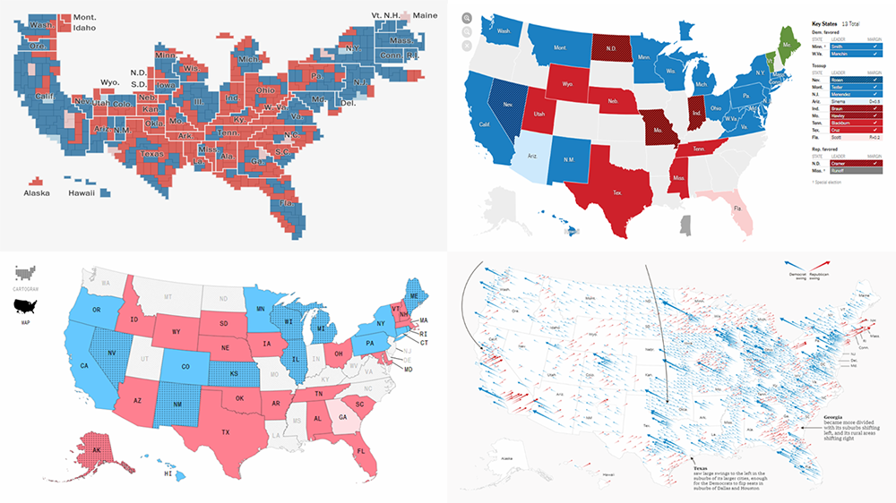 The 2018 midterm election in the United States of America has been among the hottest topics on the media agenda for quite a long time. Various publications were covering the course of the House, Senate, and governor campaigns, sharing forecasts from analysts, and so on. Now that voting is over, all eyes are on the outcome.
Today’s DataViz Weekly will show you how several prominent publications communicated the results of the midterms to their readers with the help of data visualization techniques: The New York Times, The Washington Post, Bloomberg, and The Guardian. So get ready for a lot of choropleth maps! But not only.
Read more »
November 6th, 2018 by AnyChart Team
 Following the 8.4.0 release of the AnyChart JS Charts library, now we’ve also got an awesome major update for our data visualization extension for Qlik Sense. Its version 2.5.0 is already available, adding Gantt Chart and Tag Cloud to the list of supported chart types.
Meet AnyChart Qlik Extension 2.5.0!
Read more »
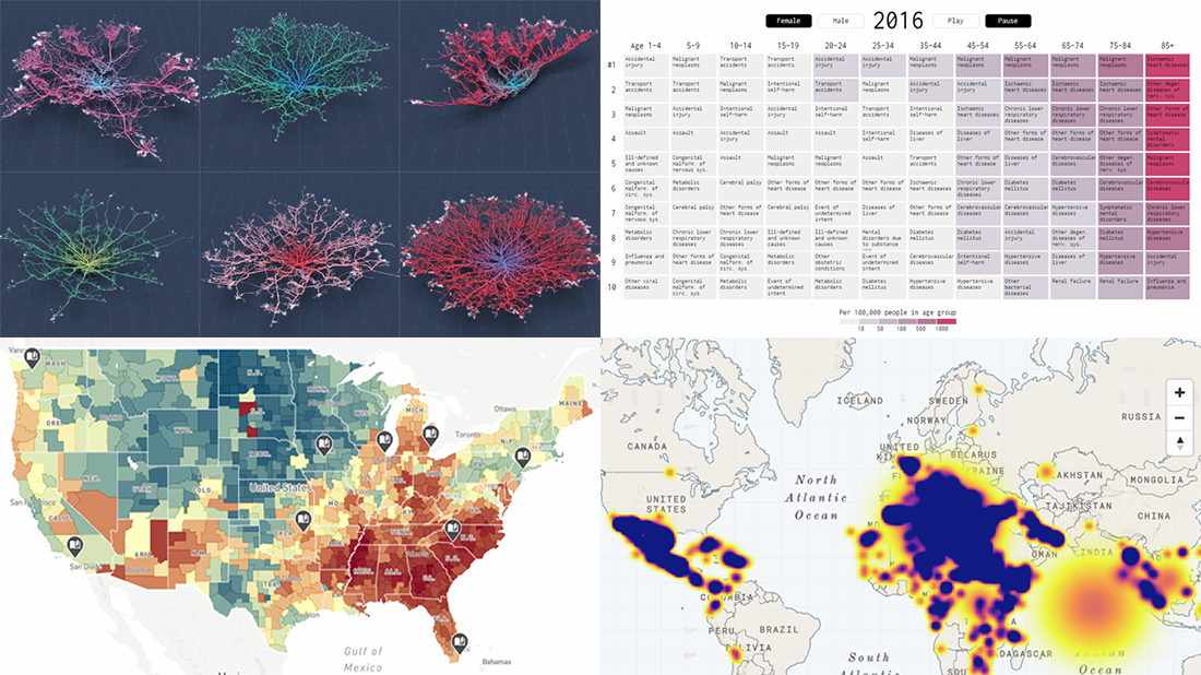
November 2nd, 2018 by AnyChart Team
 Hey everyone! We’ve gone through a number of new visualizations this week and selected four interesting projects to feature on DataViz Weekly today:
- the most commented subreddits over years;
- voter turnout in the United States;
- population density as terrain;
- years lost to leading death causes across the United Kingdom.
Read more »
October 26th, 2018 by AnyChart Team
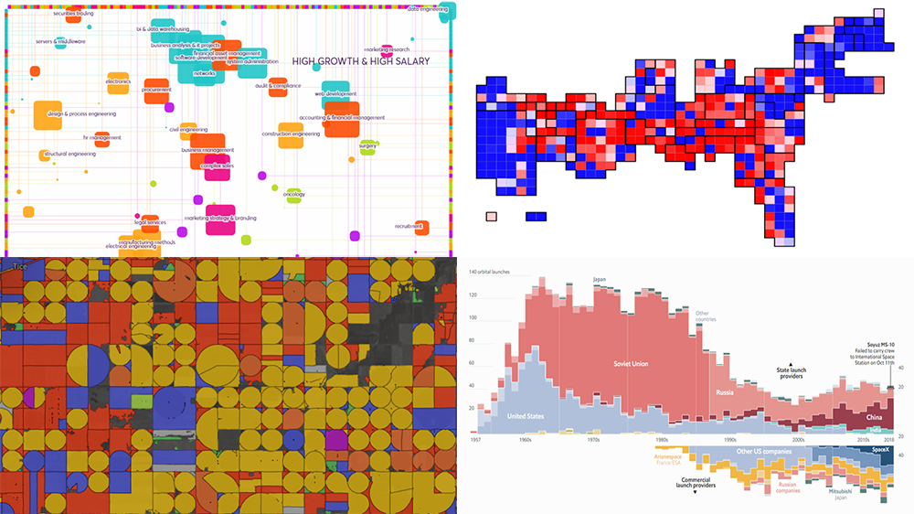 Presenting data in the form of interactive graphics helps to make its exploration more convenient and insightful. In our new DataViz Weekly post, we’ll tell you about another four interesting visualization examples illustrating this.
Today on DataViz Weekly:
- visual taxonomy of skills;
- map of AI-detected fields and crops in the U.S. and Europe;
- ORACLE of Blair — a midterms prediction model from high school students;
- chart of all space launches since 1957.
Read more »
October 19th, 2018 by AnyChart Team
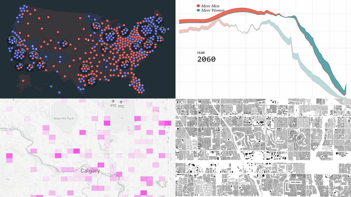 Another seven-day wait is over, and a new DataViz Weekly issue is here! This time, we offer you to look at the following interesting charting projects:
- U.S. population projections through 2060;
- House of Representatives elections from 1840;
- Calgary traffic incident prediction;
- every building in America.
Read more »
October 12th, 2018 by AnyChart Team
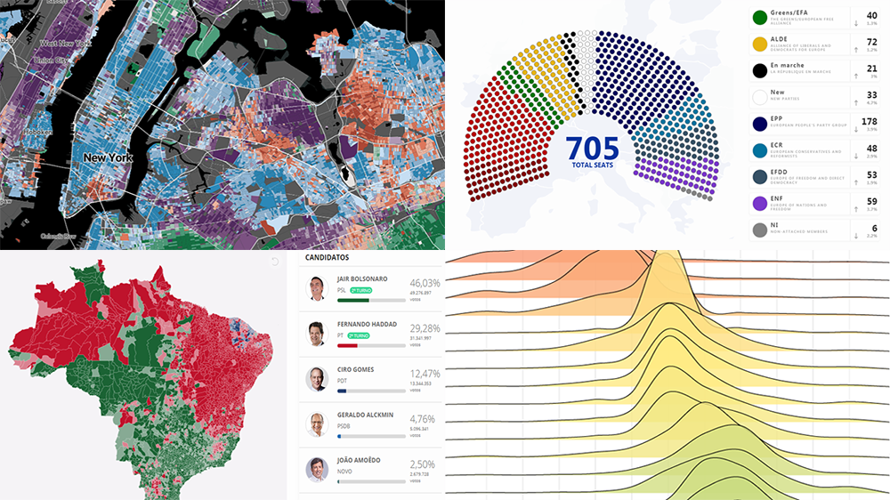 Check out some of the new interesting data visualization examples on a range of topics from all over the web.
Today in DataViz Weekly:
- European Parliament elections;
- racial diversity in the United States, block by block;
- good and bad words;
- Brazilian general elections.
Read more »
October 8th, 2018 by AnyChart Team
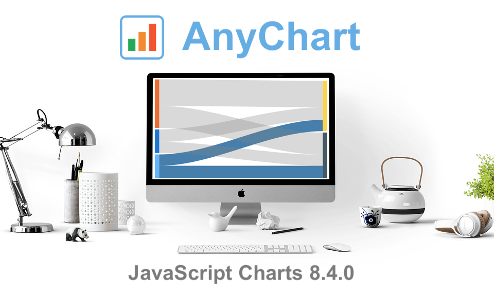 The year’s third major update for AnyChart is out, featuring the JS Sankey Diagram chart type as the ultimate centerpiece of the new release.
Learn more about AnyChart 8.4.0 and start making use of our updated JavaScript (HTML5) libraries for interactive data visualization right away.
Read more »
October 5th, 2018 by AnyChart Team
 Read the first October issue of Data Visualization Weekly to learn about four interesting dataviz projects that have recently come to light:
- city road networks visualized as corals;
- U.S. Opportunity Atlas;
- top 10 causes of death over years;
- human migration routes that are most dangerous.
Read more »
September 28th, 2018 by AnyChart Team
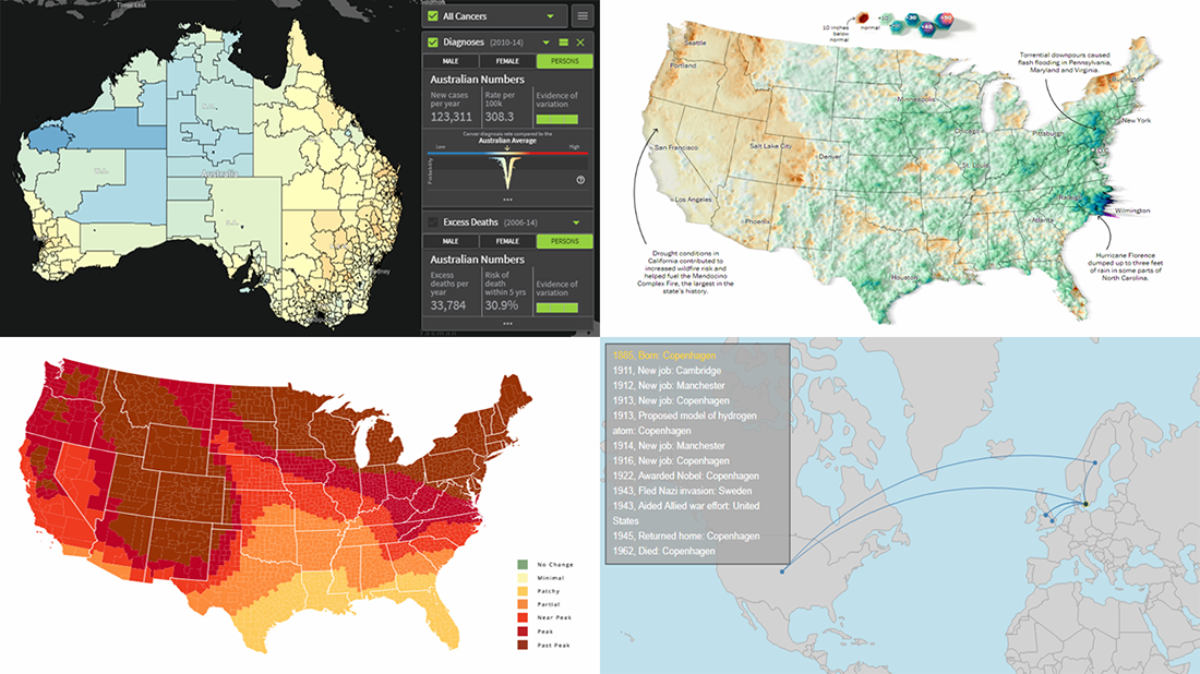 Today’s DataViz Weekly article highlights new beautiful map visualizations, demonstrating how mapping data can help to get geographical insights such as spatial trends, clusters, and so on:
- Australian Cancer Atlas;
- lifetime movements of Nobel Prize laureates in physics;
- U.S. summer rain levels;
- fall foliage prediction across the U.S.
Read more »