July 20th, 2018 by AnyChart Team
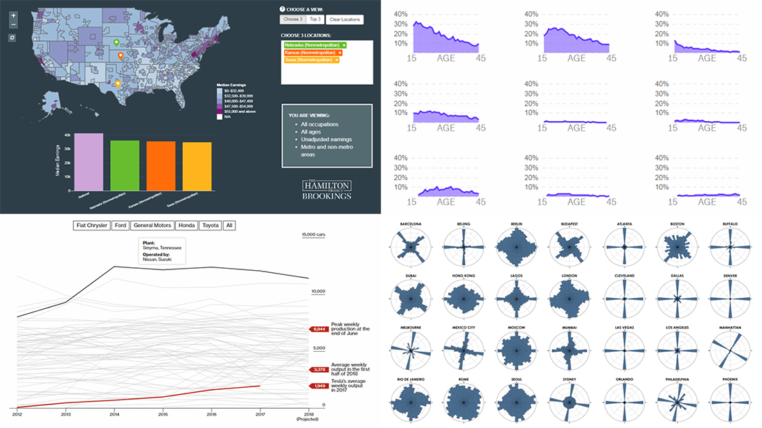 Not only is the AnyChart JS Charts blog a go-to place for our news and tips and tutorials. It’s also where — within the framework of our regular DataViz Weekly feature — we keep you posted on new interesting data visualizations from out there on the web. Today, we’ve chosen to highlight the following information graphic works:
- street orientation in cities around the world;
- occupations and earnings across the United States;
- birth control methods;
- car output of Tesla against North America’s most productive factories.
Read more »
July 13th, 2018 by AnyChart Team
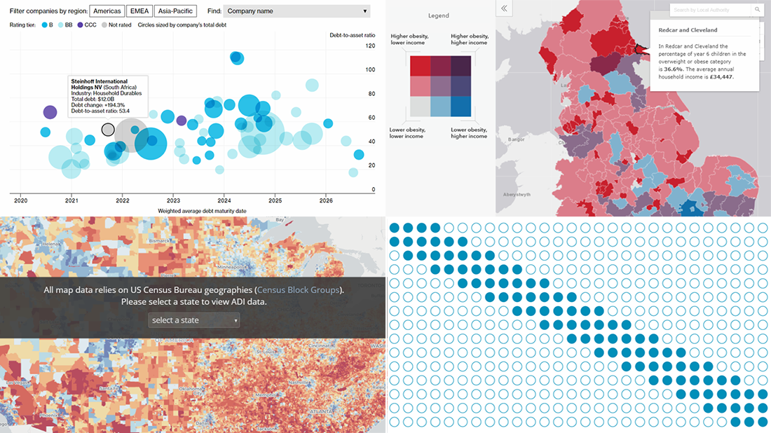 Visualizing recurring patterns that may be recognized in data, socio-economic deprivation neighborhood by neighborhood across the United States, the global corporate debt issue, and England’s childhood obesity — these topics are in the focus of the new DataViz Weekly digest that we are glad to present right now.
Read more »
July 10th, 2018 by AnyChart Team
 We at AnyChart are proud to announce the 8.3.0 release of our JS chart libraries AnyChart, AnyStock, AnyGantt, and AnyMap! The present major update brings full support of HTML in tooltips, background settings for chart data bounds, coloring rules and thresholds, easy axis label positioning, new technical indicators, and even more.
Read more »
July 6th, 2018 by AnyChart Team
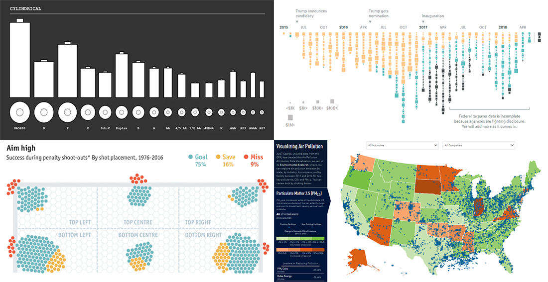 Hello Friday! DataViz Weekly is here to entertain you with several new interesting data graphics we’ve recently come across.
Here’s a quick list of what visualizations we are glad to draw your attention to this time, to start with:
- all battery sizes;
- political and government spendings at Donald Trump’s properties from 2015 to 2018;
- Environmental Explorer;
- FIFA World Cup and UEFA Euro penalty shoot-outs.
Read more »
June 29th, 2018 by AnyChart Team
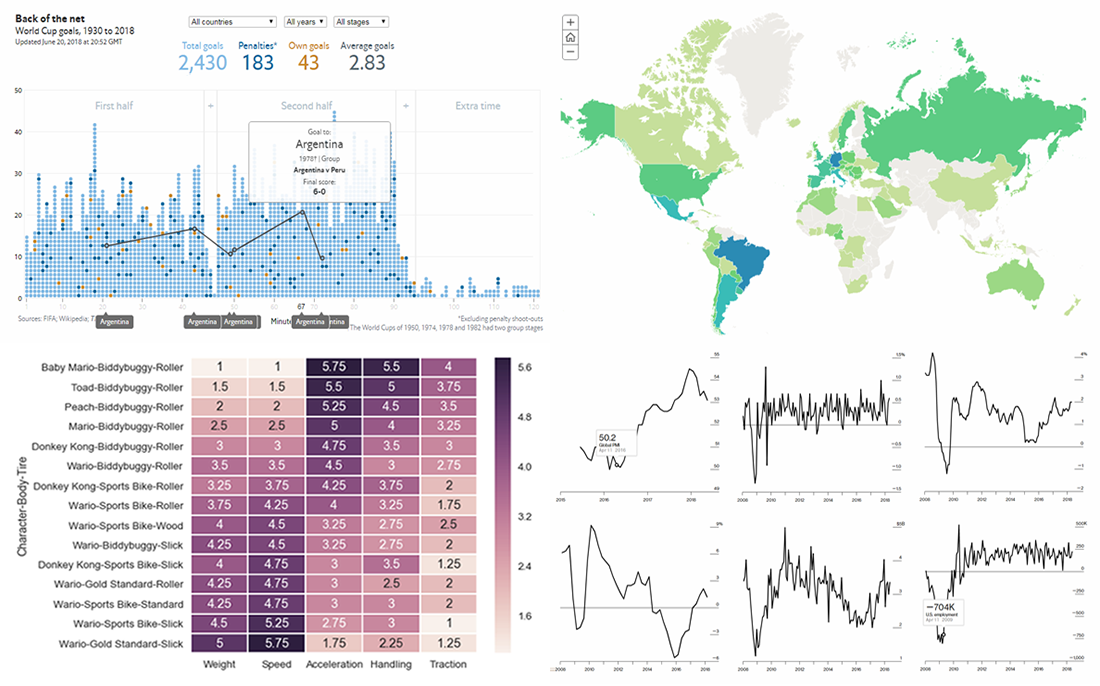 The 21st FIFA World Cup in Russia attracts the attention of many millions around the world who have been thoroughly watching the matches, and the tournament is about to enter the playoff stage. Today’s DataViz Weekly post on our blog will tell you about two cool data visualization works devoted to this competition and its history:
- all (more than 2,400) World Cup goals in one chart, and
- thirty-three maps about the World Cup.
In addition, new DataViz Weekly features the following interesting graphics:
- finding the best characters in Mario Kart, and
- 12 key global economic indicators.
Read more »
June 22nd, 2018 by AnyChart Team
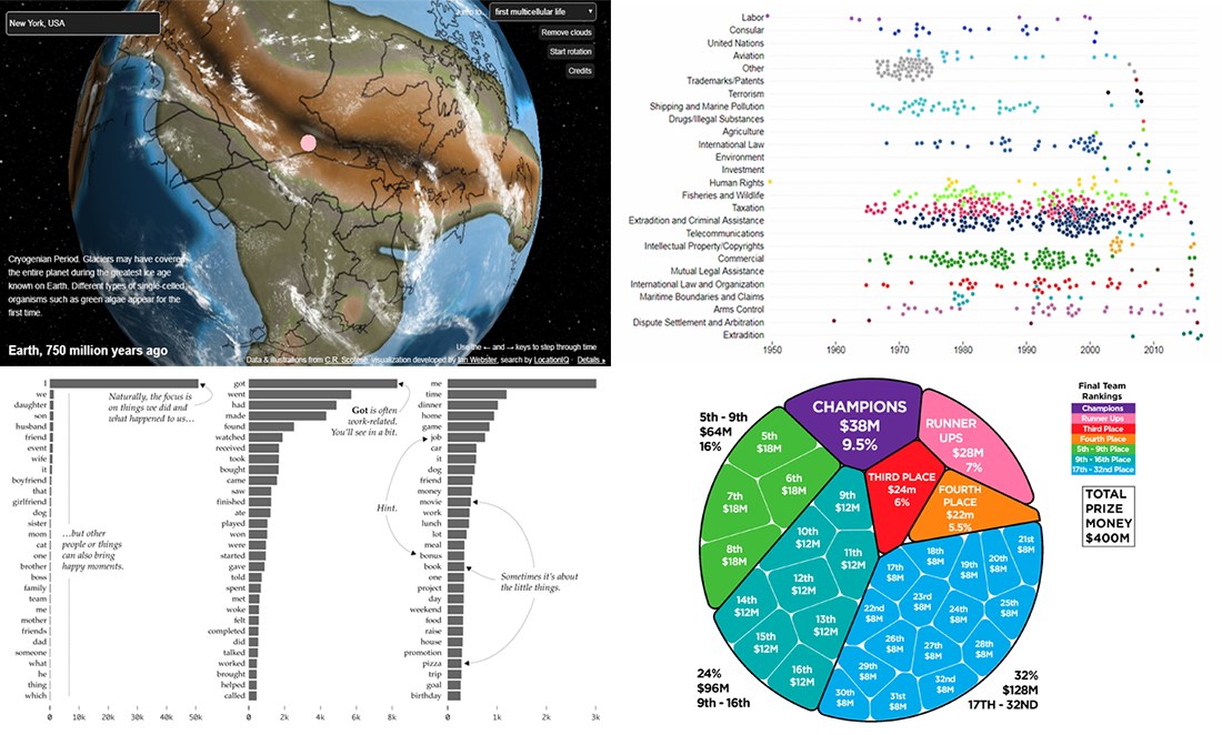 DataViz Weekly continues to share with you interesting data stories and visualizations. Take a look at our new selection:
- U.S. Treaties Explorer;
- ancient Earth globe;
- happy moments in life;
- FIFA World Cup prize money.
Read more »
June 21st, 2018 by Irina Maximova

It’s always been important to AnyChart to make JavaScript charts run in HTML5 projects fast regardless of the users’ technology stack. Our AnyChart, AnyMap, AnyStock, and AnyGantt libraries for data visualization are compatible with all major technologies and platforms, and there is a bunch of different integration samples already available. All of them are a great help in making the process of chart creation more pleasant and less time-consuming. In this article, we will tell you how to integrate AnyChart JS Charts with Elasticsearch. To begin with, let’s find out what Elasticsearch is and what makes it special.
Read more »
June 15th, 2018 by AnyChart Team
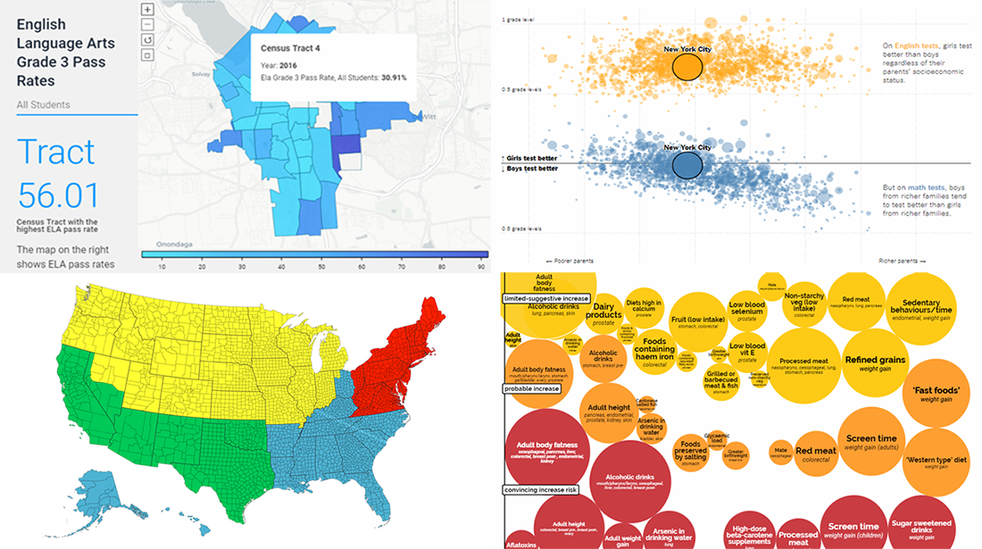 Understanding data gets easier when the data you are looking into is visualized. To illustrate this, here’s a new collection of interesting charts, infographics, and stories based on them that we have found on the web just recently.
Today in Data Visualization Weekly:
- life in Central New York;
- population distribution in the big picture;
- gender gap in school test scores;
- cancer risk factors.
Read more »
June 14th, 2018 by AnyChart Team
 Great news for Qlik users! We’ve released version 2.4.0 of the AnyChart Qlik Extension. The latest update brings several important new features to Qlik charts: multiple scales, localization support, coloring controls for OHLC, candlestick and waterfall charts, as well as label rotation settings.
Learn more about the new version of our JavaScript (HTML5) charting library extension for interactive data visualization on Qlik data analytics platform, and what’s next in our plans.
Read more »
June 8th, 2018 by AnyChart Team
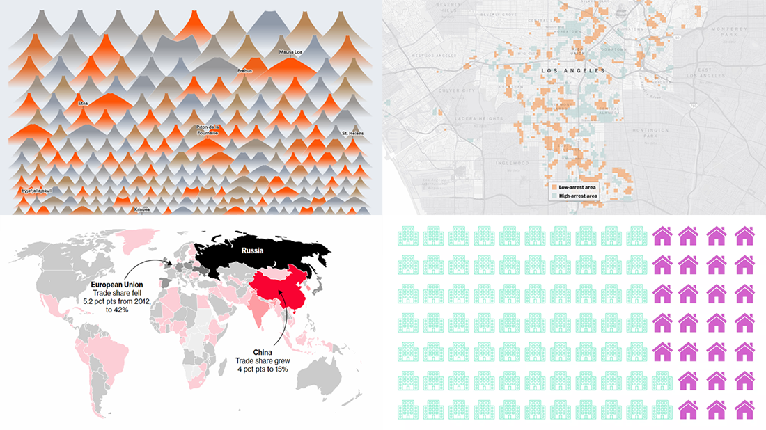 The new DataViz Weekly article is here. Today, we are glad to share with you the following cool data visuals, just in case you missed them out there:
- all known volcano eruptions since 1883;
- remote and non-remote workers’ time usage;
- unsolved murders in major US cities;
- Russia’s economic results.
Read more »